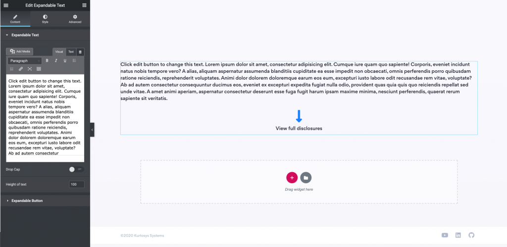
With the Expandable Text widget, you can include a large amount of text on a page without displaying all of it until the user clicks on the View full-text call to action. You can control the height of the text that you want to display first enabling you to have large pieces of text on your page without displaying it outright.
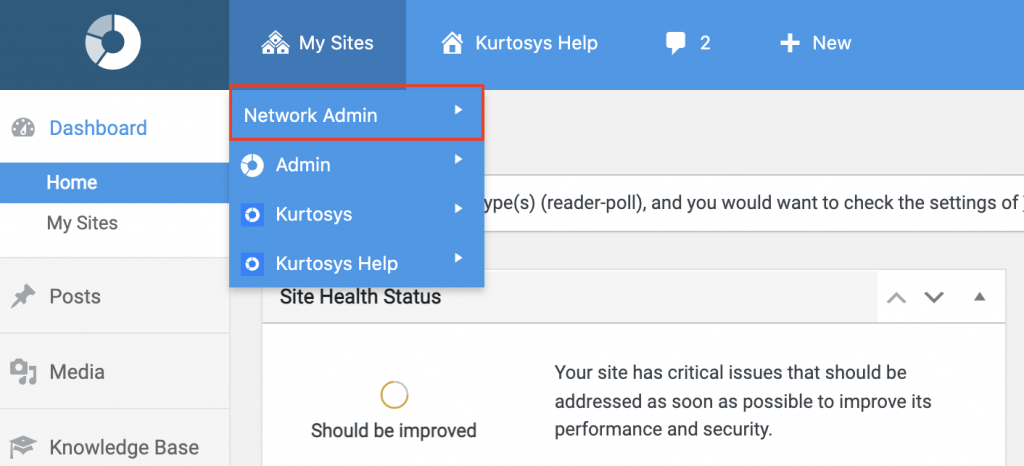
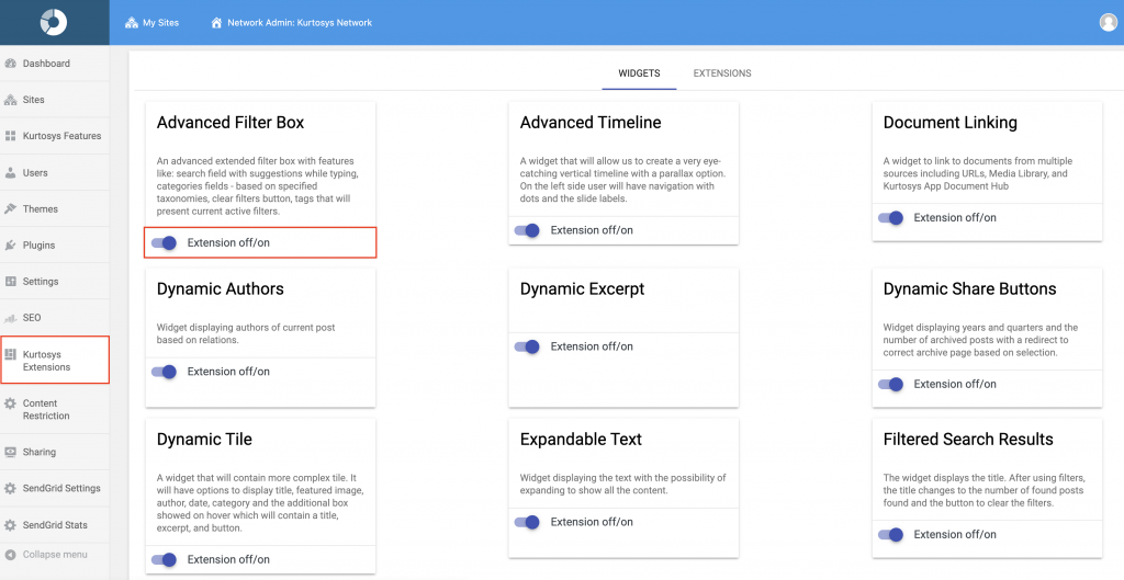
This widget needs to be activated in the Network Admin area.
How to configure the Expandable Text Widget
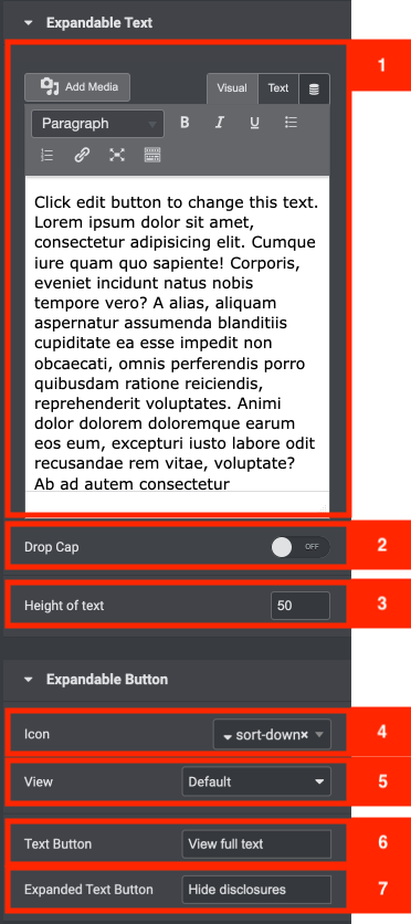
Expandable Text and button Settings
- The first area contains a text area where you can place all of your text.
- Next, you can toggle the Drop Cap function on or off. A drop cap is where the first character of the first paragraph is made larger, taking up several lines of text or the first few sentences.
- The Height of Text area controls the height of the text that is displayed in Pixels.
- The Icon Area controls what icon is displayed above the clickable text that shows all of the text.
- The view select field allows you to select either default, stacked or framed. This will change the way the background of the icon is displayed. (either outlined, clear or filled)
- If you toggled the above area to either framed or stacked then you will see the shape select field this allows you to select either default, square, or circle. This will change the look of the button by adding either a circle or a square around it. If you keep it on default then it will just show the icon.
- Next, we have the Text Button field. This is where you can input the text for your button when it is not expanded (in order to let the user expand it).
- Below this, we have the Expanded Text Button field. This is where you can input the text for your button when it is expanded (in order to collapse it).
Example of the widget
Click edit button to change this text. Lorem ipsum dolor sit amet, consectetur adipisicing elit. Cumque iure quam quo sapiente! Corporis, eveniet incidunt natus nobis tempore vero? A alias, aliquam aspernatur assumenda blanditiis cupiditate ea esse impedit non obcaecati, omnis perferendis porro quibusdam ratione reiciendis, reprehenderit voluptates. Animi dolor dolorem doloremque earum eos eum, excepturi iusto labore odit recusandae rem vitae, voluptate? Ab ad autem consectetur consequuntur ducimus eos, eveniet ex excepturi expedita fugiat nulla odio, provident quas quia quis quo reiciendis repellat sed unde vitae. A amet animi aperiam, aspernatur consectetur deserunt esse fuga fugit harum ipsam maxime minima, nesciunt perferendis, quaerat rerum sapiente sit veritatis.
Click edit button to change this text. Lorem ipsum dolor sit amet, consectetur adipisicing elit. Cumque iure quam quo sapiente! Corporis, eveniet incidunt natus nobis tempore vero? A alias, aliquam aspernatur assumenda blanditiis cupiditate ea esse impedit non obcaecati, omnis perferendis porro quibusdam ratione reiciendis, reprehenderit voluptates. Animi dolor dolorem doloremque earum eos eum, excepturi iusto labore odit recusandae rem vitae, voluptate? Ab ad autem consectetur consequuntur ducimus eos, eveniet ex excepturi expedita fugiat nulla odio, provident quas quia quis quo reiciendis repellat sed unde vitae. A amet animi aperiam, aspernatur consectetur deserunt esse fuga fugit harum ipsam maxime minima, nesciunt perferendis, quaerat rerum sapiente sit veritatis.


