
After creating your Wizard-style Attestation app, the app will need to be styled to match the look and feel of the rest of the website.
Table of Contents
Header Title
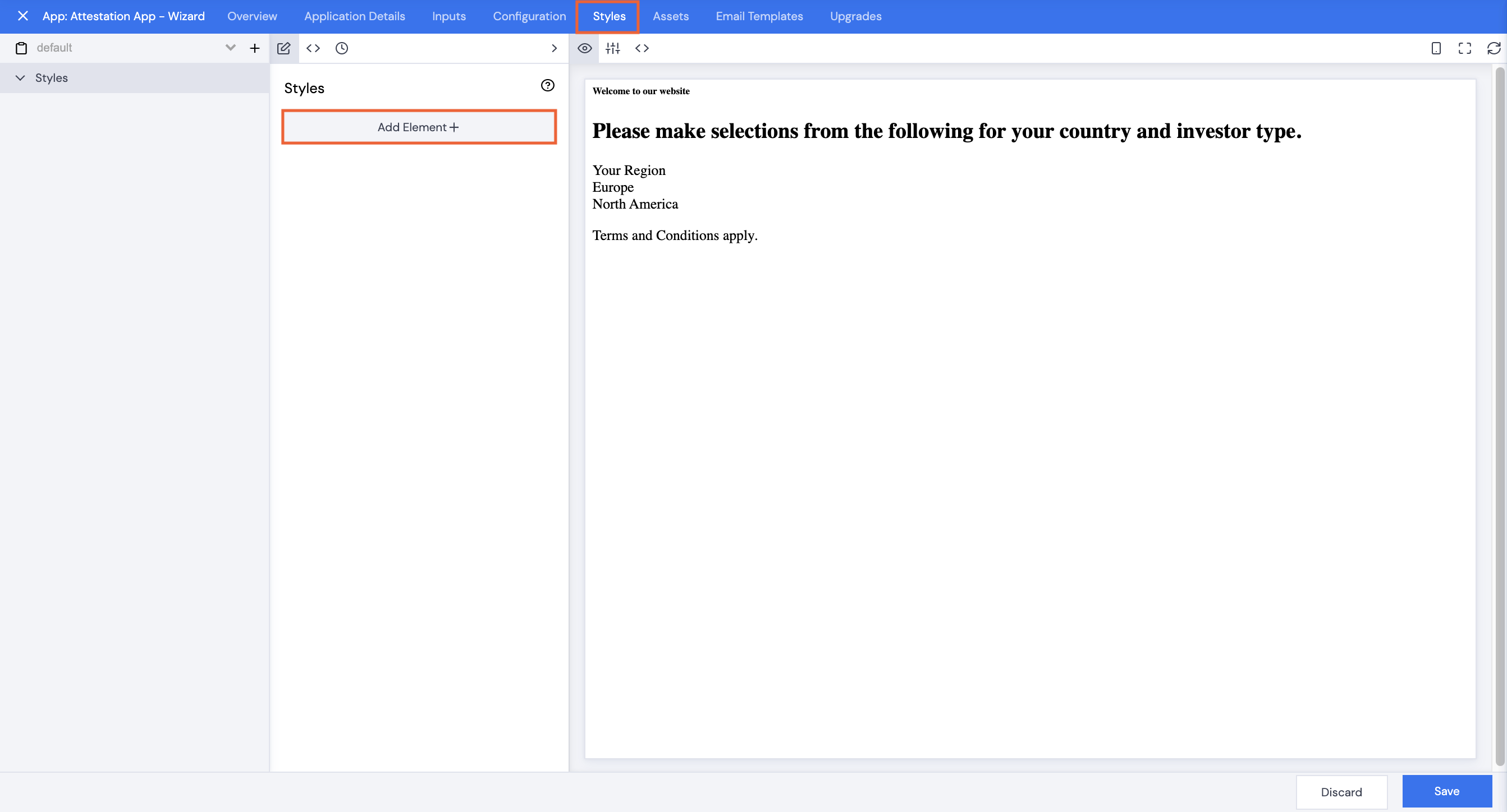
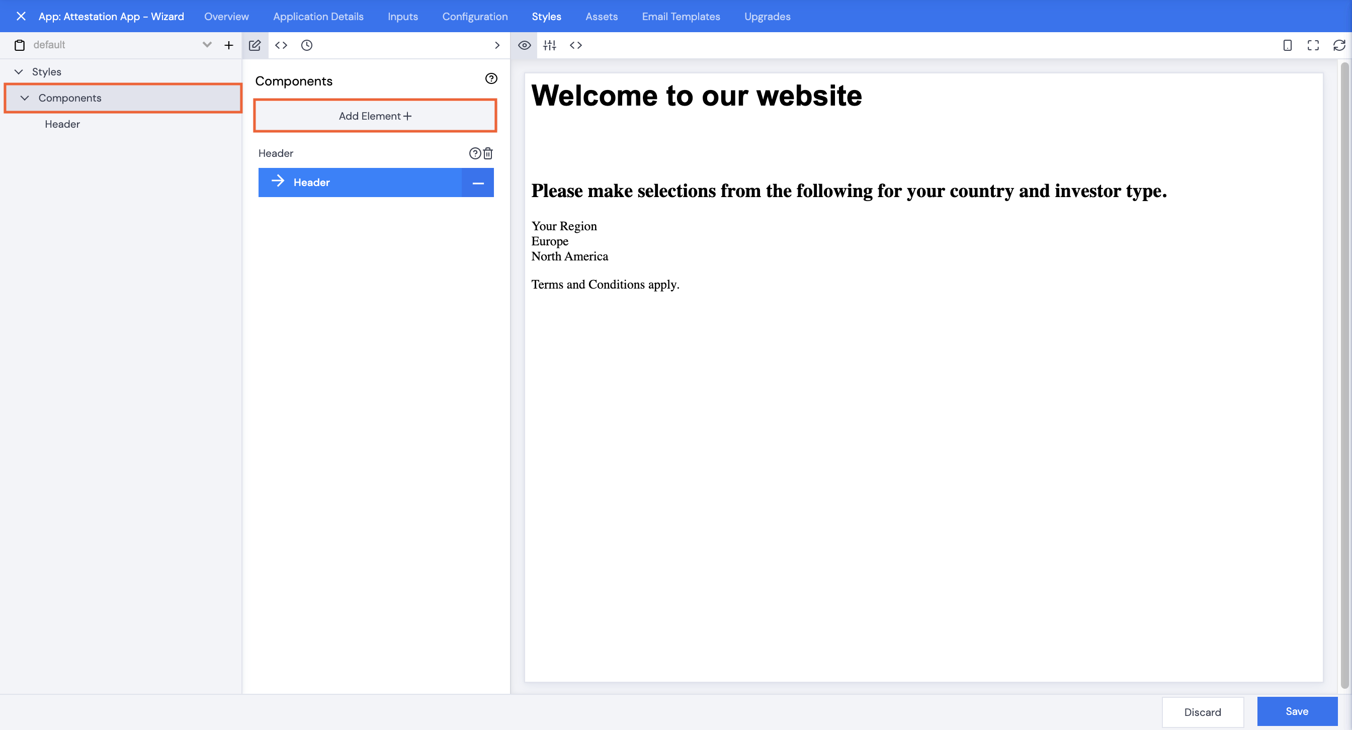
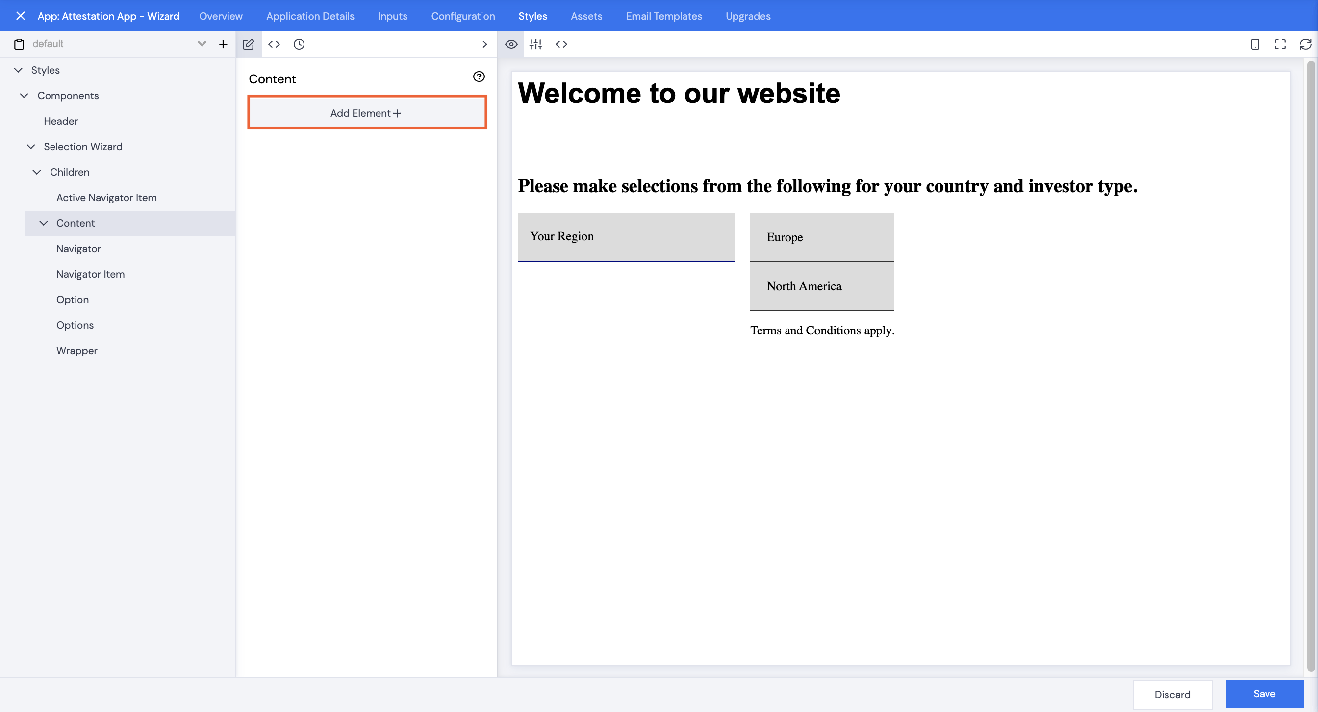
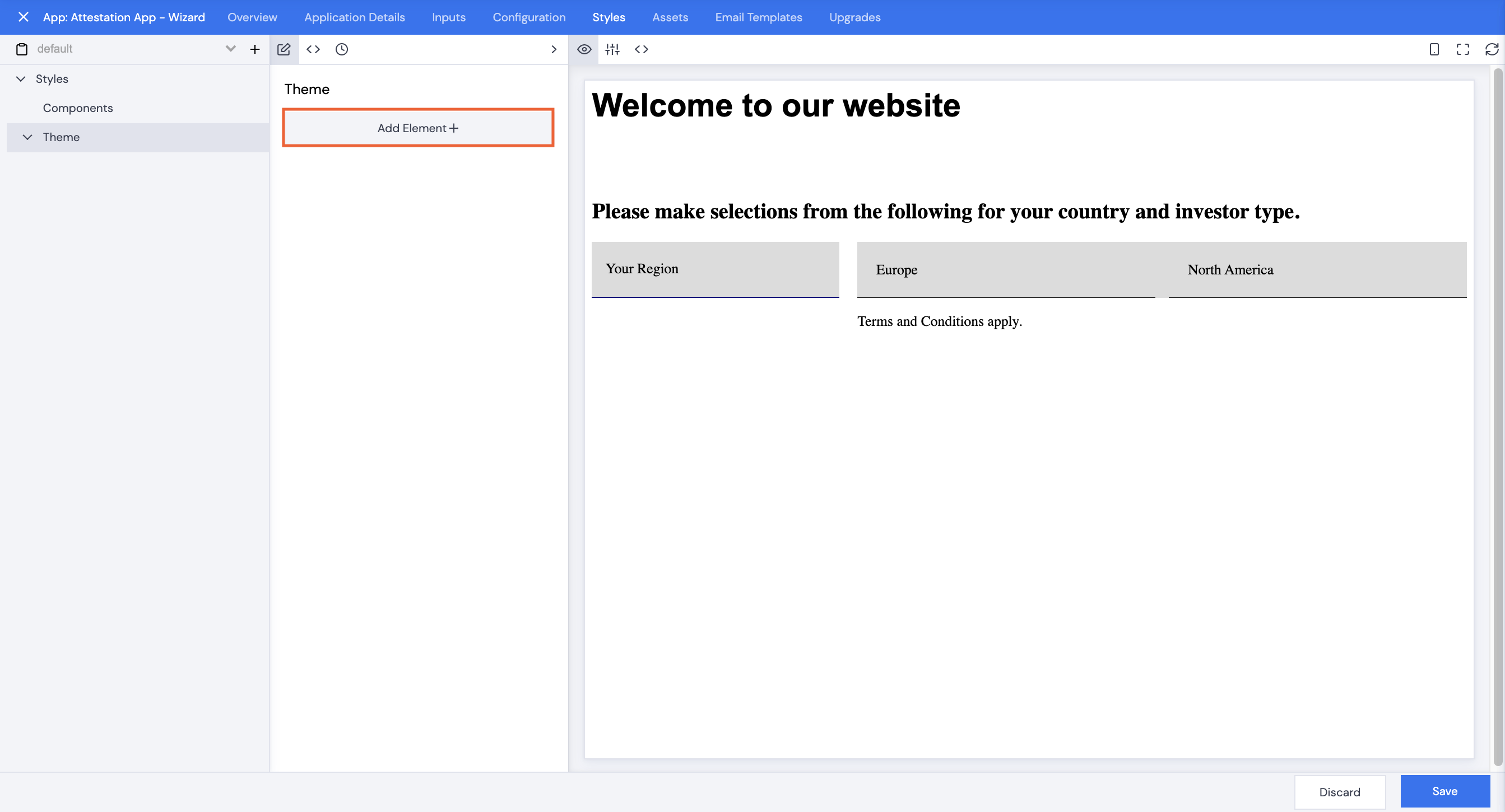
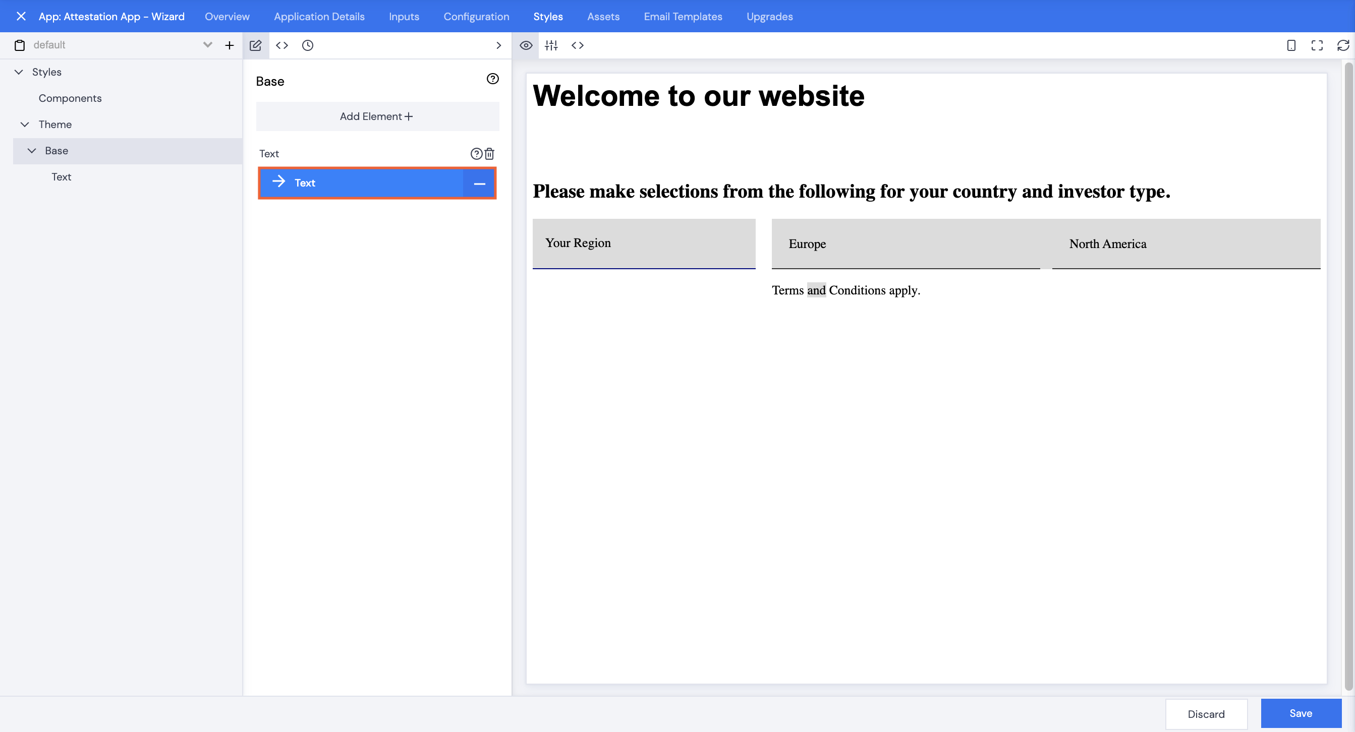
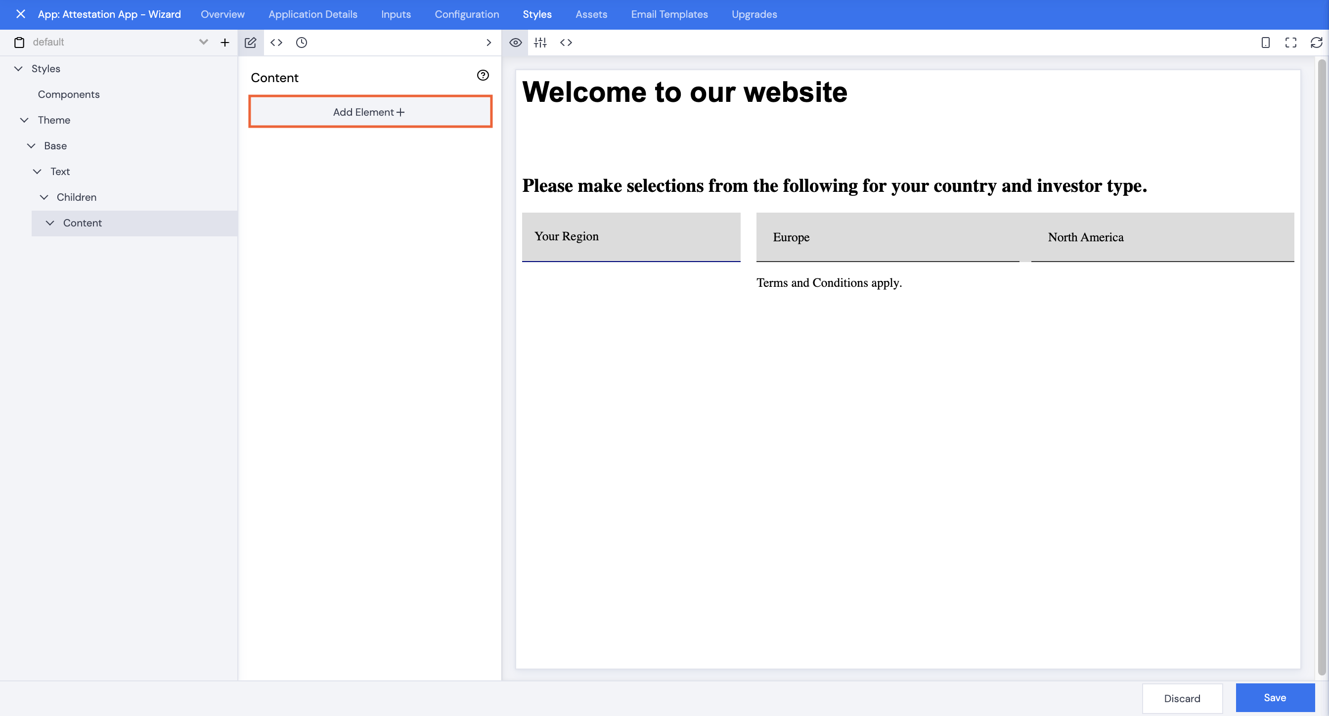
- With the Styles tab selected, click Add Element+.
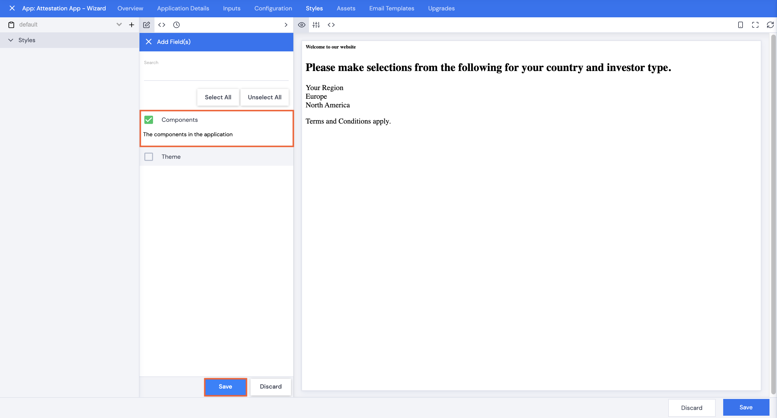
- Select Components, then click Save.
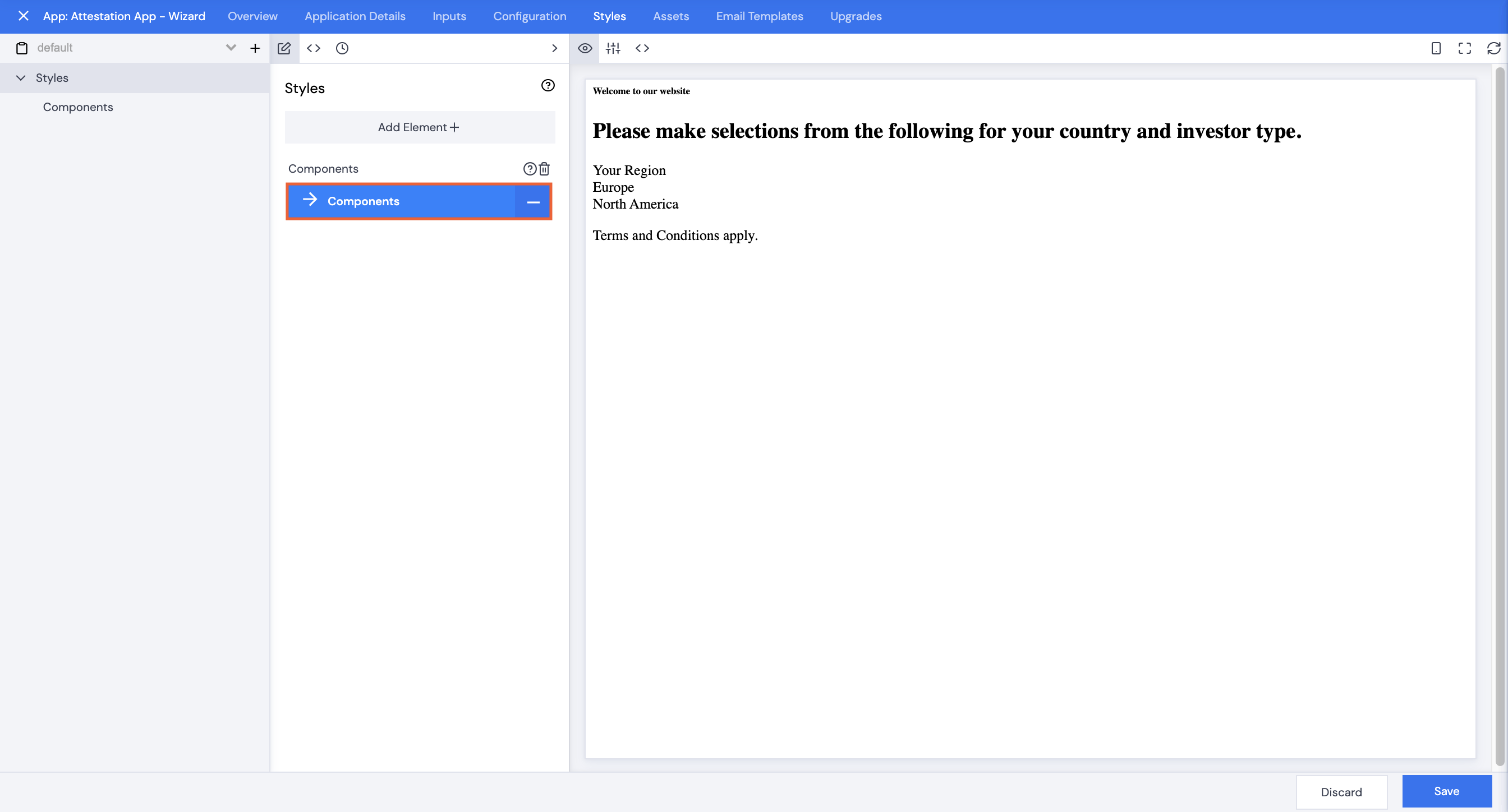
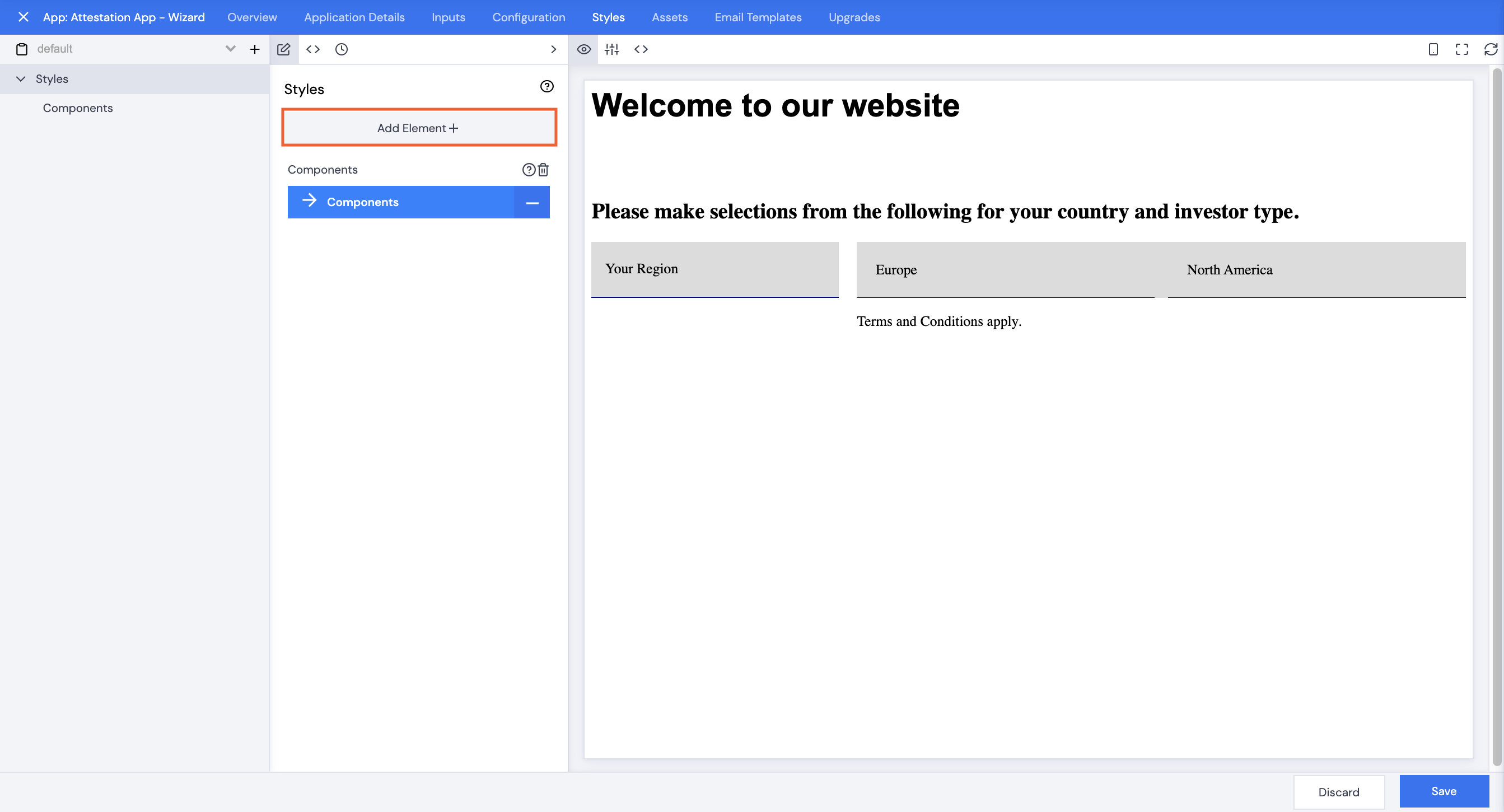
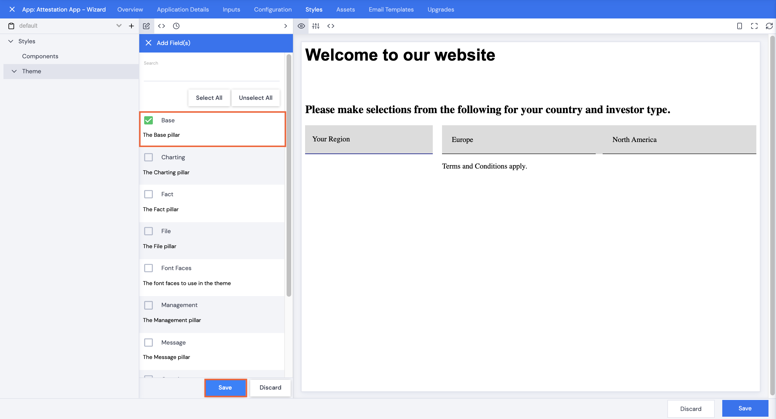
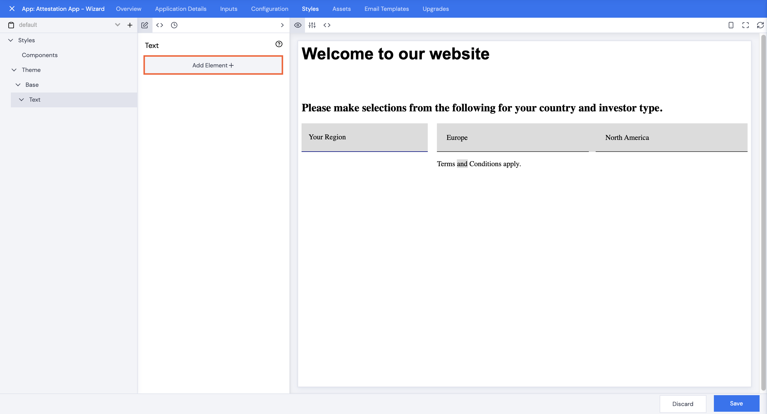
- Click Components.
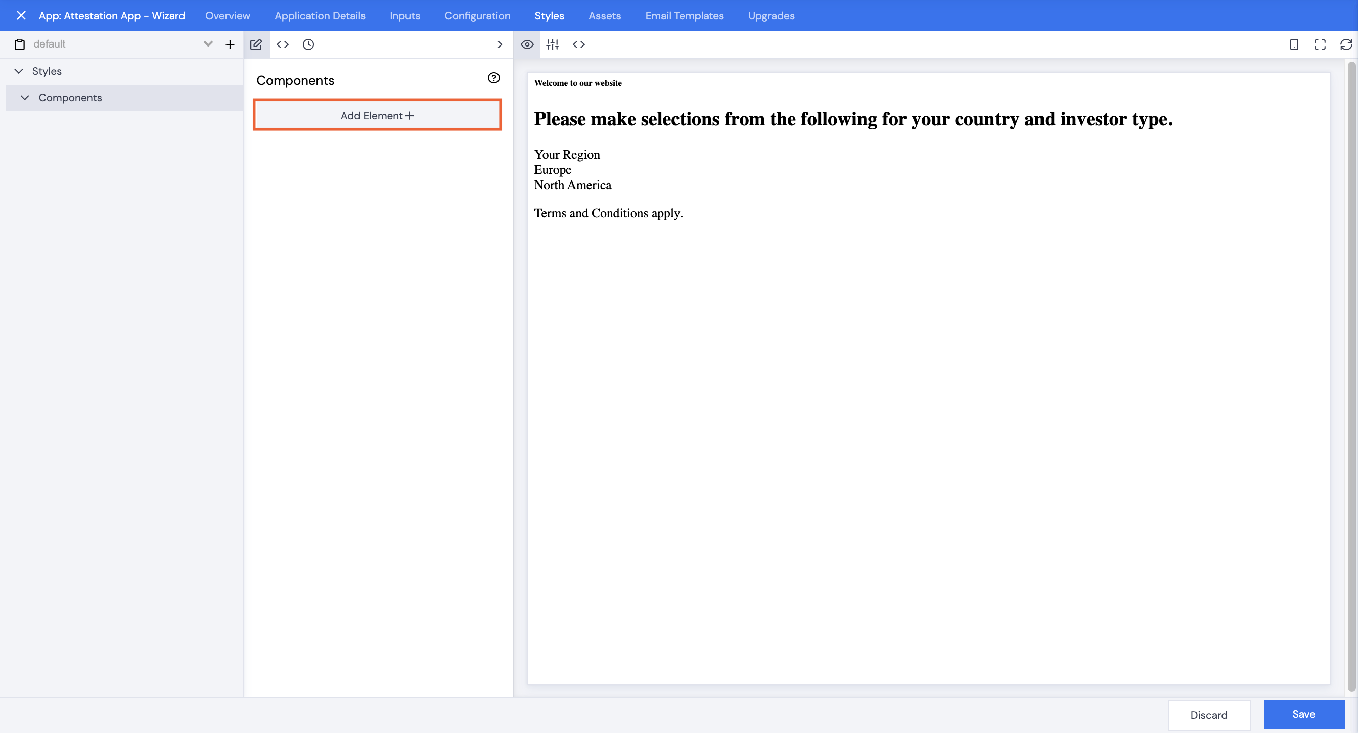
- Click Add Element+.
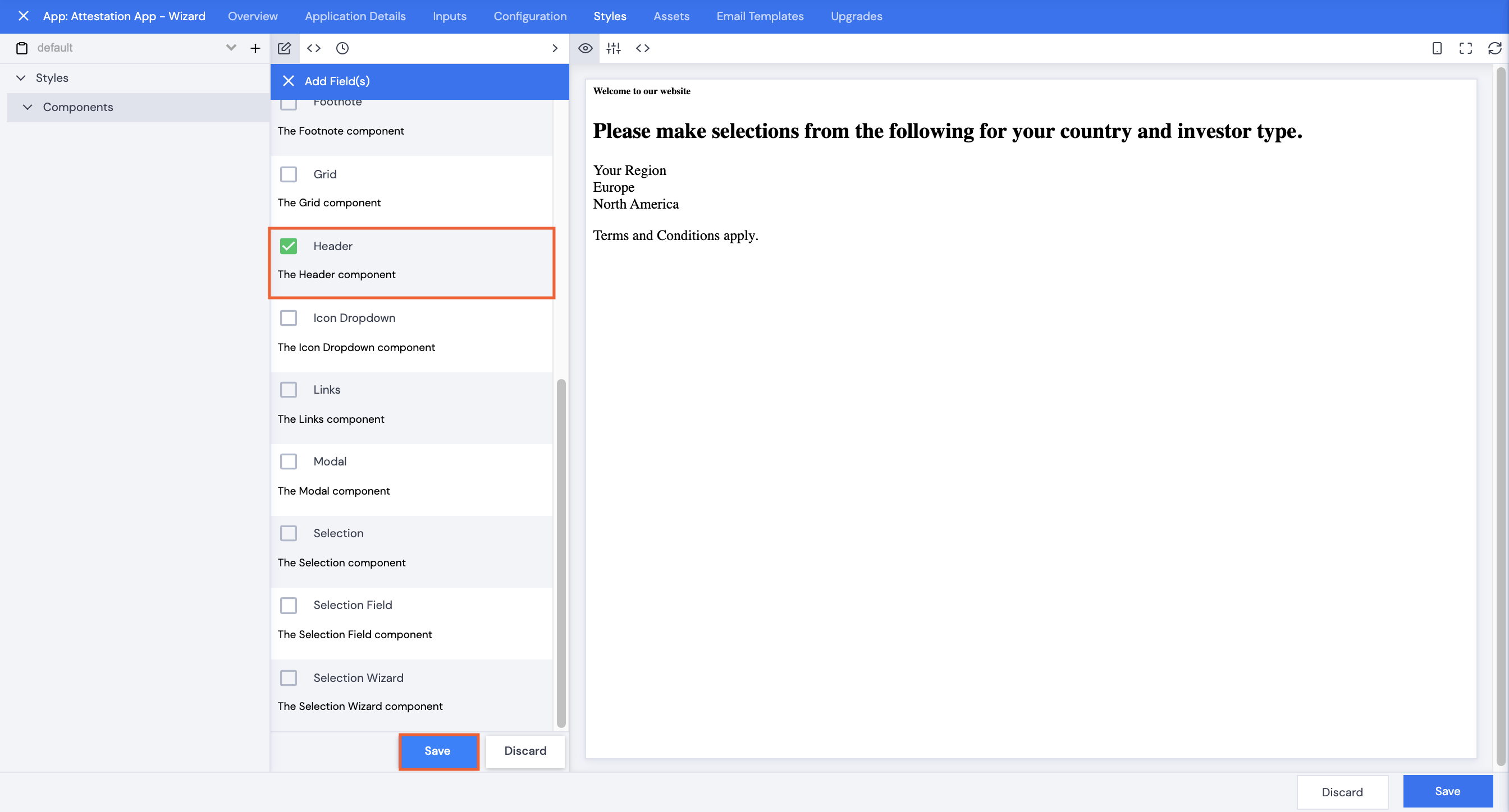
- Scroll or search to select Header, then click Save.
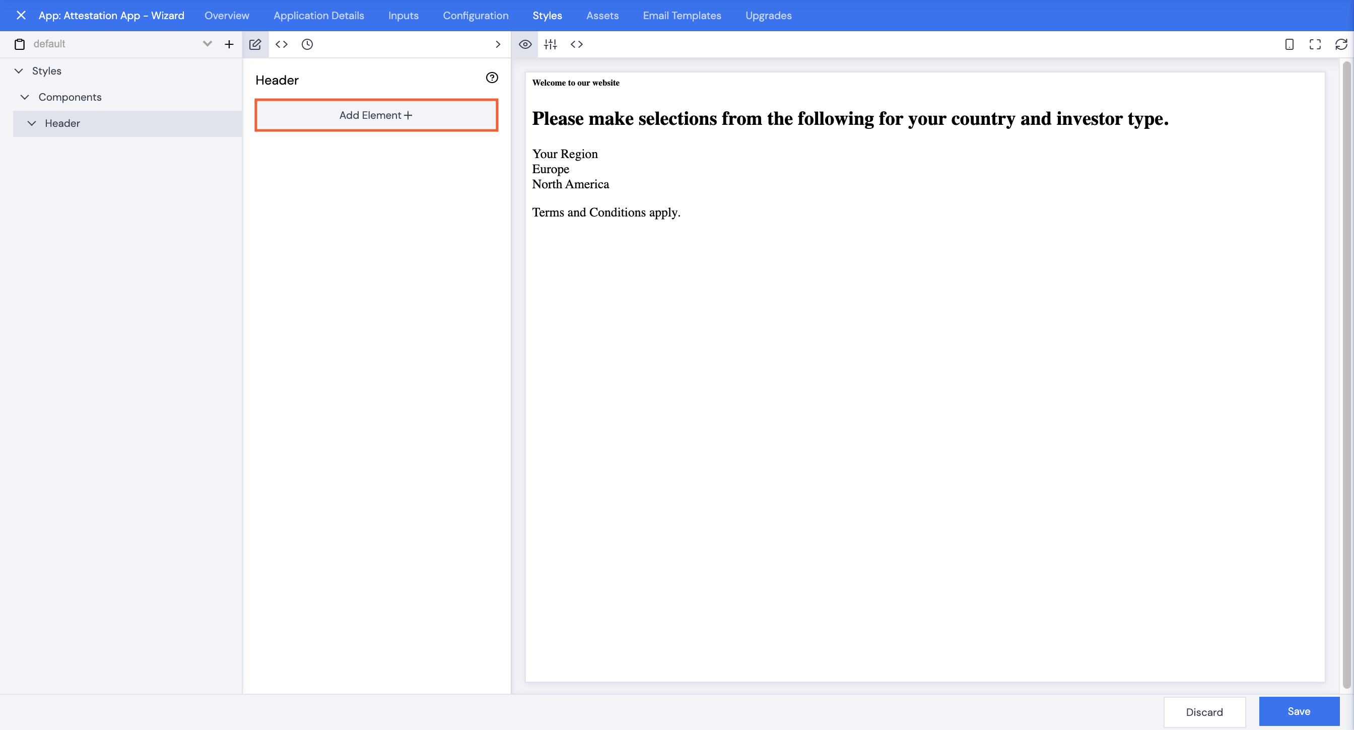
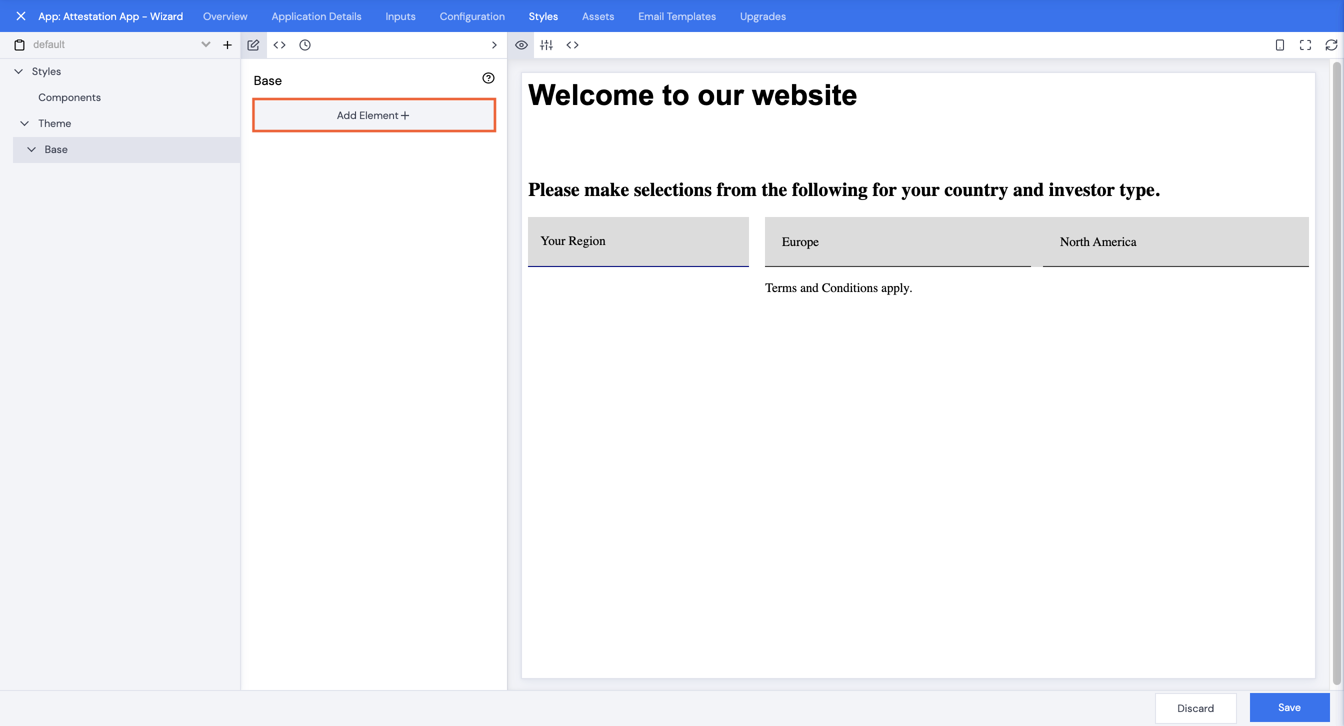
- Click Header.
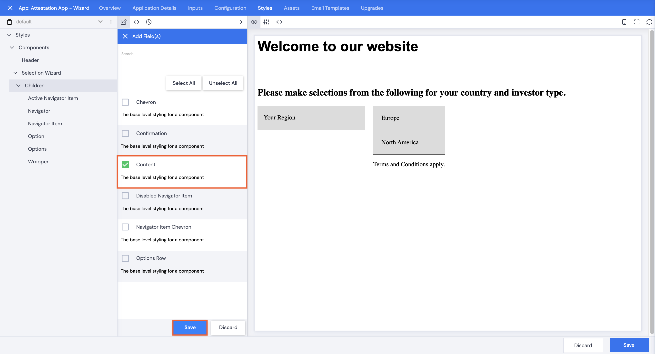
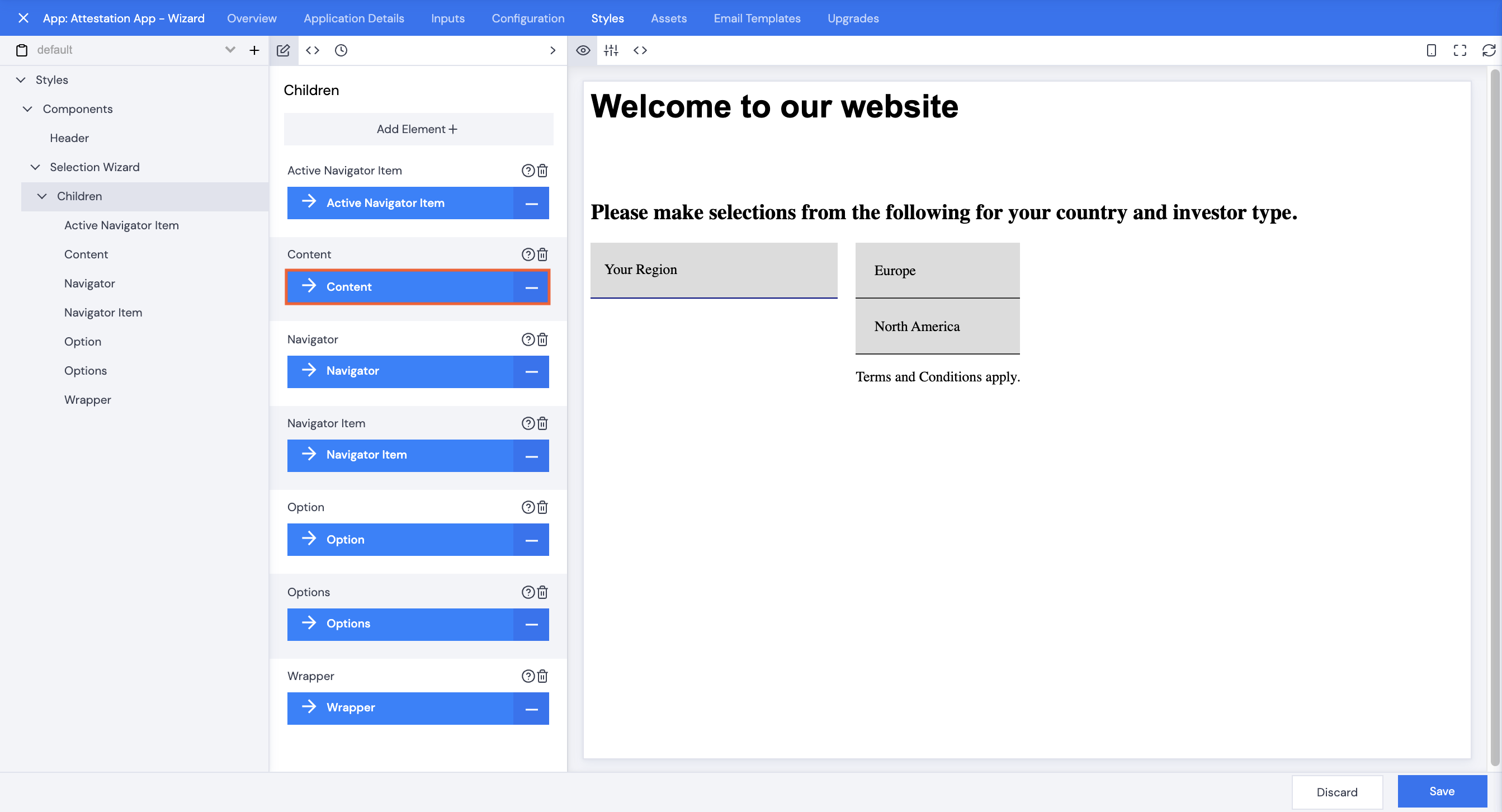
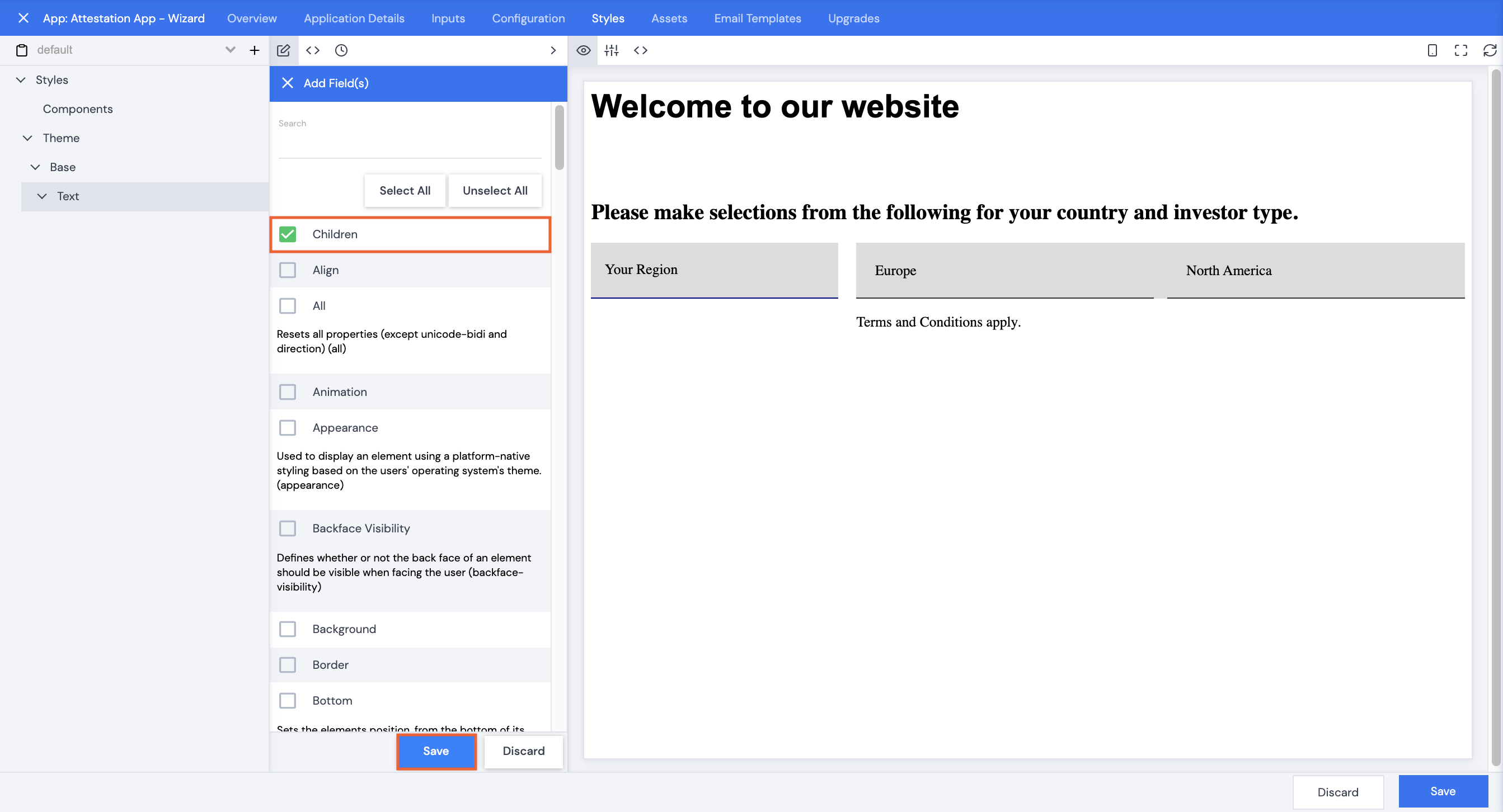
- Click Add Element+.
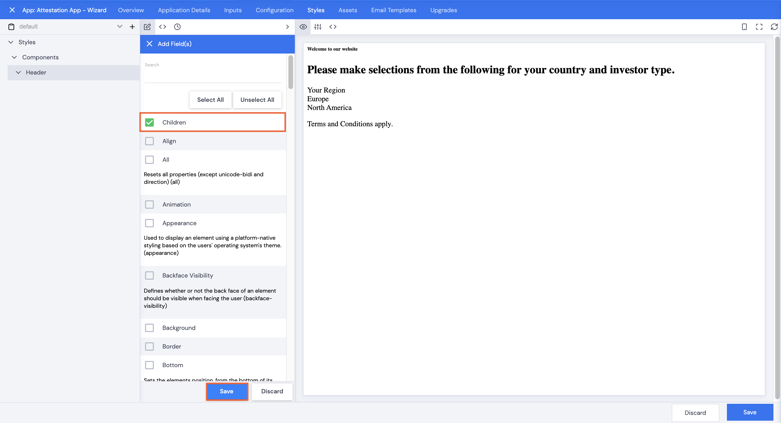
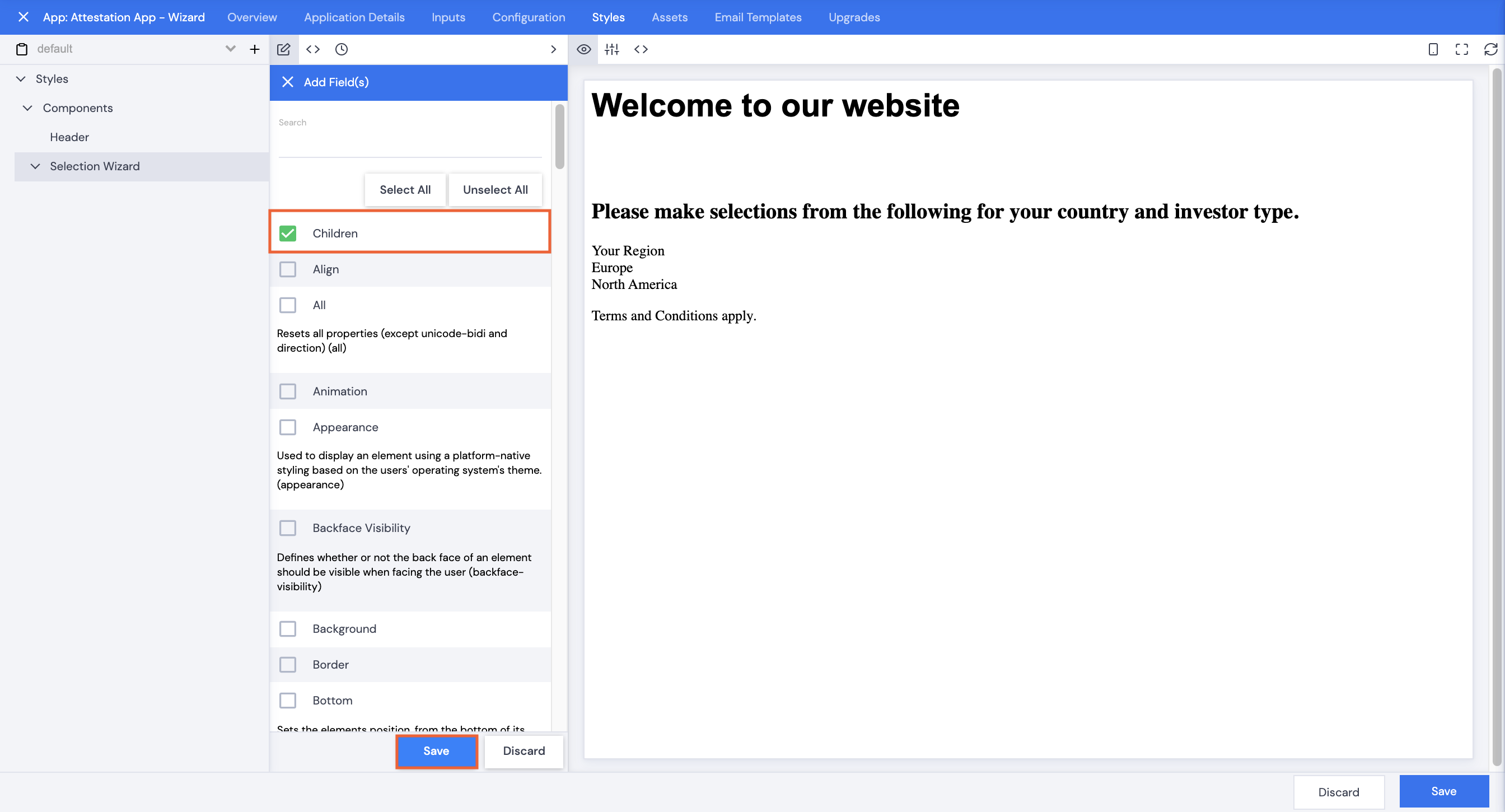
- Select Children, then click Save.
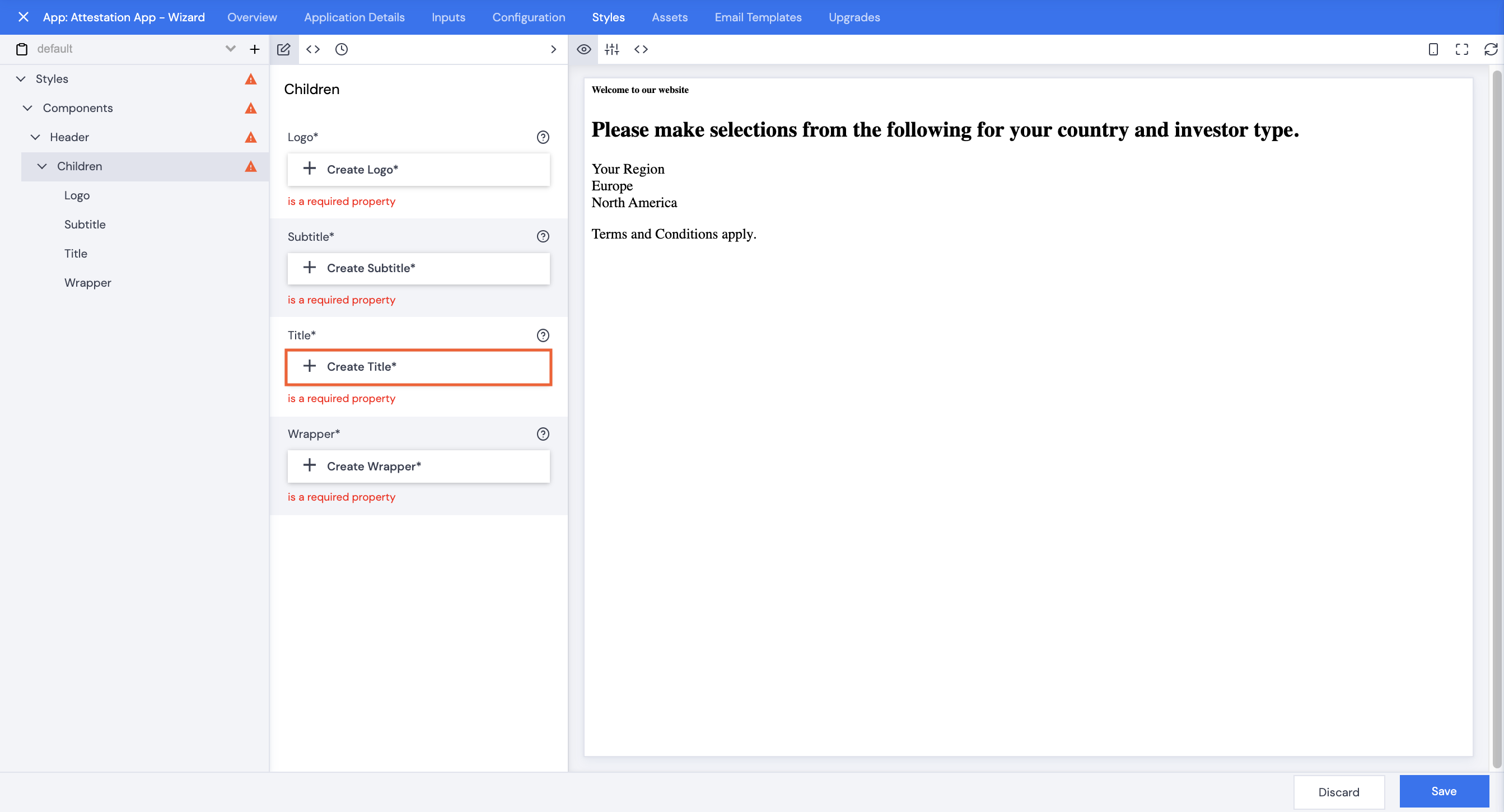
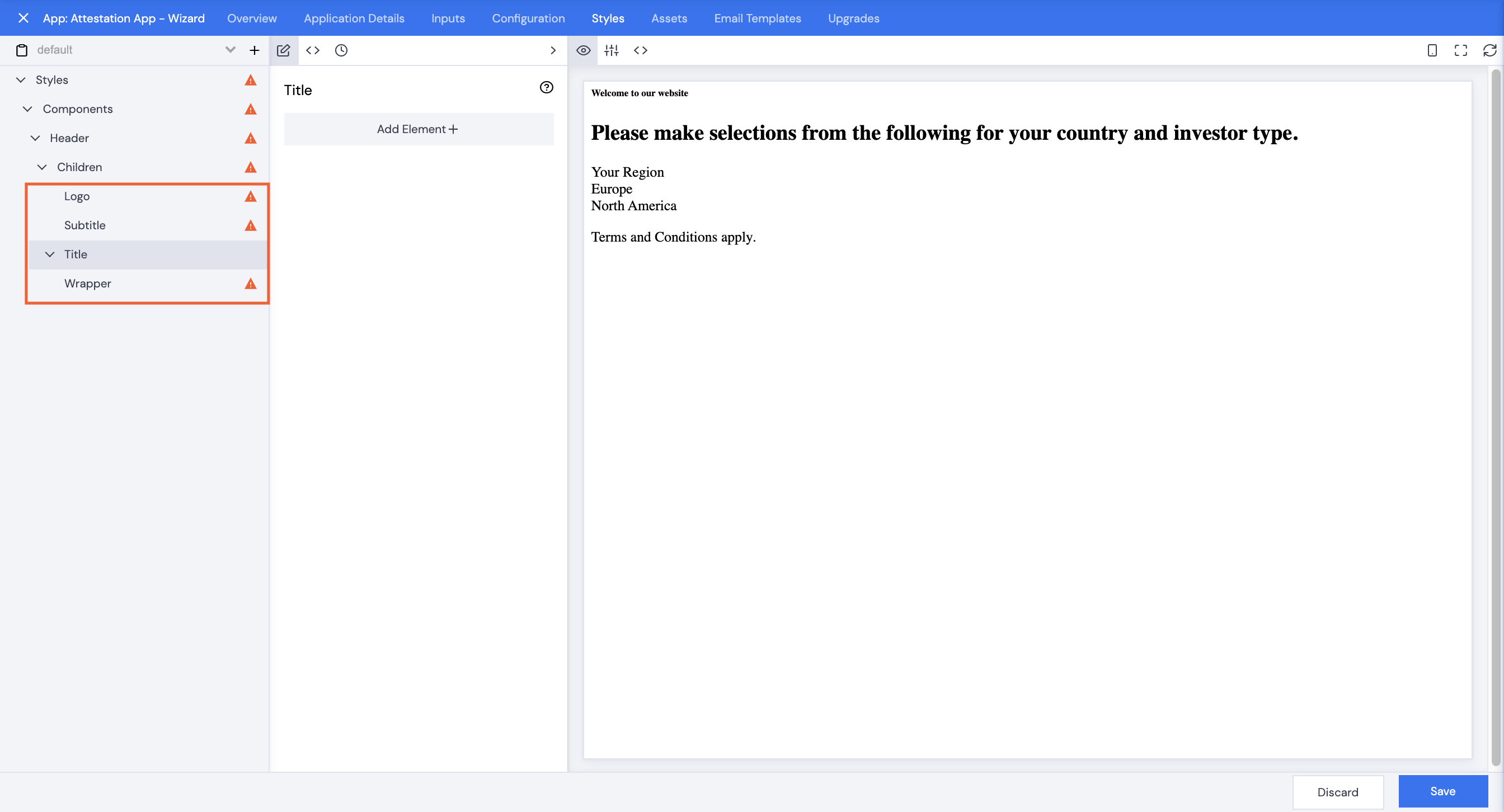
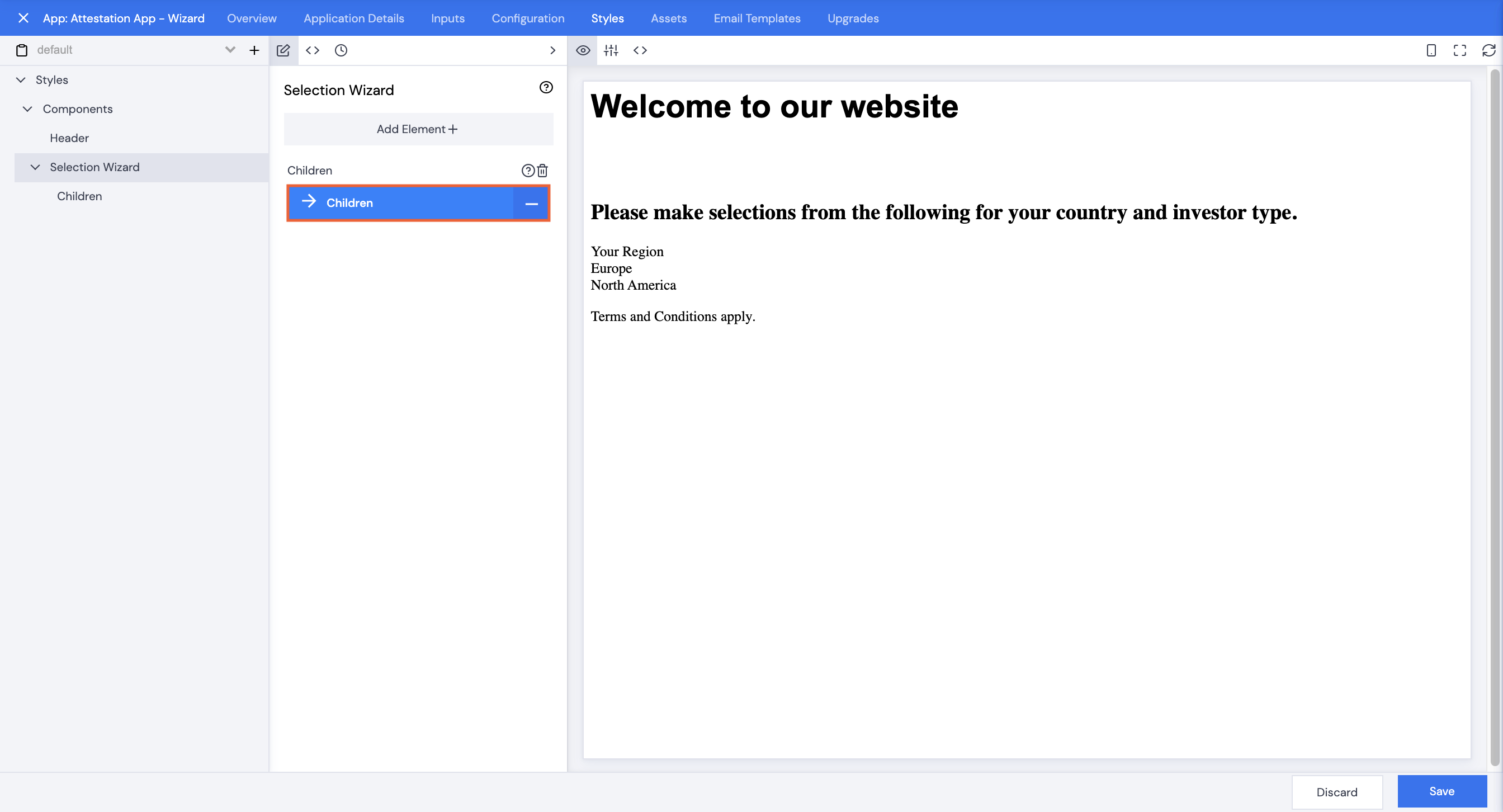
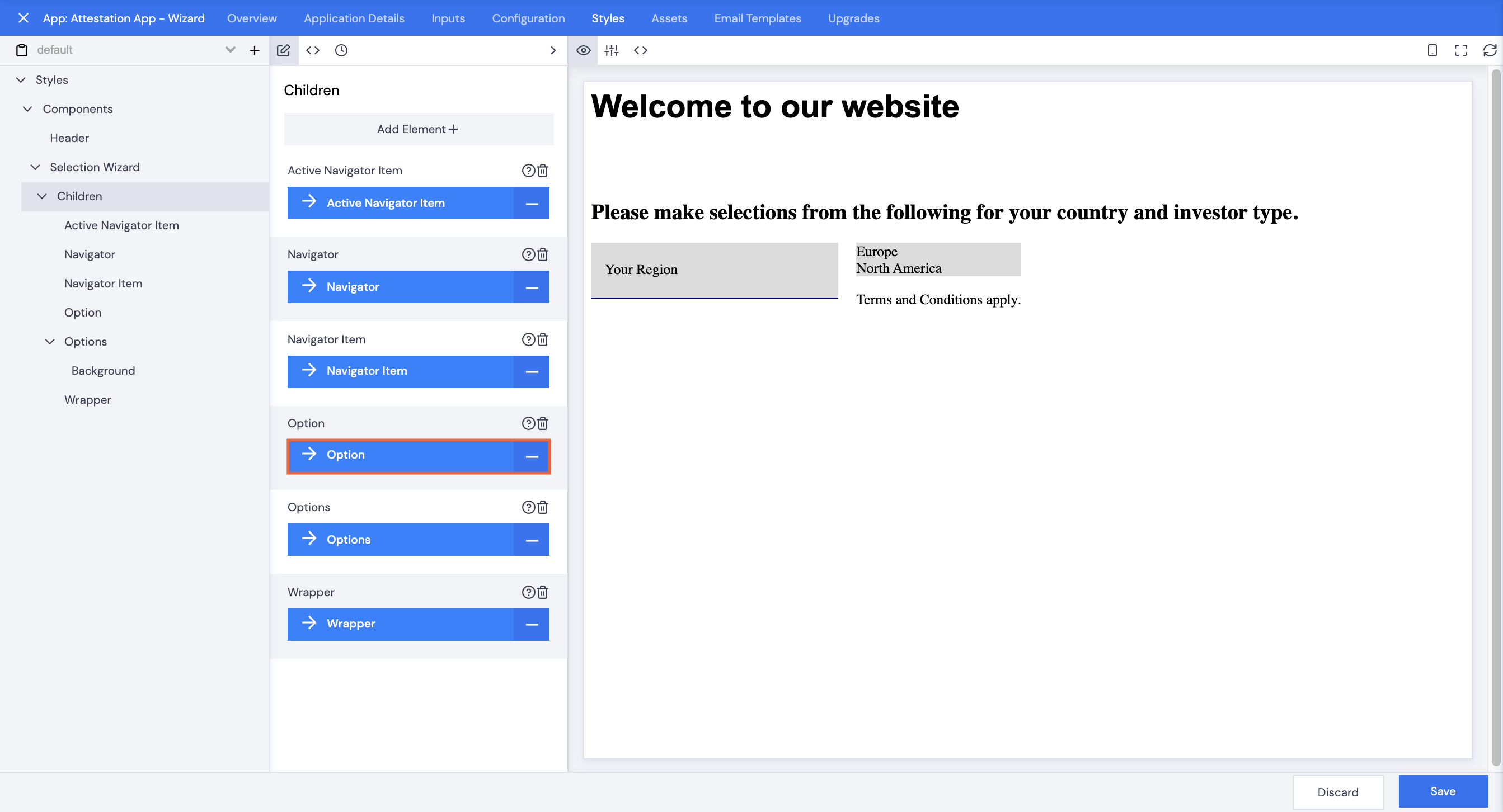
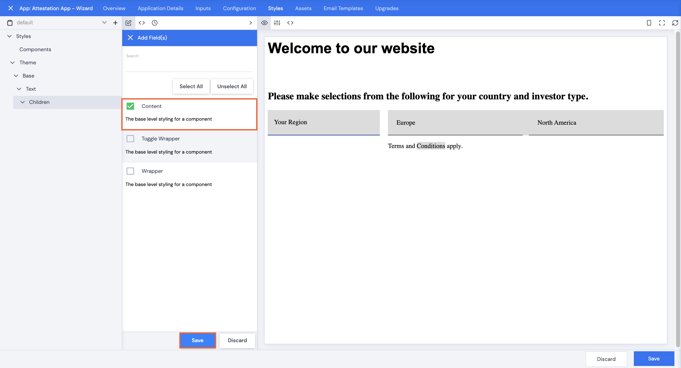
- Click Children.
- Click +Create Title*.
- Click on each item under Children in the left navigation pane to remove the errors.
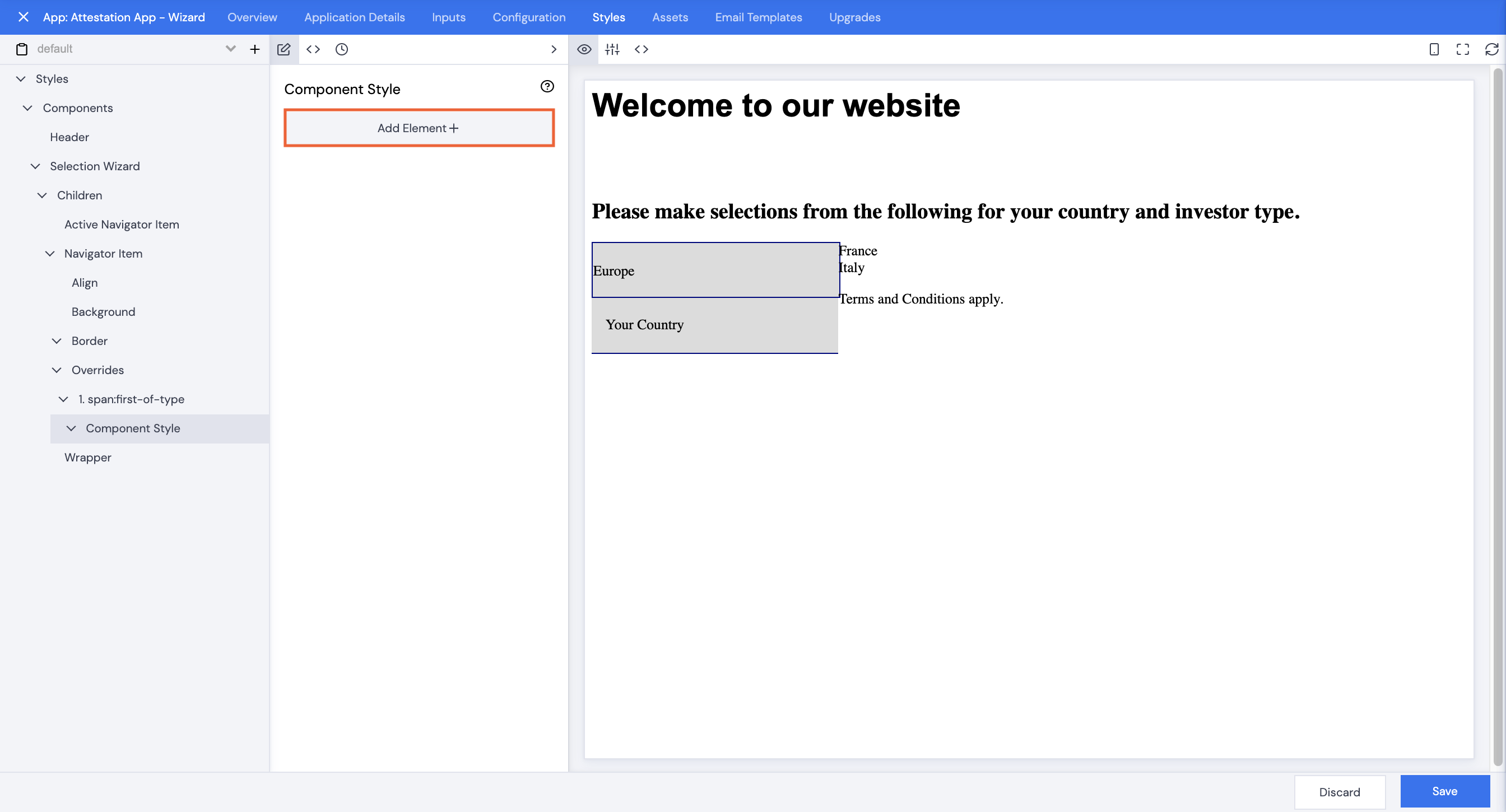
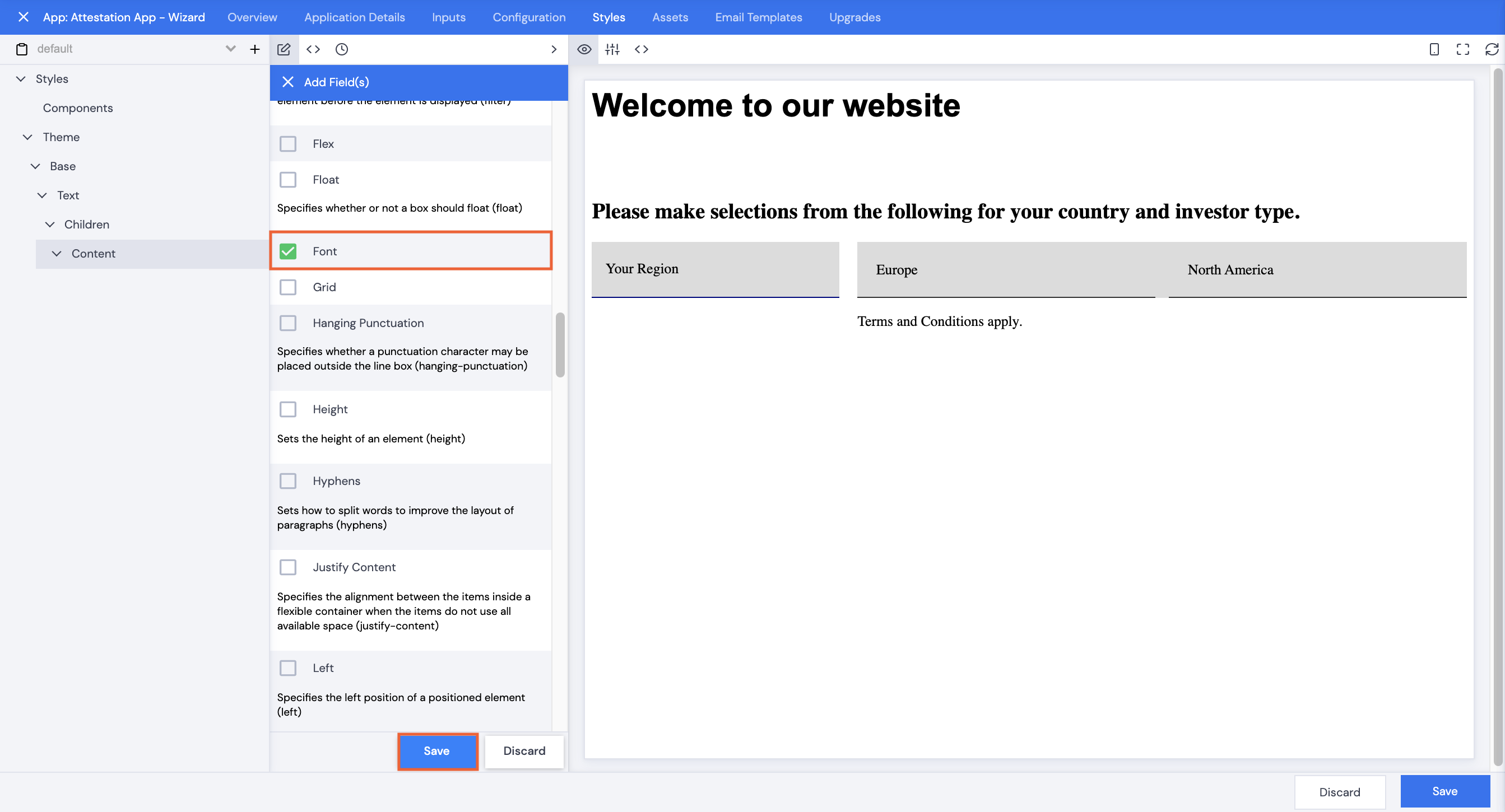
- With Title selected, click Add Element+.
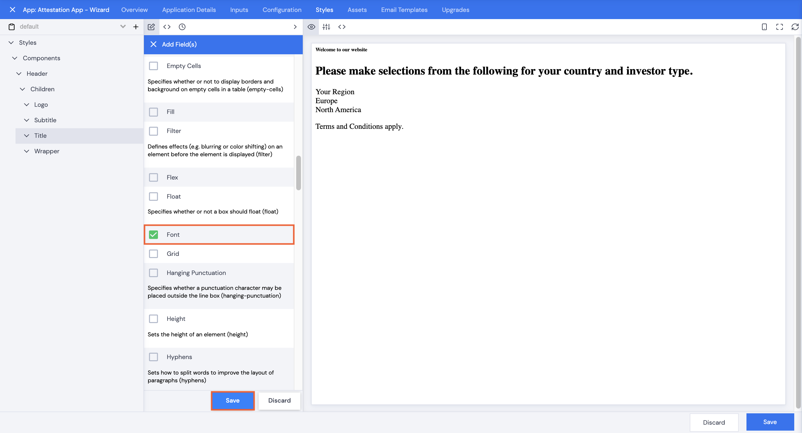
- Scroll or search to select Font, then click Save.
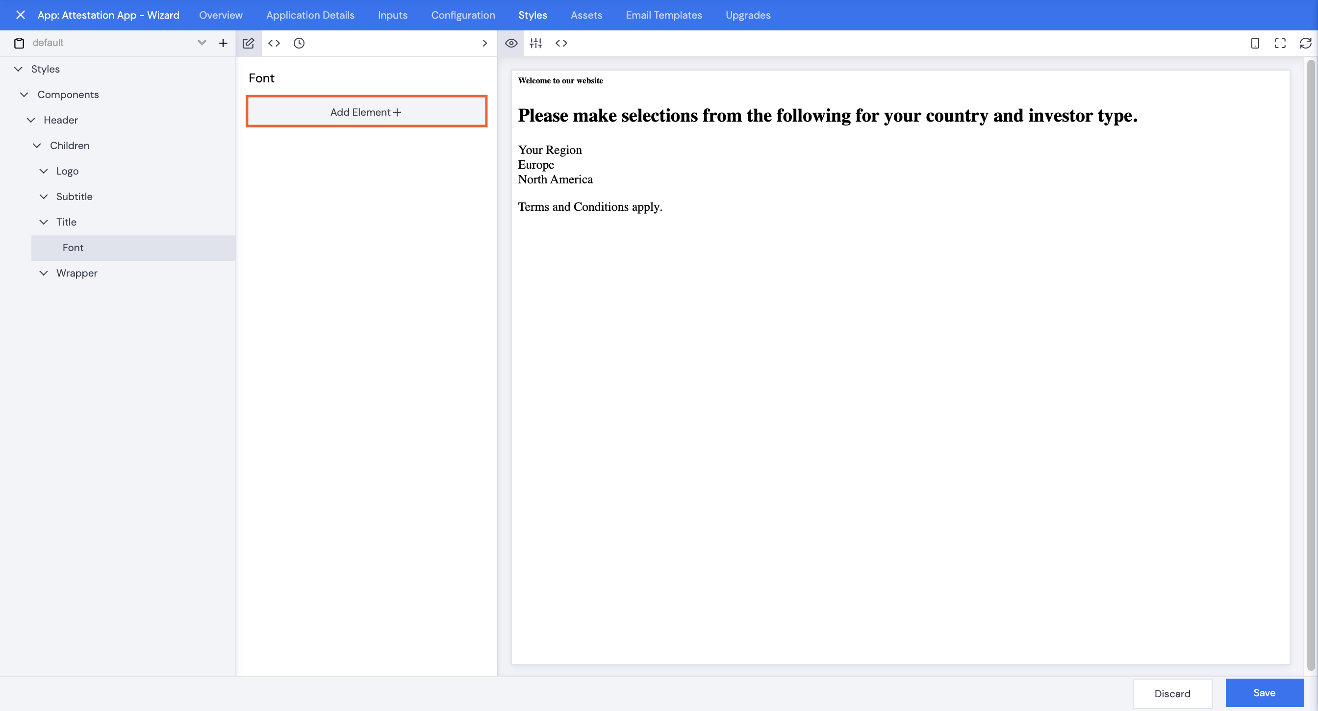
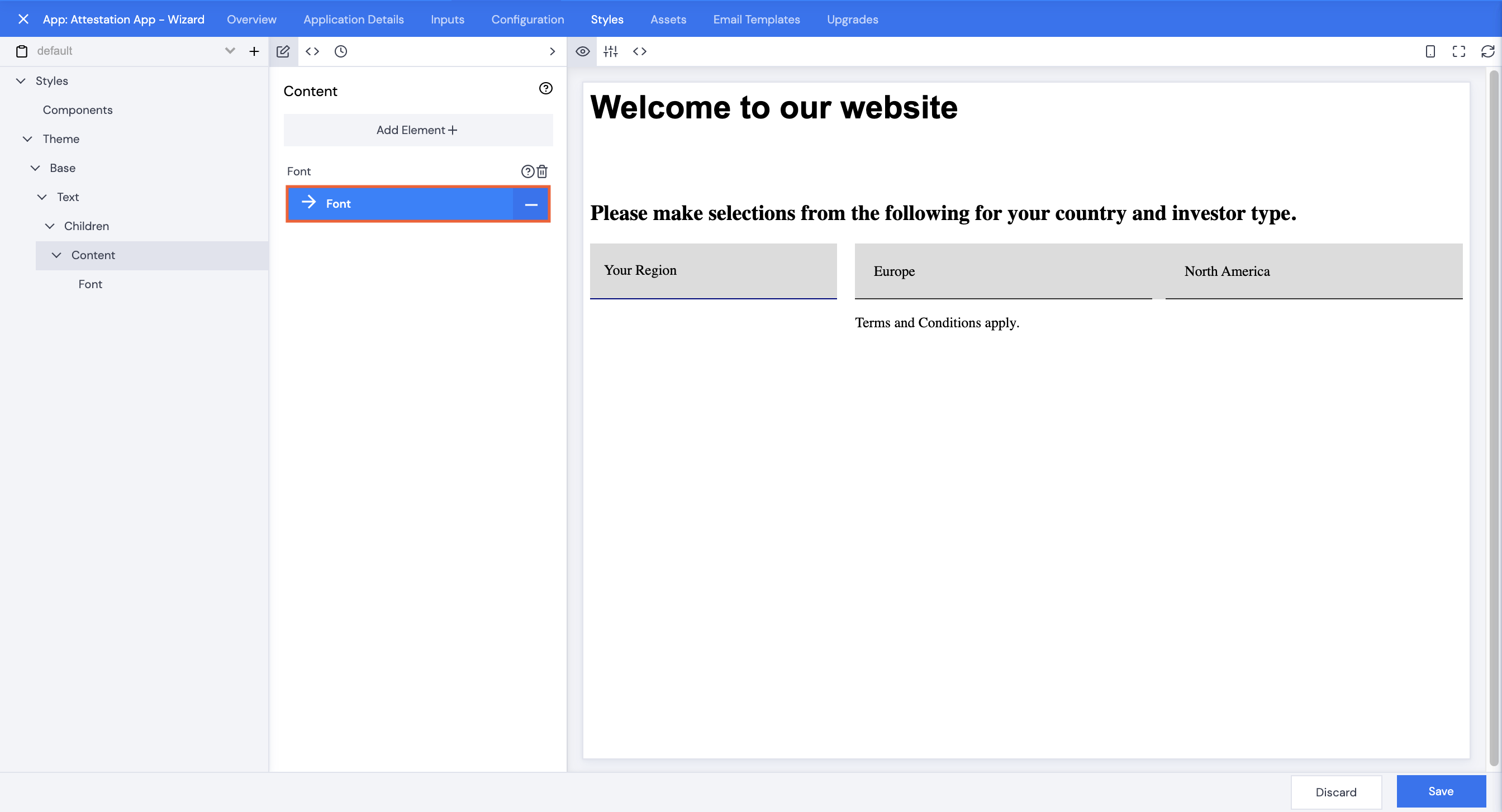
- Click Font.
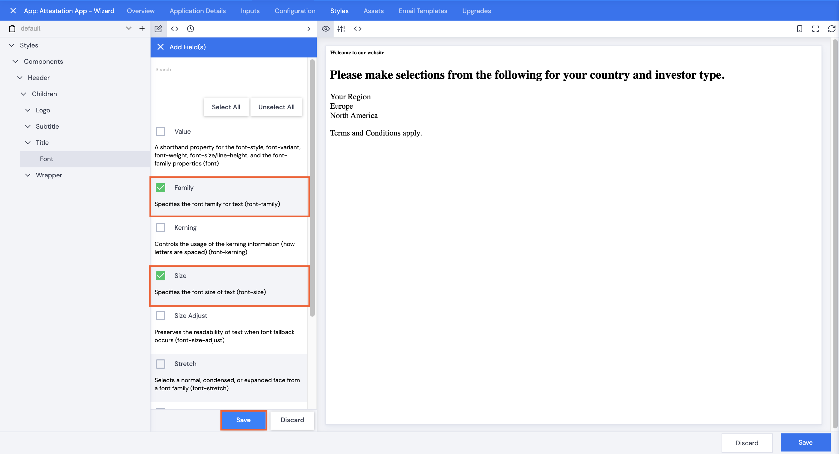
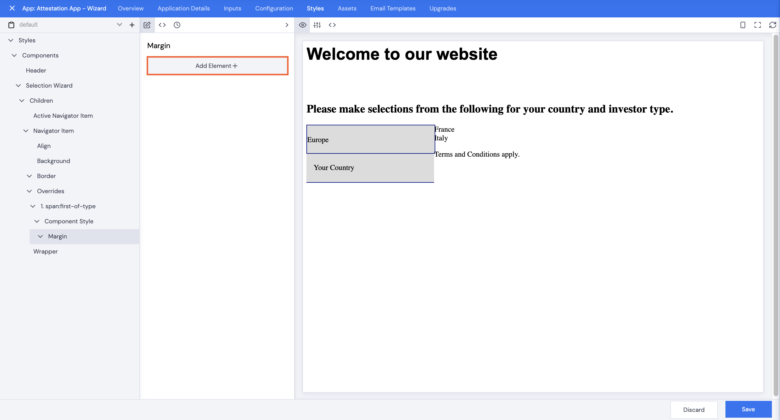
- Click Add Element+.
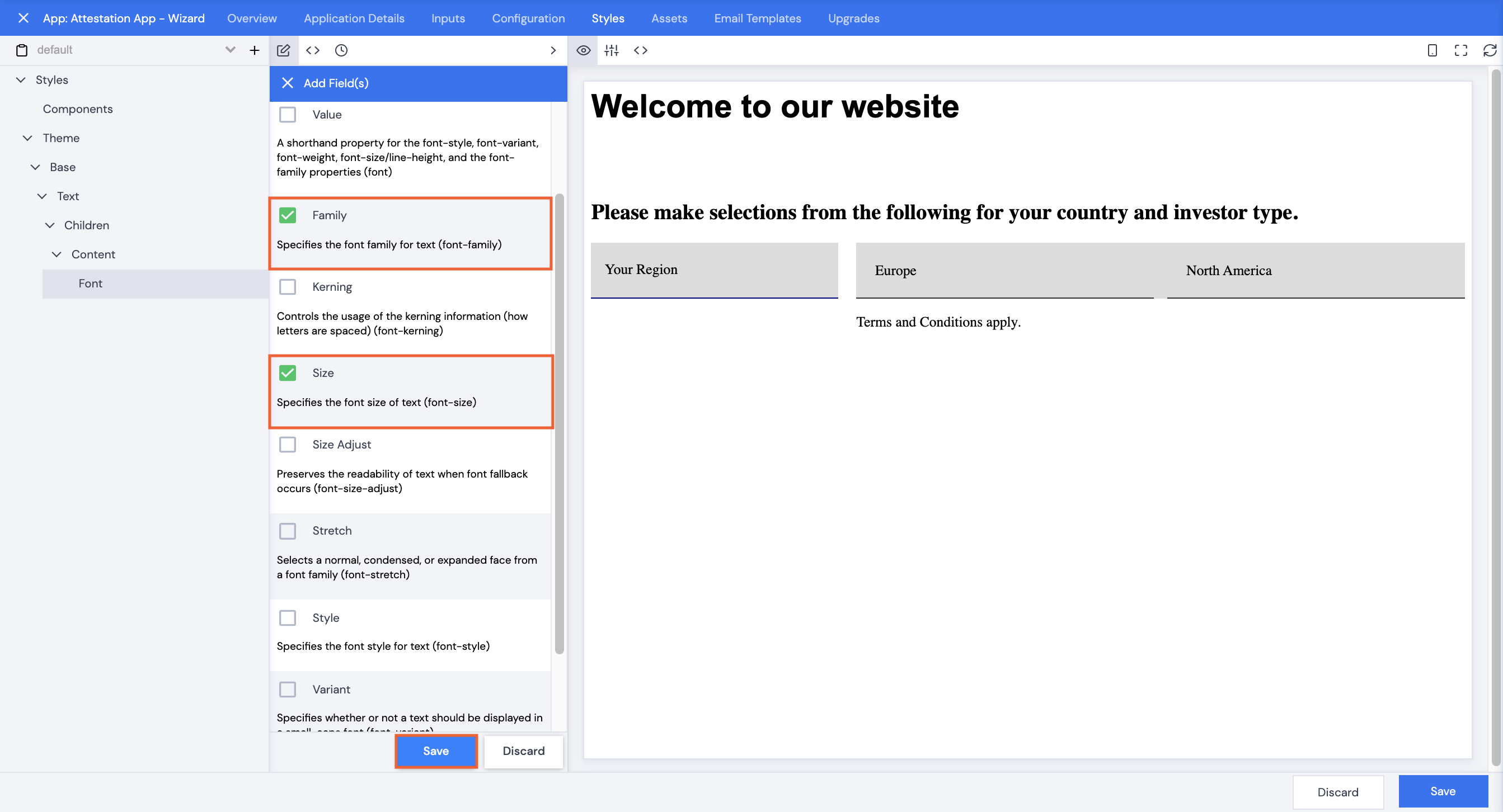
- Select Family and Size, then click Save.
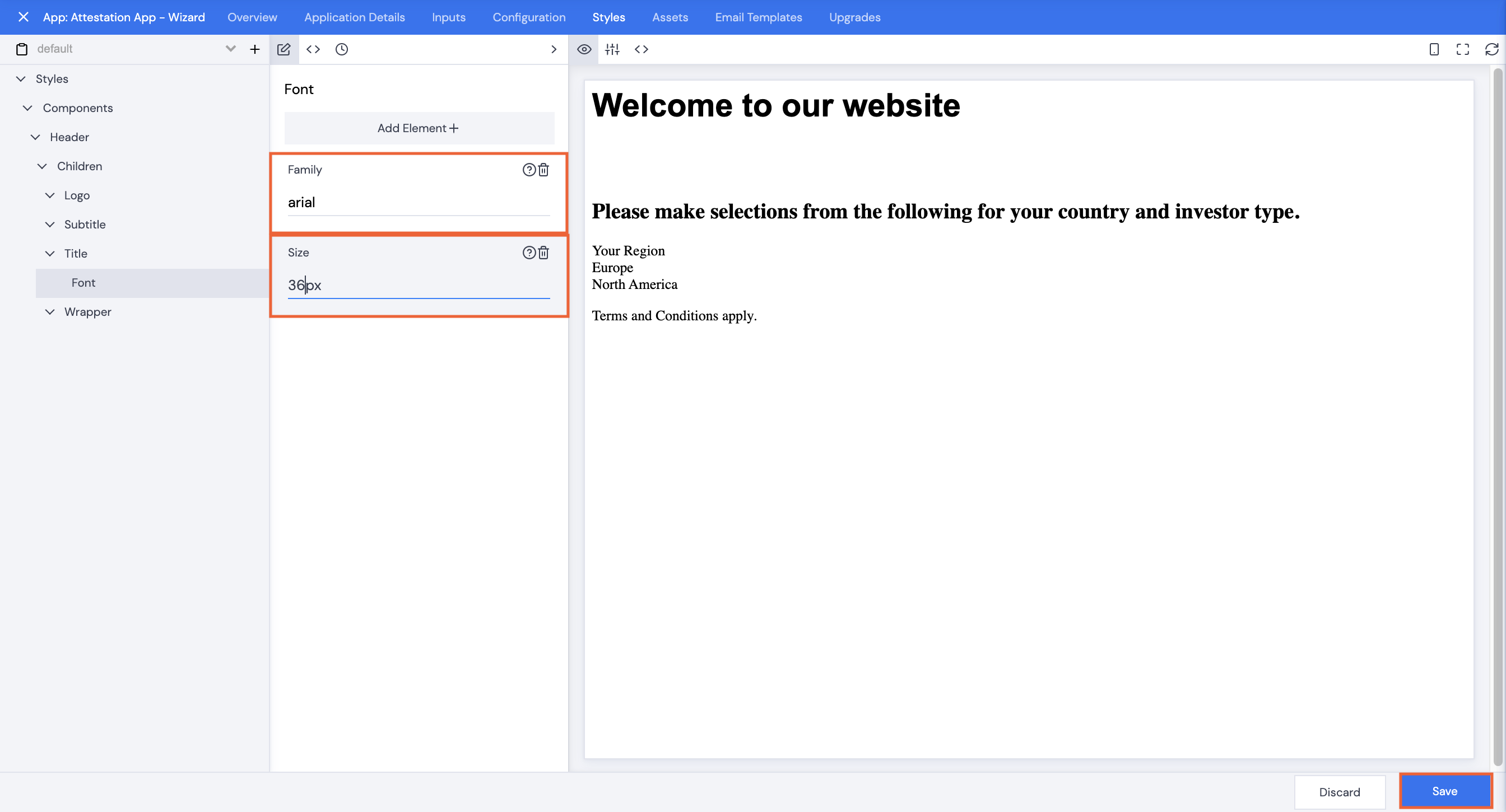
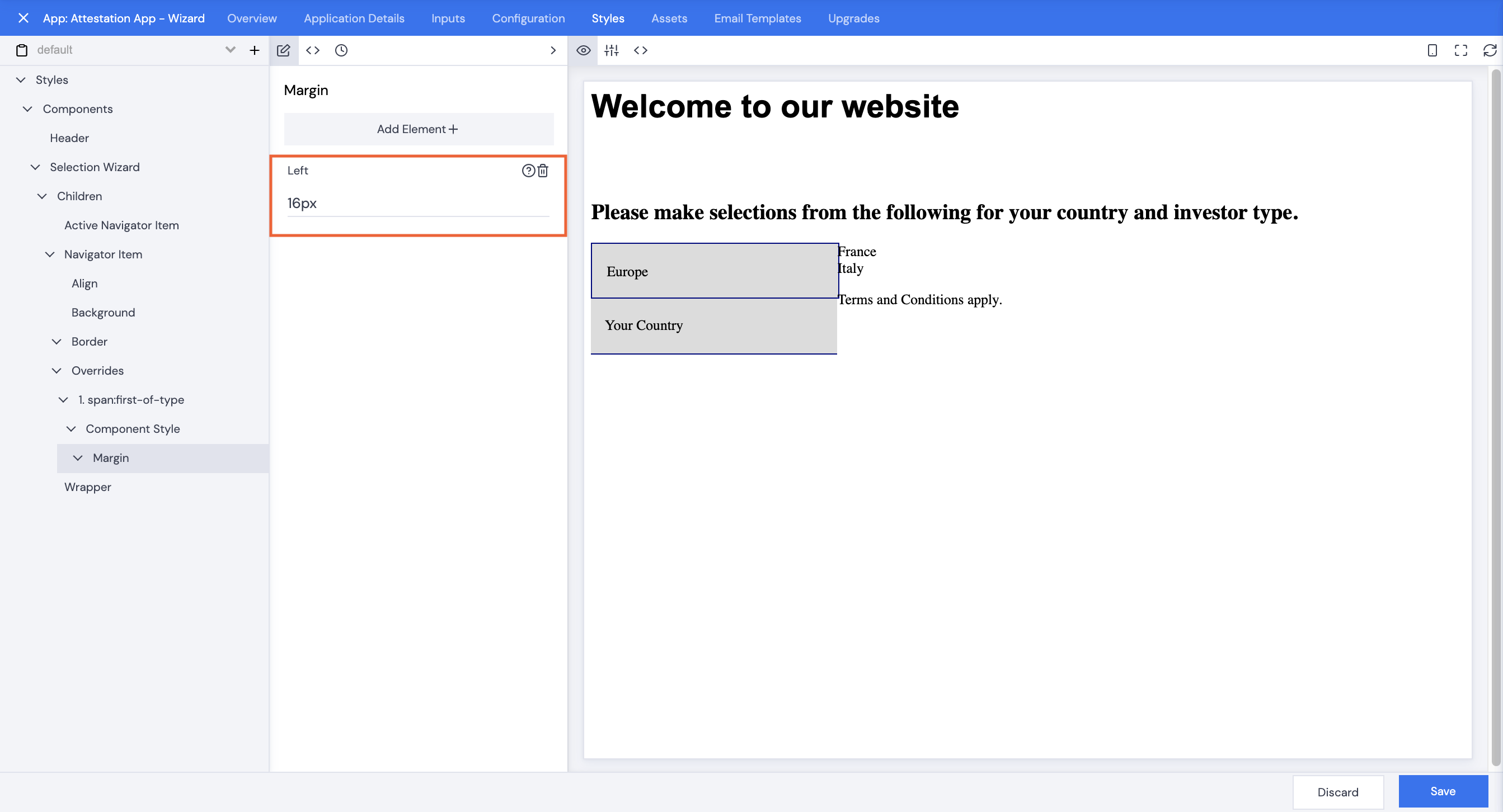
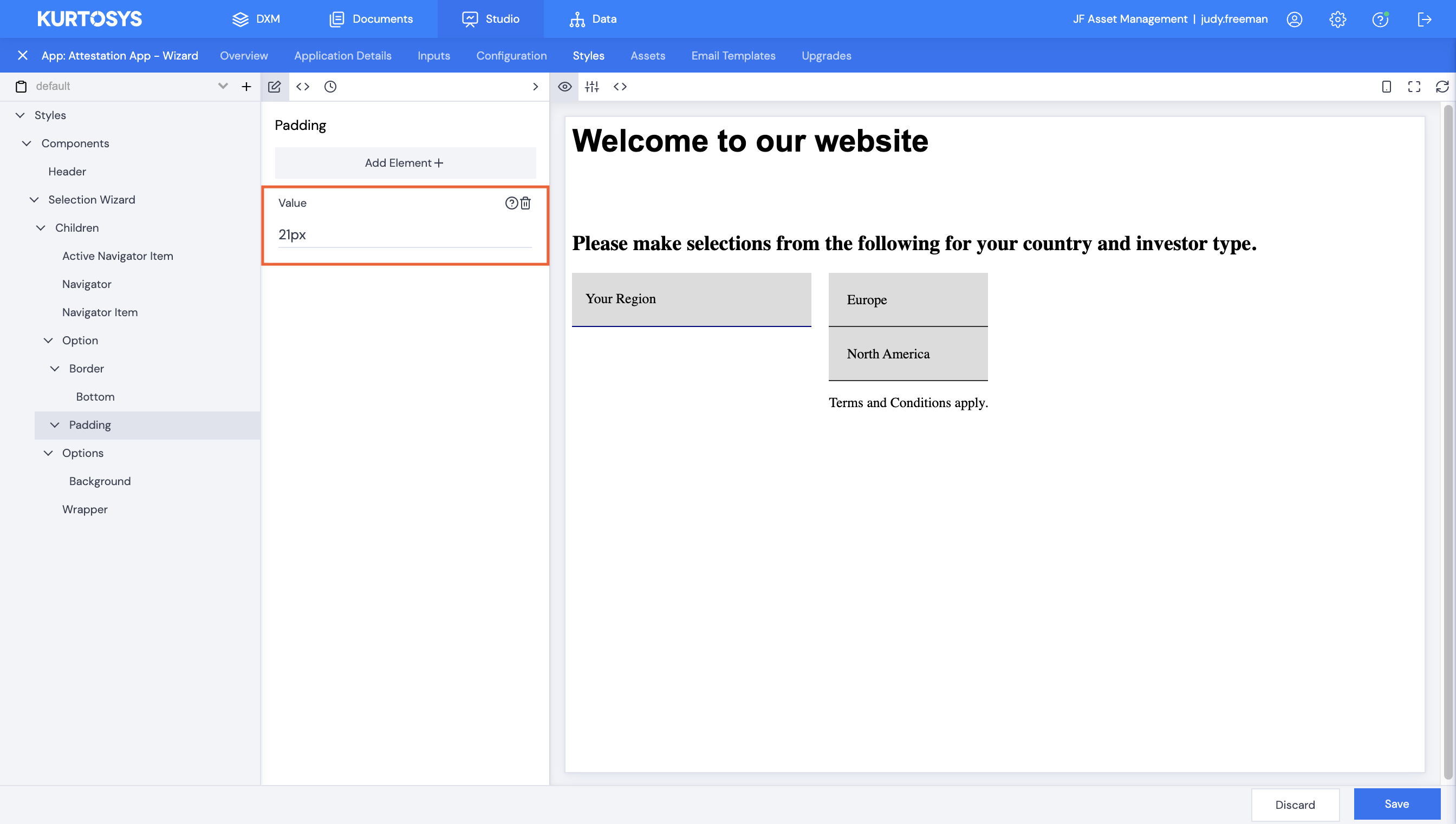
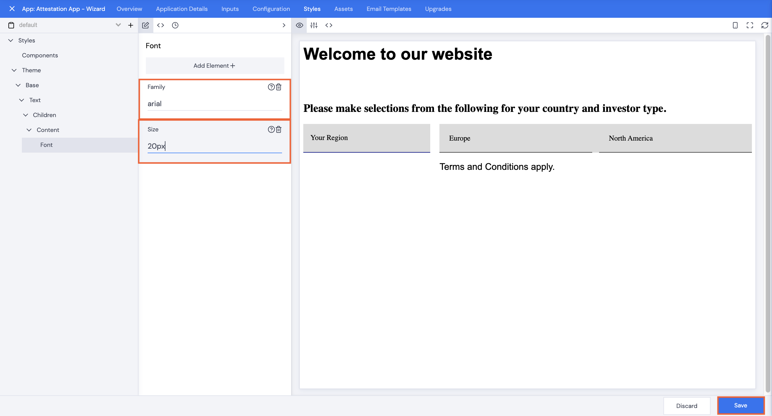
- Type in a font Family name.
- Type in a font Size in pixels.
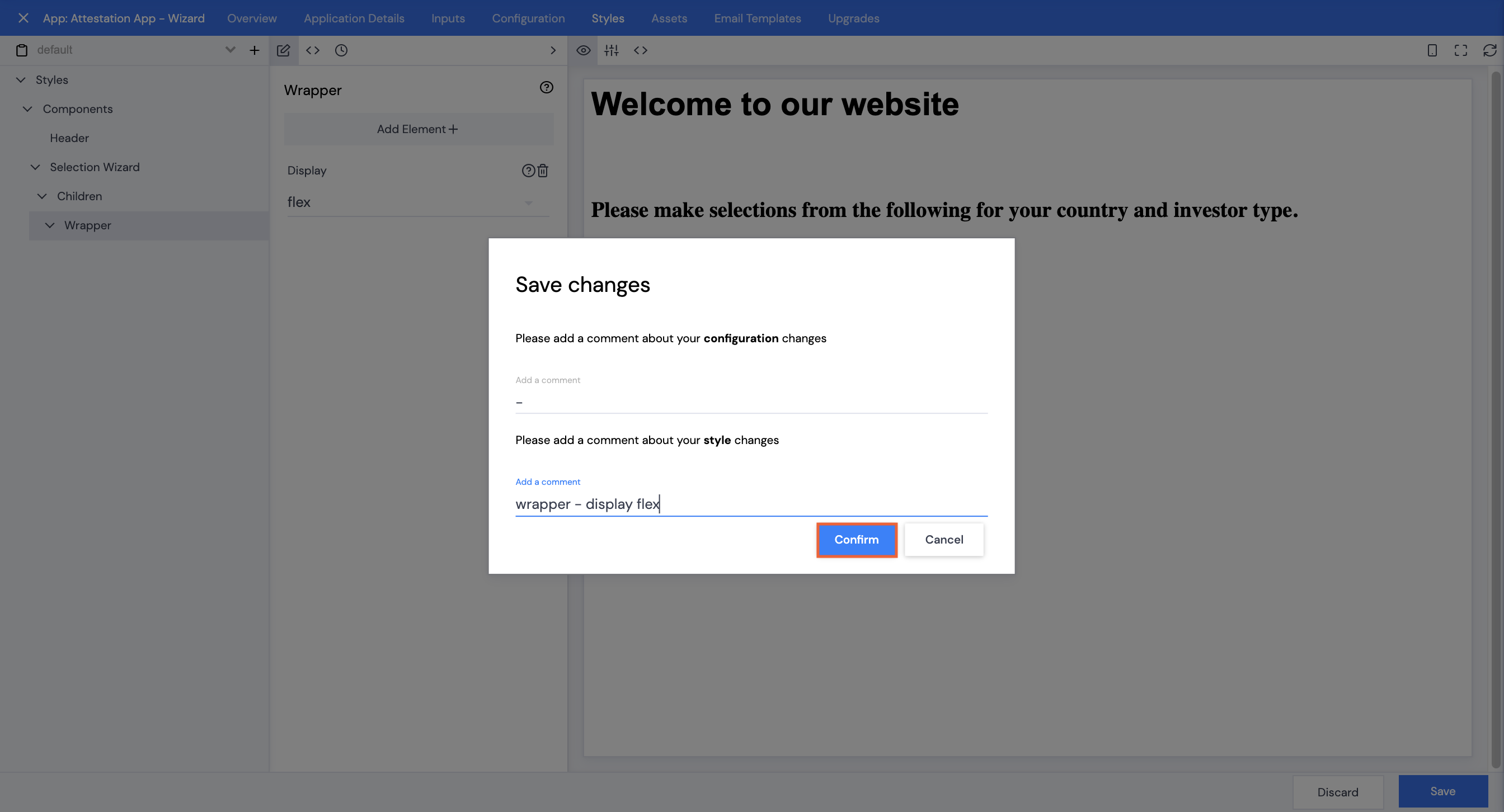
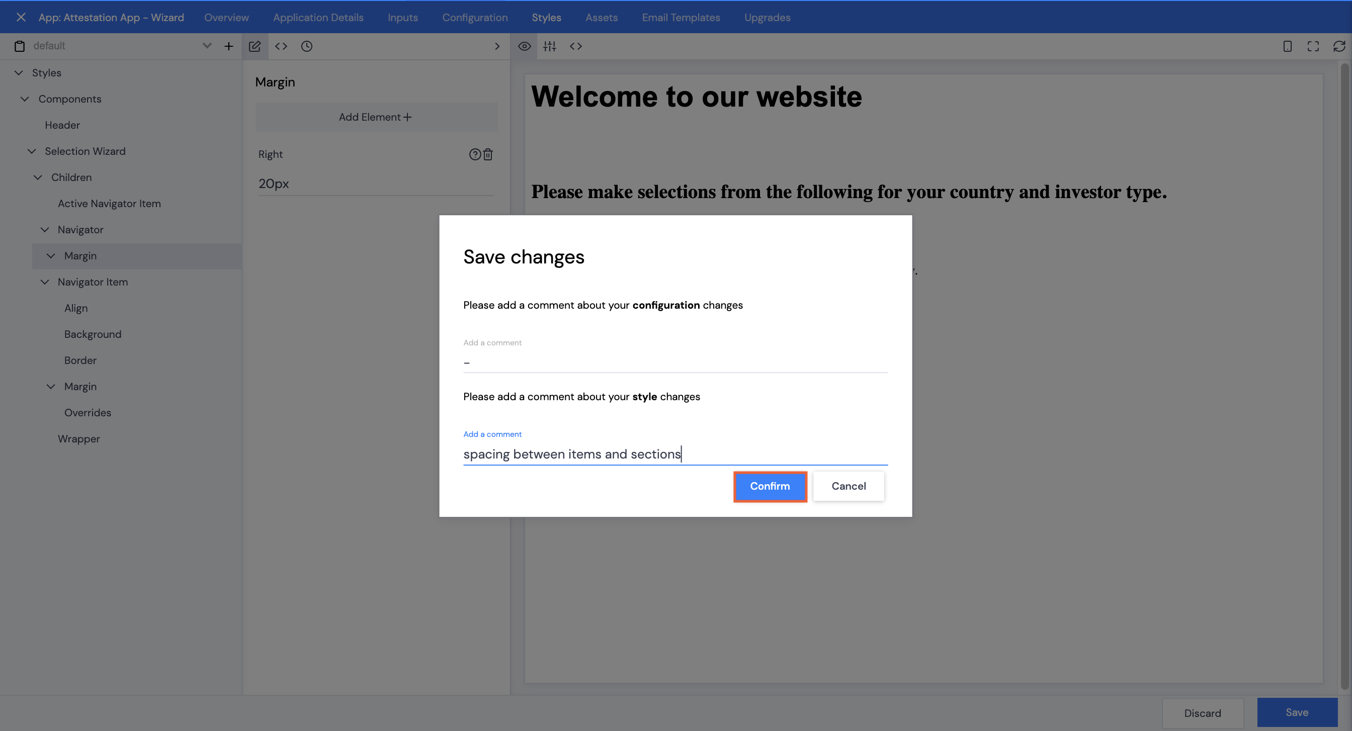
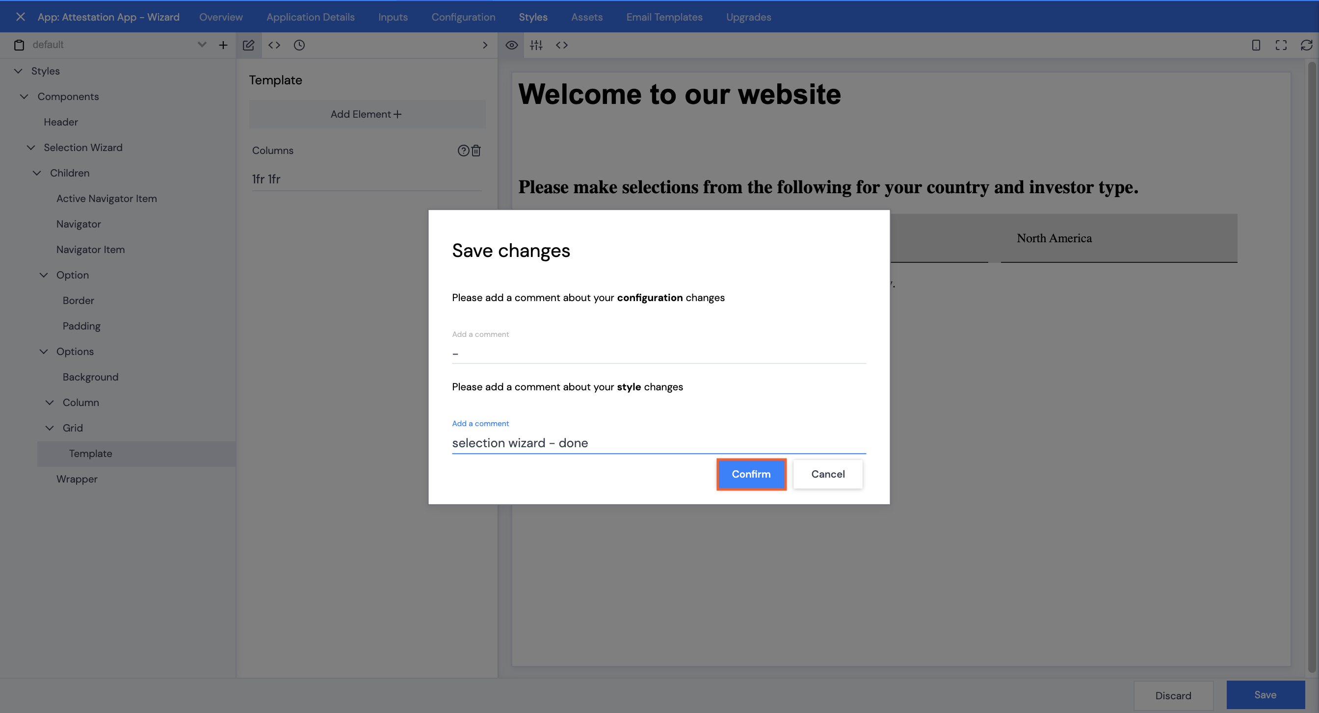
- Click Save.
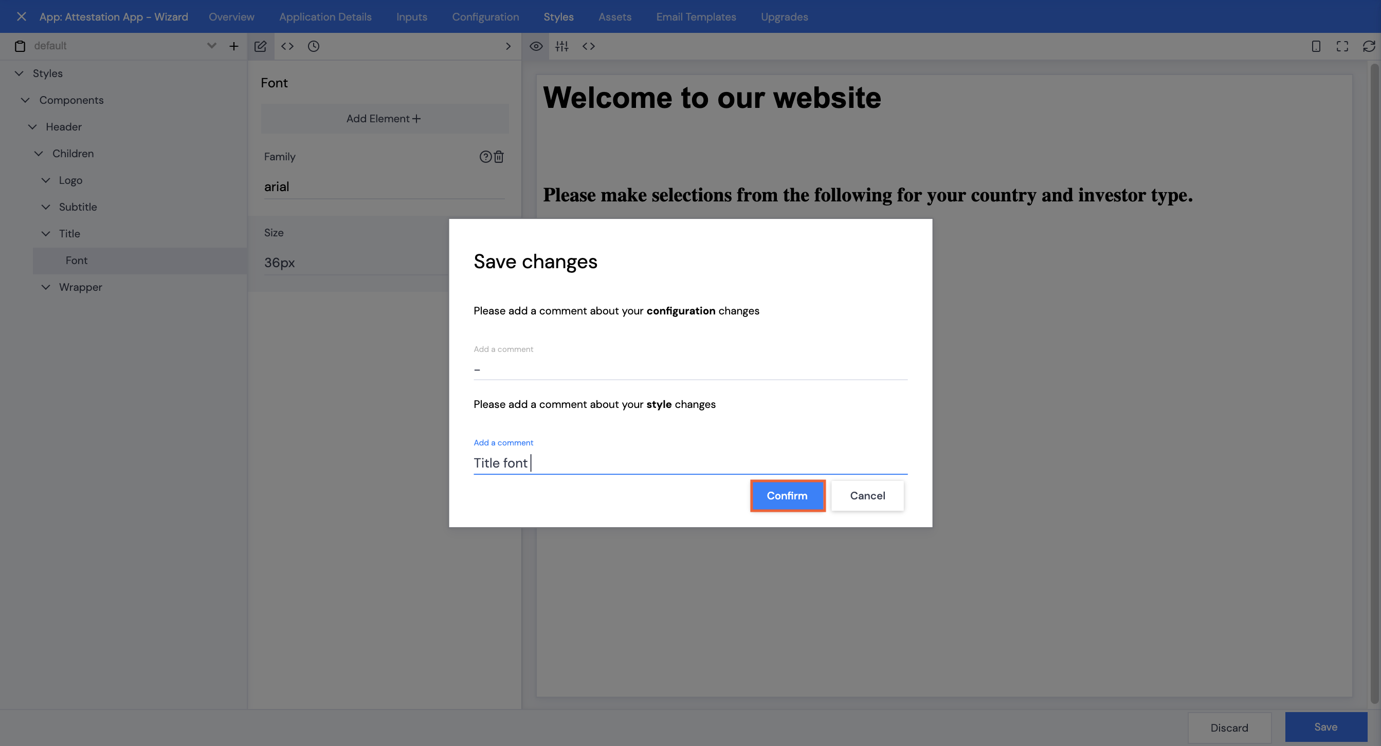
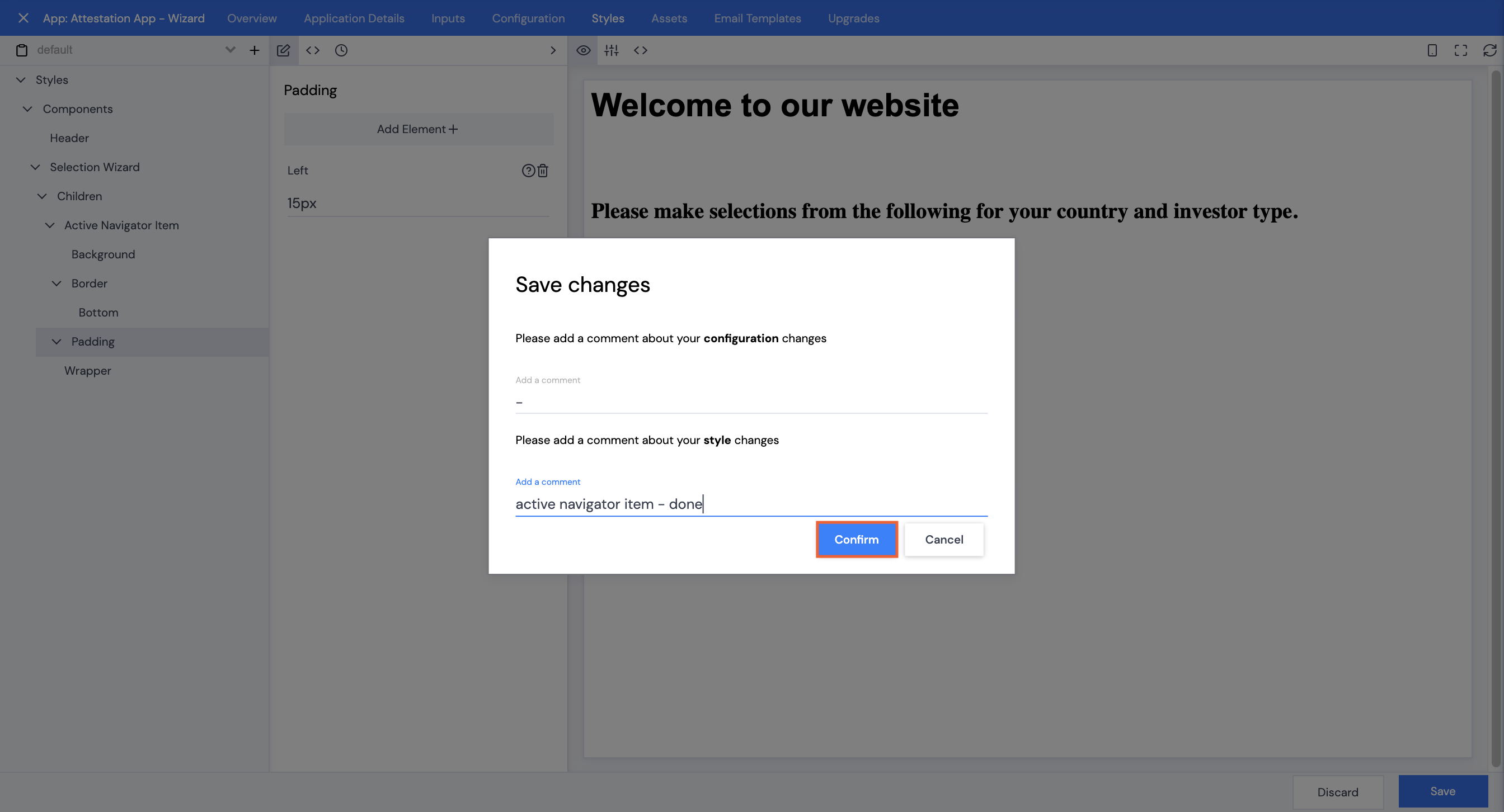
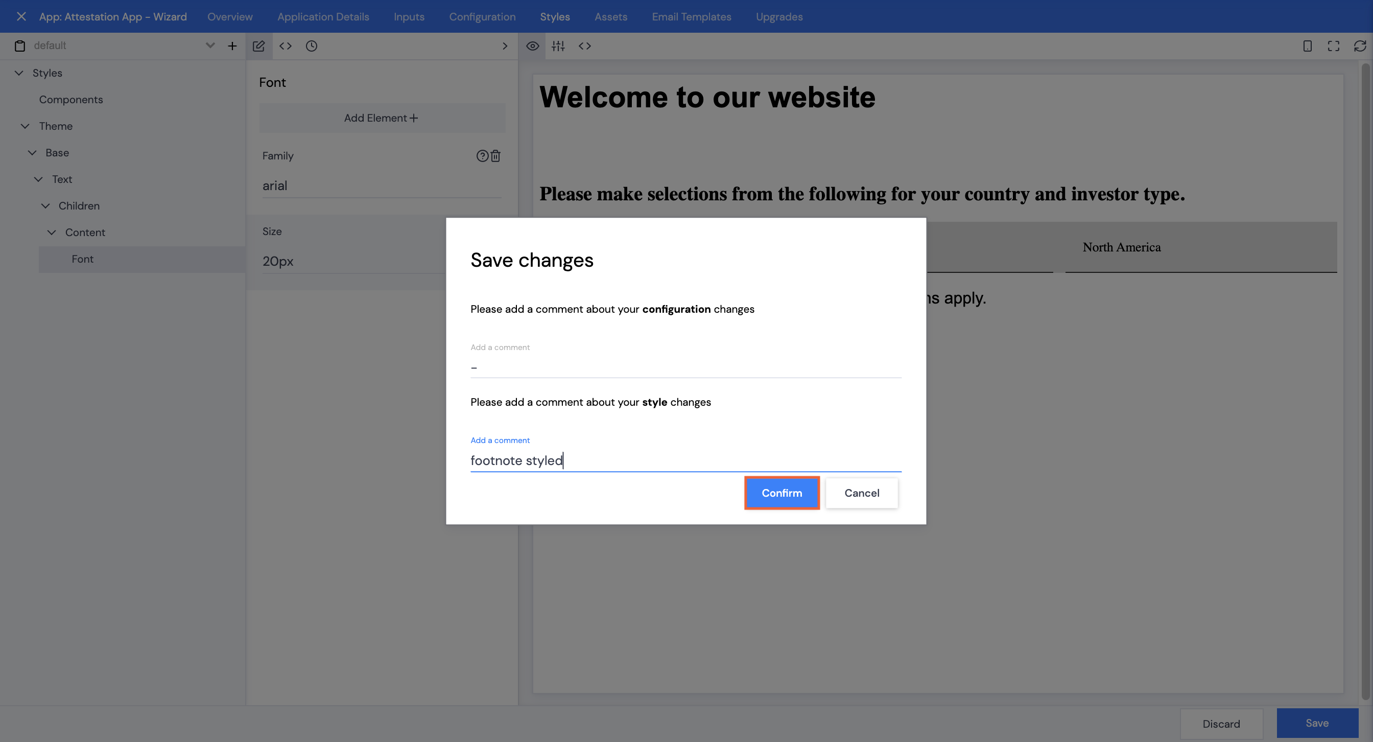
- Type in a comment, then click Confirm.
Selections Display
Layout
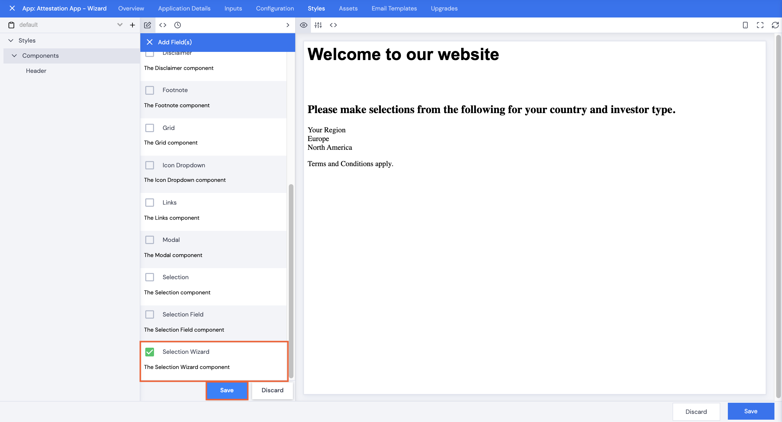
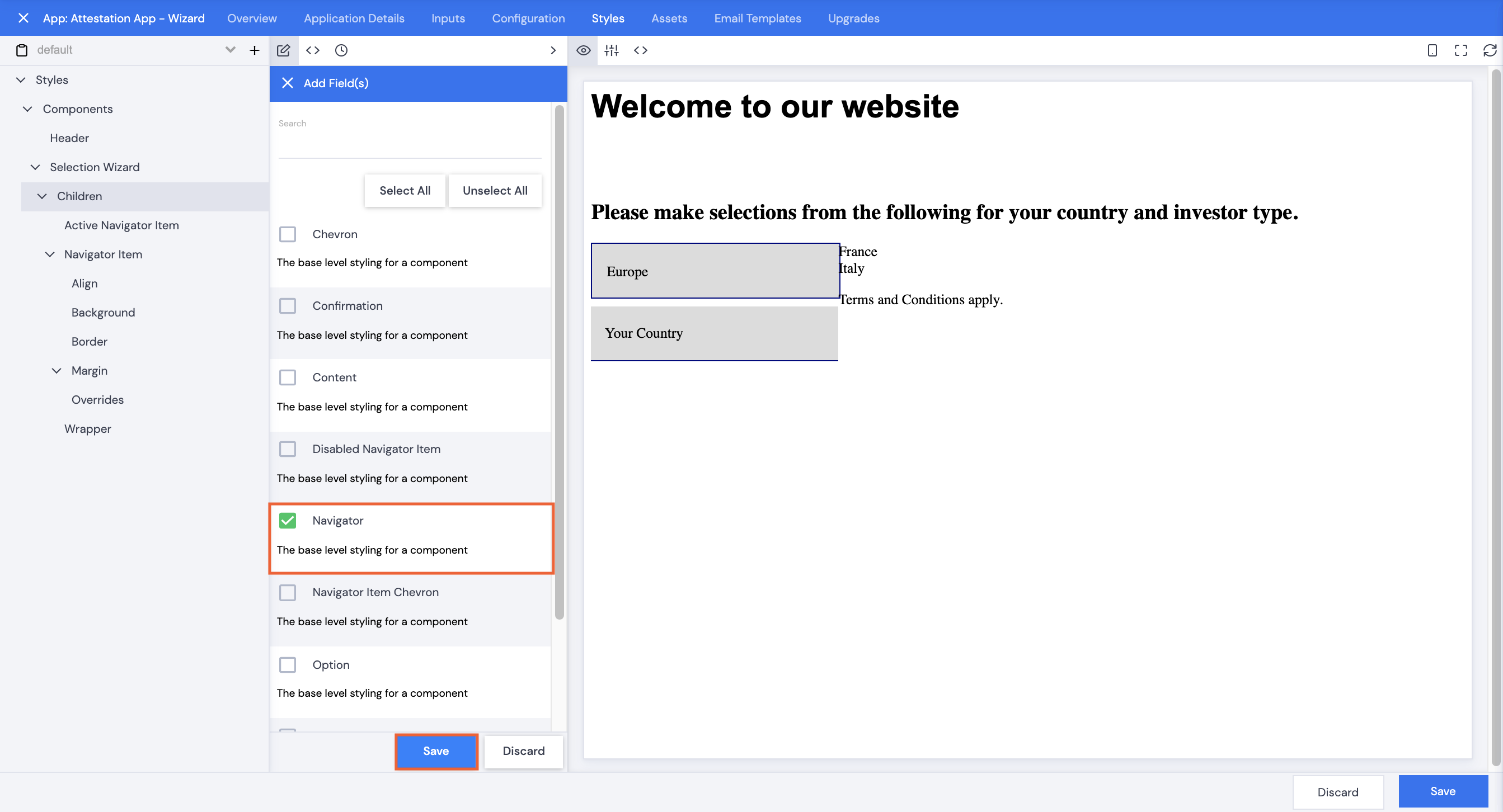
- Click Components.
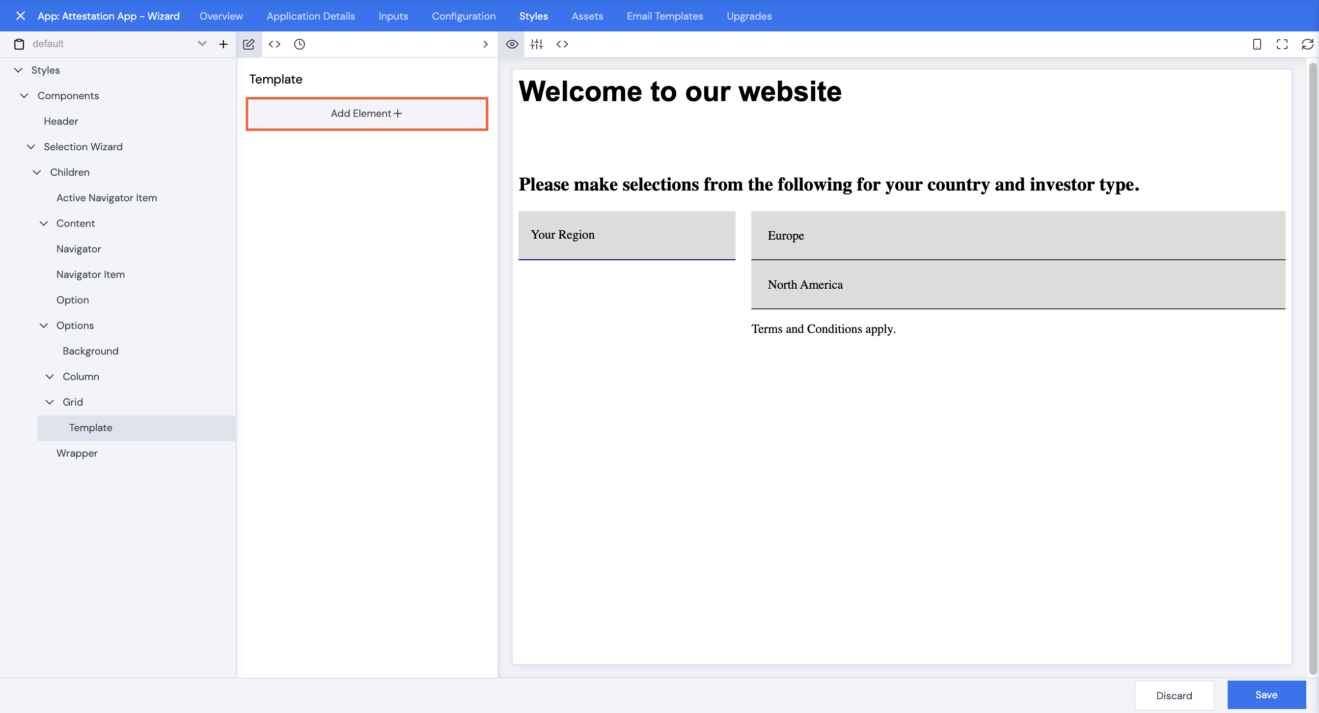
- Click Add Element+.
- Scroll or search to select Selection Wizard, then click Save.
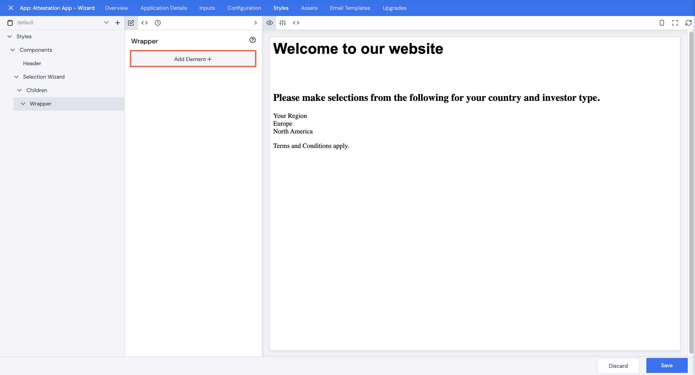
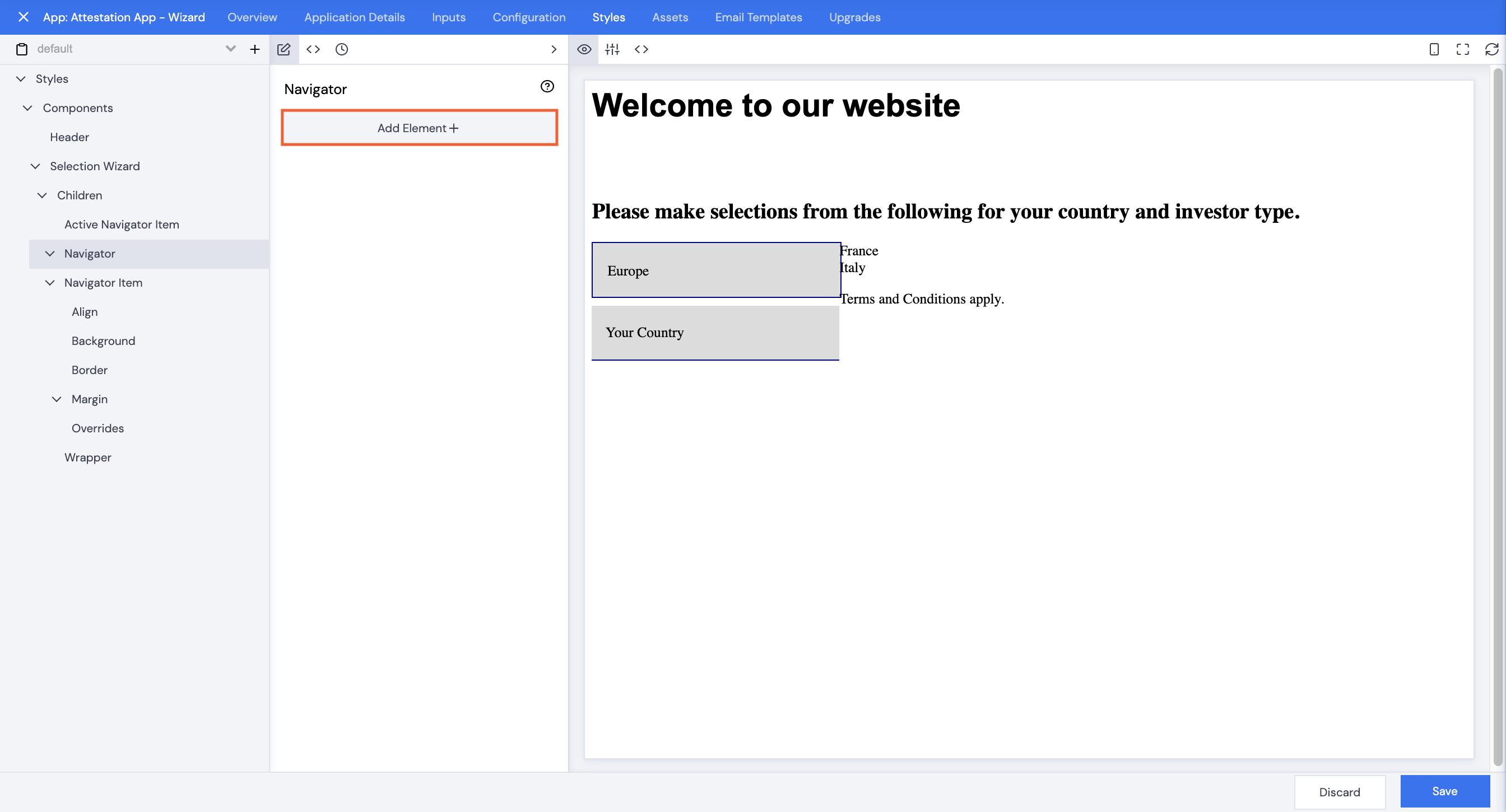
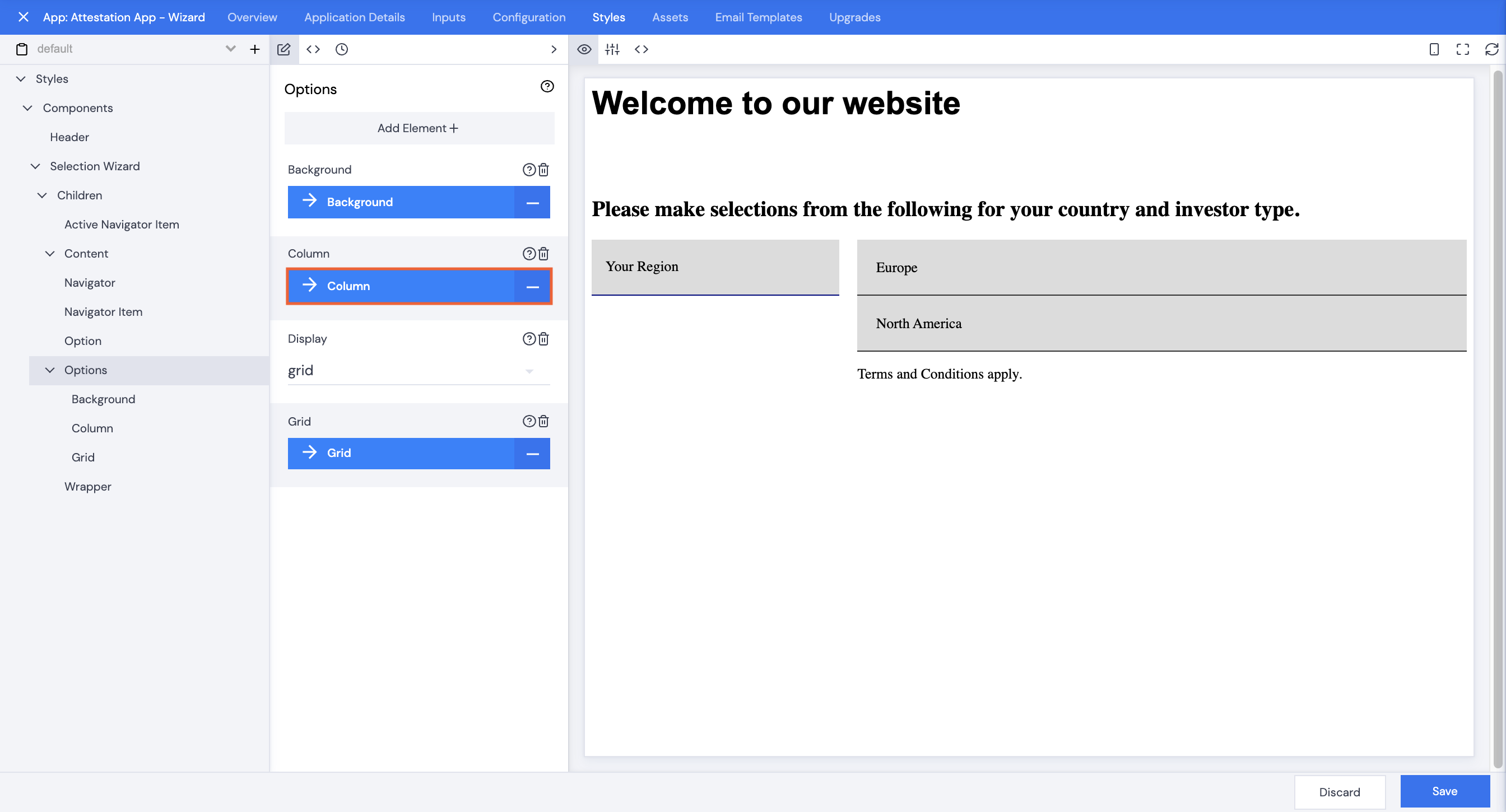
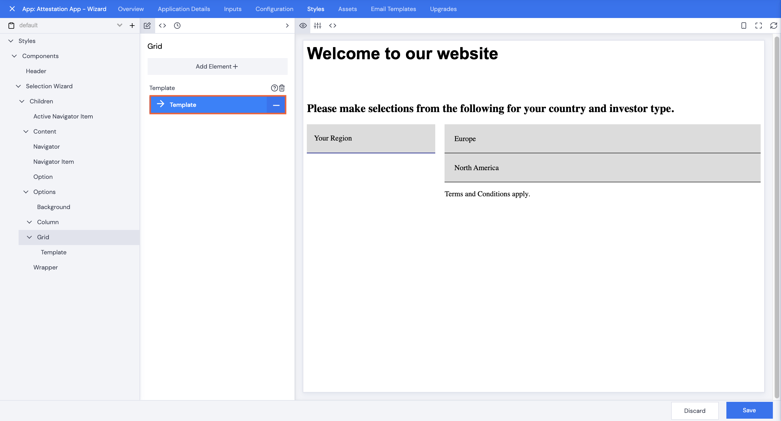
- Click Selection Wizard.
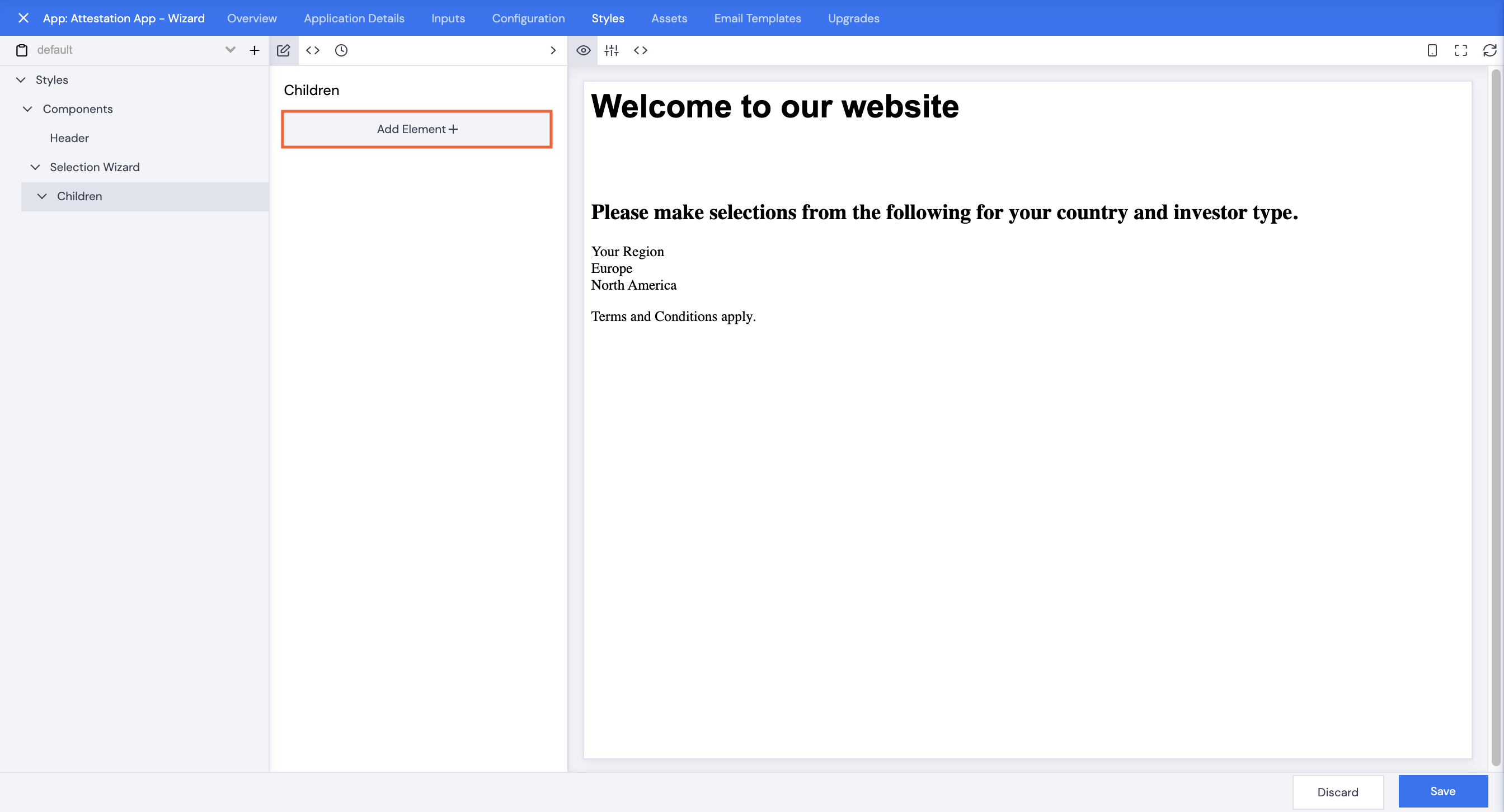
- Click Add Element+.
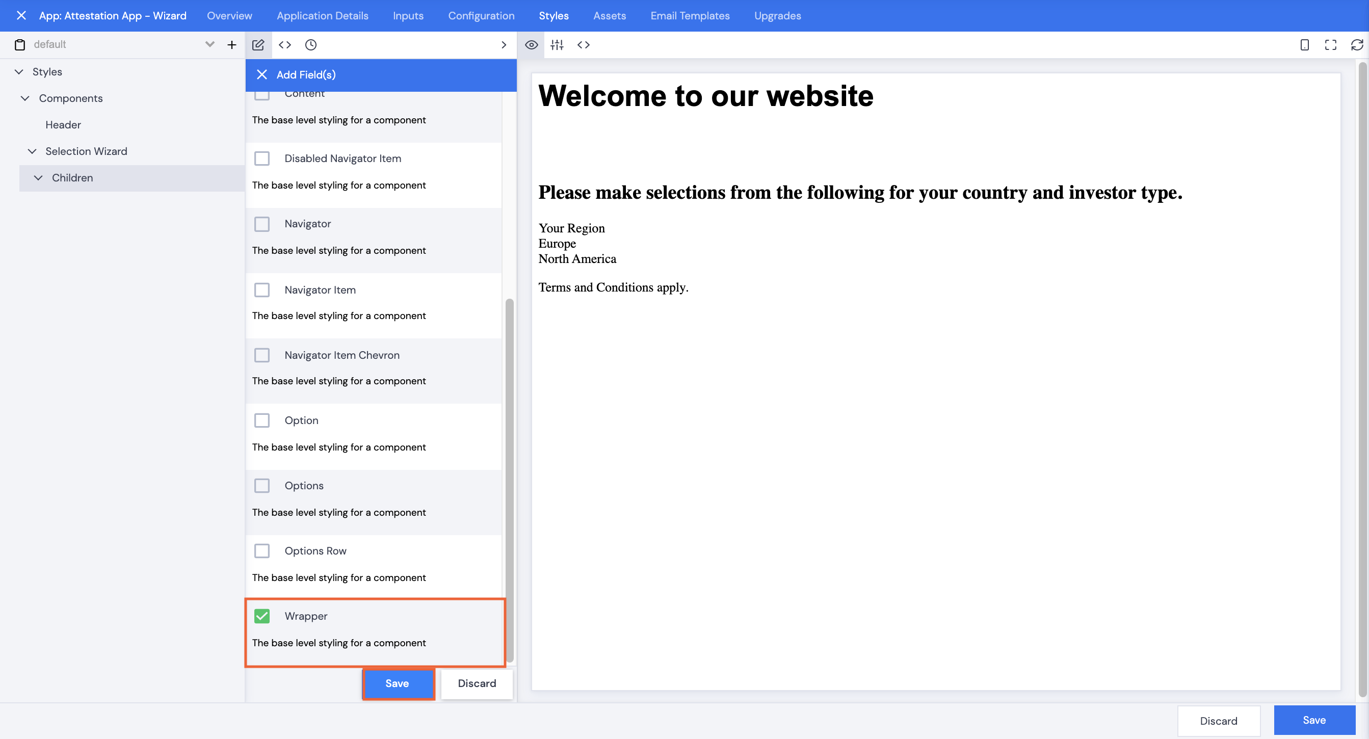
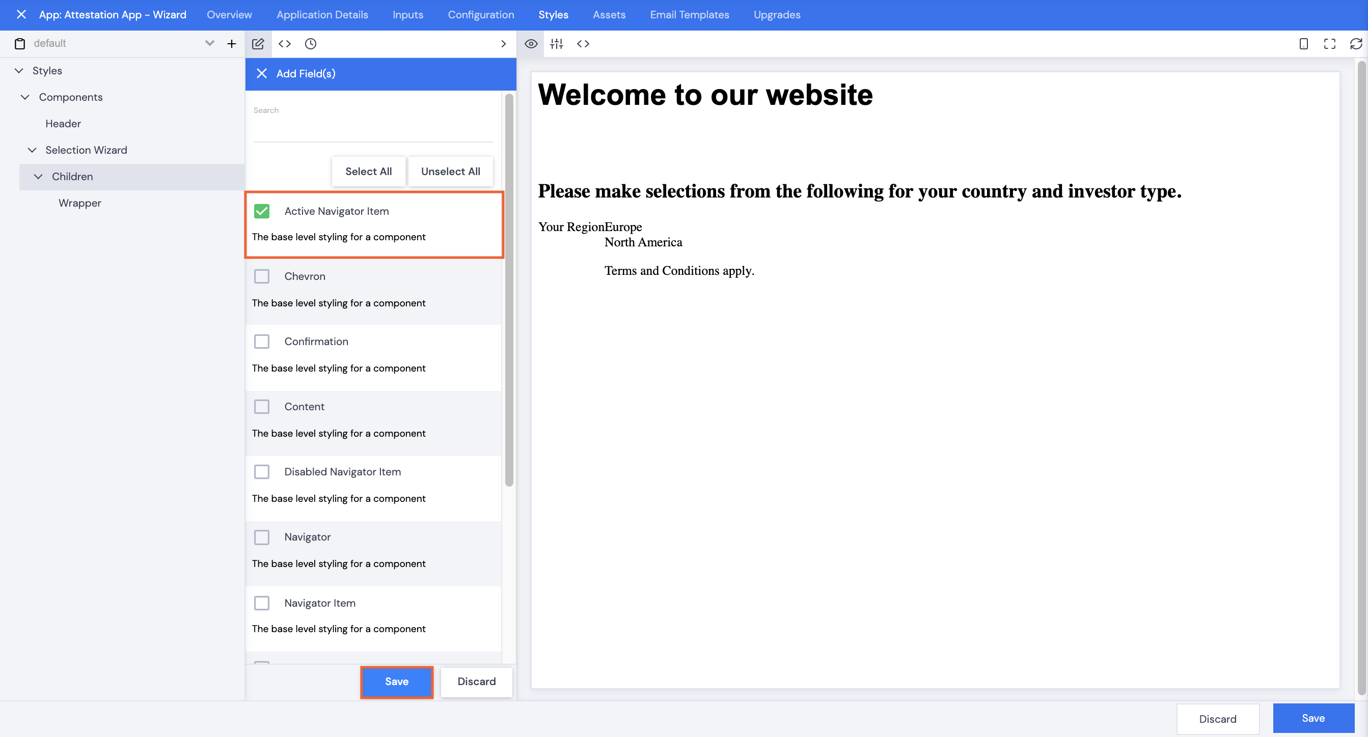
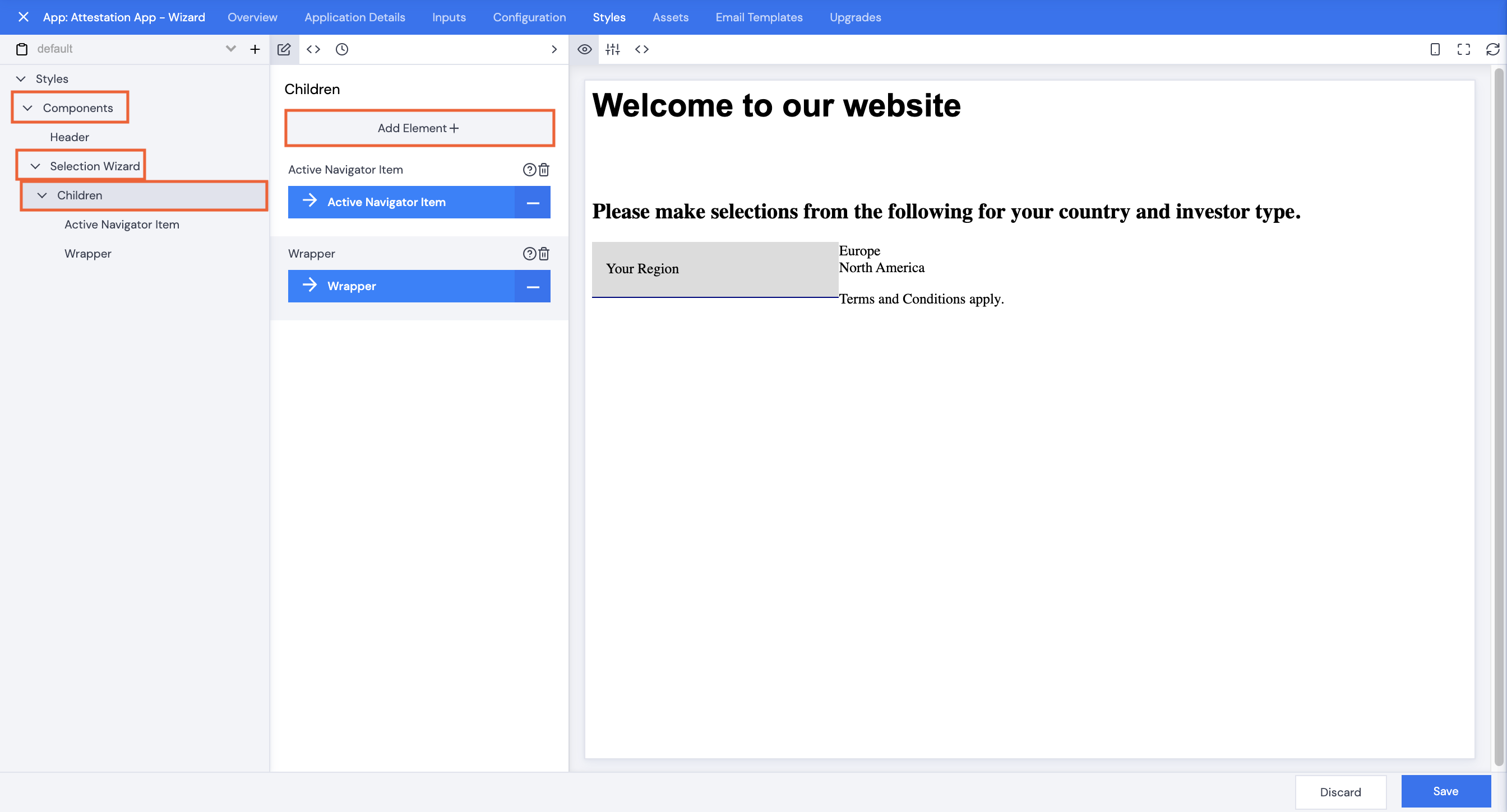
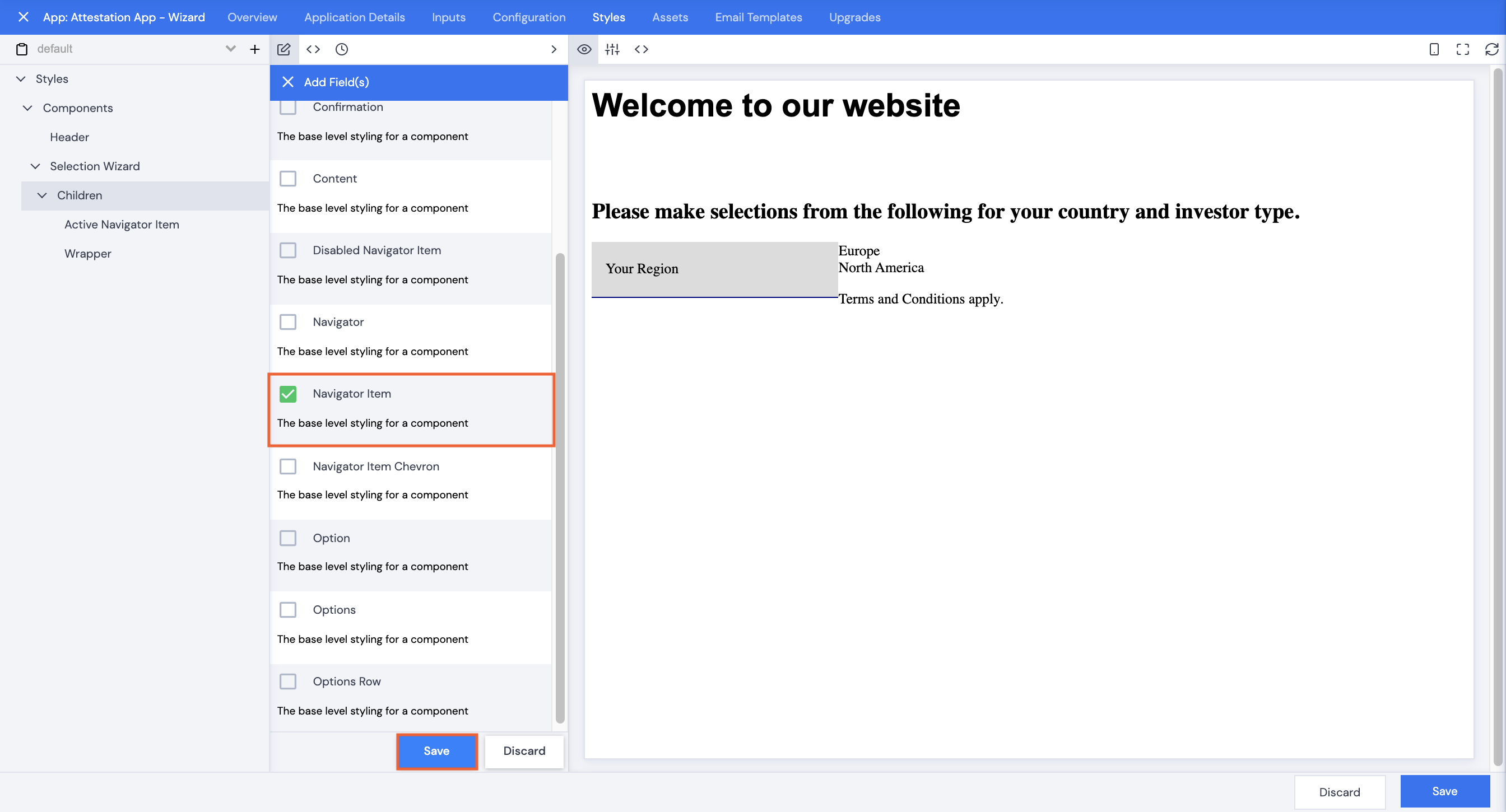
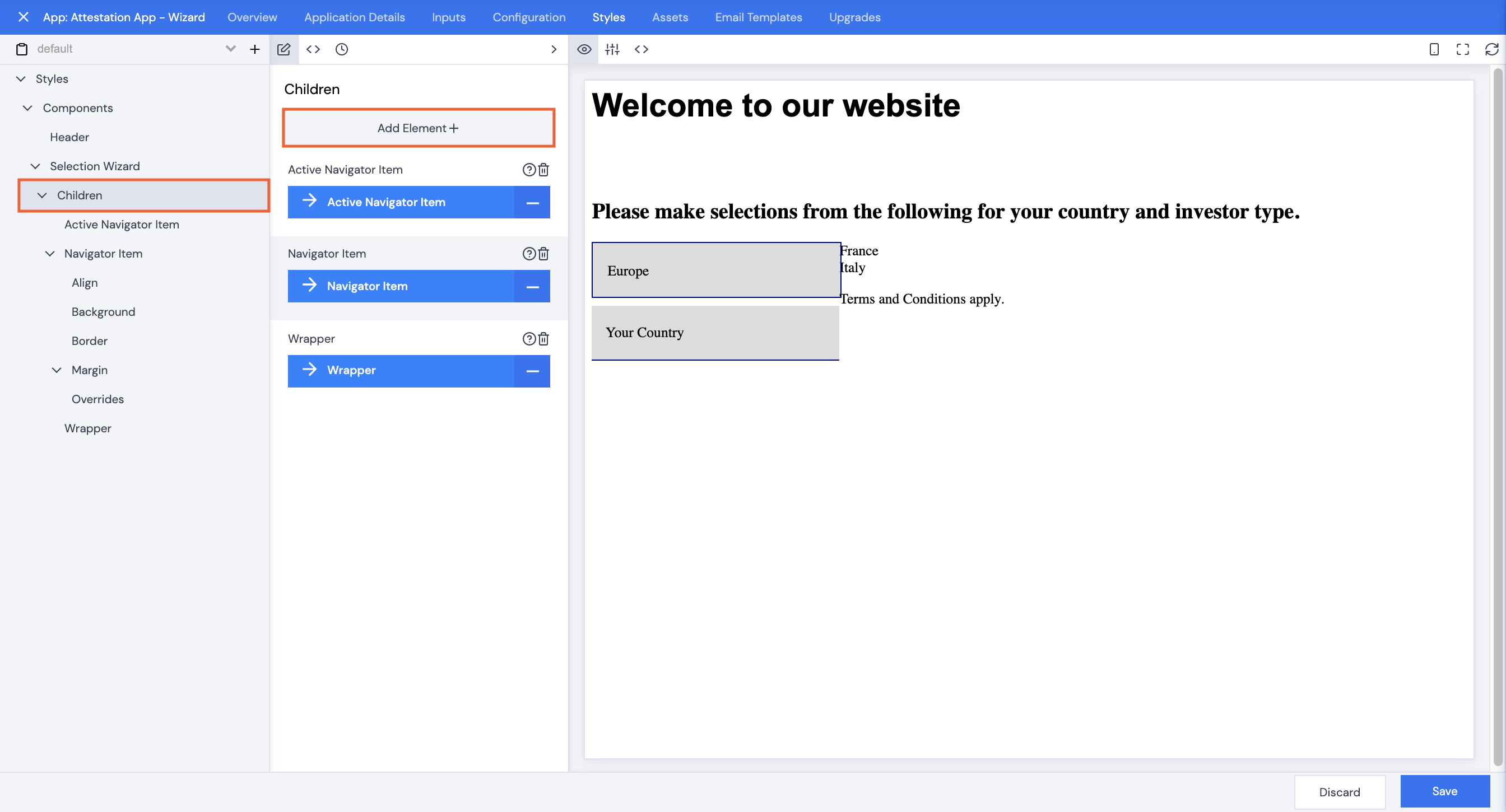
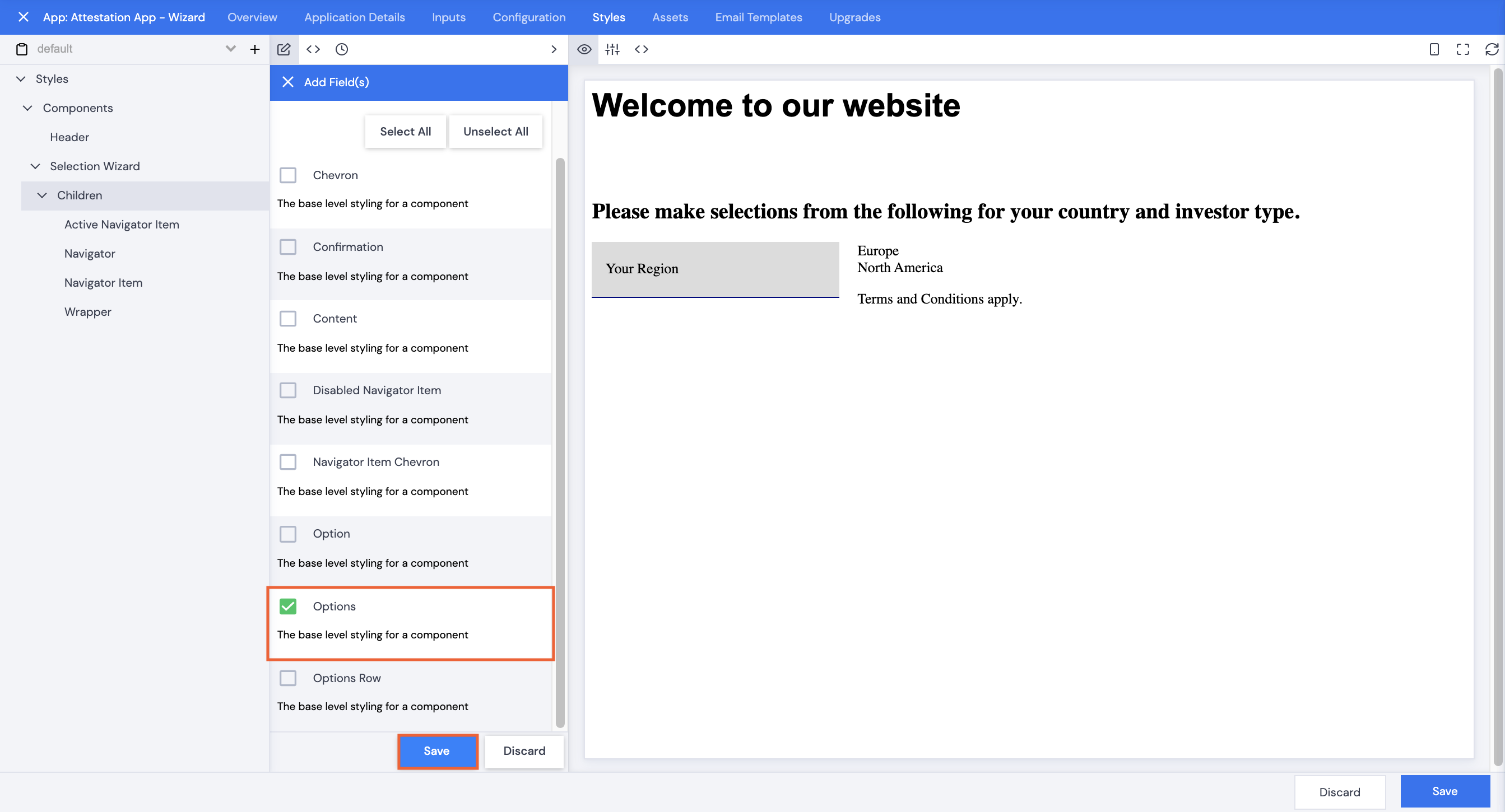
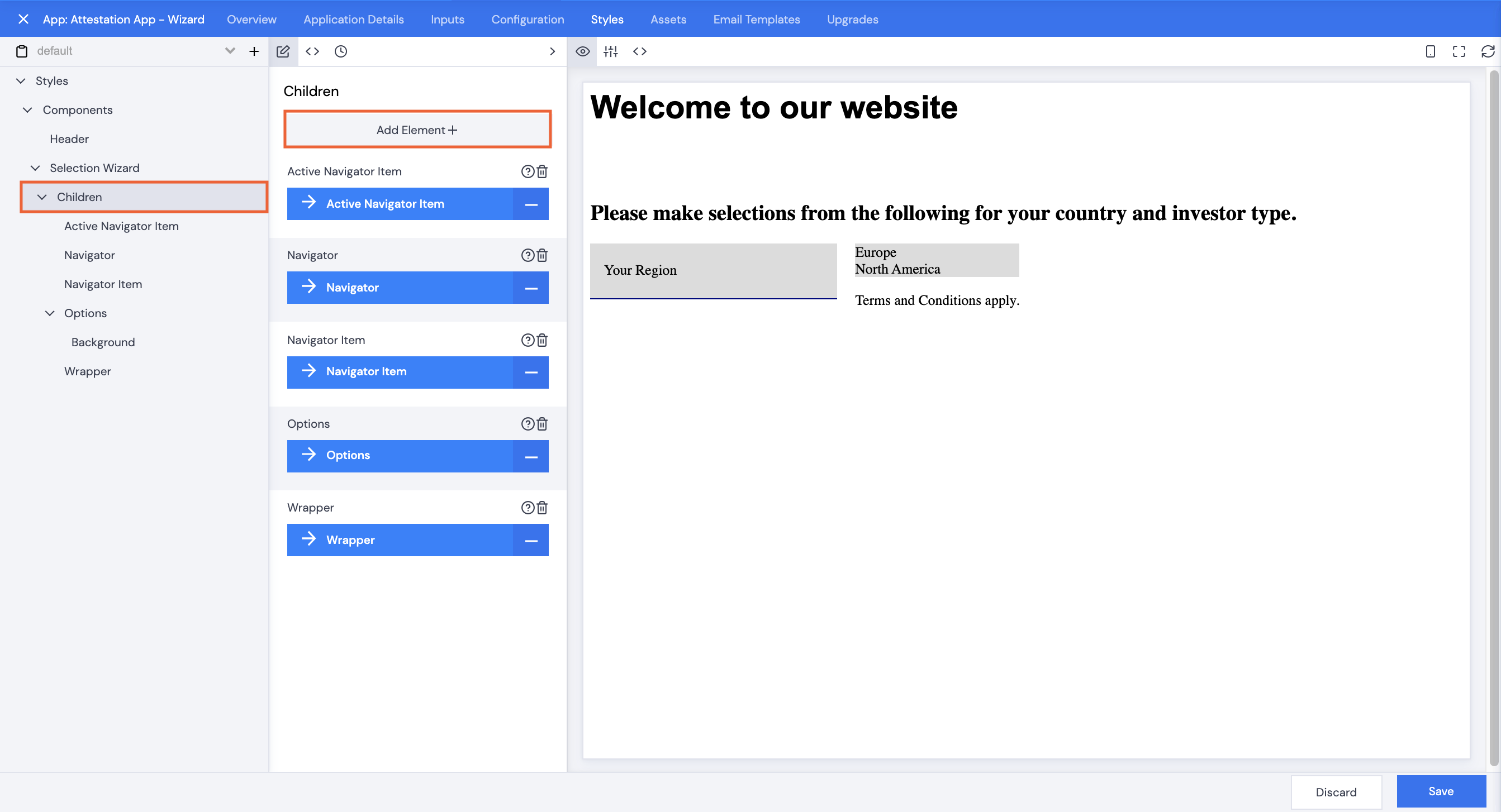
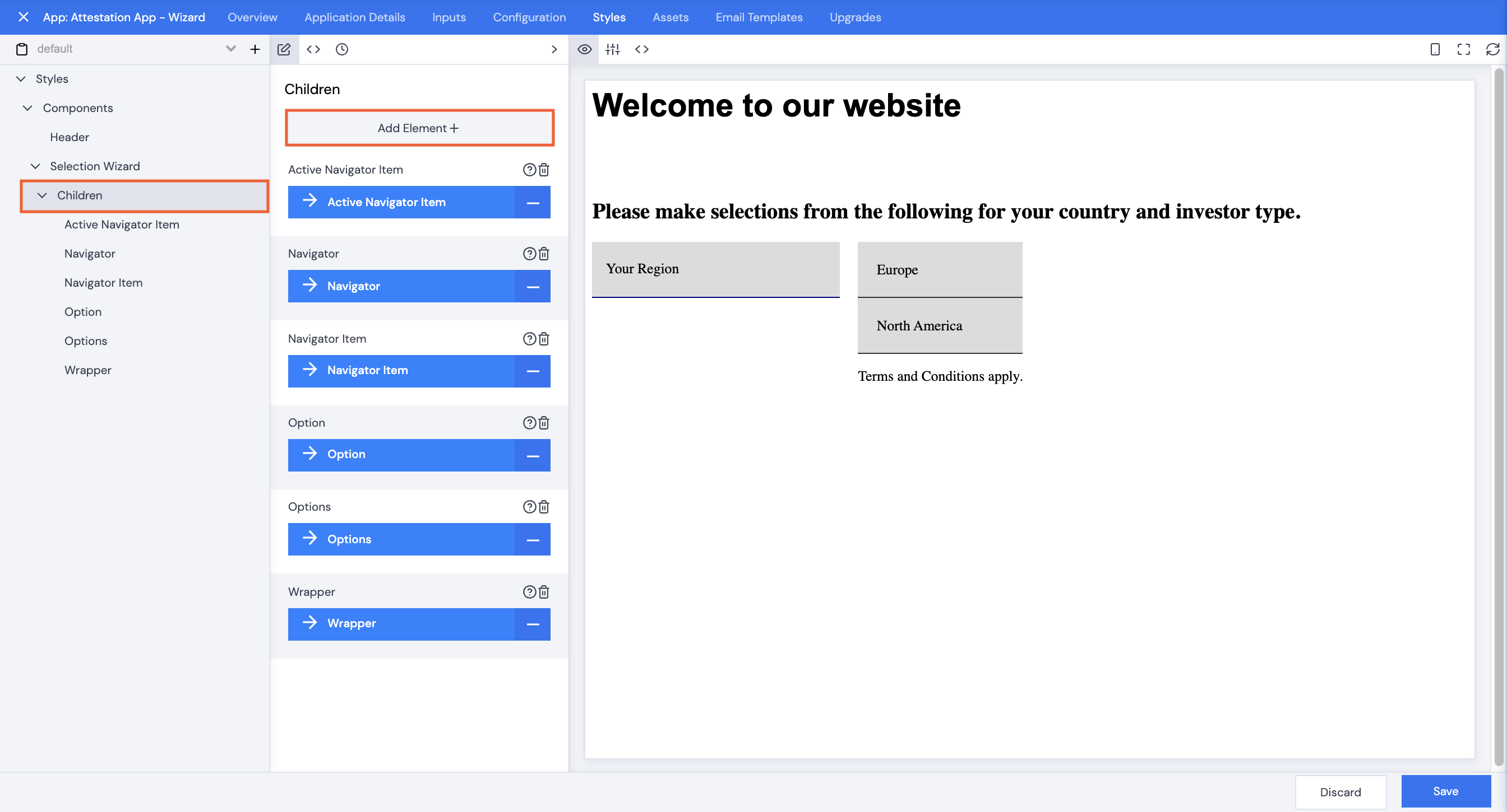
- Select Children, then click Save.
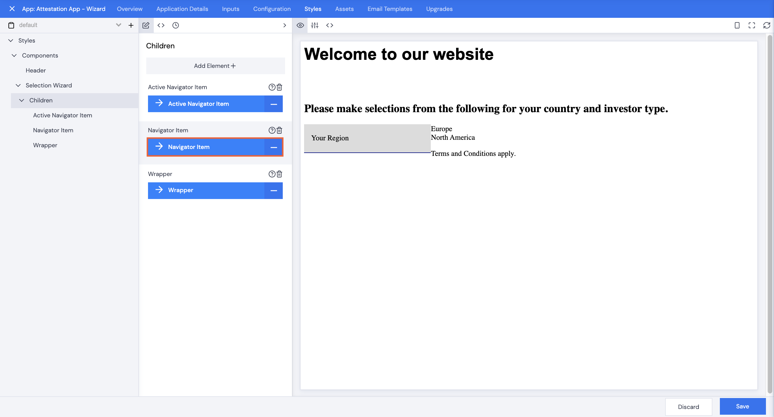
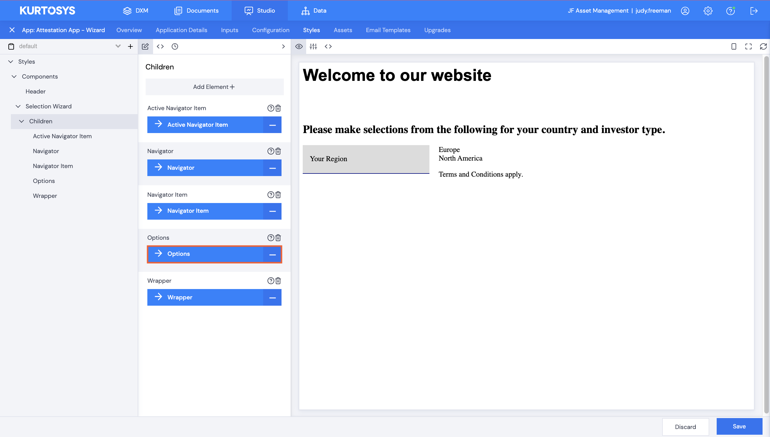
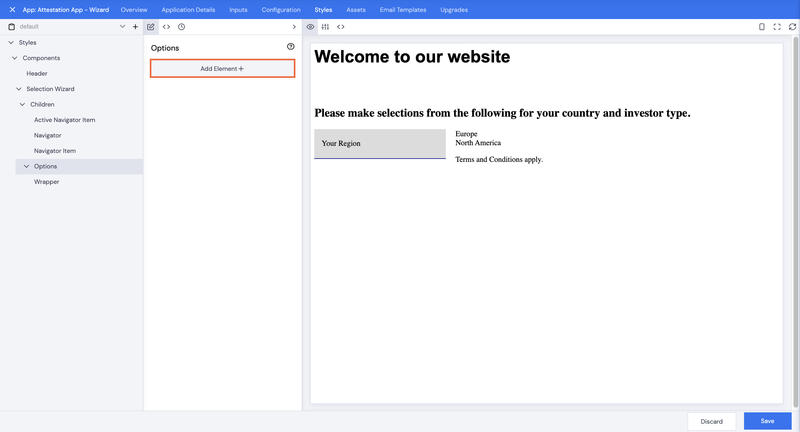
- Click Children.
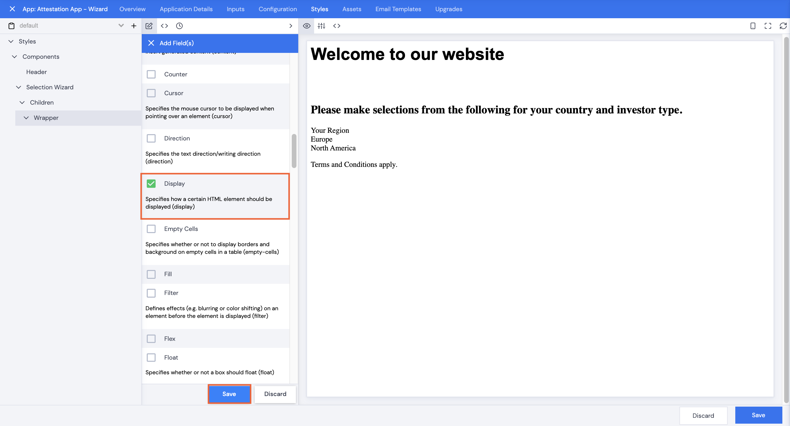
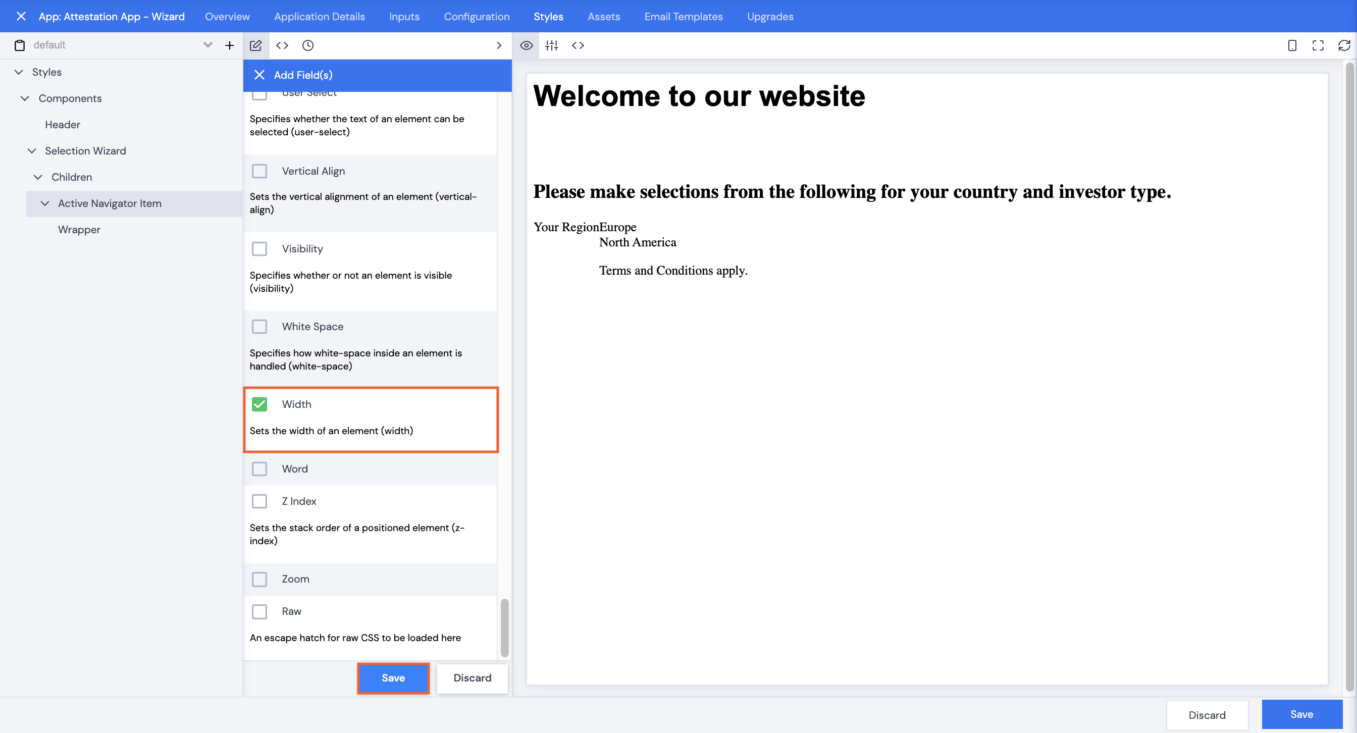
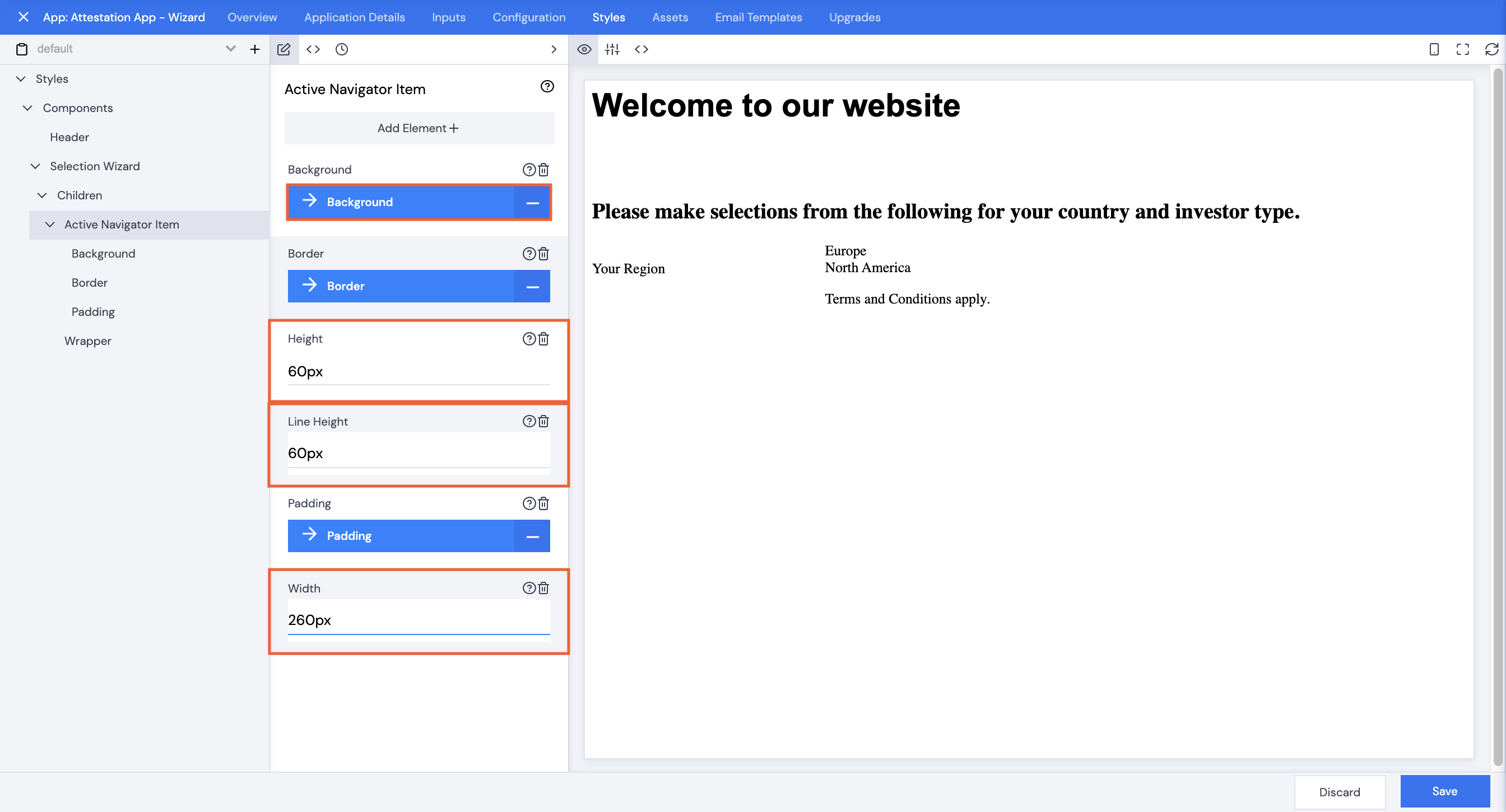
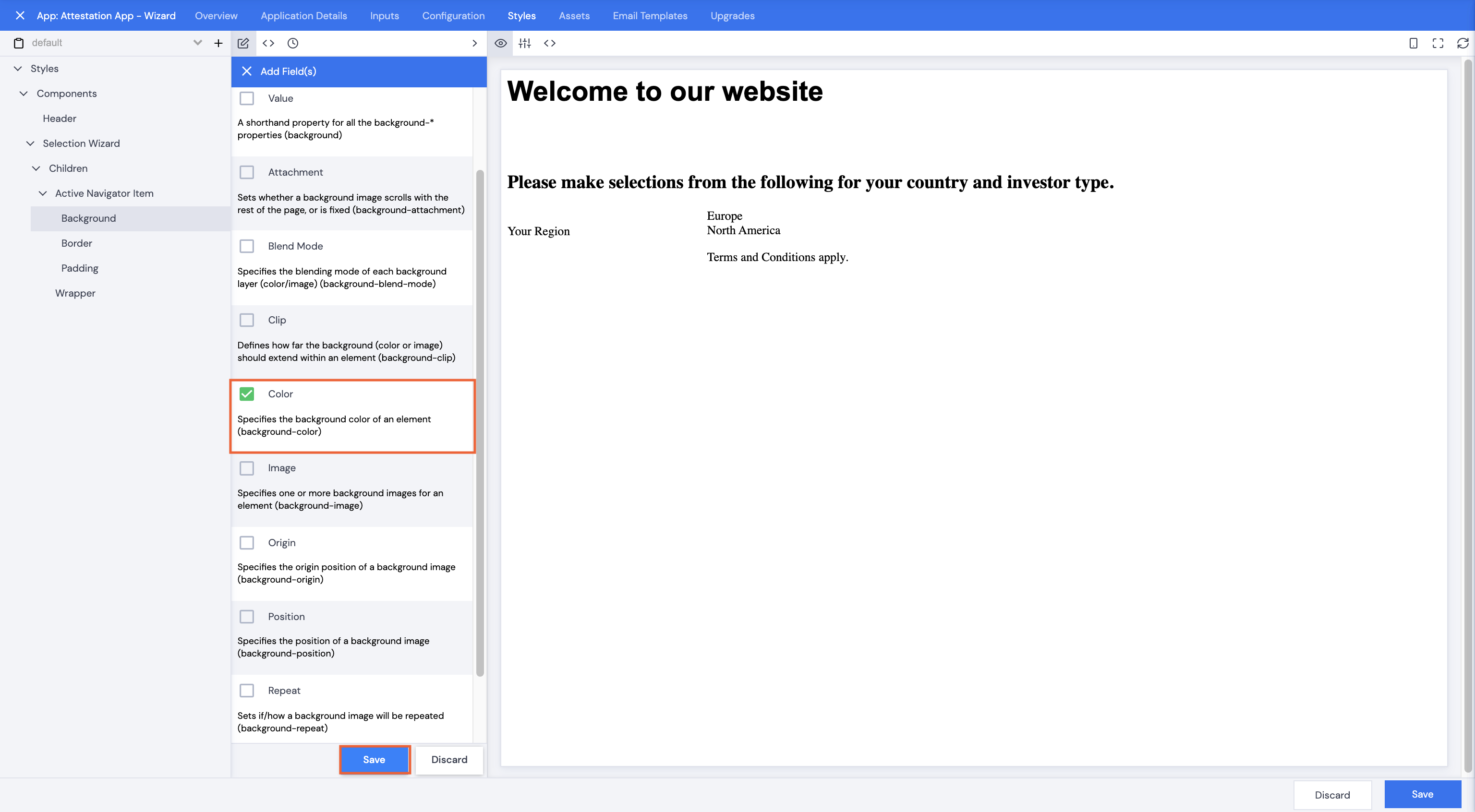
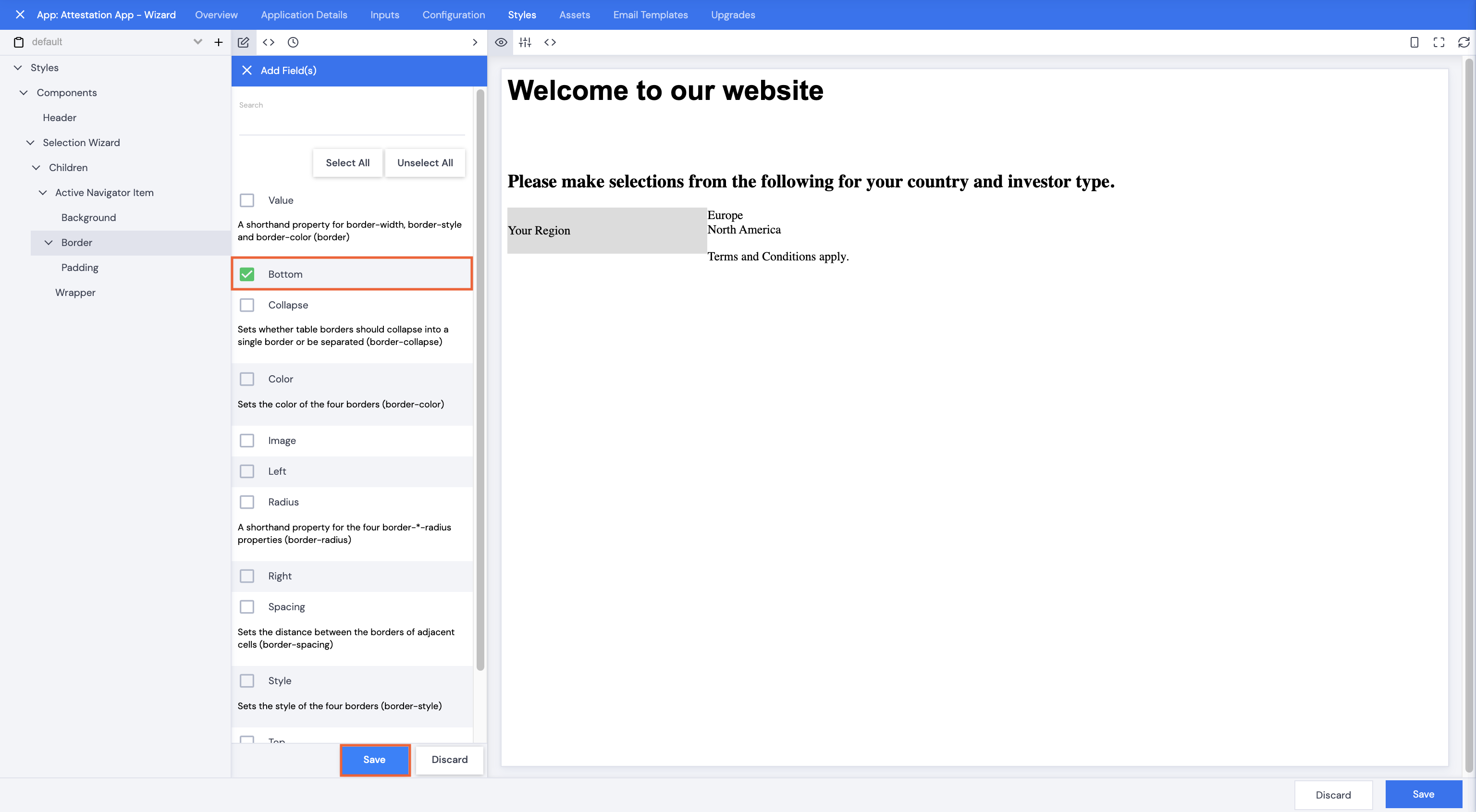
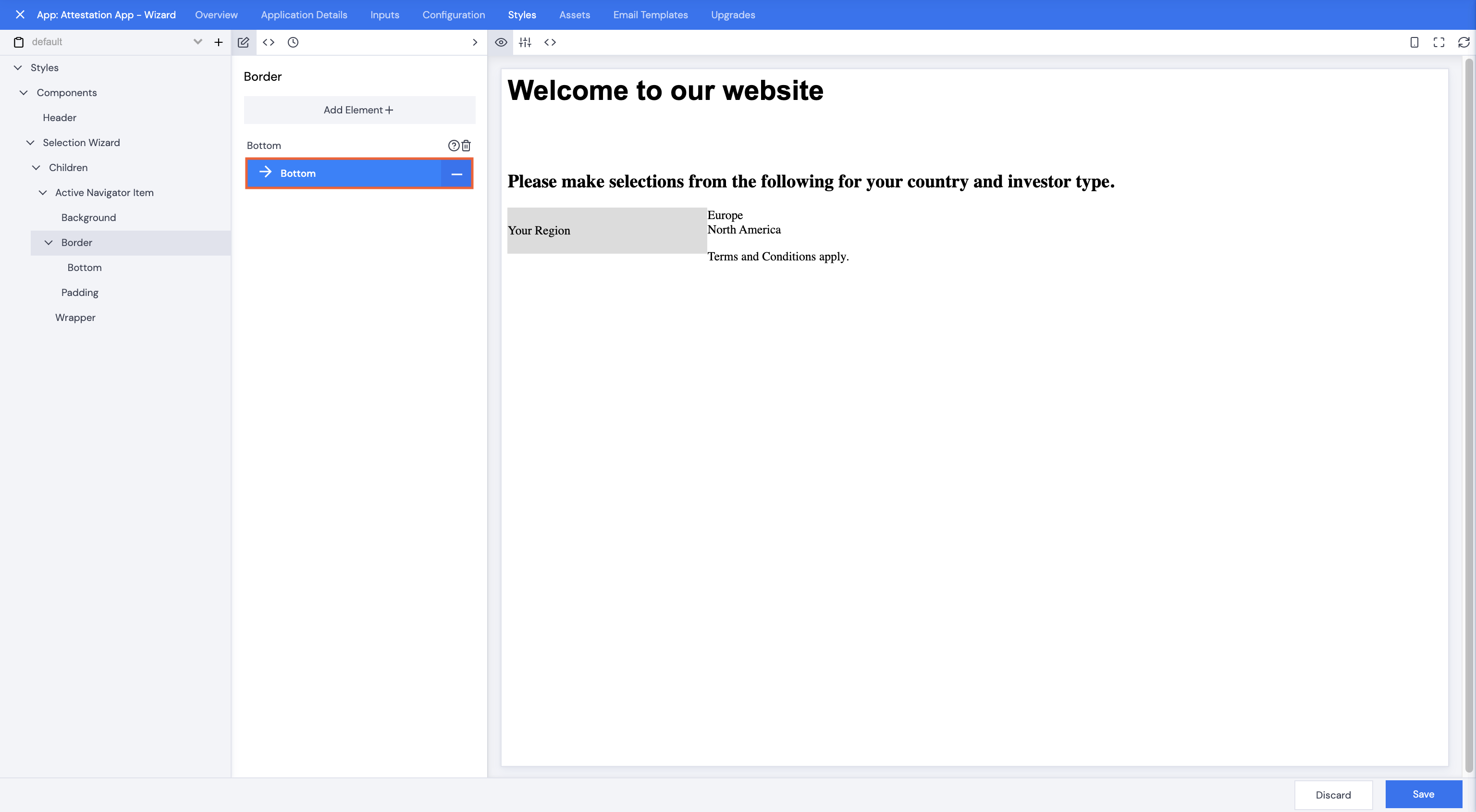
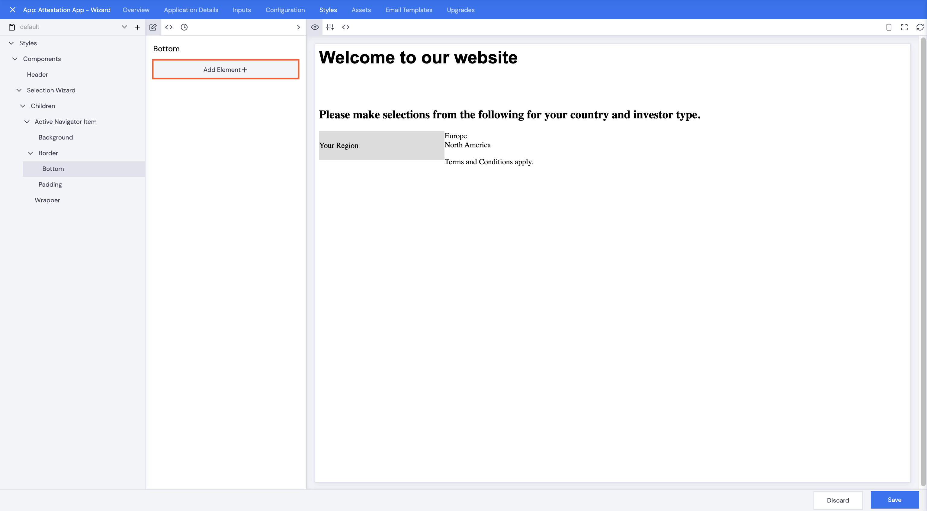
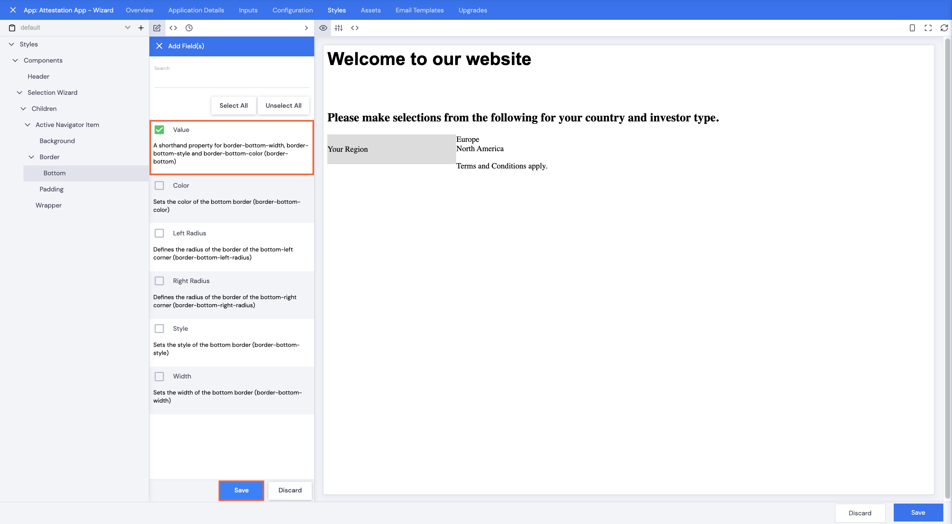
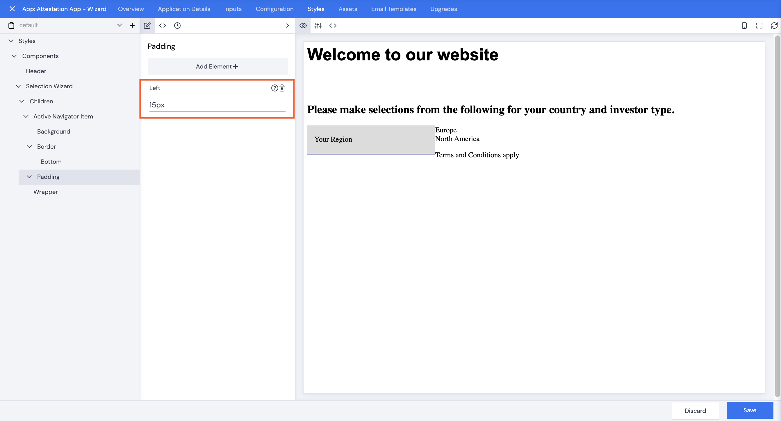
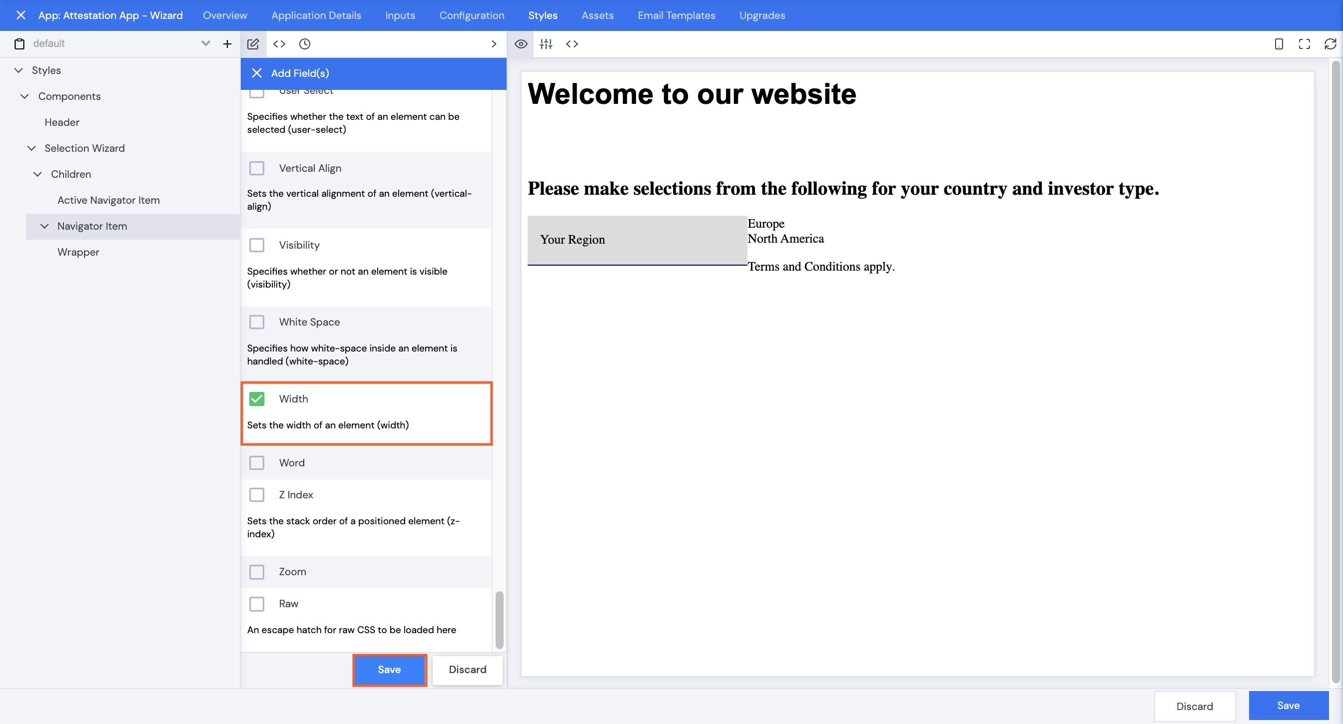
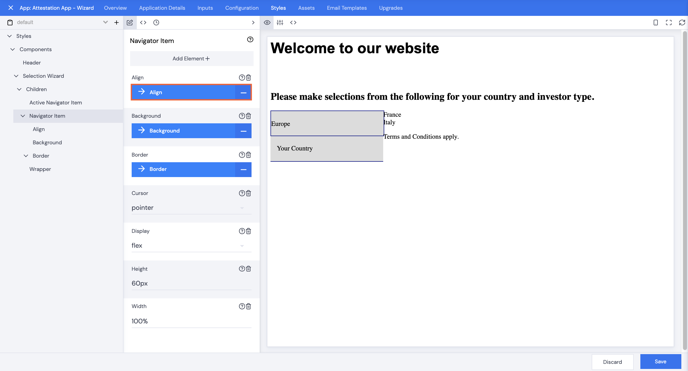
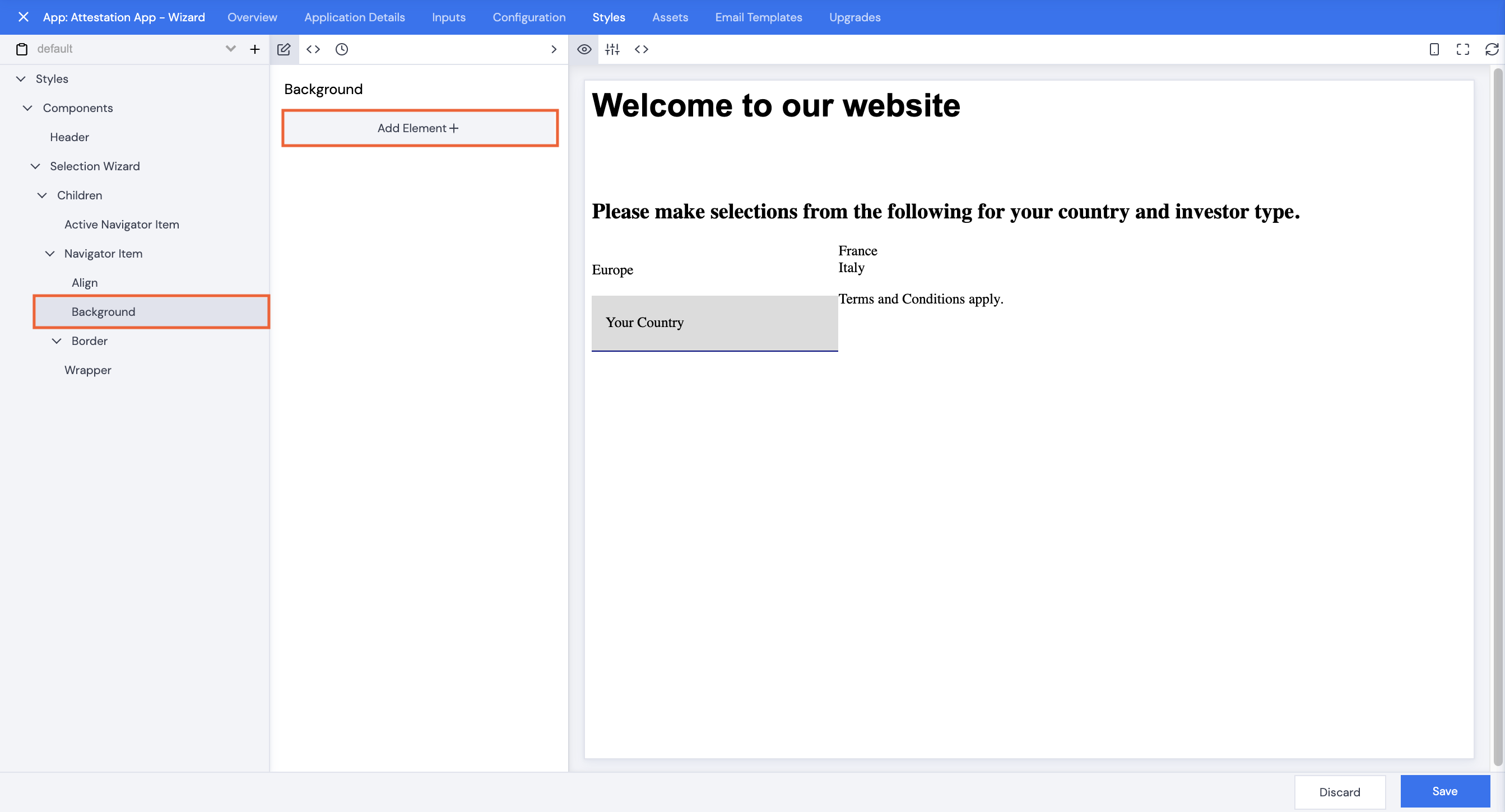
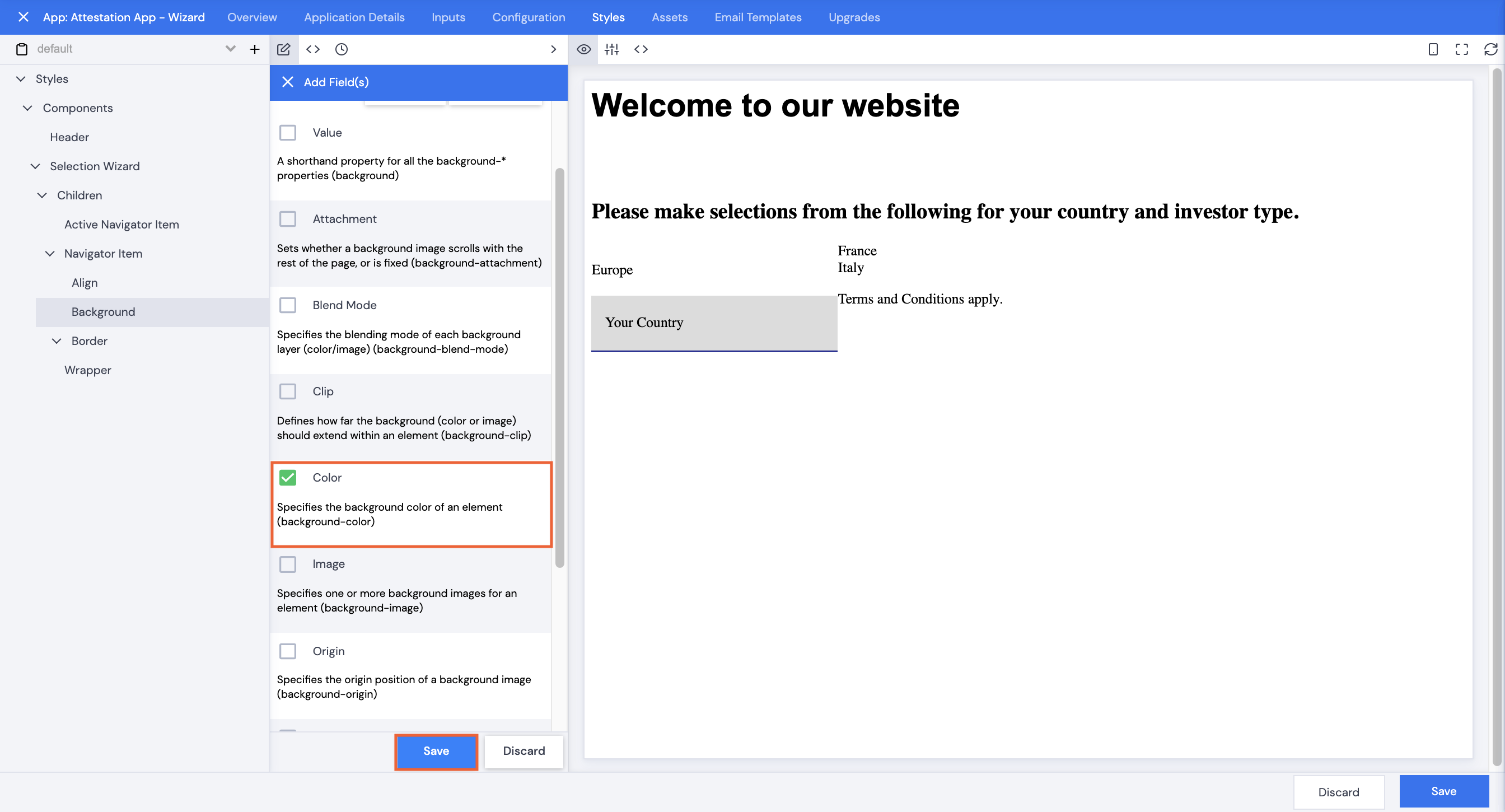
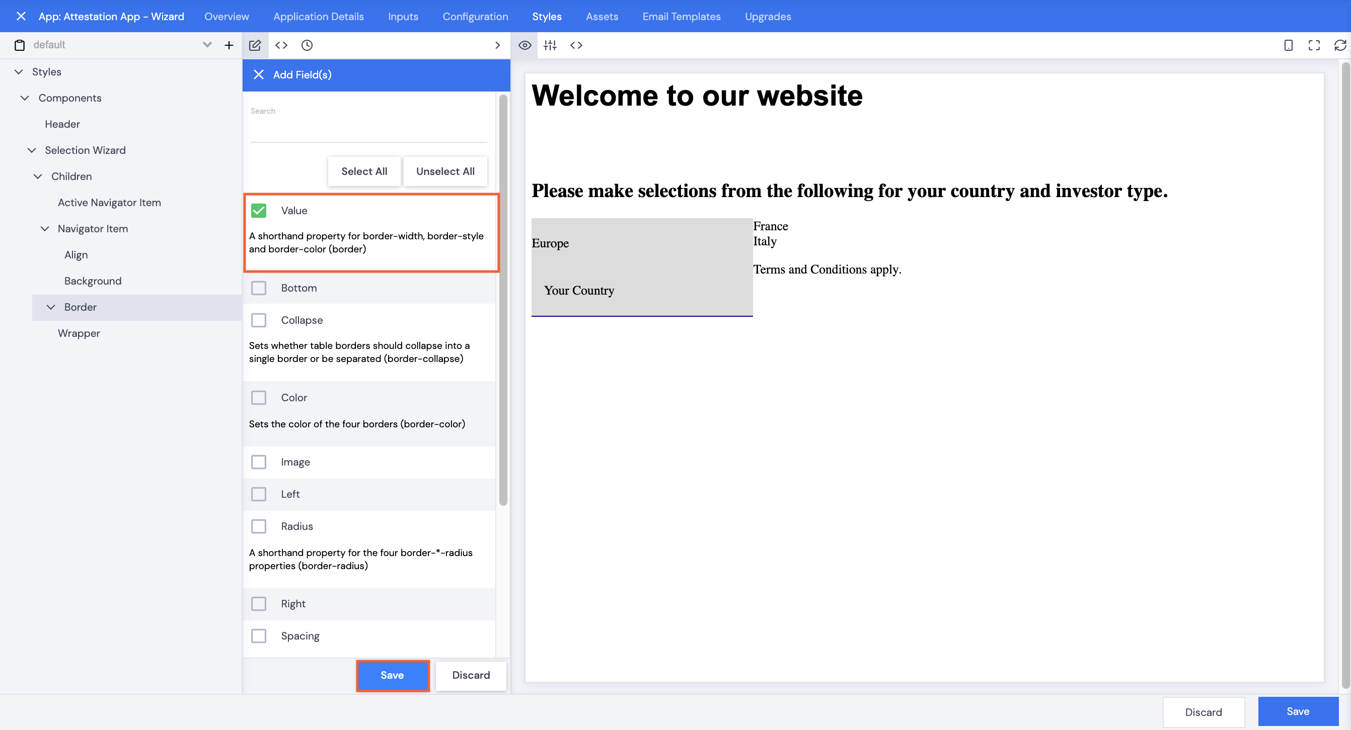
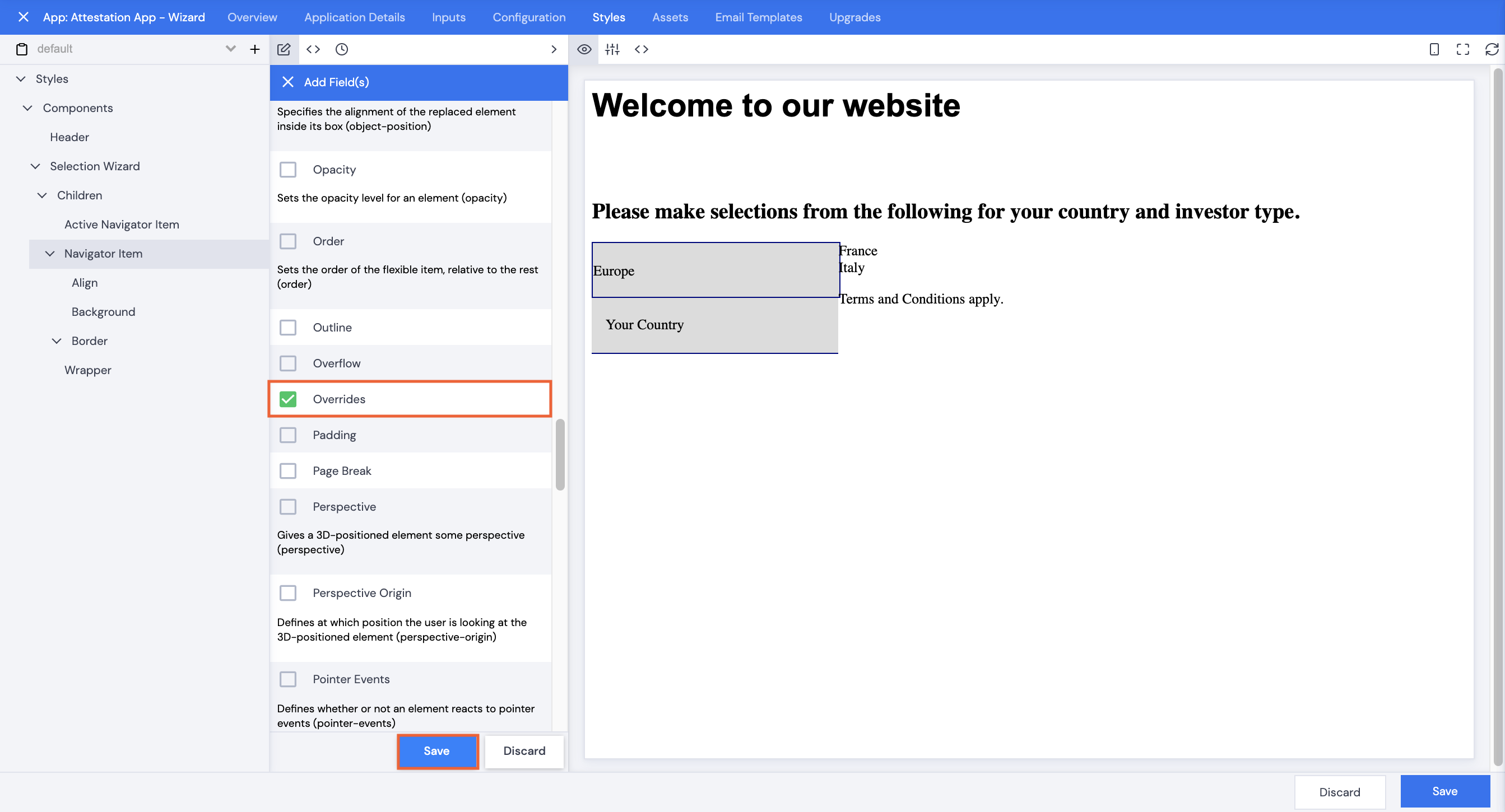
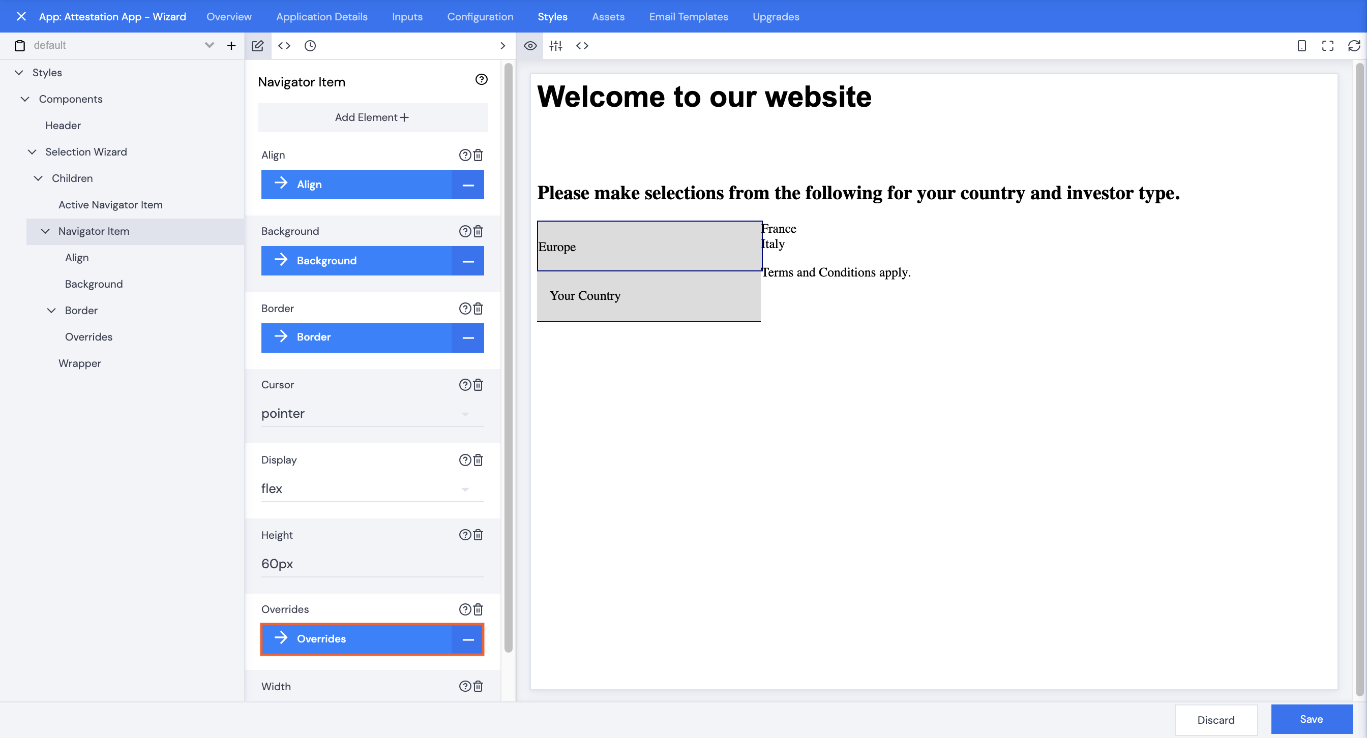
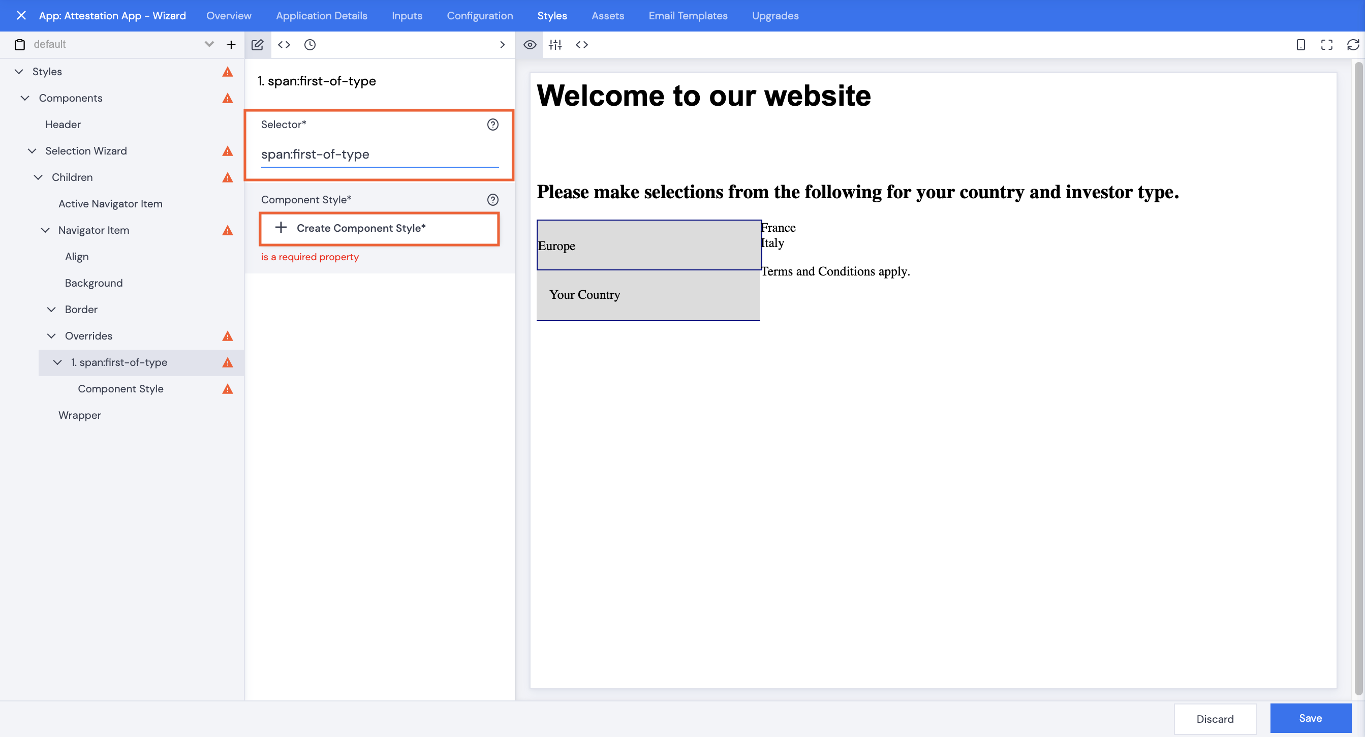
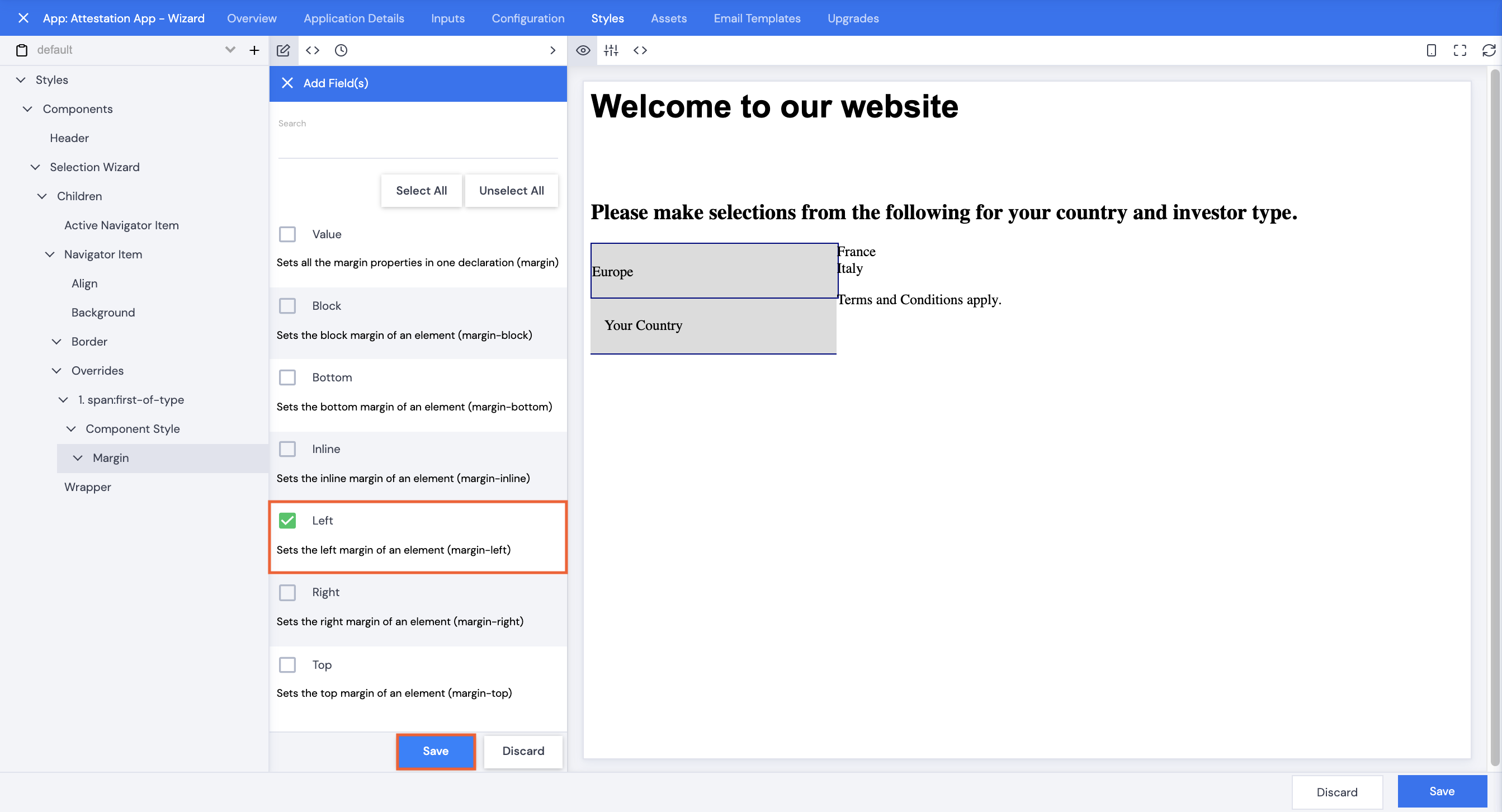
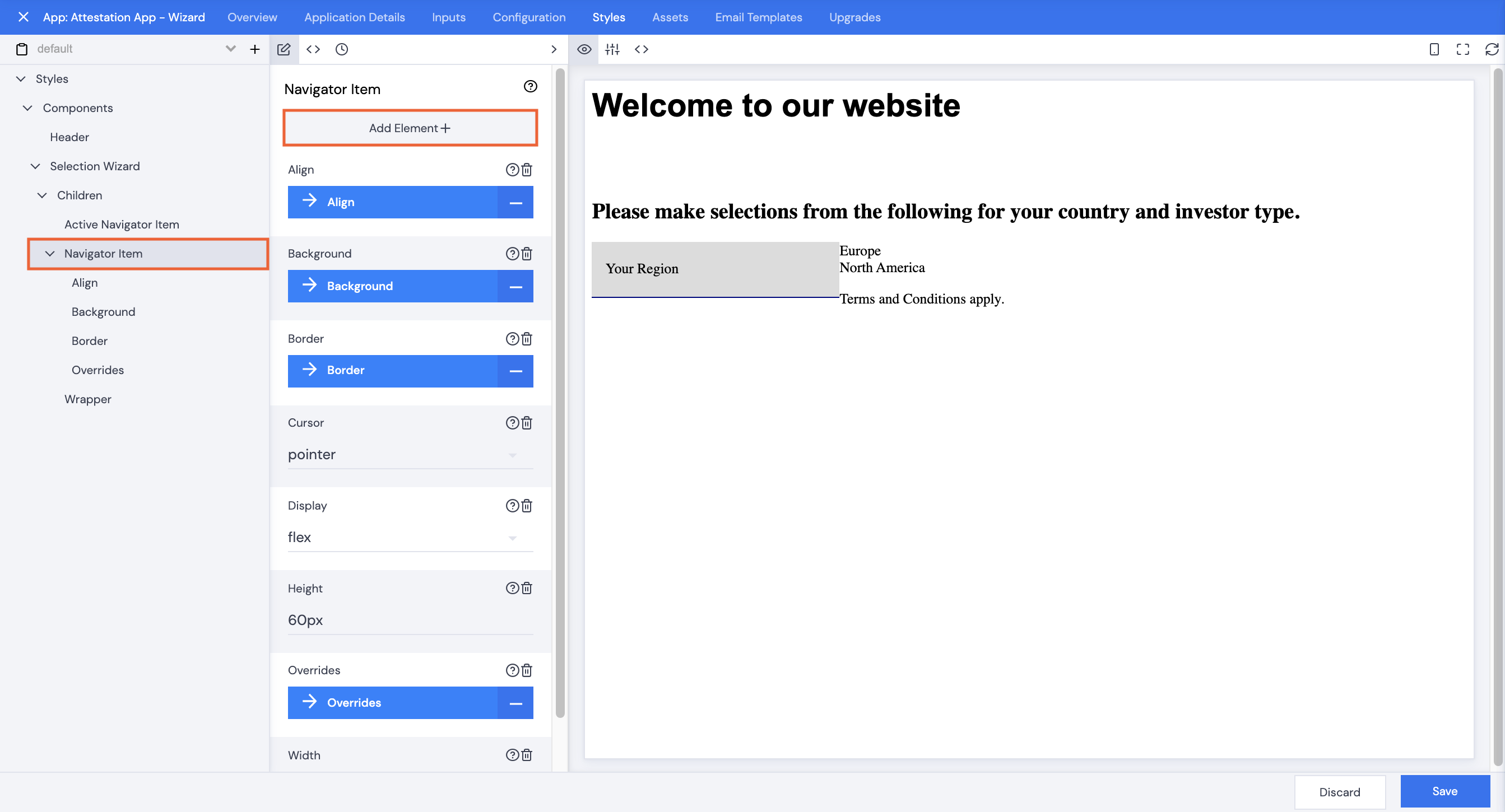
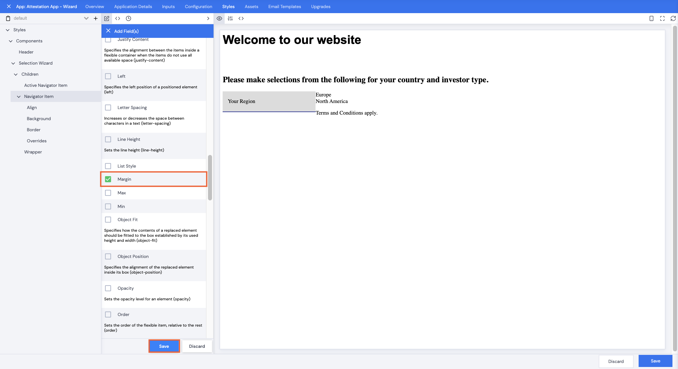
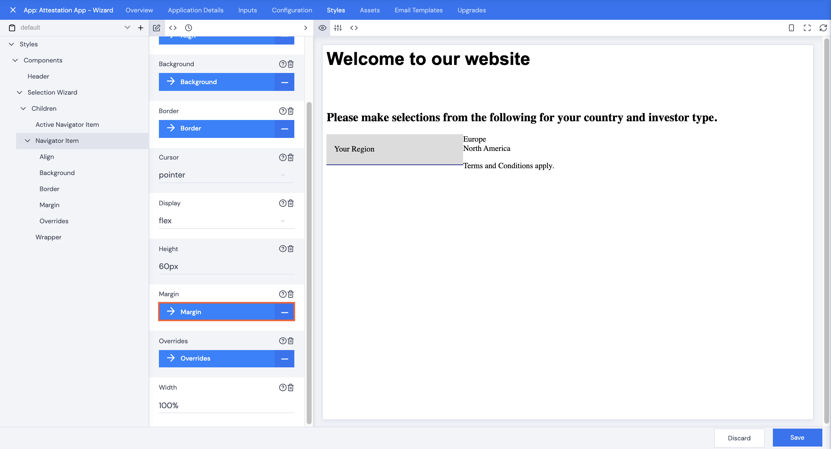
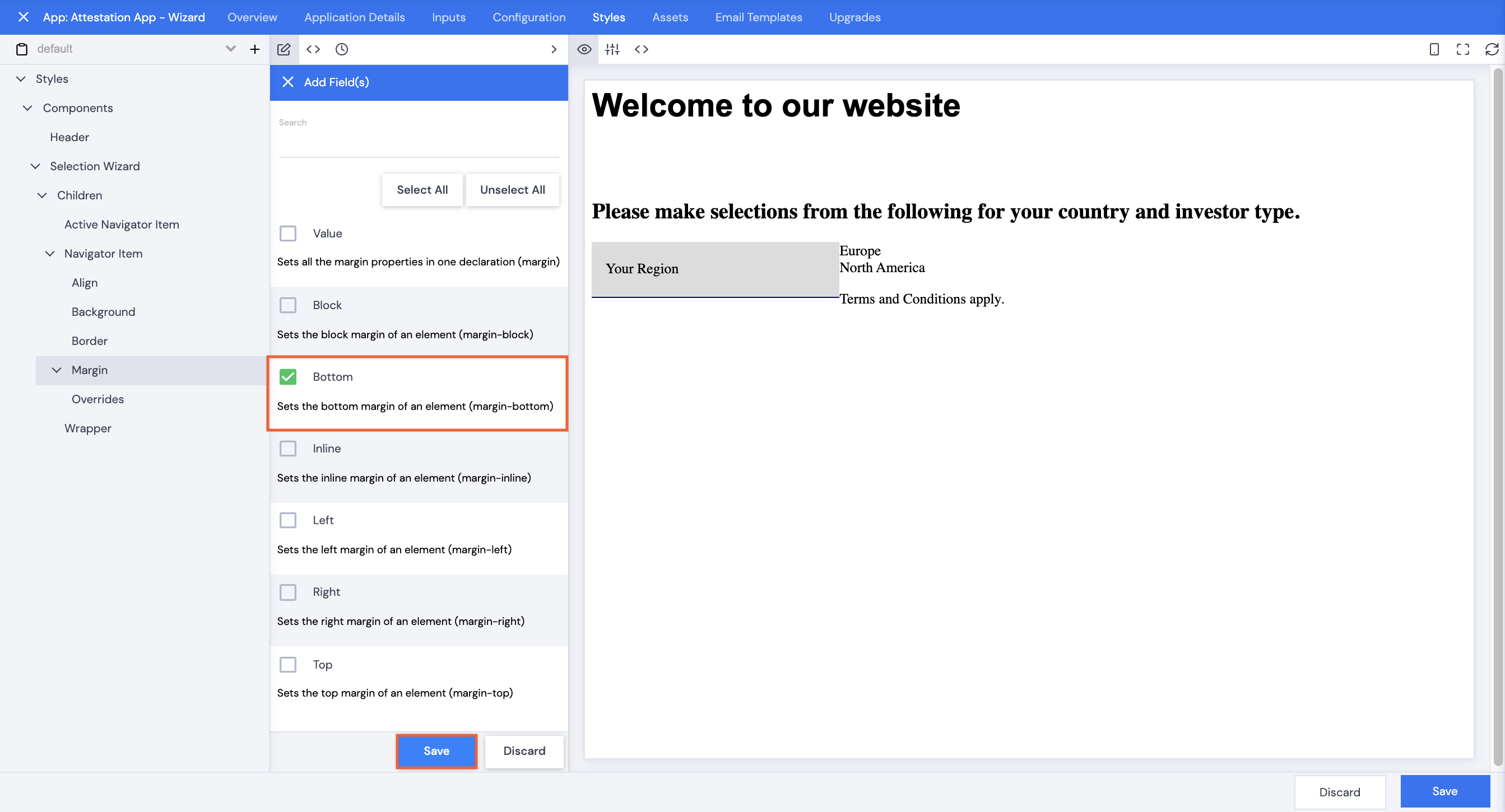
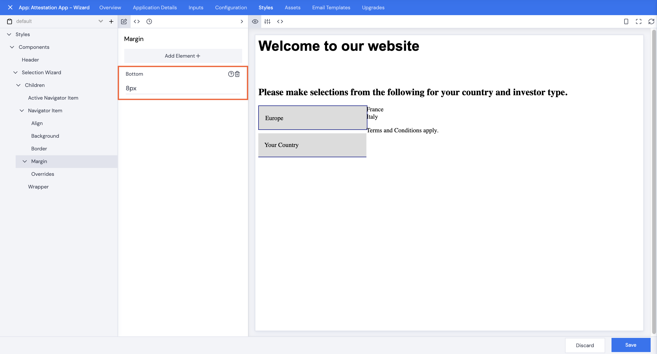
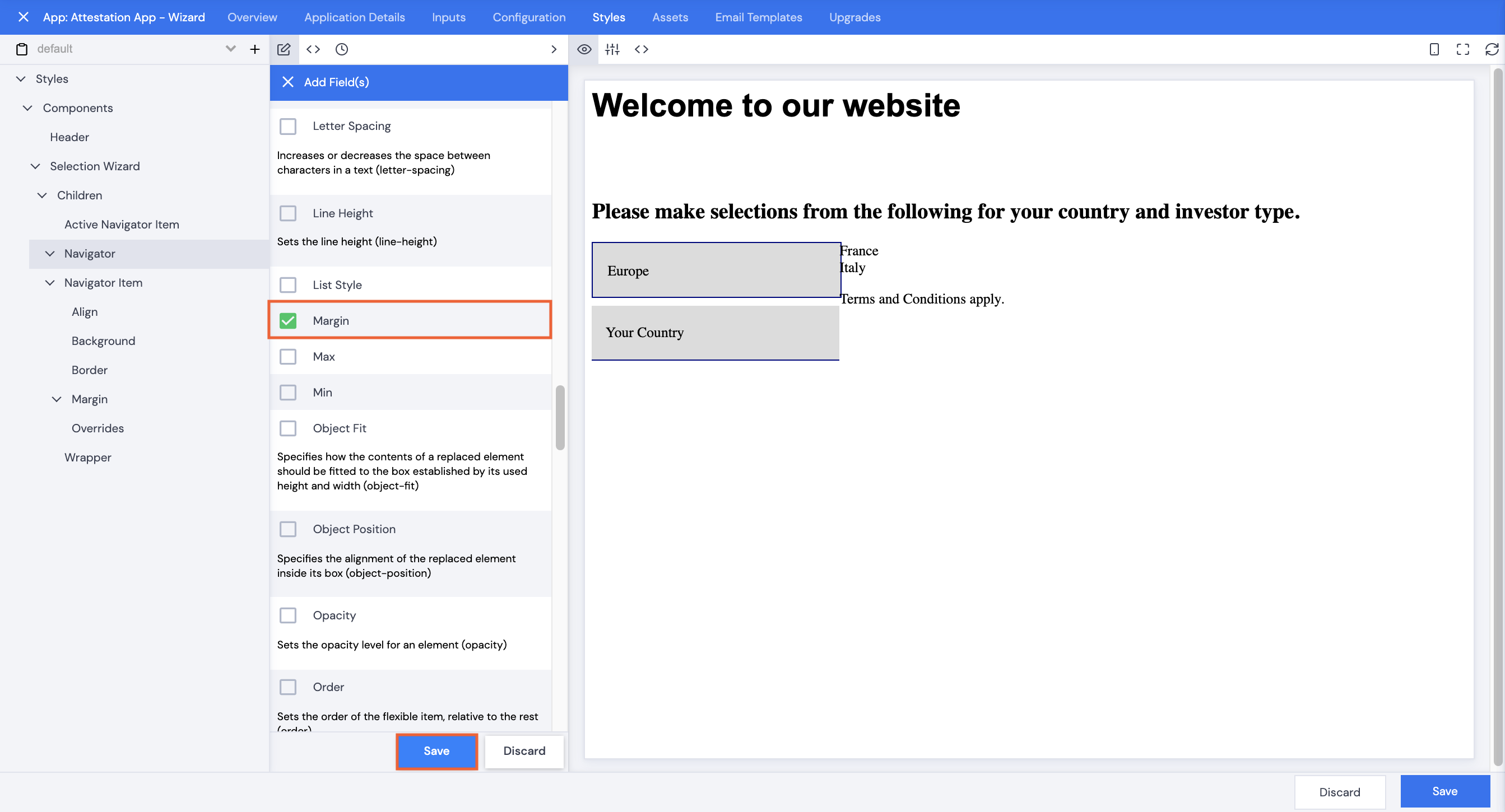
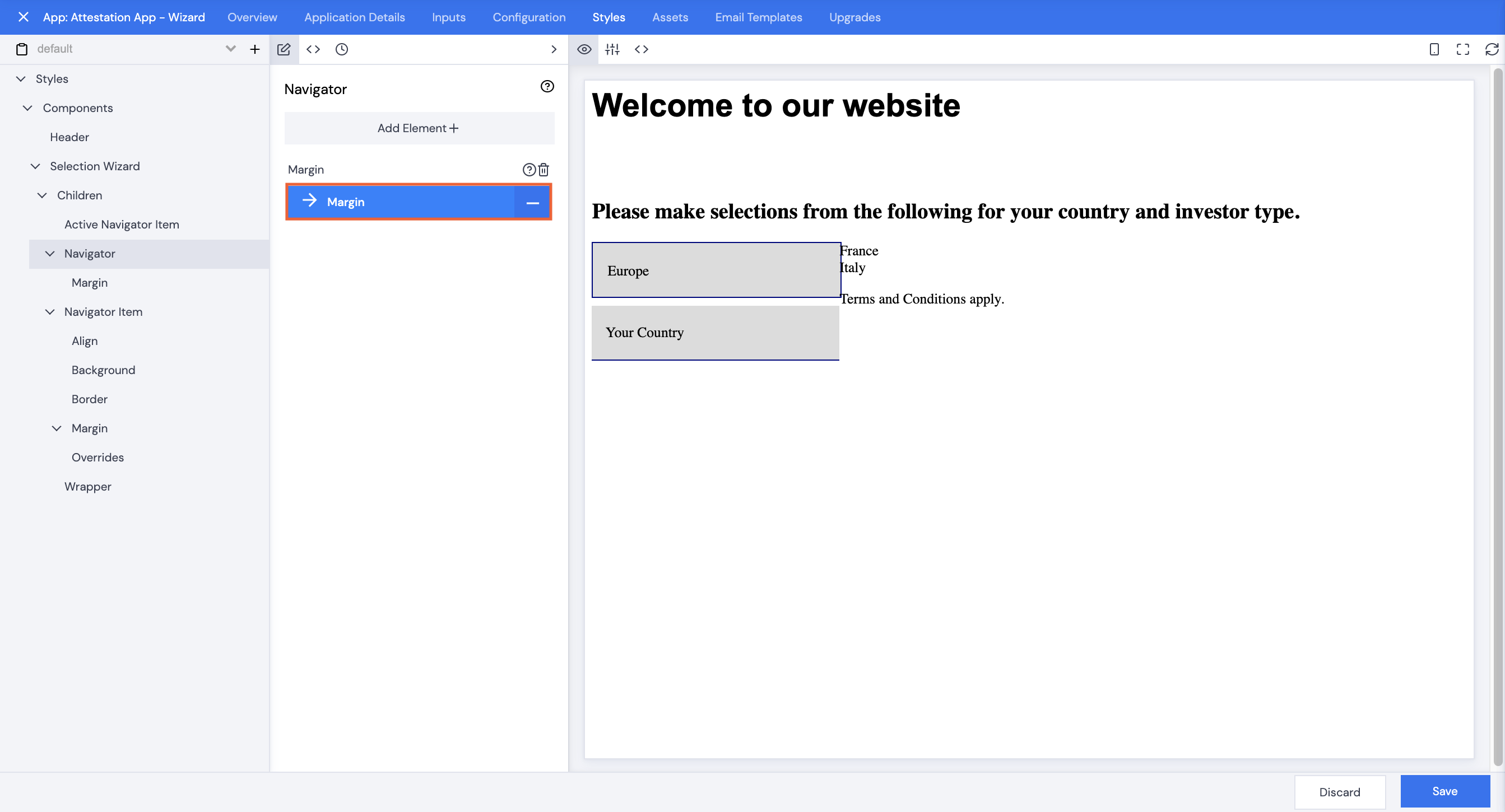
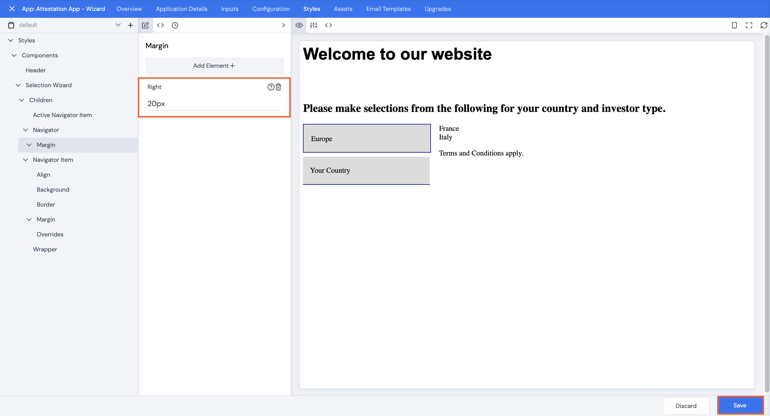
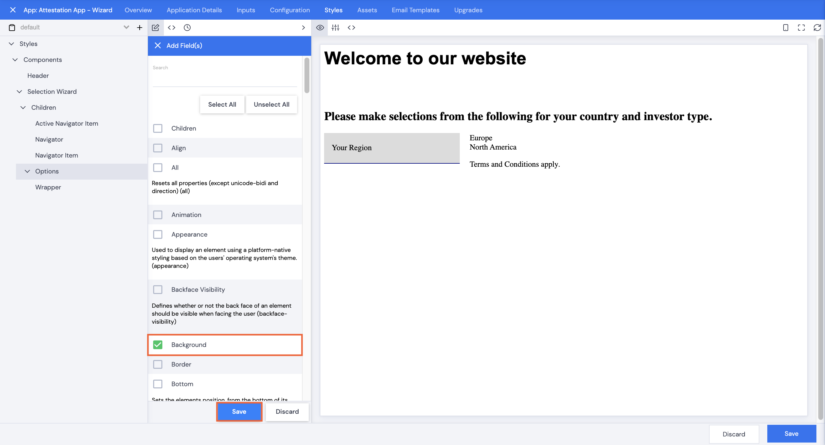
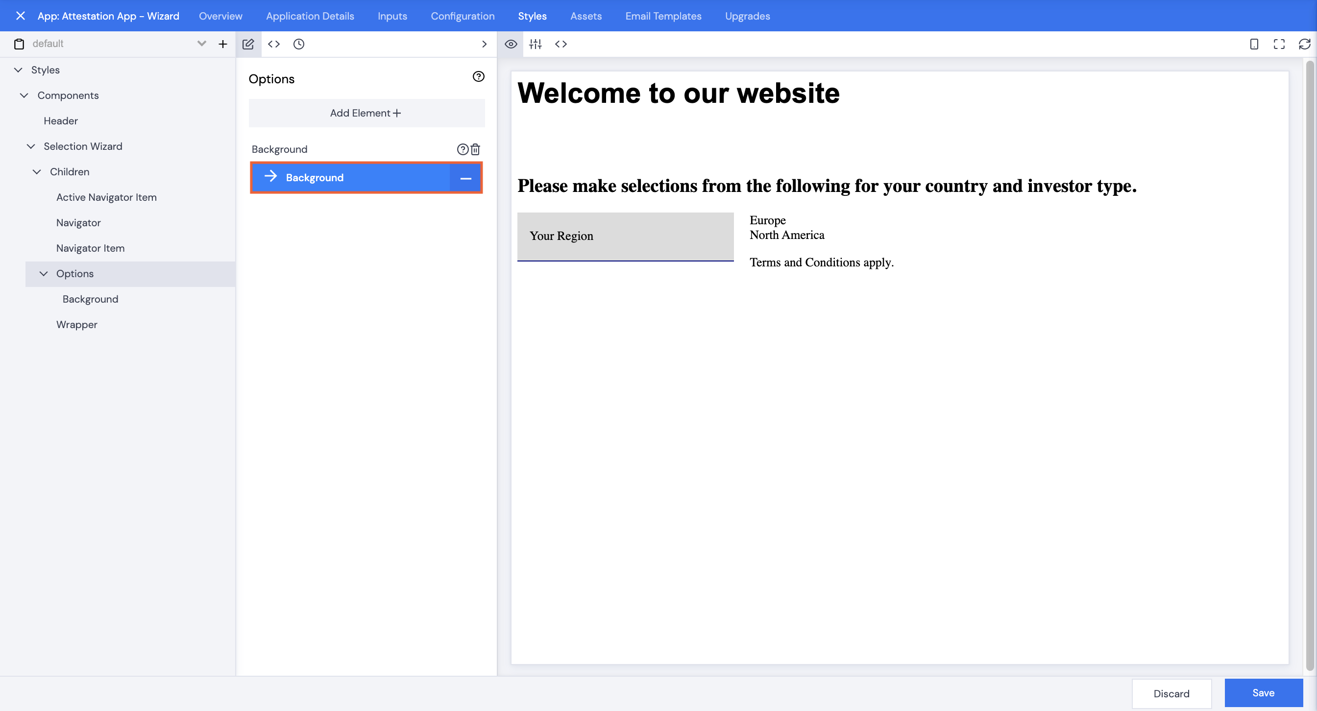
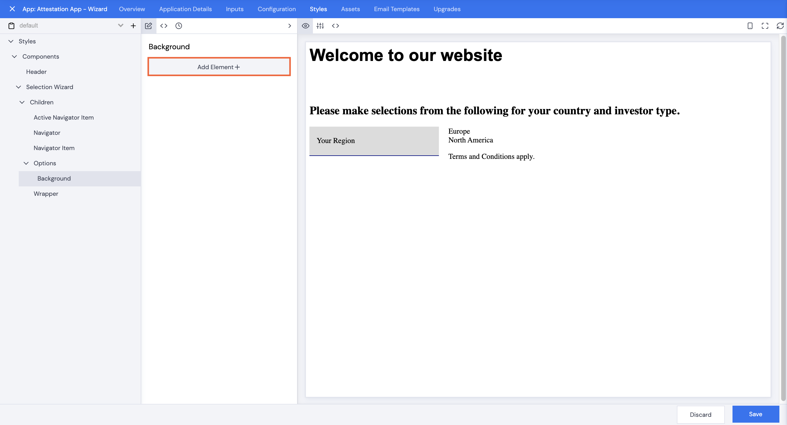
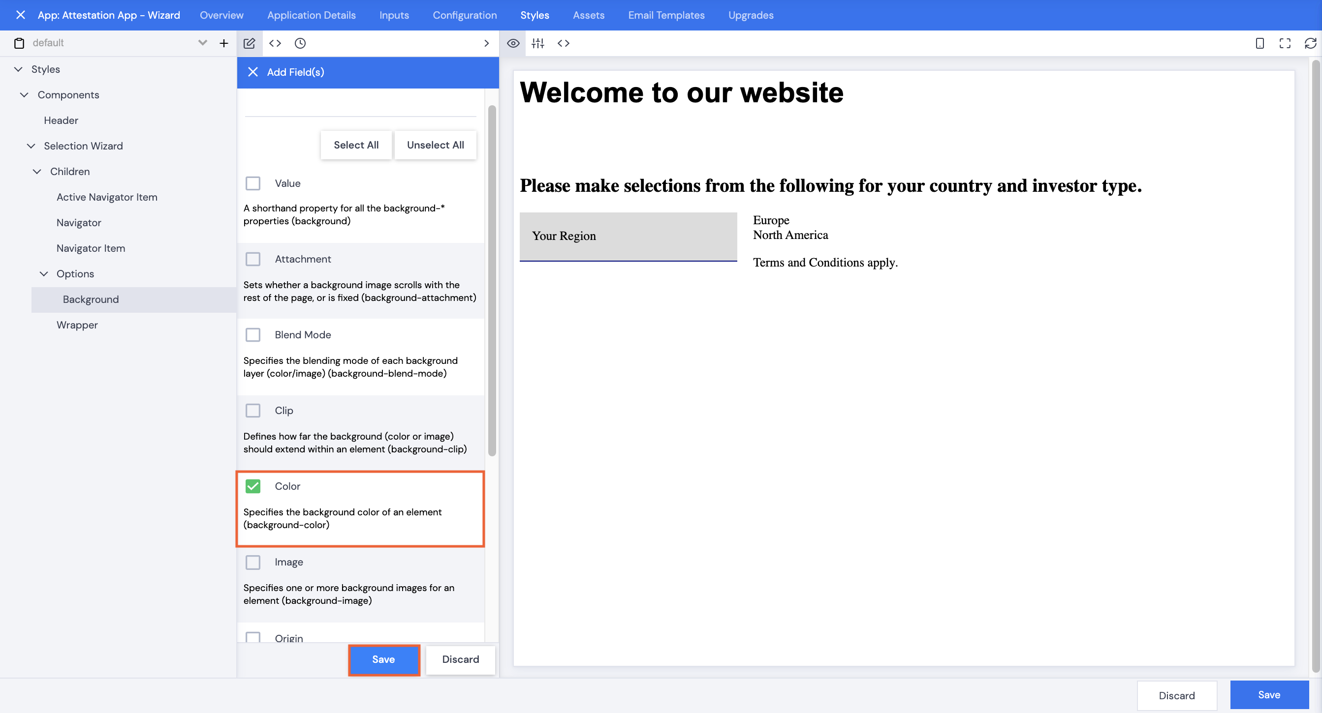
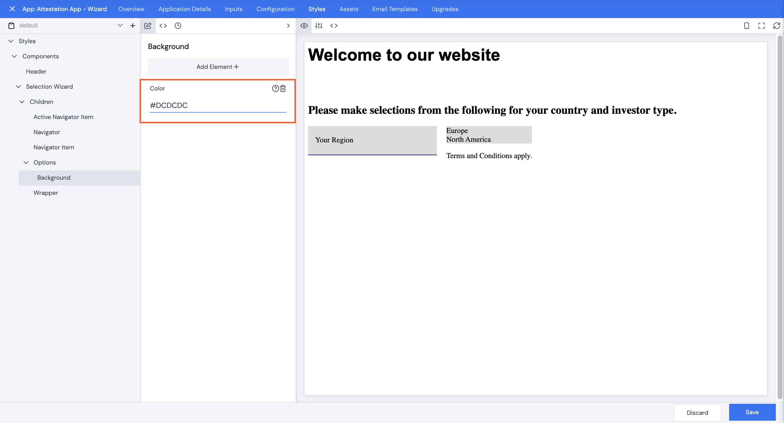
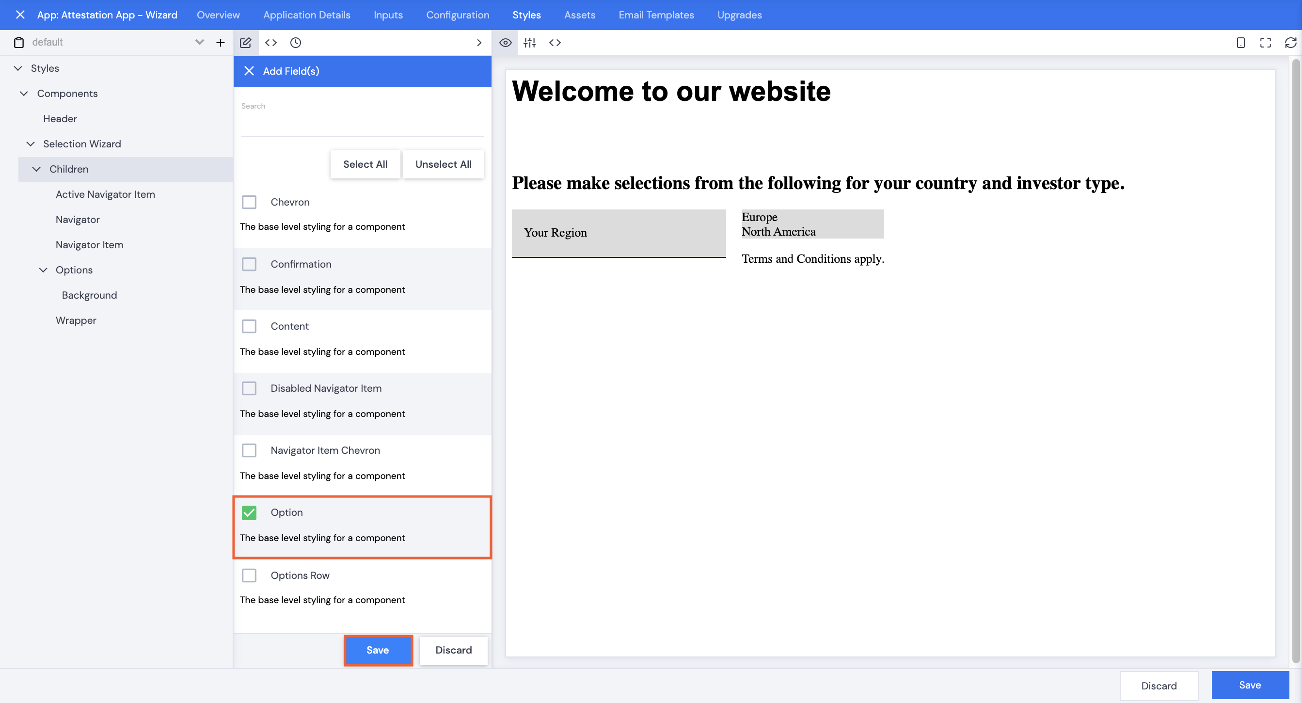
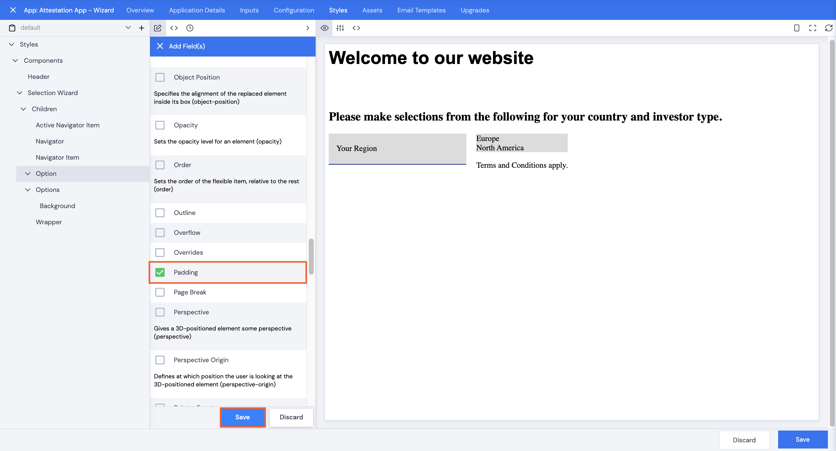
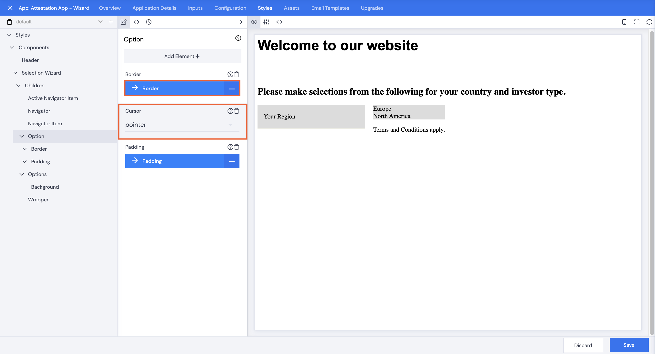
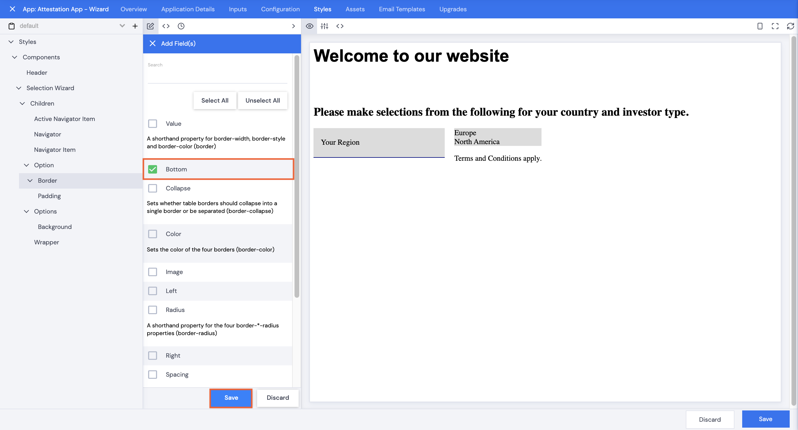
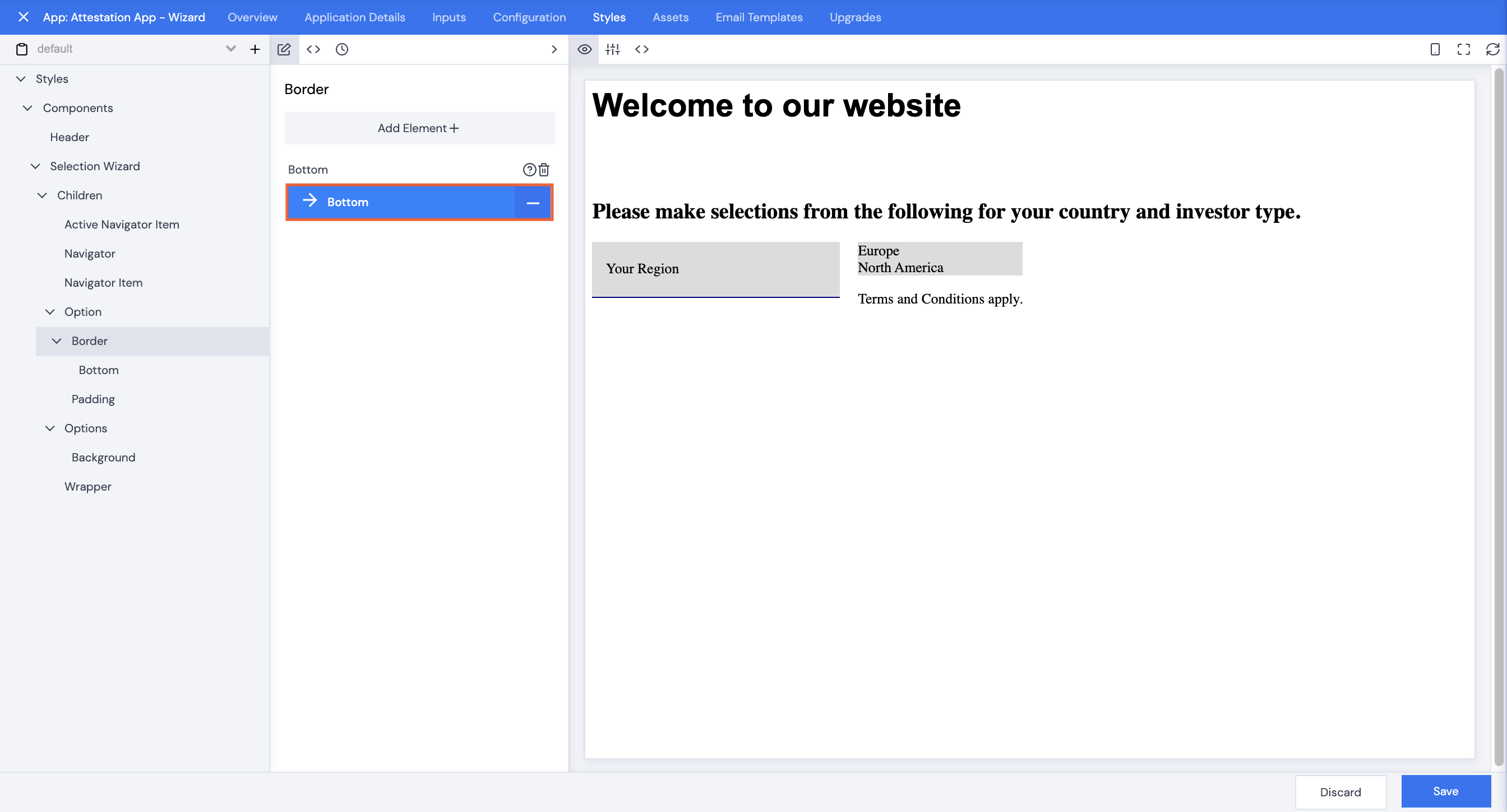
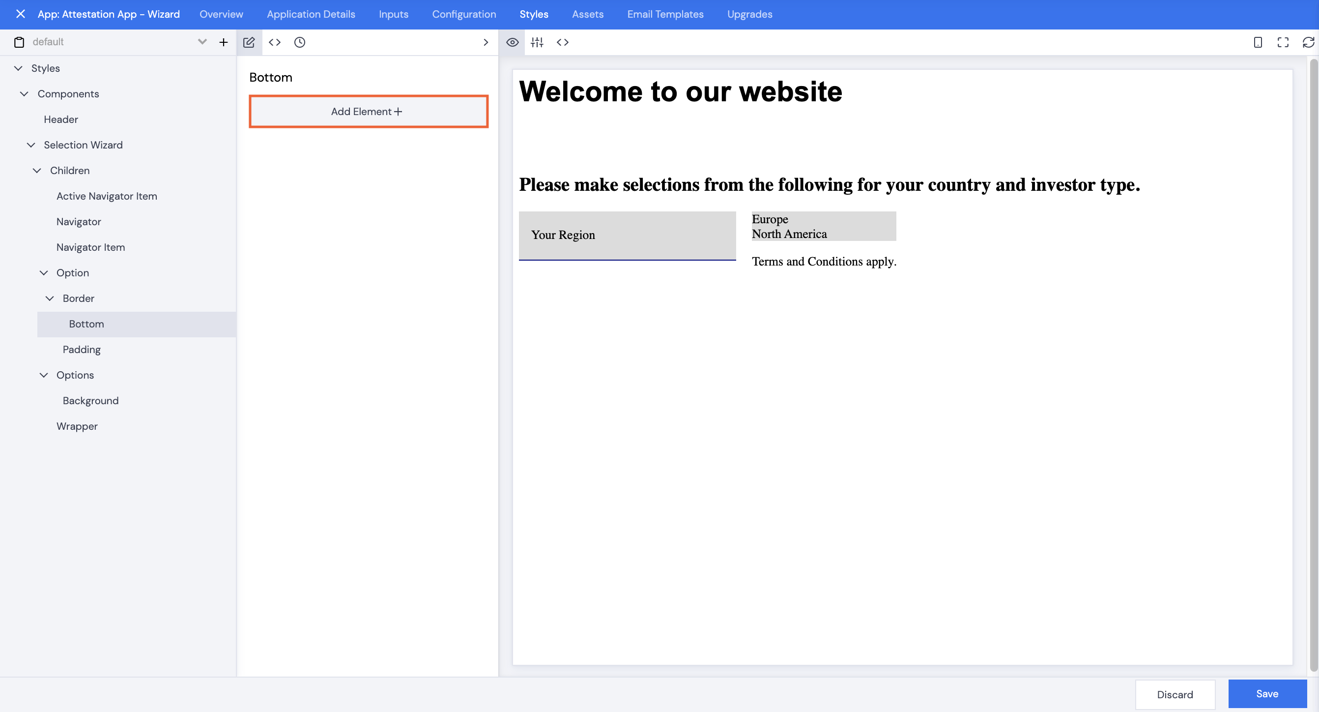
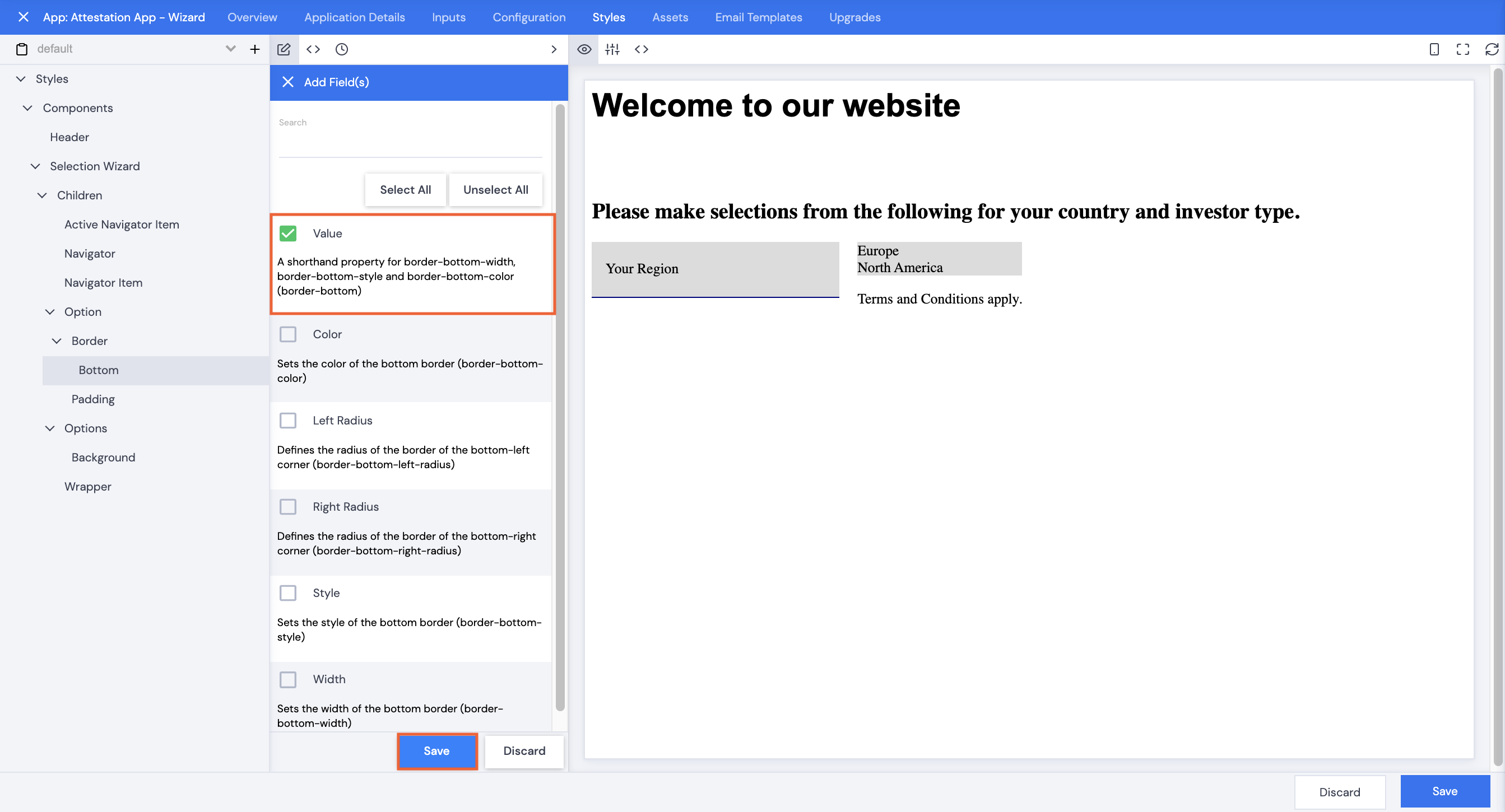
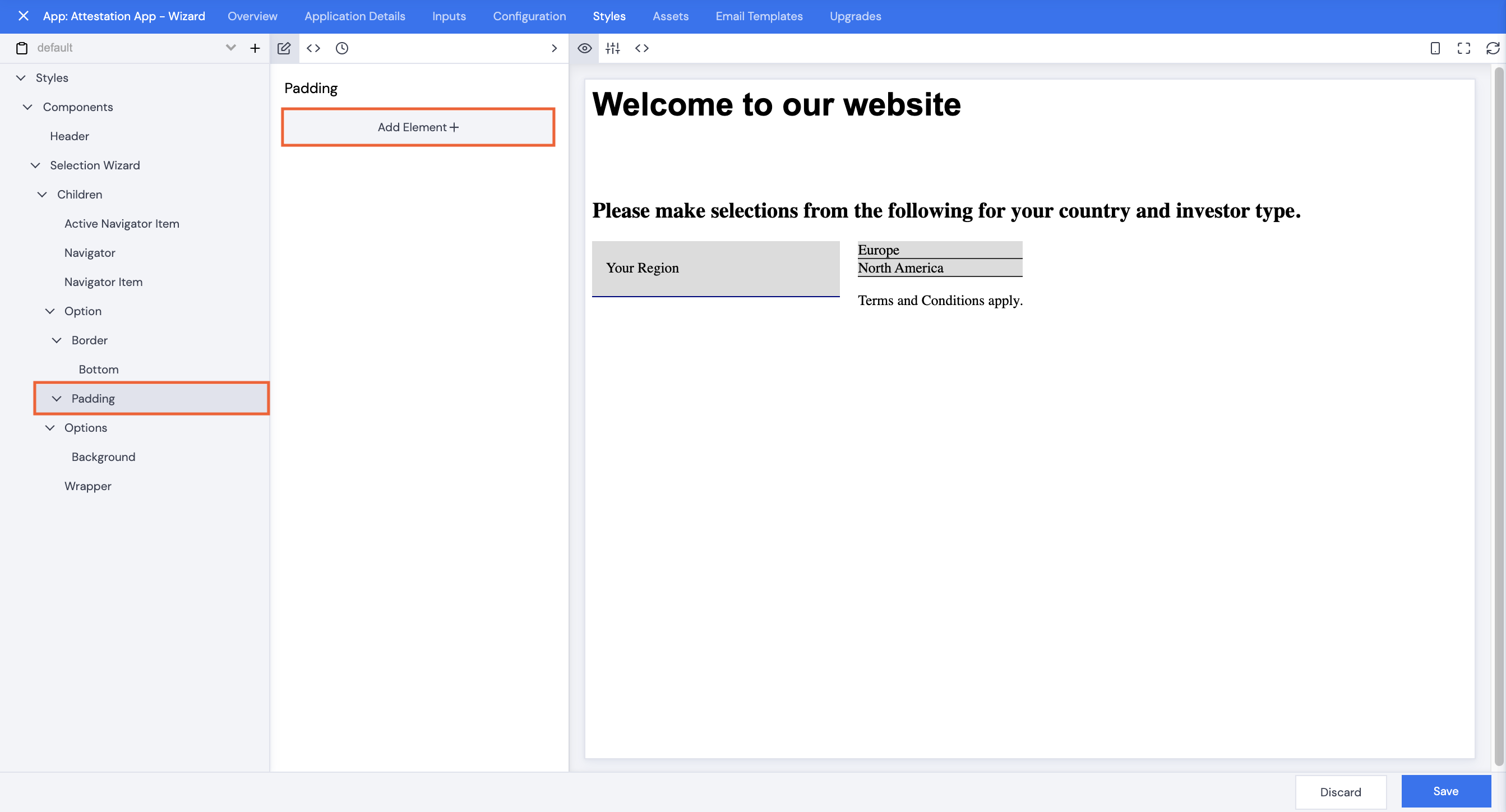
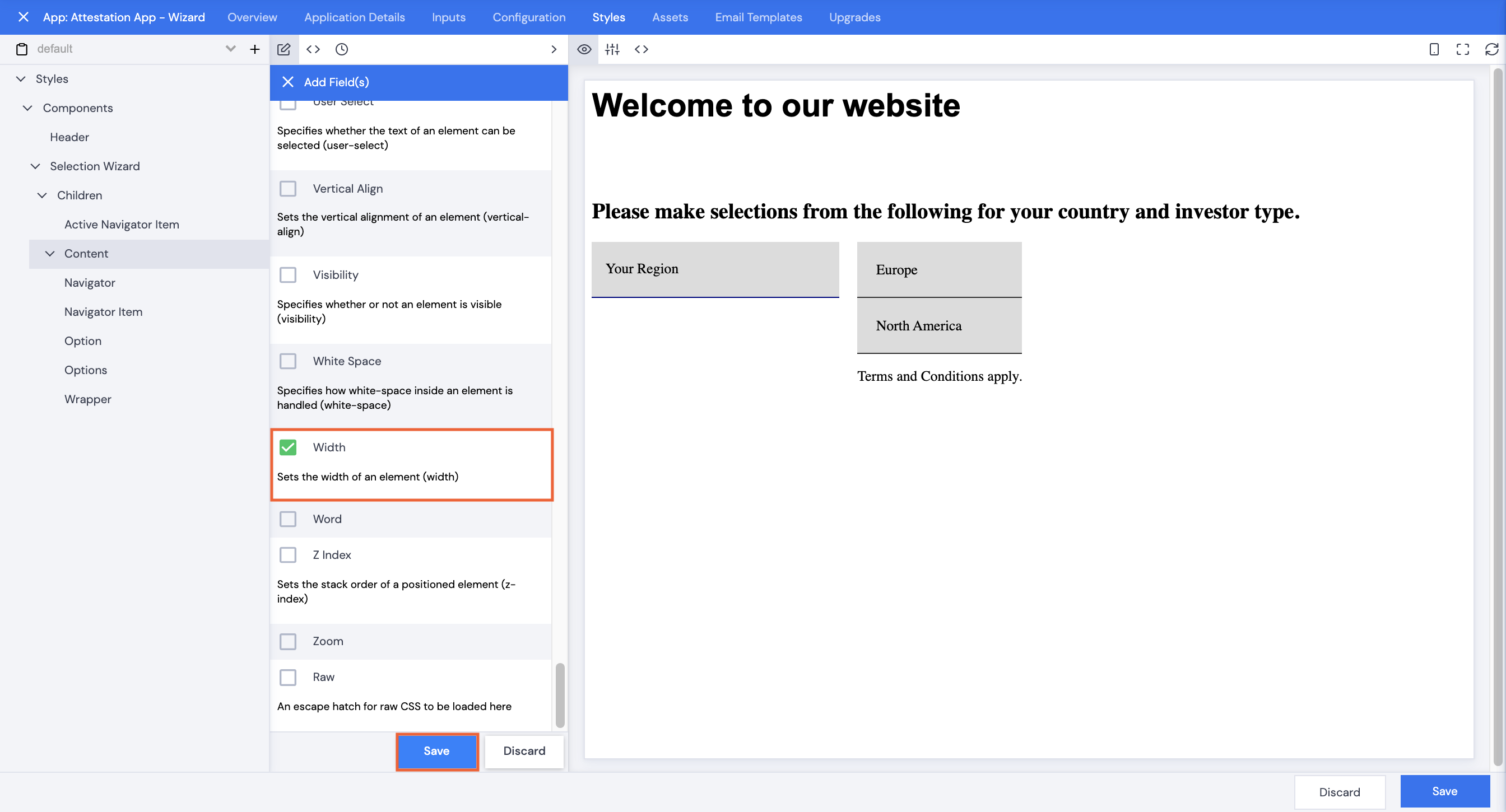
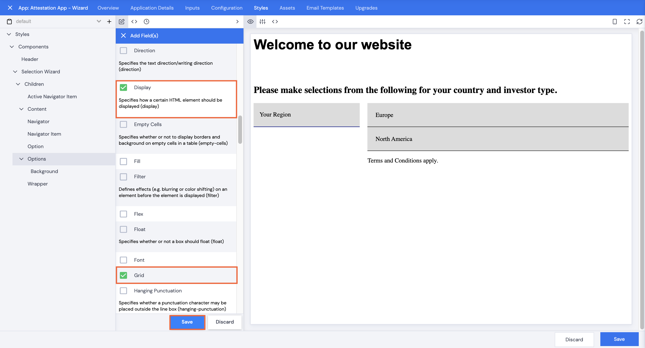
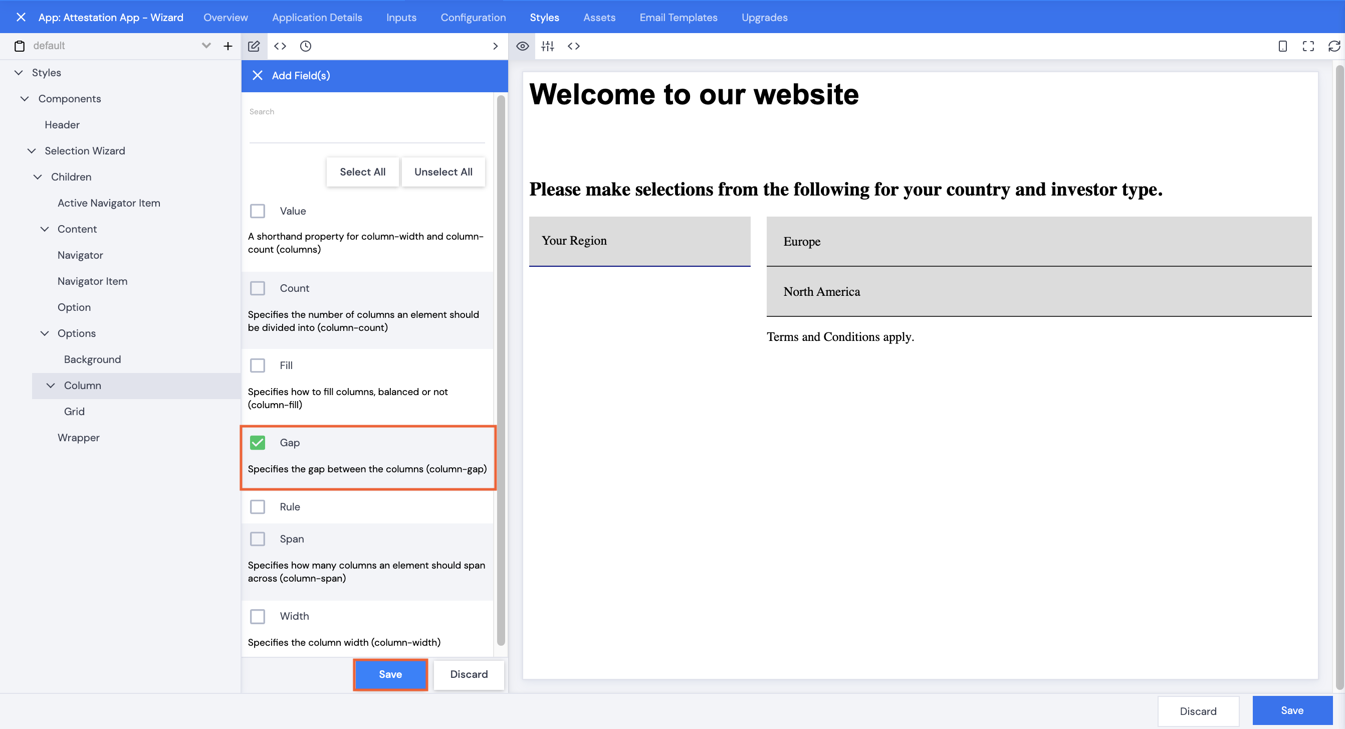
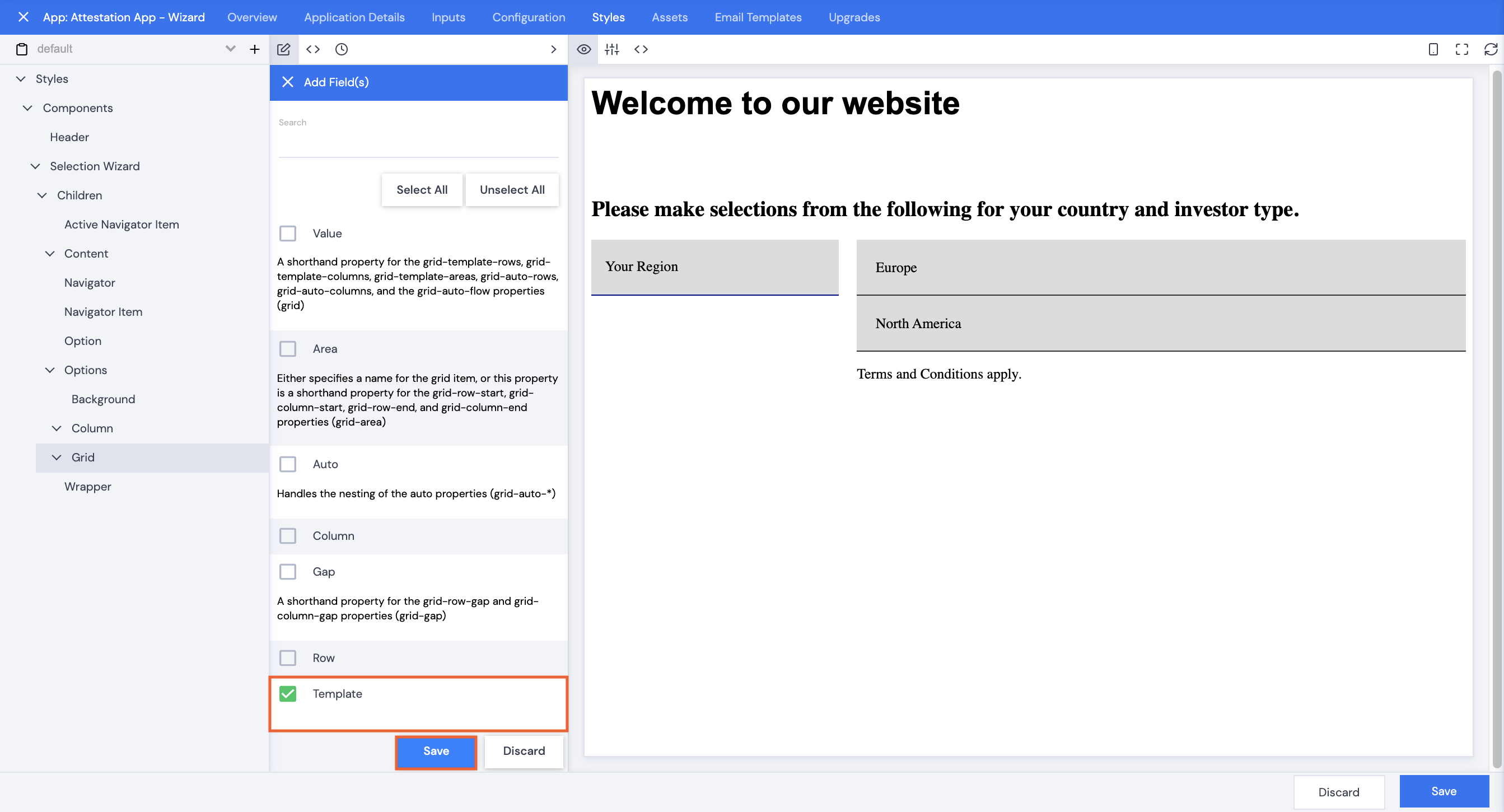
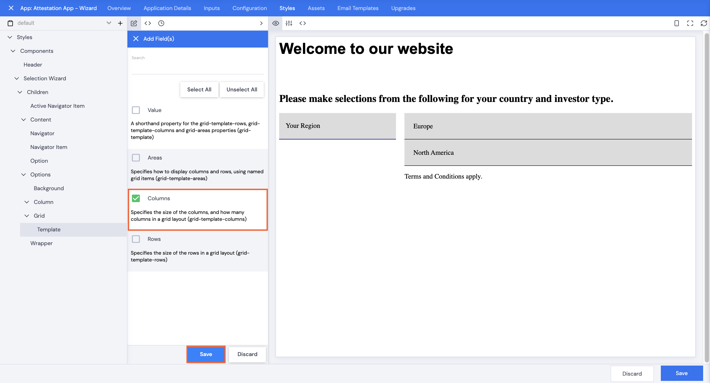
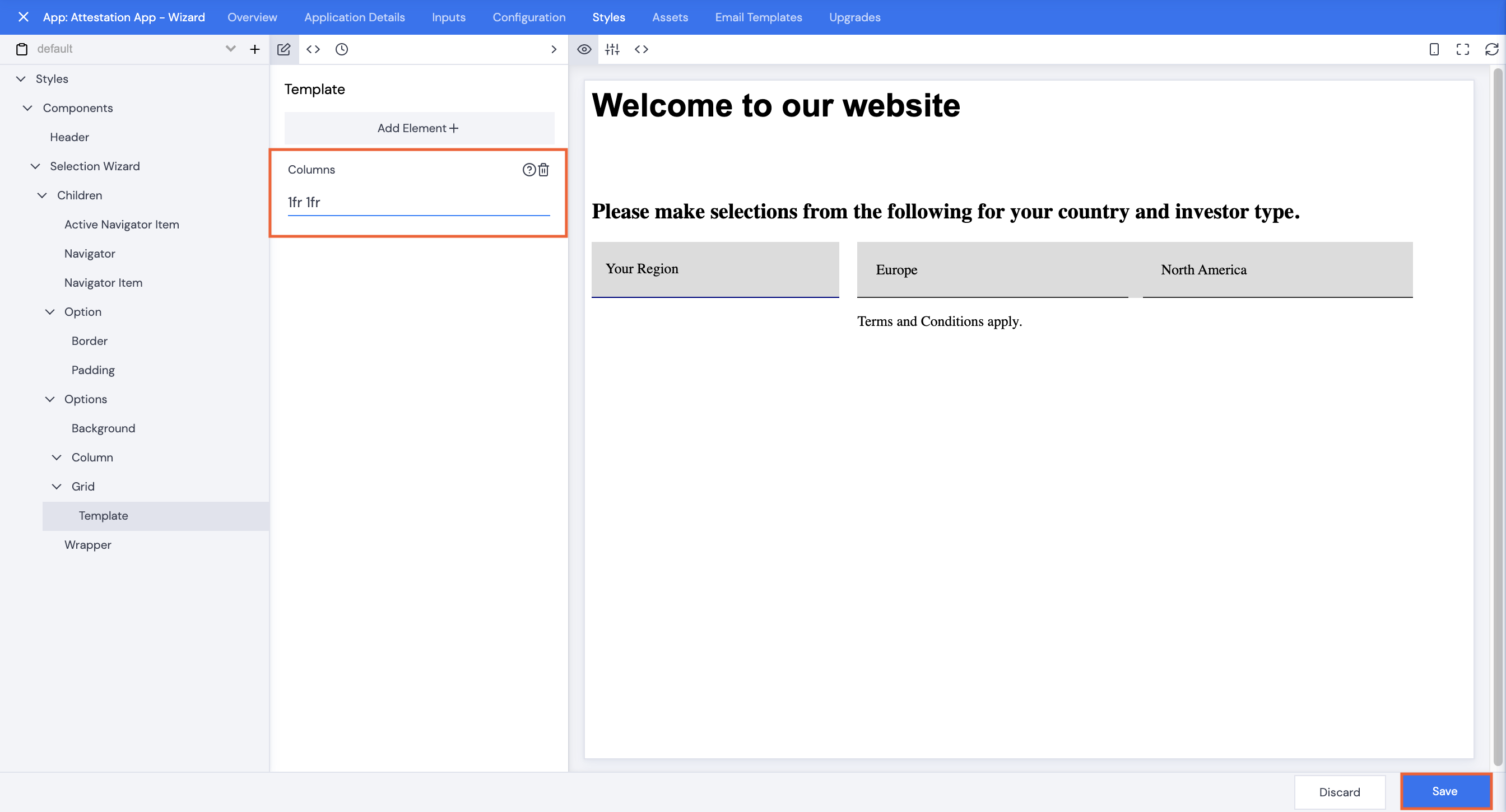
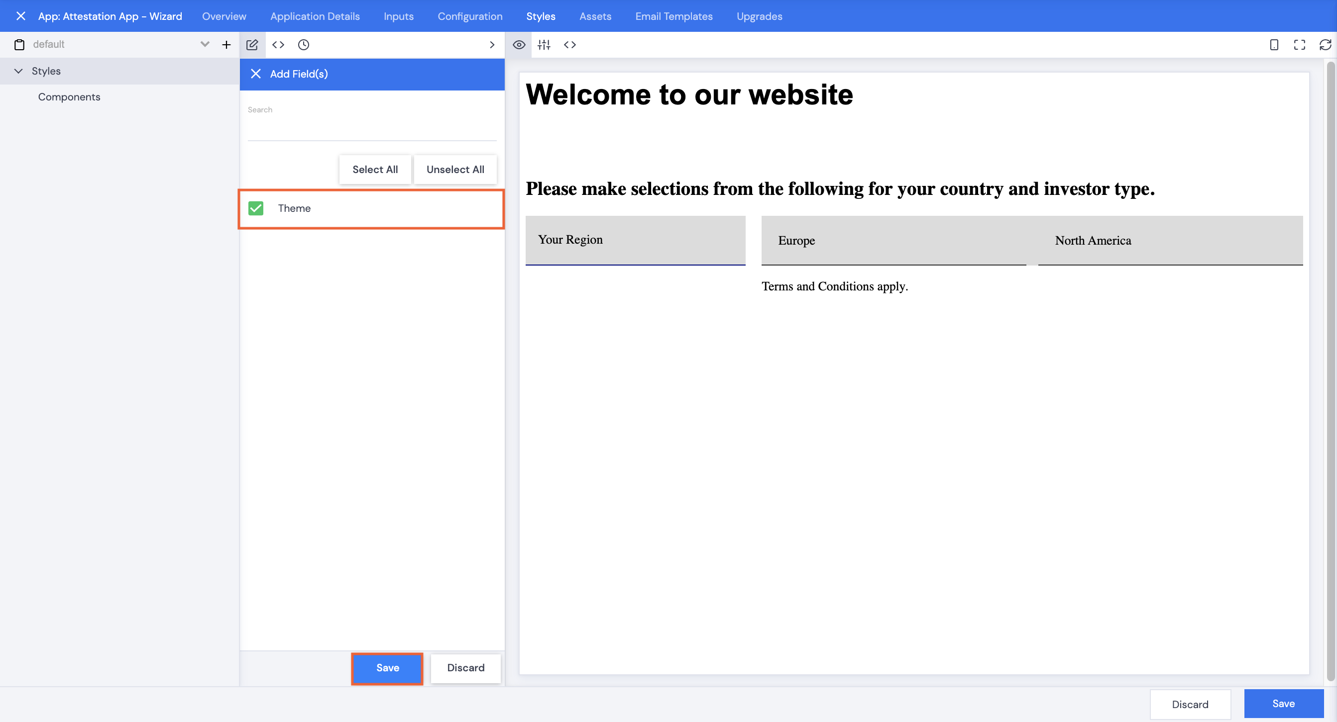
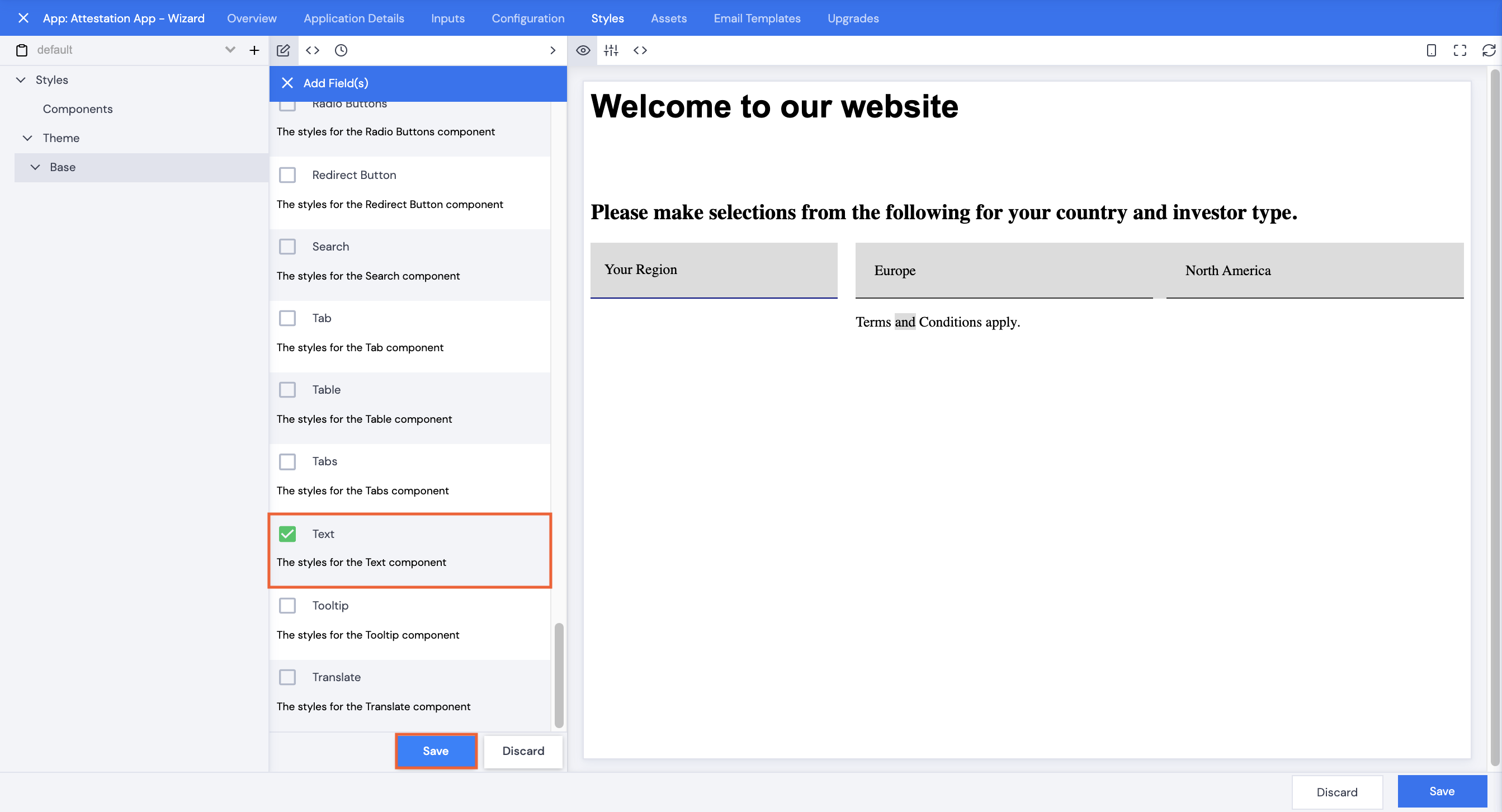
- Scroll or search to select Align, Background, Border, Cursor, Display, Height and Width, then click Save.
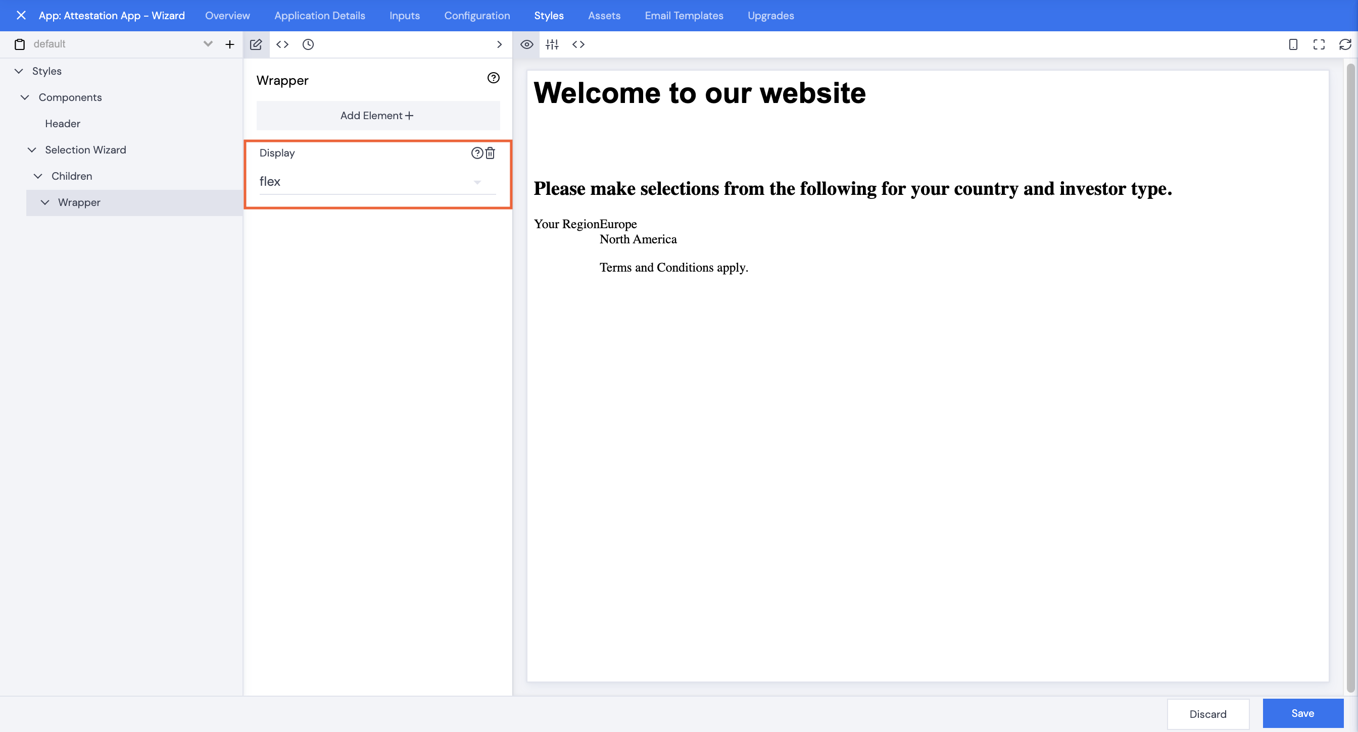
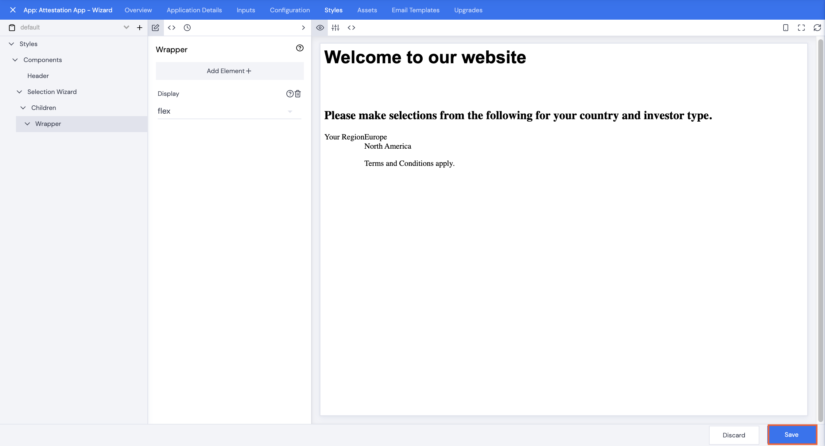
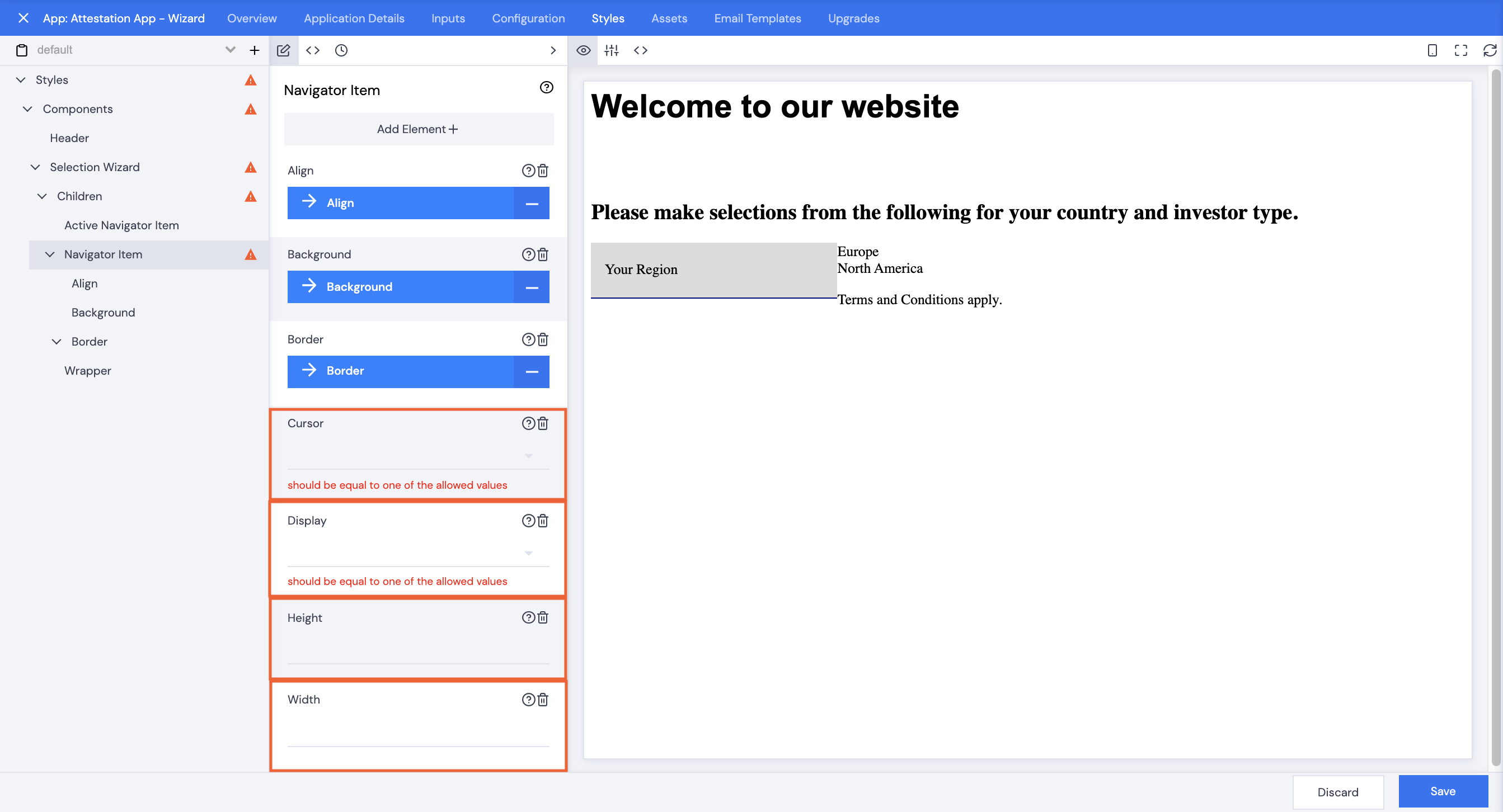
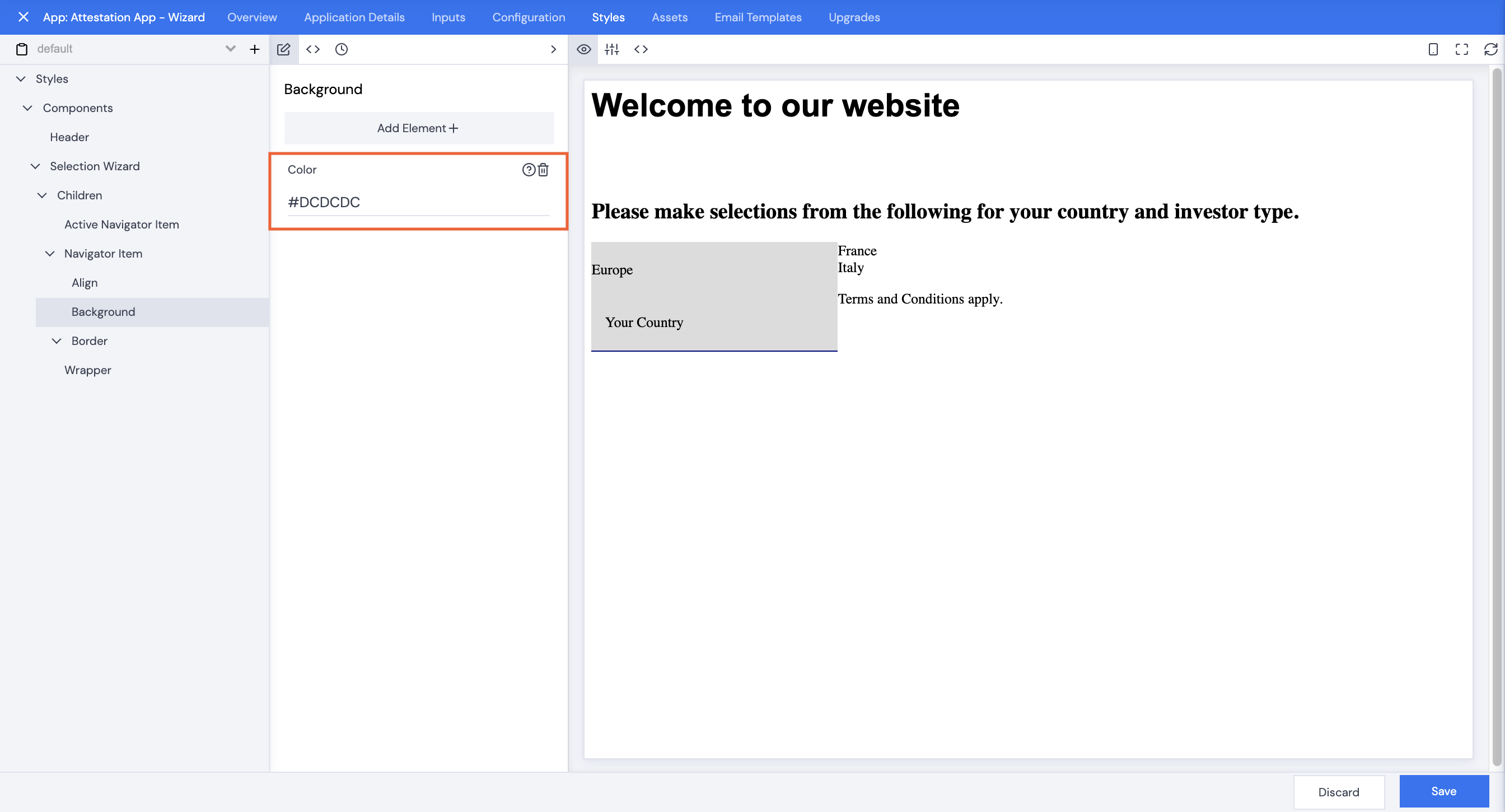
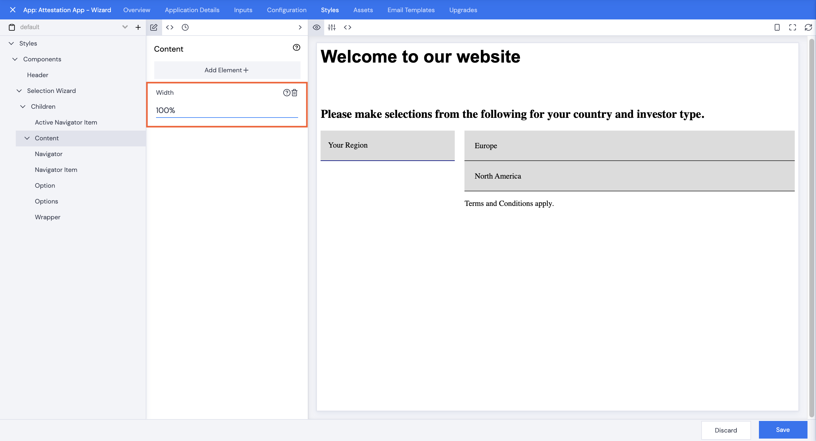
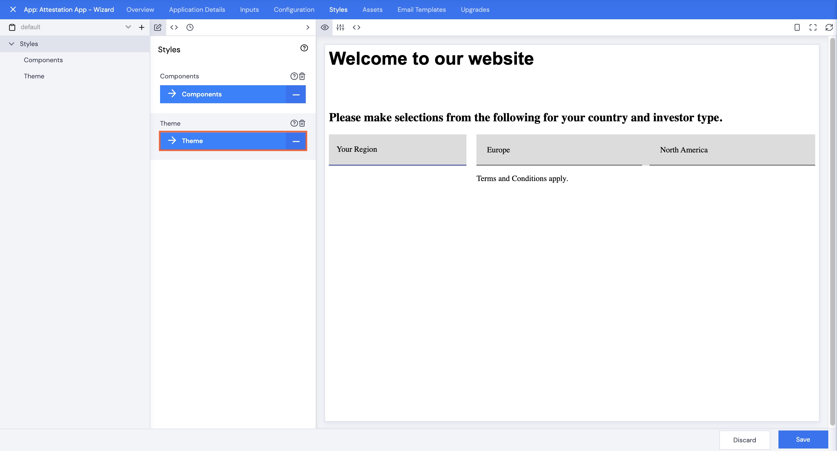
- Set Cursor to Pointer, Display to flex, Height to (match the Active Navigator Height) 60px, Width to 100%.
(Select one of the region options so that you can see the effect your styling has. Keep reselecting this as you continue styling.)