

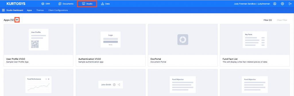
Add a new App
Click the Studio tab, then click + to add a new application.
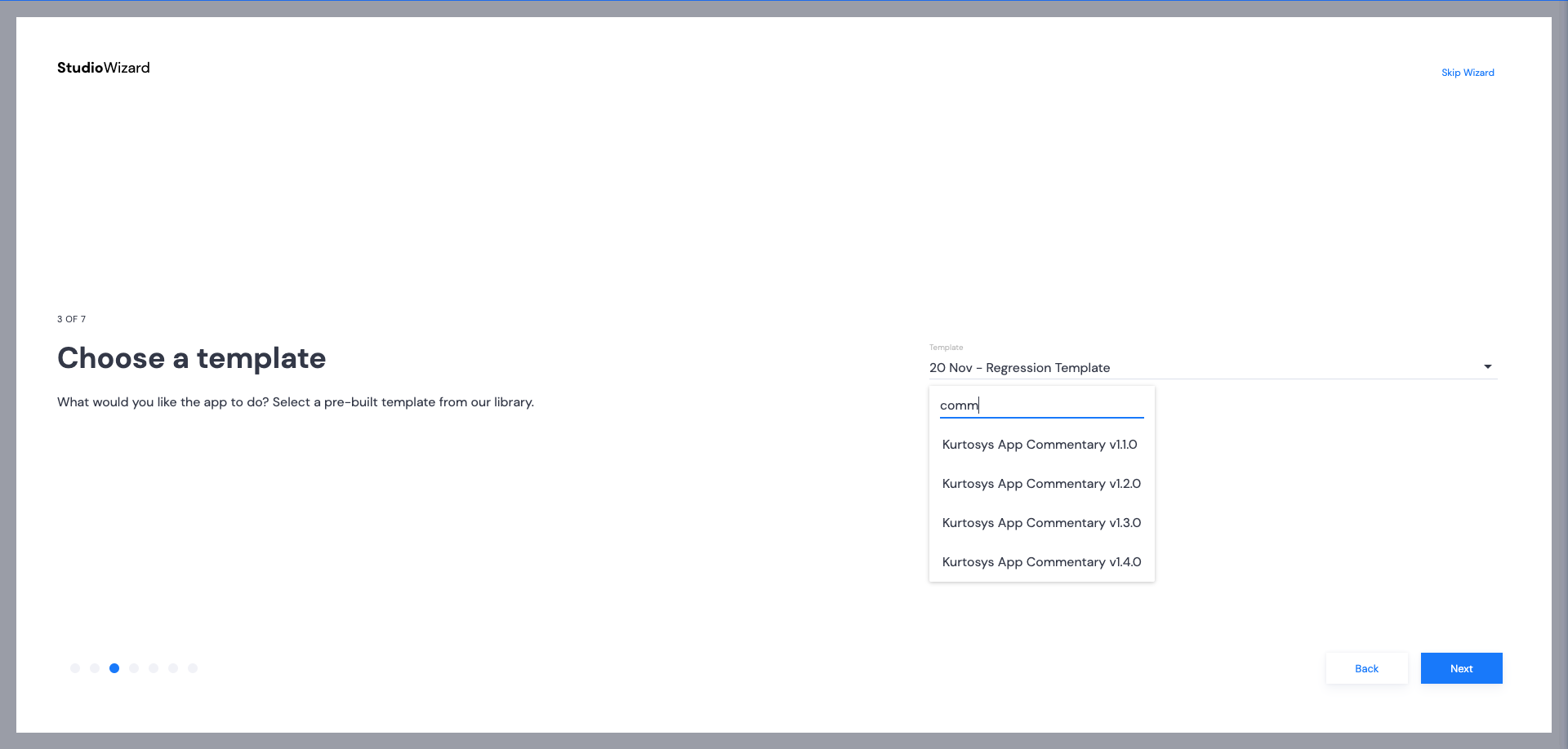
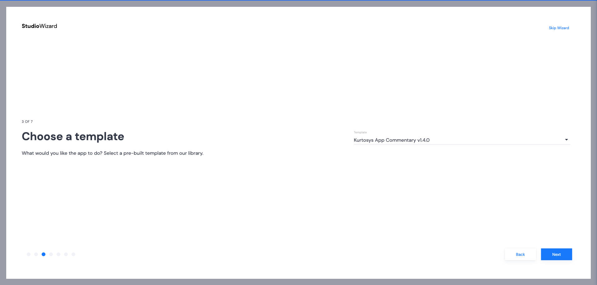
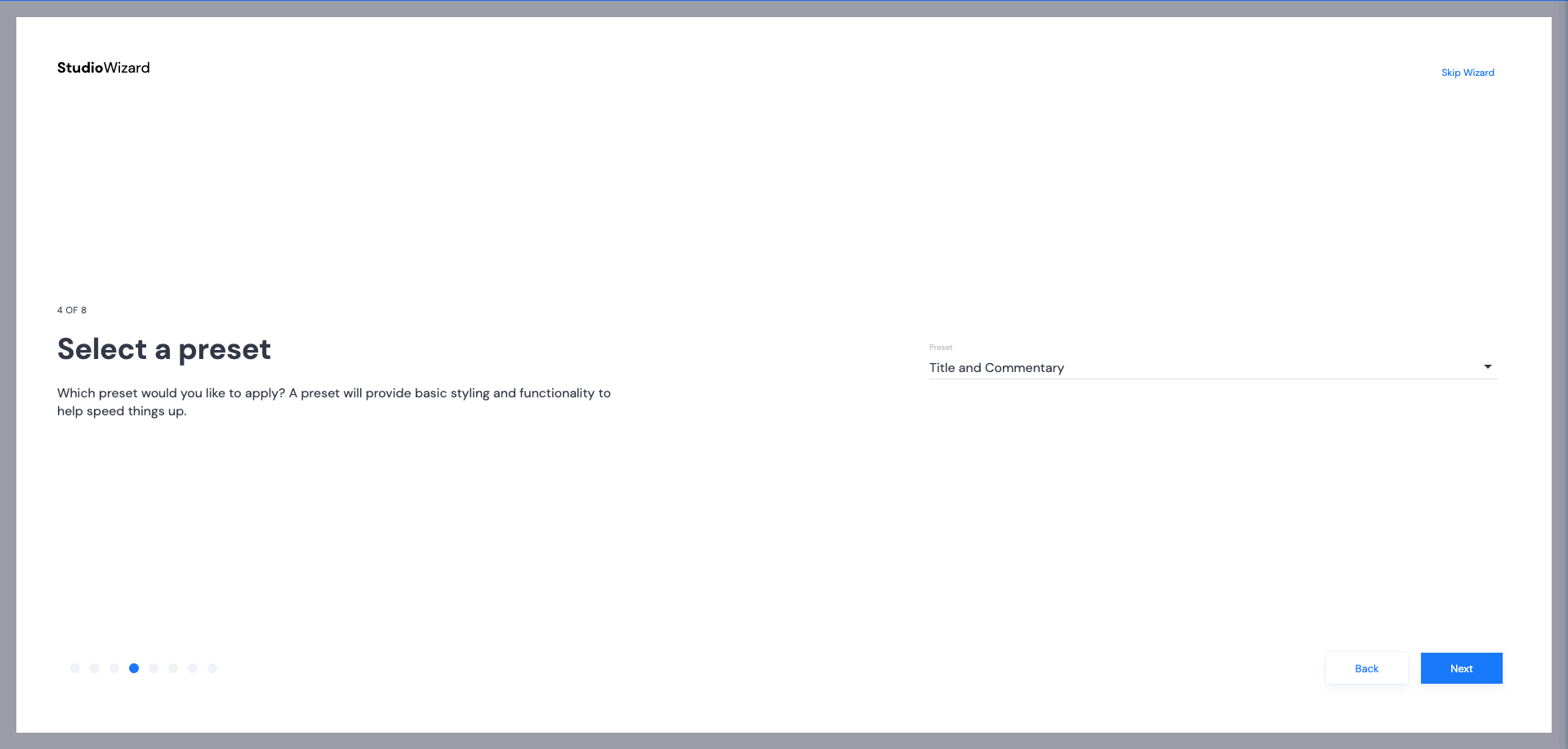
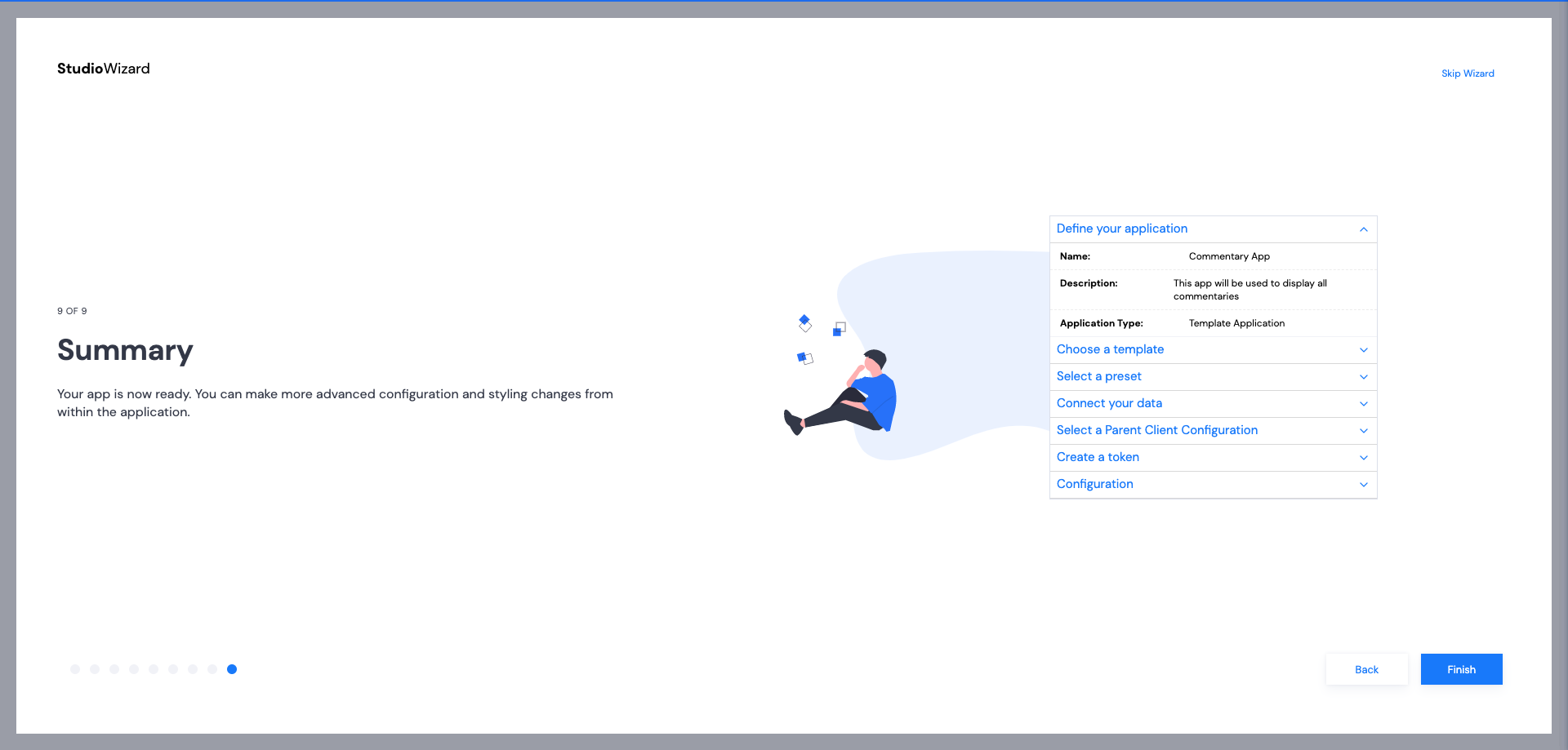
Studio Wizard
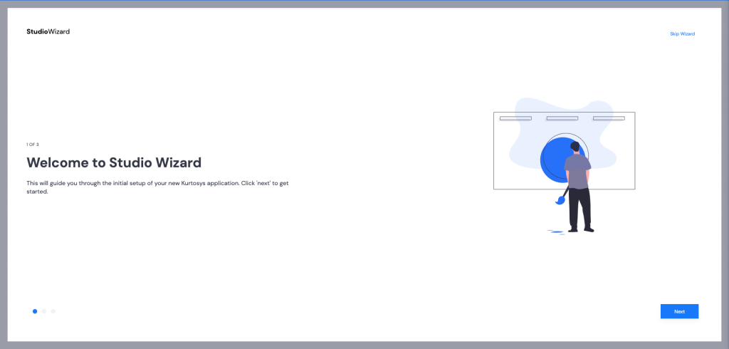
- Click Next to start the Studio Wizard.
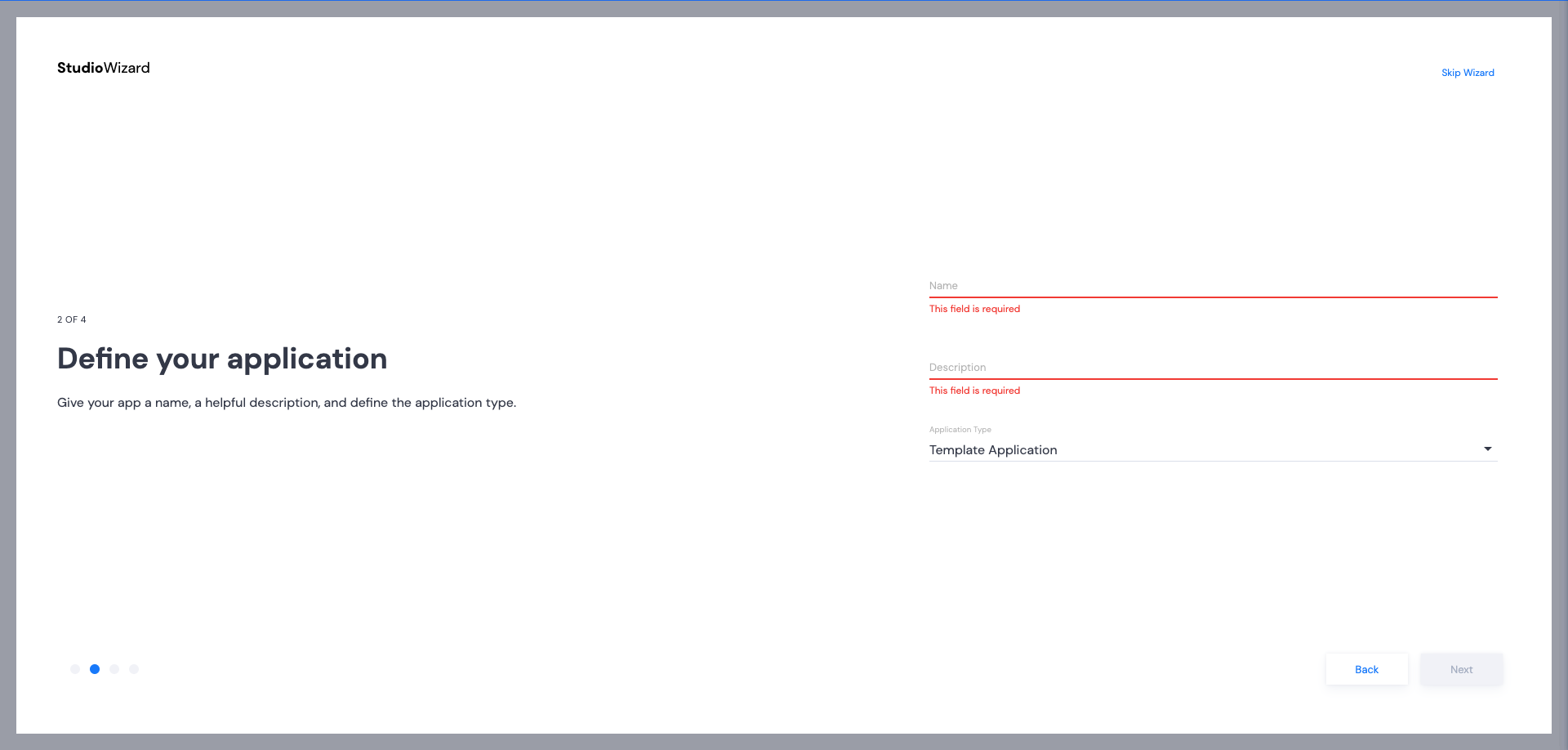
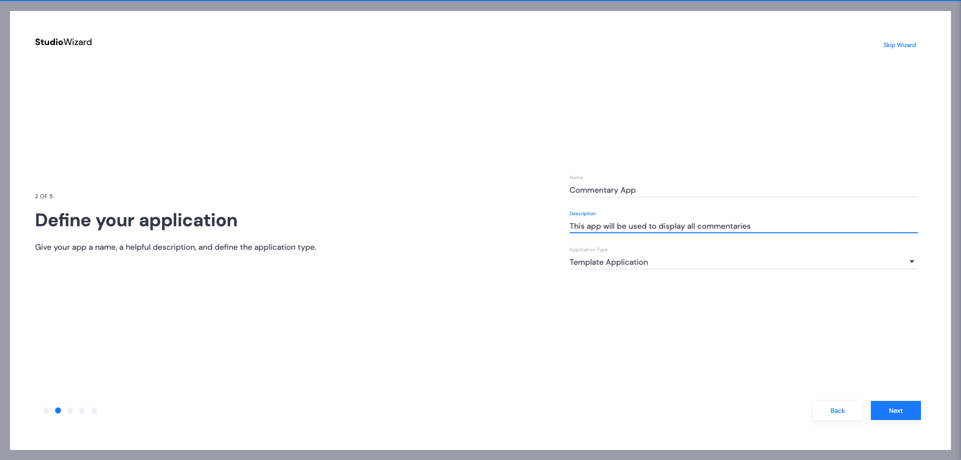
- Provide a name and description for your app. Once these items have been filled, the Next button will become active. Click Next.
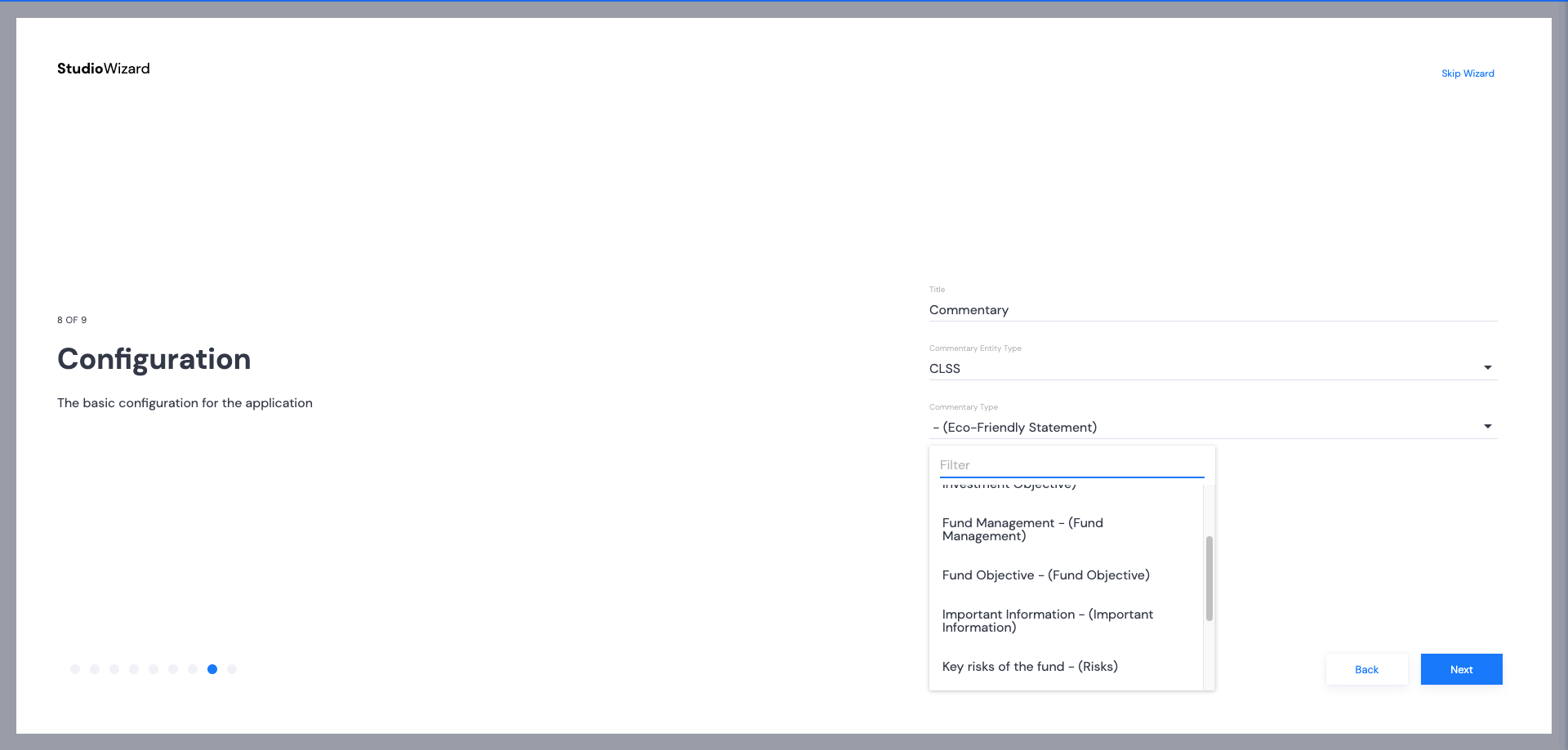
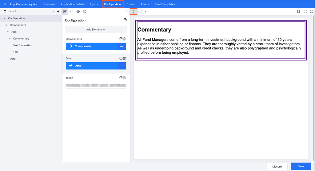
Configuration
Preview
Click the Configuration tab, and make sure the Preview button is selected.
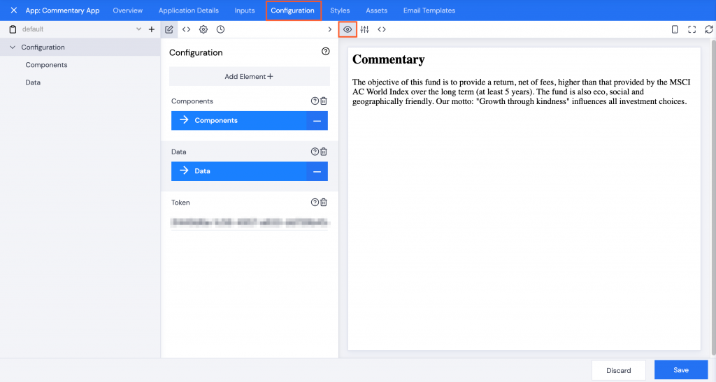
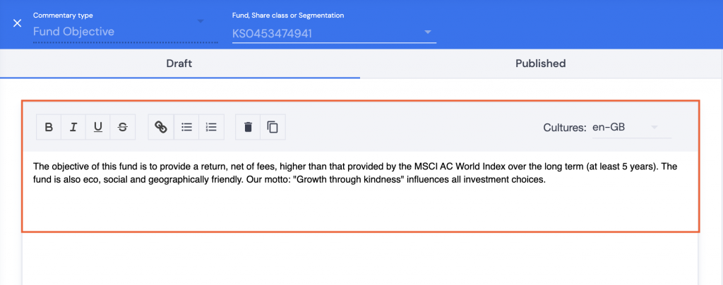
The Commentary Type that was selected while building the app using the Wizard will be displayed.
Note: Some commentaries are linked to specific ISIN codes, input values may need to be updated to see the selected commentary.
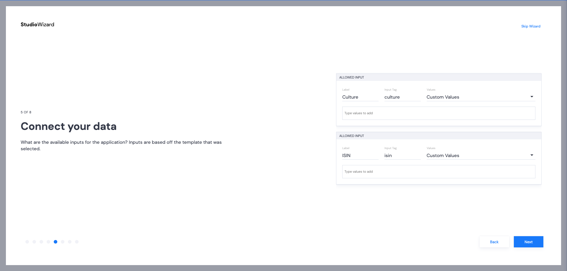
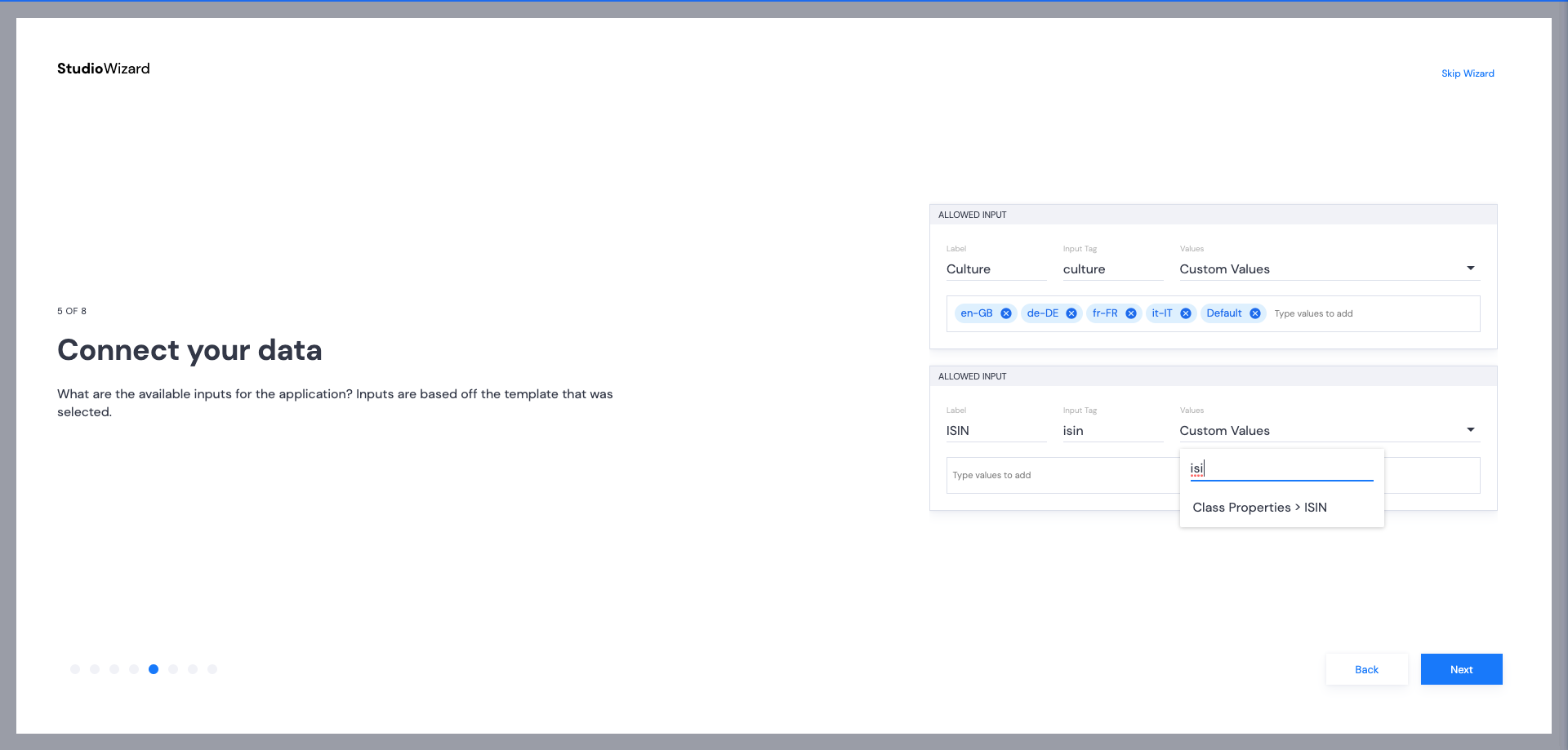
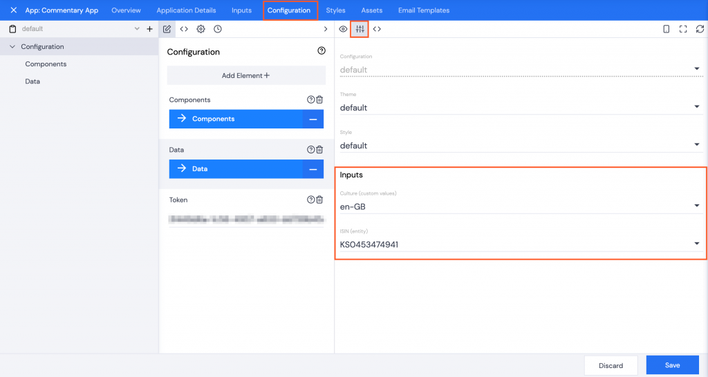
Inputs
Click the Inputs button, select the appropriate Culture and ISIN to ensure the commentary displays correctly.
You may need to check Data | Commentaries for this information.
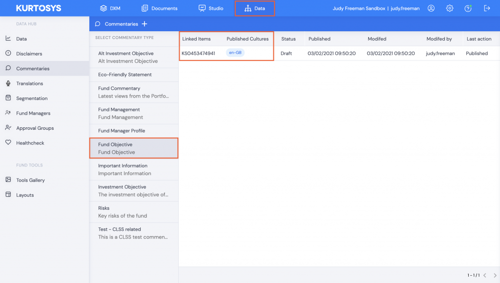
You may also need to confirm that the commentary you are testing has published text.
In Configuration | Inputs Use the dropdown arrow next Culture and ISIN to change your selection to match the information in Data.
JSON
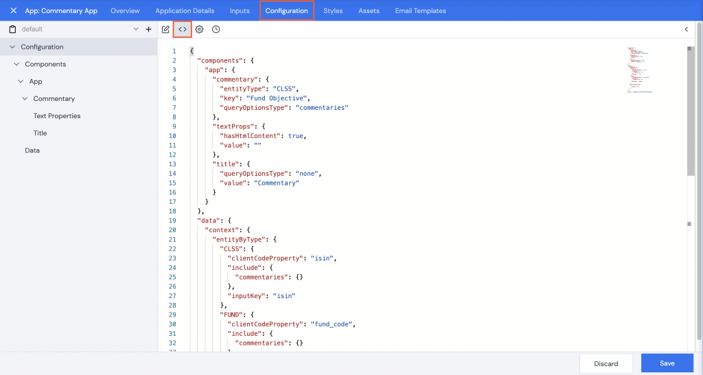
Click the JSON button to make any amendments to the input key or other values using the JSON code.
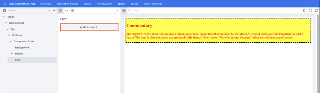
Styles
Click the Styles tab to add some styling to the app.
Note: It is only necessary to add styles to an app if it is not using the client's general styling Theme.
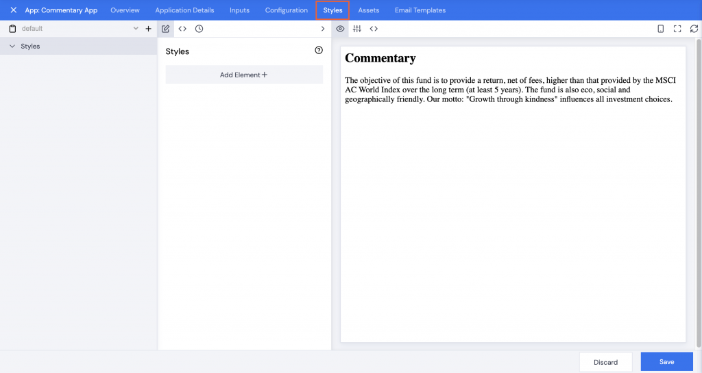
Styles can be added either by clicking the <> JSON icon and then copying and pasting a JSON file into the editor or using the UI and adding Style elements.
Using the UI:
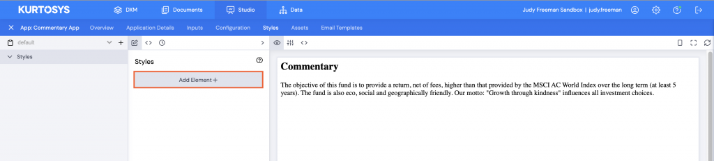
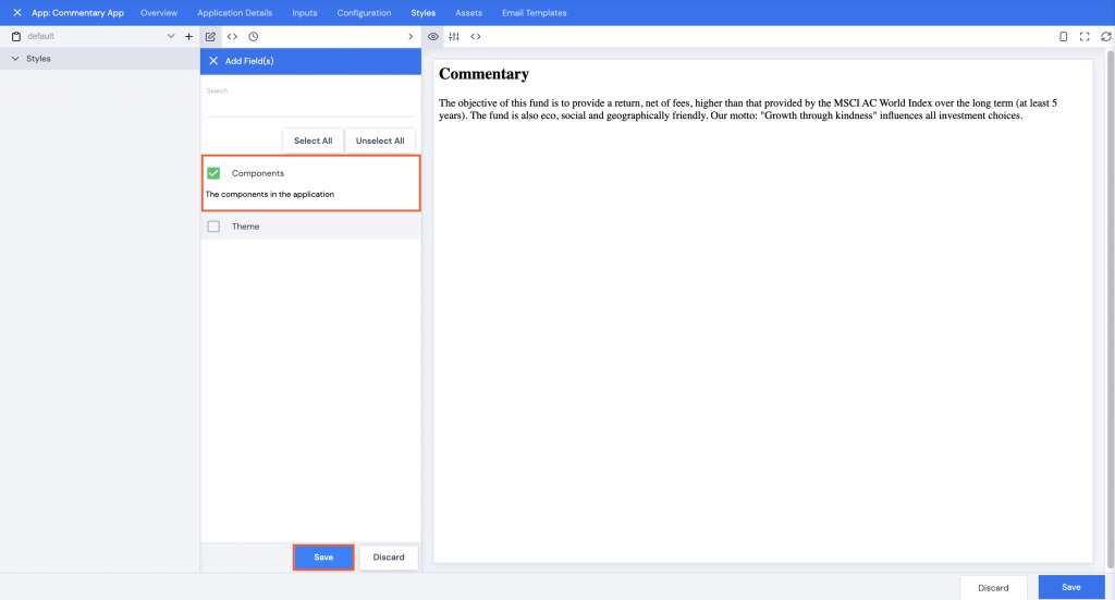
- Click Add Element+.
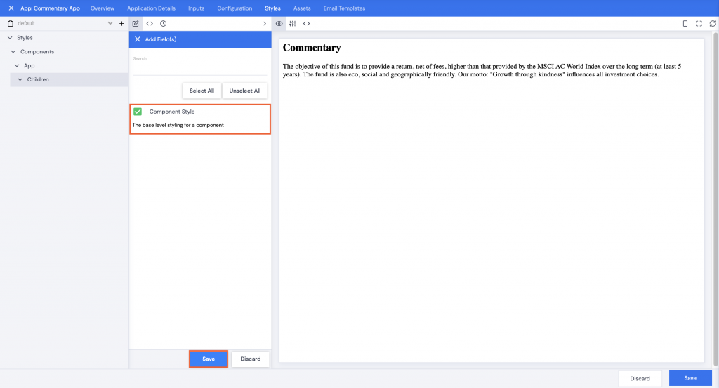
- Check the checkbox next to Components.
- Click Save.
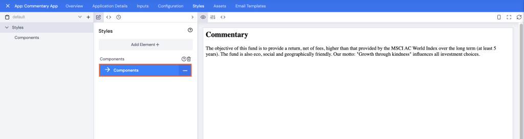
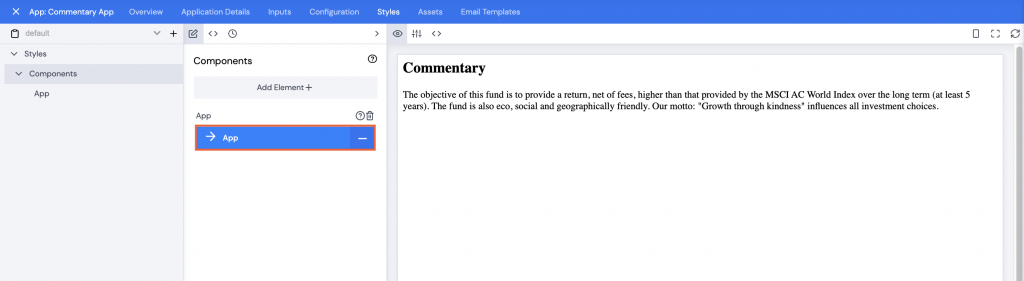
- Click Components.
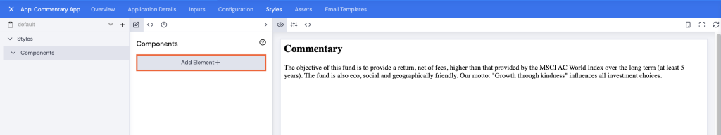
- Click Add Element+.
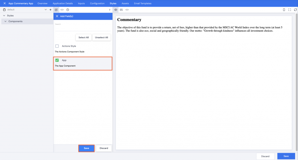
- Check the checkbox next to App.
- Click Save.
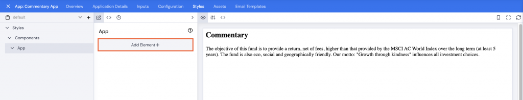
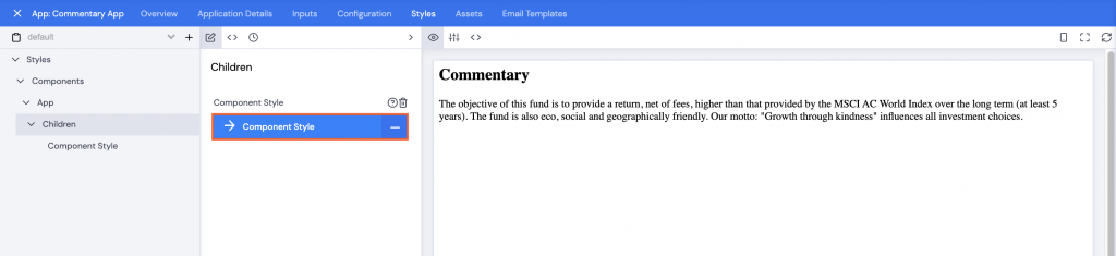
- Click App.
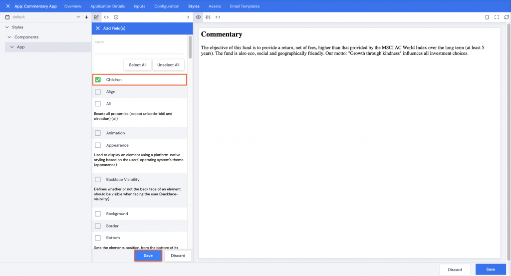
- Click Add Element+.
- Only check the checkbox next to Children.
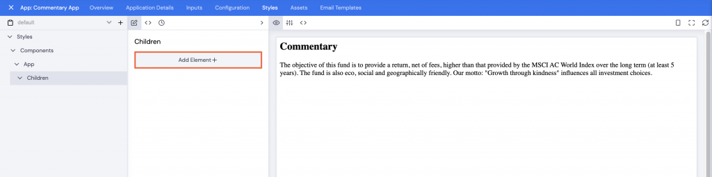
- Click Save.
- Click Add Element+.
- Check the checkbox next to Component Style.
- Click Save.
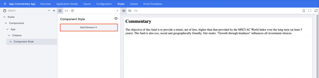
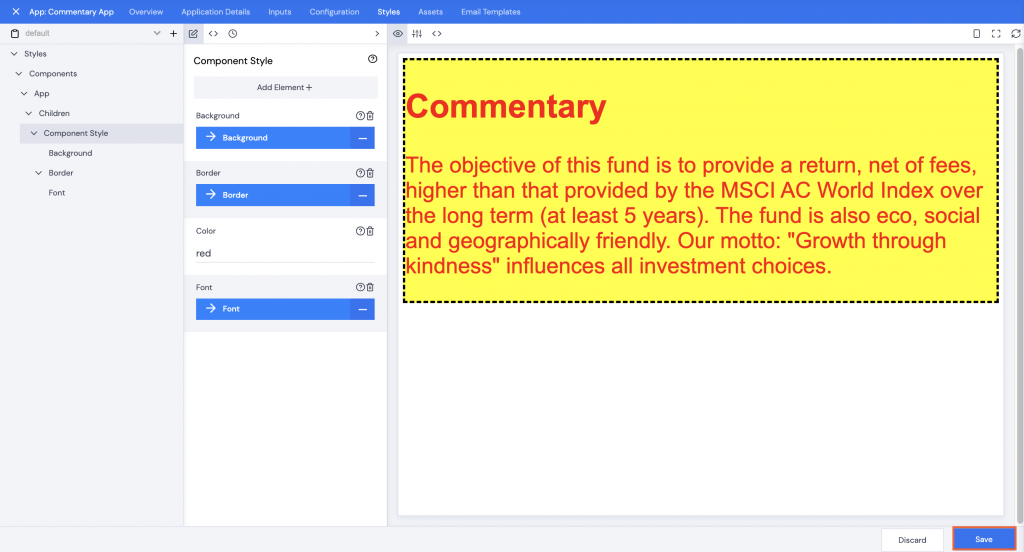
- Click Component Style.
- Click Add Element+.
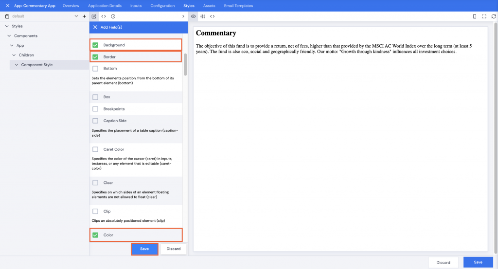
In the next menu, you can make changes font style, color, size, etc.
- For example, scroll down to select Background, Border, and Color.
- Click Save.
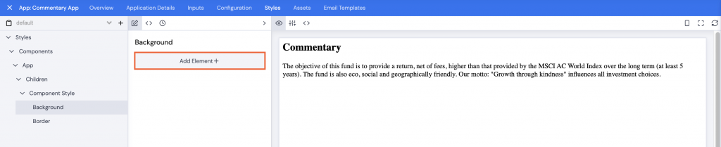
- Click Background.
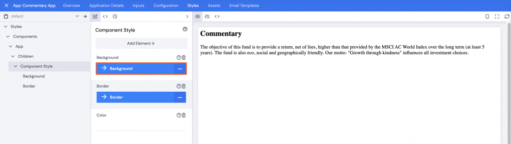
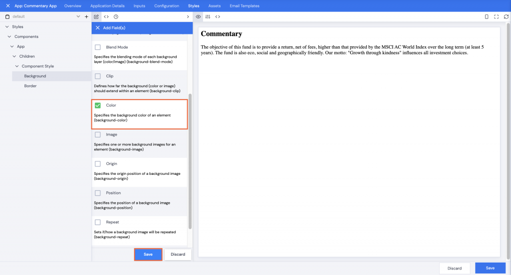
- Click Add Element+.
- Check the Checkbox next to Color.
- Click Save.
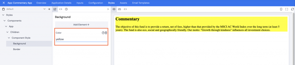
- Type in a color name or code, e.g. yellow, in the Color field. The background immediately updates to the selected color.
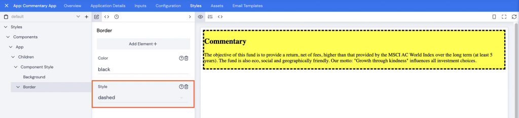
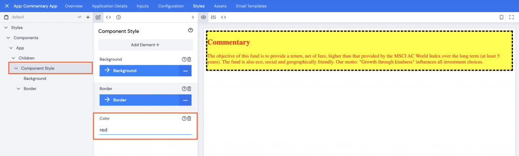
- Click Component Style in the left navigation pane.
- Click Border.
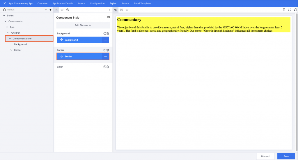
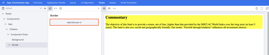
- Click Add Element+.
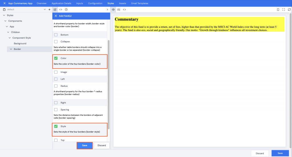
- Check the checkboxes next to Color and Style.
- Click Save.
- Type in a color name or code, e.g. black, in the Color field.
- Click Style, a dropdown list of options will display.
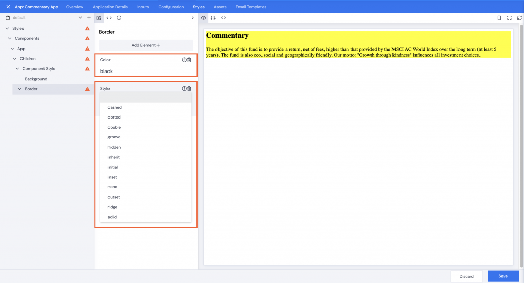
- Click to select, the border will be added immediately.
- Click Component Style in the left navigation pane.
- Type a color name or code in the Color field. The commentary text color will update immediately.
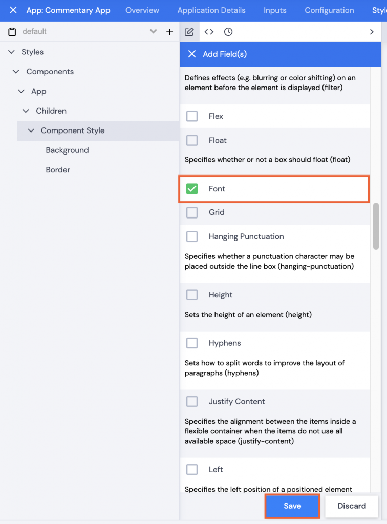
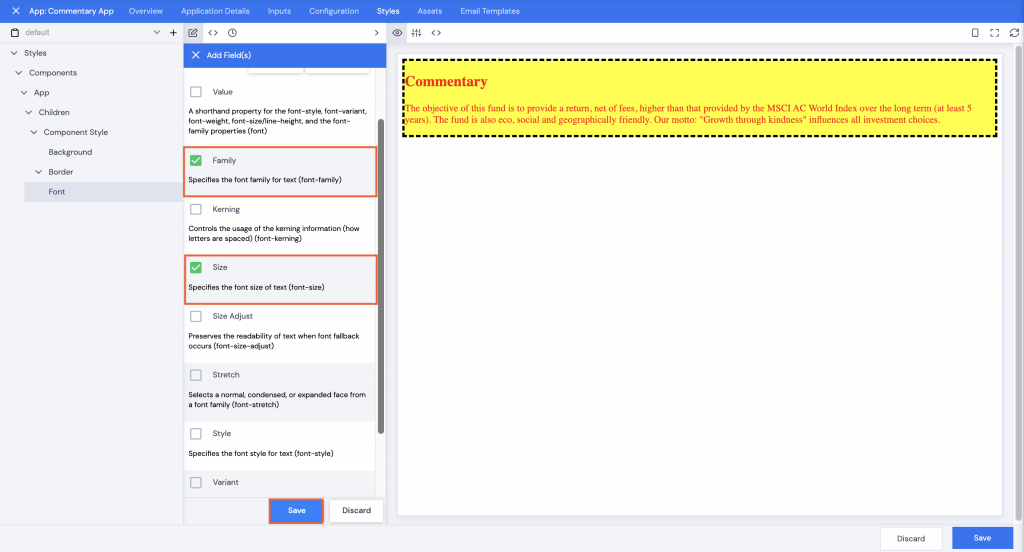
- Click Add Element+ under Component Style.
- Check the checkbox next to Font.
- Click Save.
- Click Font.
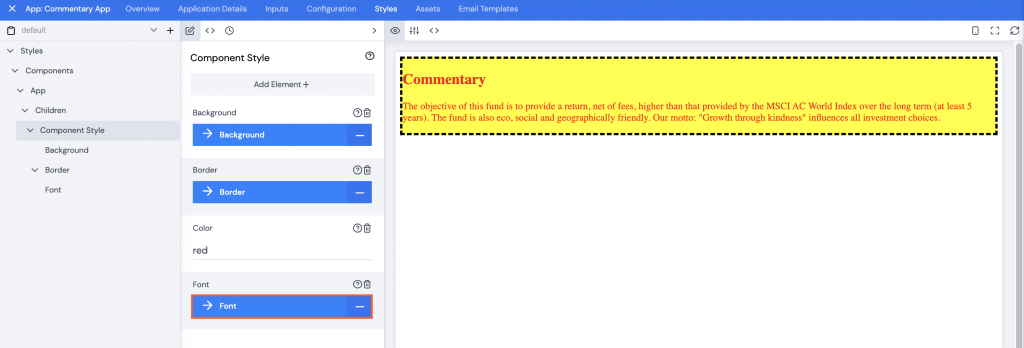
- Click Add Element+.
- Check the checkboxes next to Family and Size.
- Click Save.
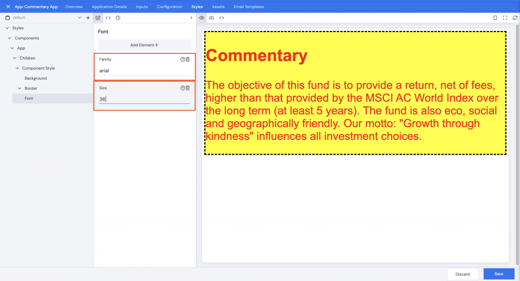
- Type in a font style in the Family field.
- Type in a font size in the Size field.
The text will update immediately.
- When all styling is complete, click Save.
- Add a comment, then click Confirm.
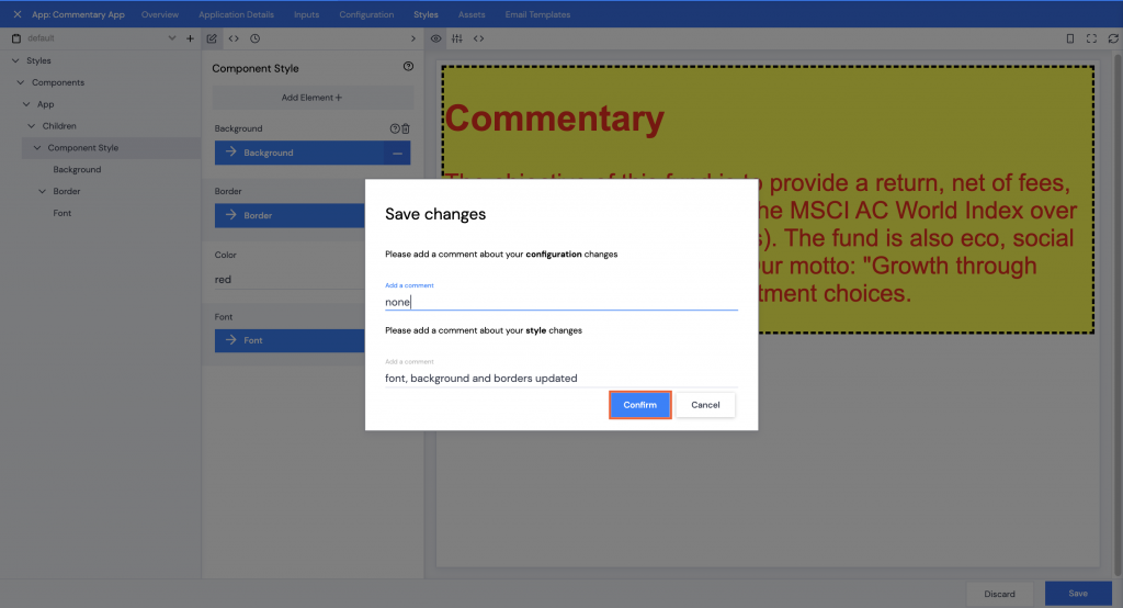
A green Saved! pop up bar will display across the bottom of the screen.
Adding a JSON Style file:
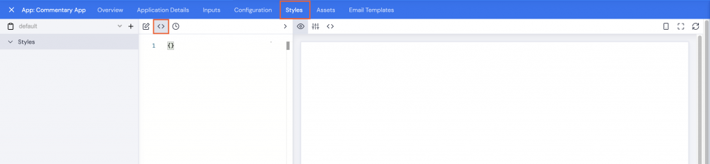
- Click the Styles tab.
- Click the <> JSON icon.
- Then Copy and Paste the file below into the editor. Make sure to remove the empty curly brackets.
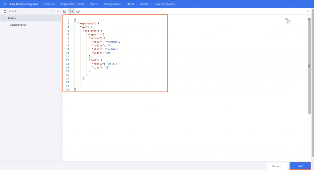
- Click Save.
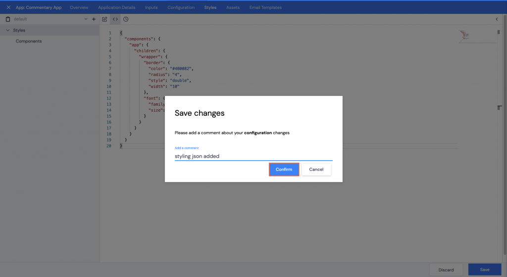
- Add a comment, then click Confirm.
A green Saved! pop up bar will display across the bottom of the screen.
- Click the Configuration tab again and make sure the Preview icon is selected. The commentary styles will be updated.