
Studio themes behave like global stylesheets for apps created in a particular client instance. The intention behind them is to make app designers’ lives easier so that instead of painstakingly setting up styling for every app – usually dozens per client – a global stylesheet or theme is used.
Themes are created according to customers’ requirements and specifications; font style, size, spacing, color palette, borders, alignment, kerning, etc. down to the finest detail. Multiple themes can be created and applied with styles overrides used where necessary, but the advantage of having a stylesheet where a global change can be made is priceless not only in terms of time needed to release an update but also in terms of the expense of making an update.
This enables consistency between web pages and post types, all commentaries will look the same if they’re using the same theme, all tables will look the same, etc. This creates a professional-looking website that is carefully branded with attention to detail in terms of marketing requirements, and look and feel.
Adding a new Theme
- Click the Studio tab.
- Click the Themes tab.
- Click + to add a new theme.
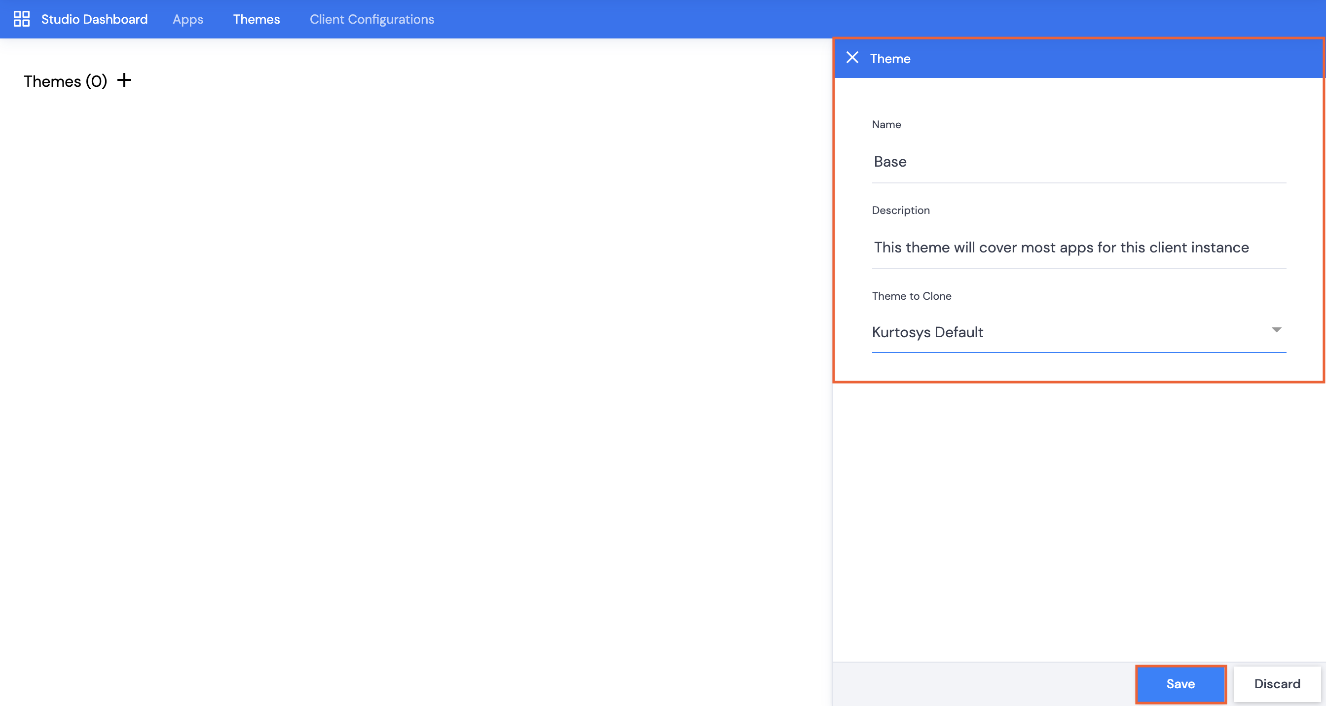
- Give the theme a Name, e.g. Base. This is a mandatory field.
- You can add a Description. This is not a mandatory field.
- Click Save.
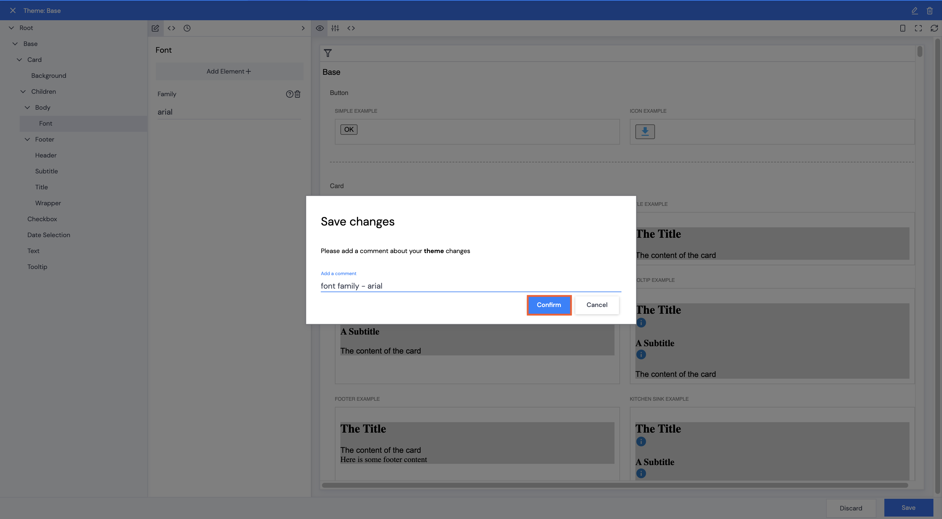
- Add a comment, then click Confirm.
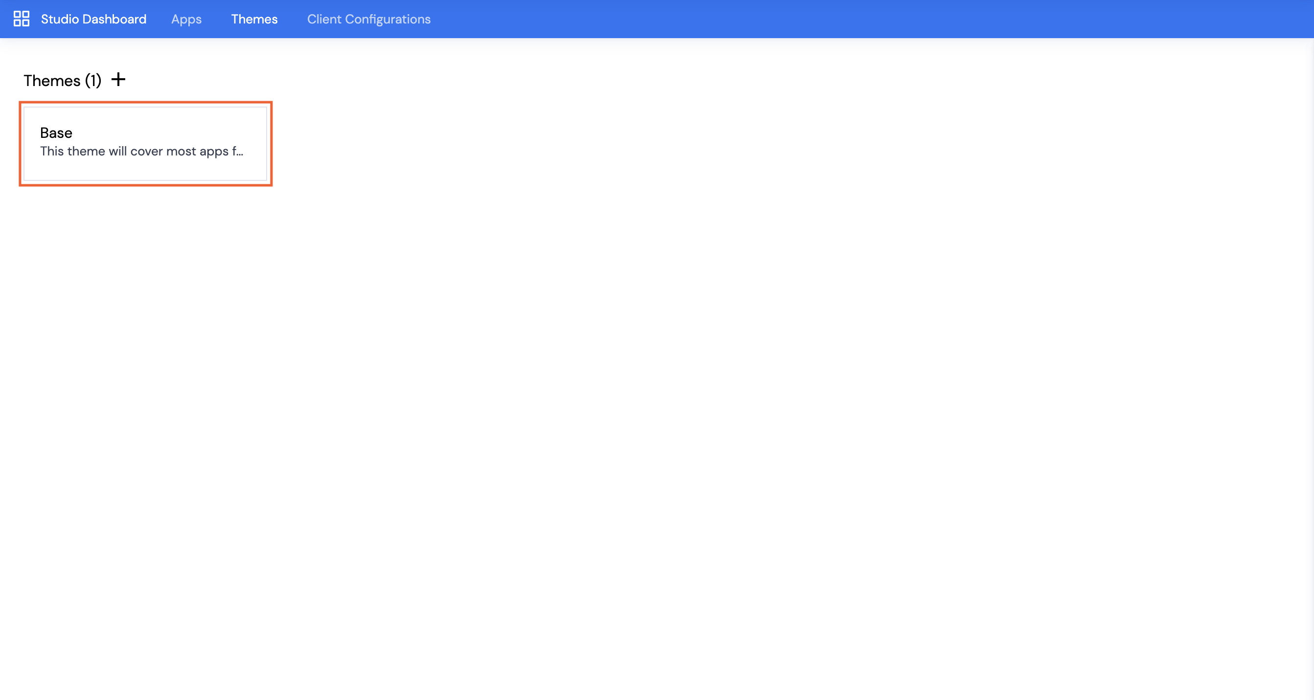
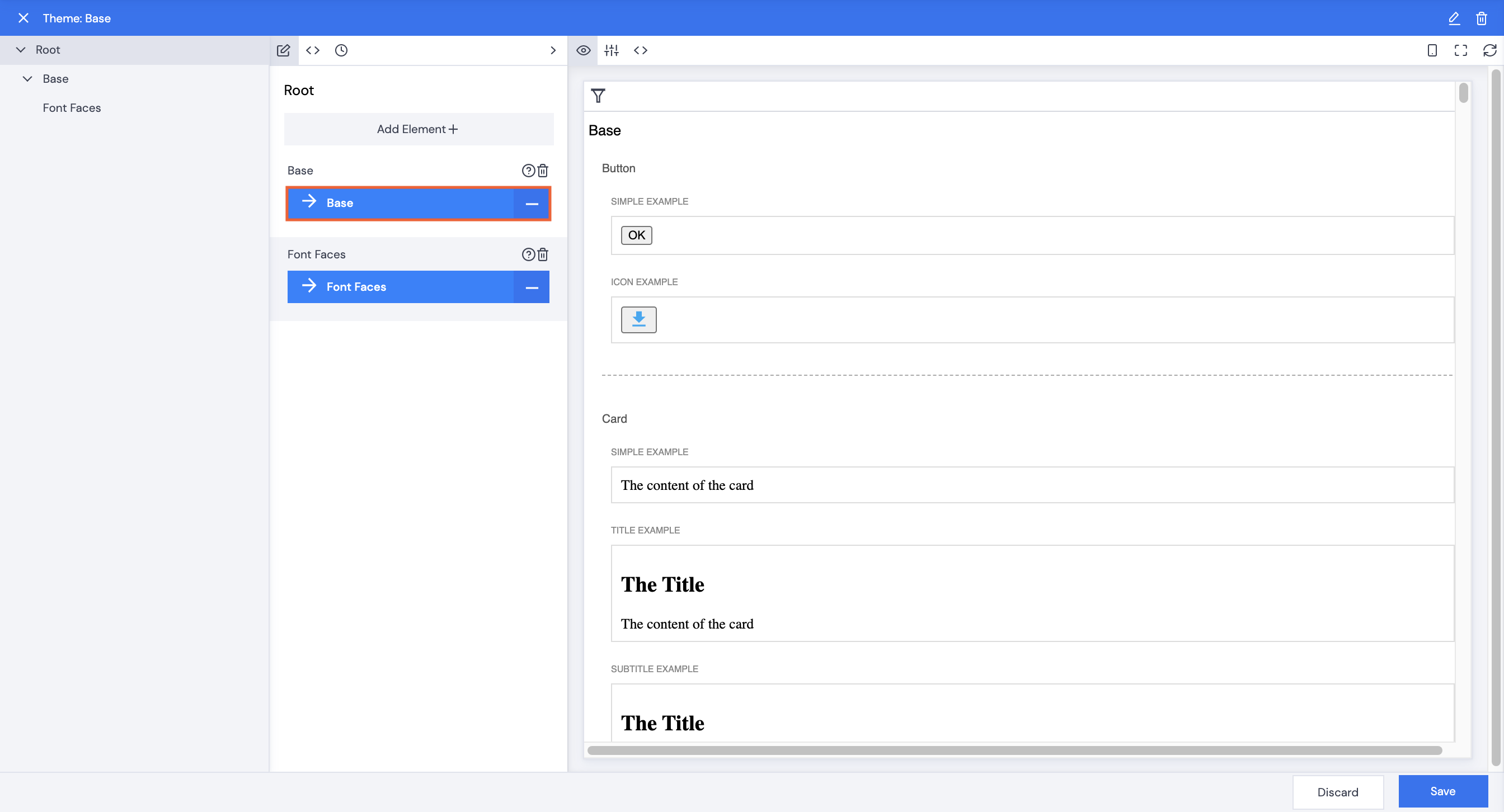
- Click Base (or whatever you have named your theme).
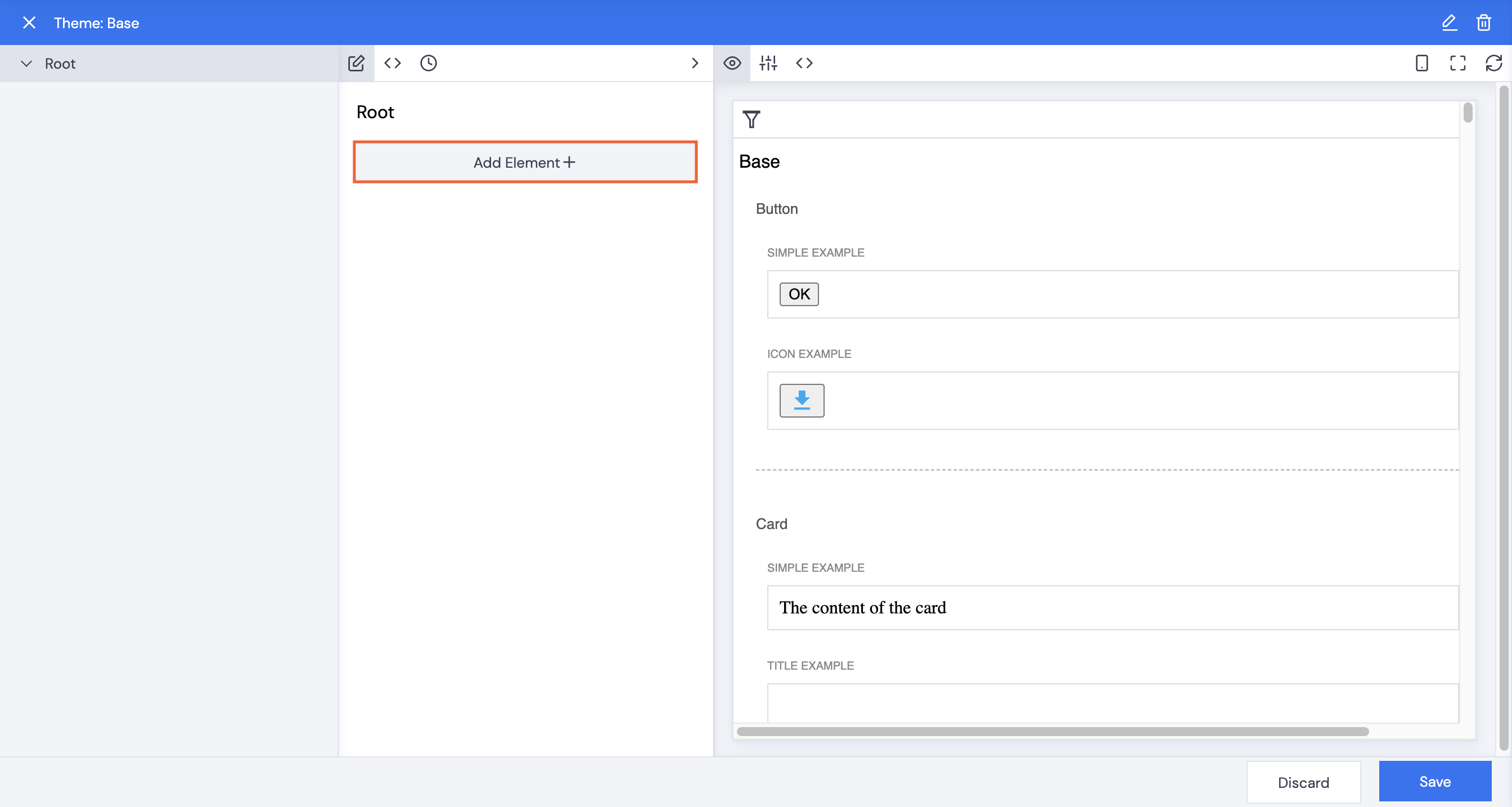
Theme Styling Examples
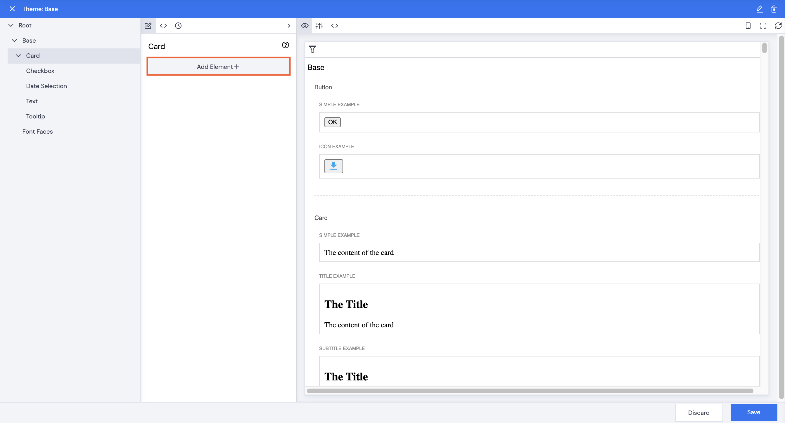
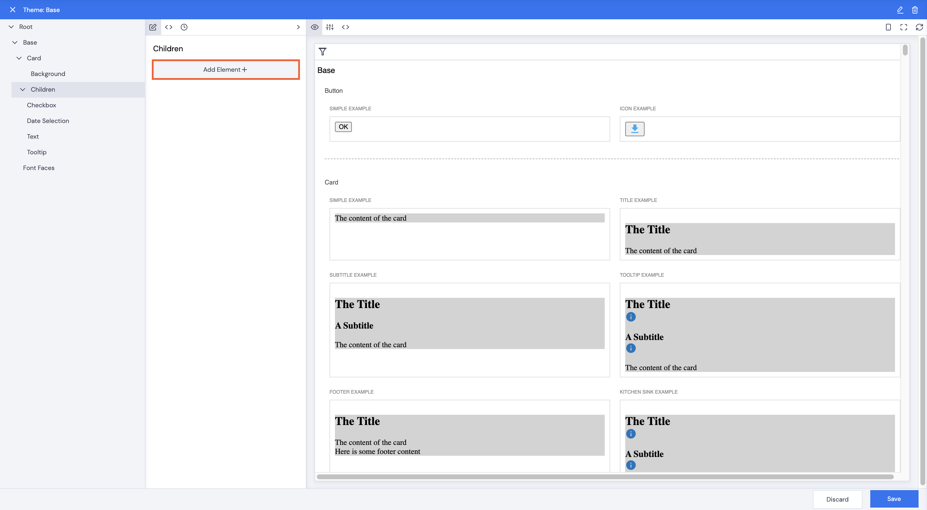
Card
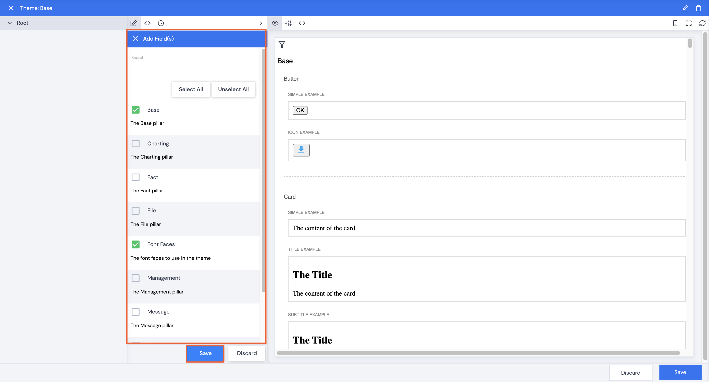
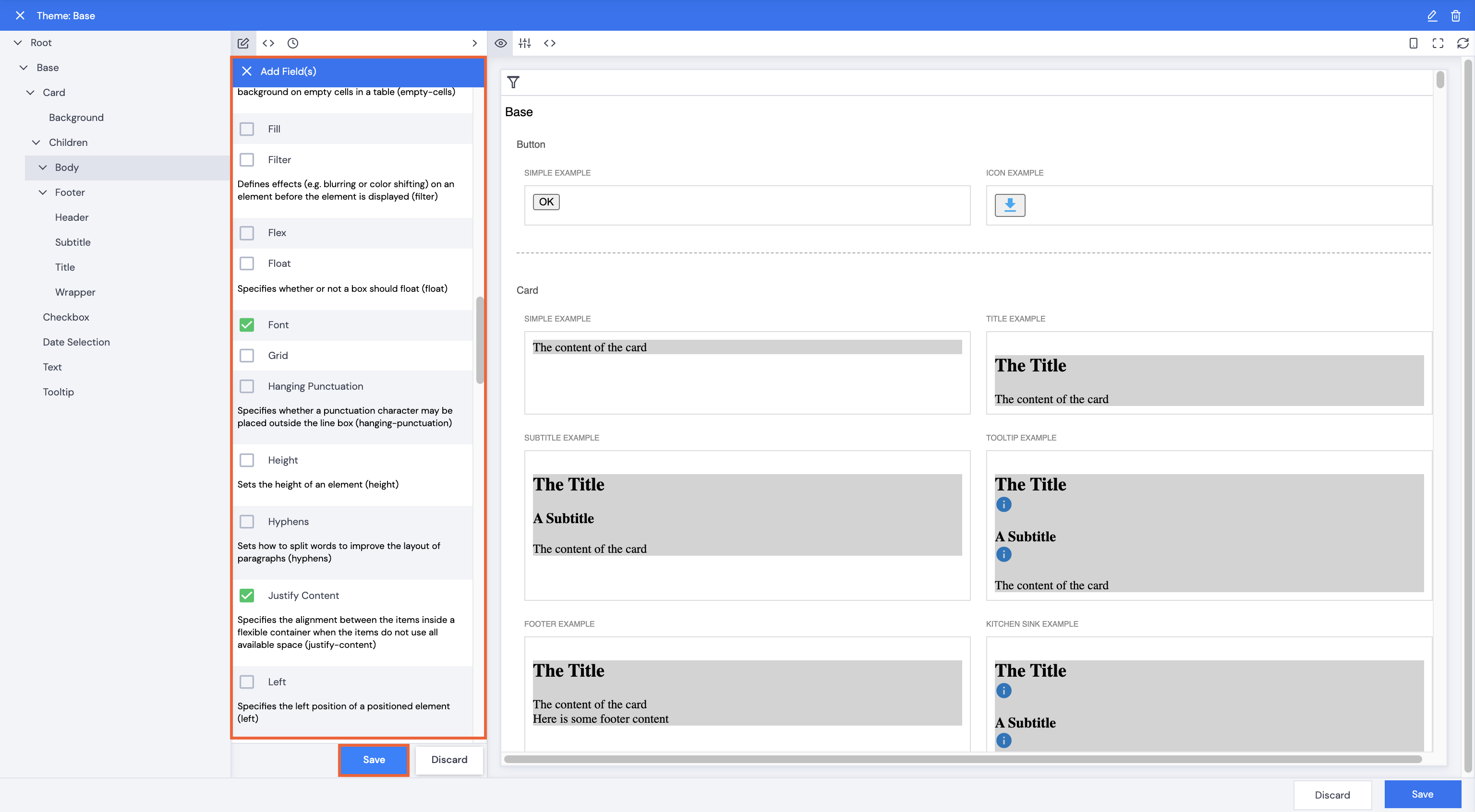
- Sample element styles will be displayed in the preview pane on the right, click Add Element+ to select elements to style.
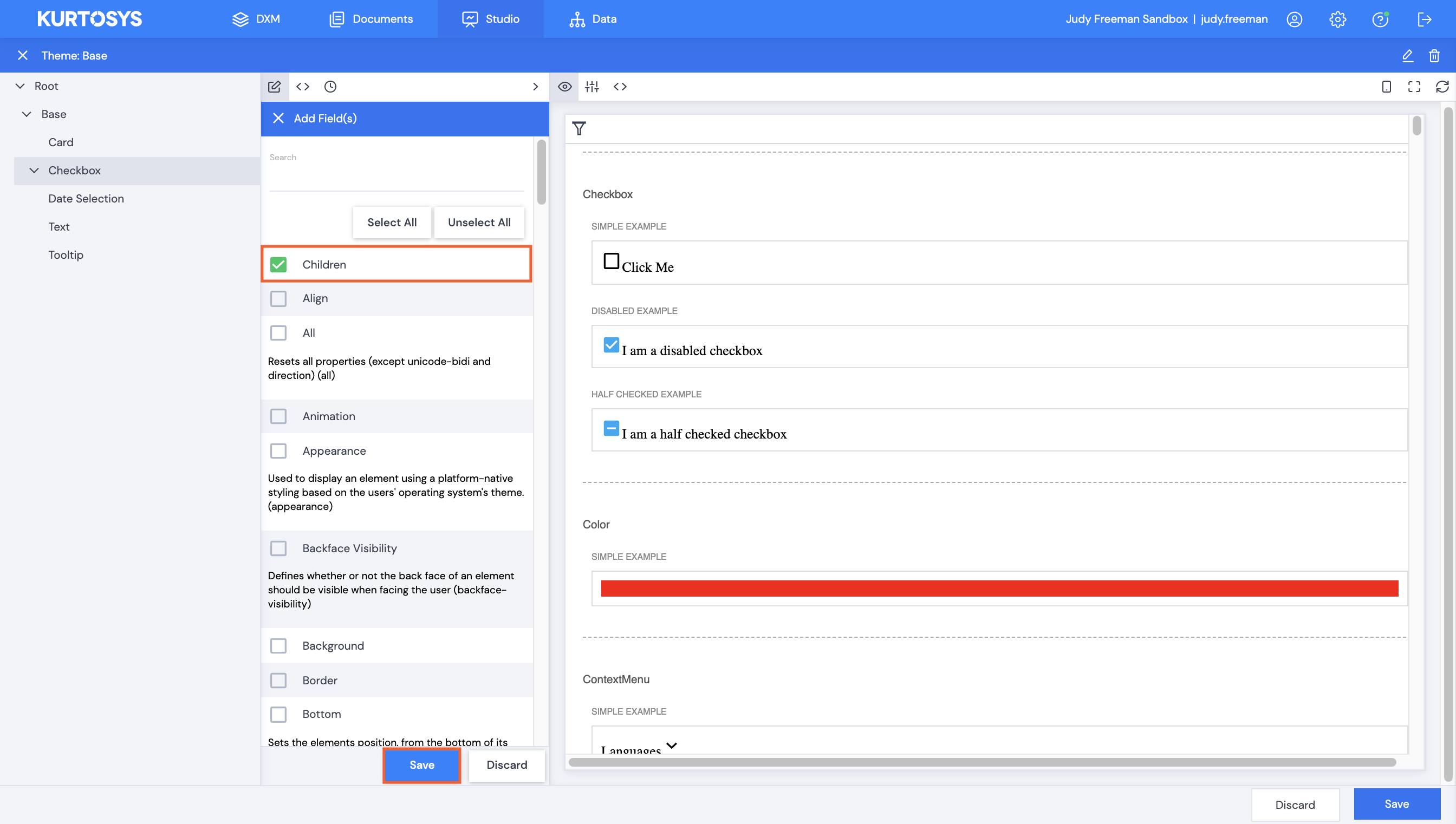
- Select fields from the list.
- Click Save.
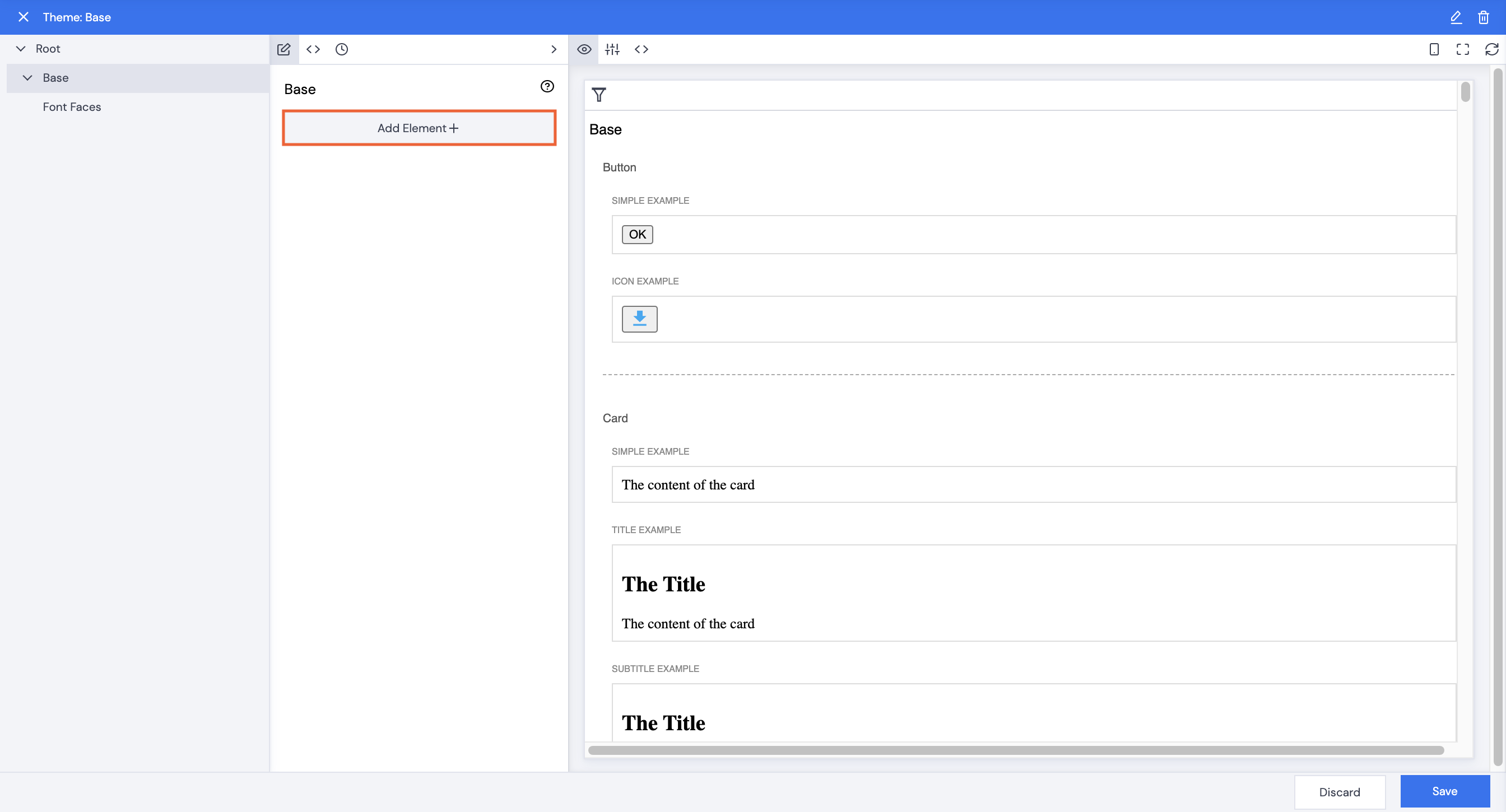
- Click Base.
- Click Add Element+.
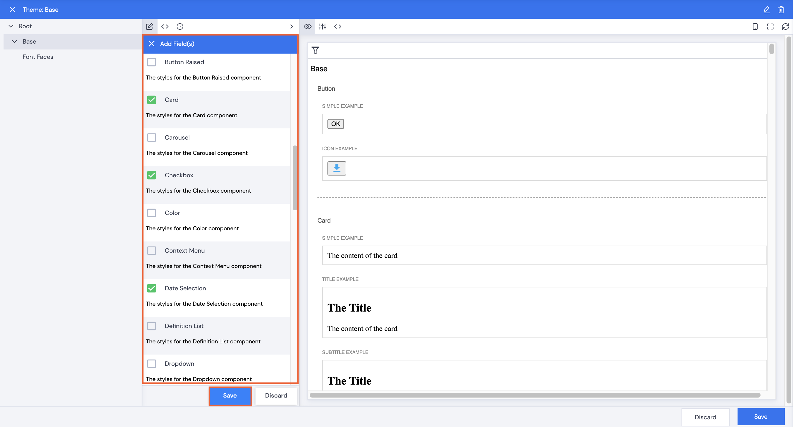
- Select fields to edit.
- Click Save.
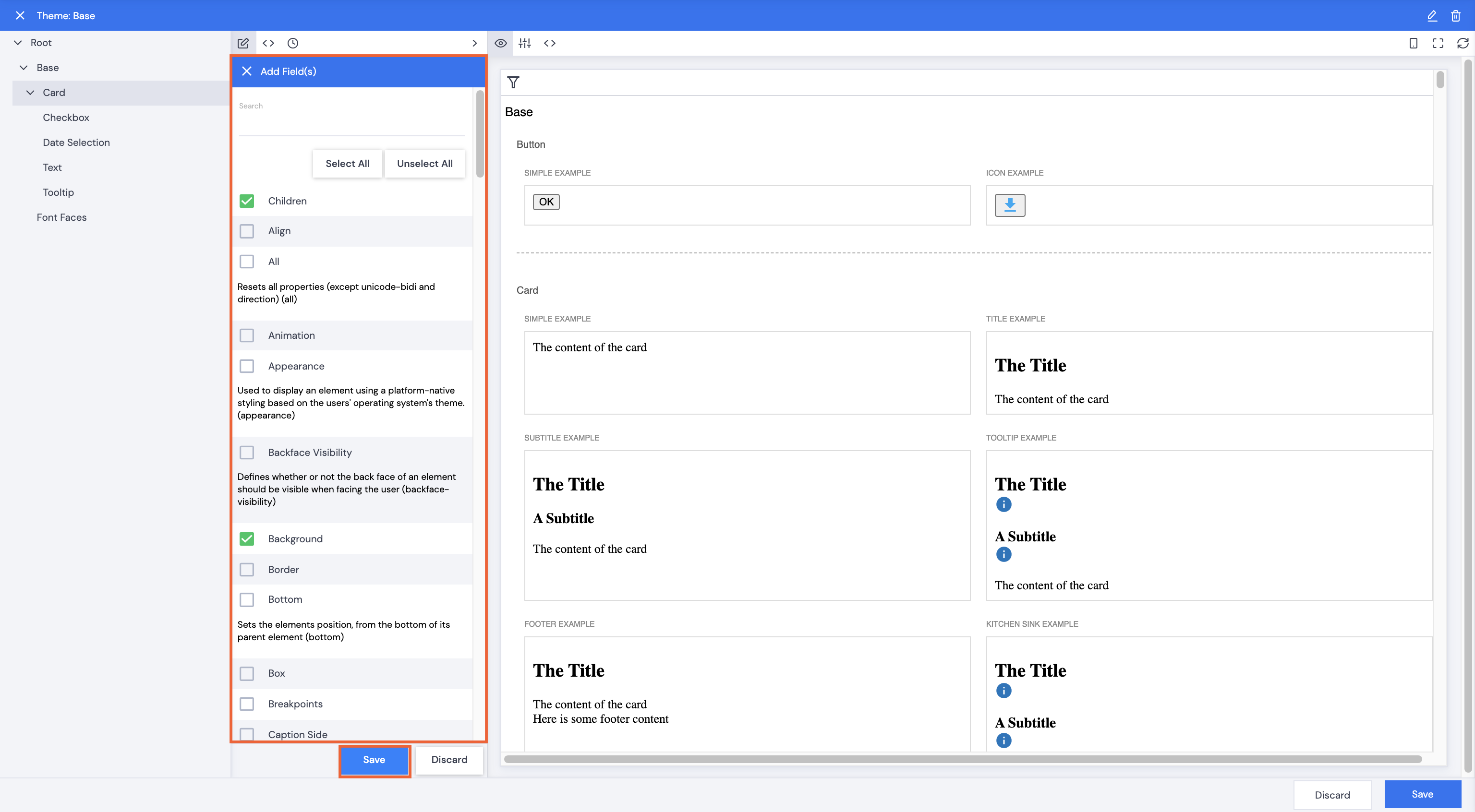
- Click one of the fields, e.g. Card.
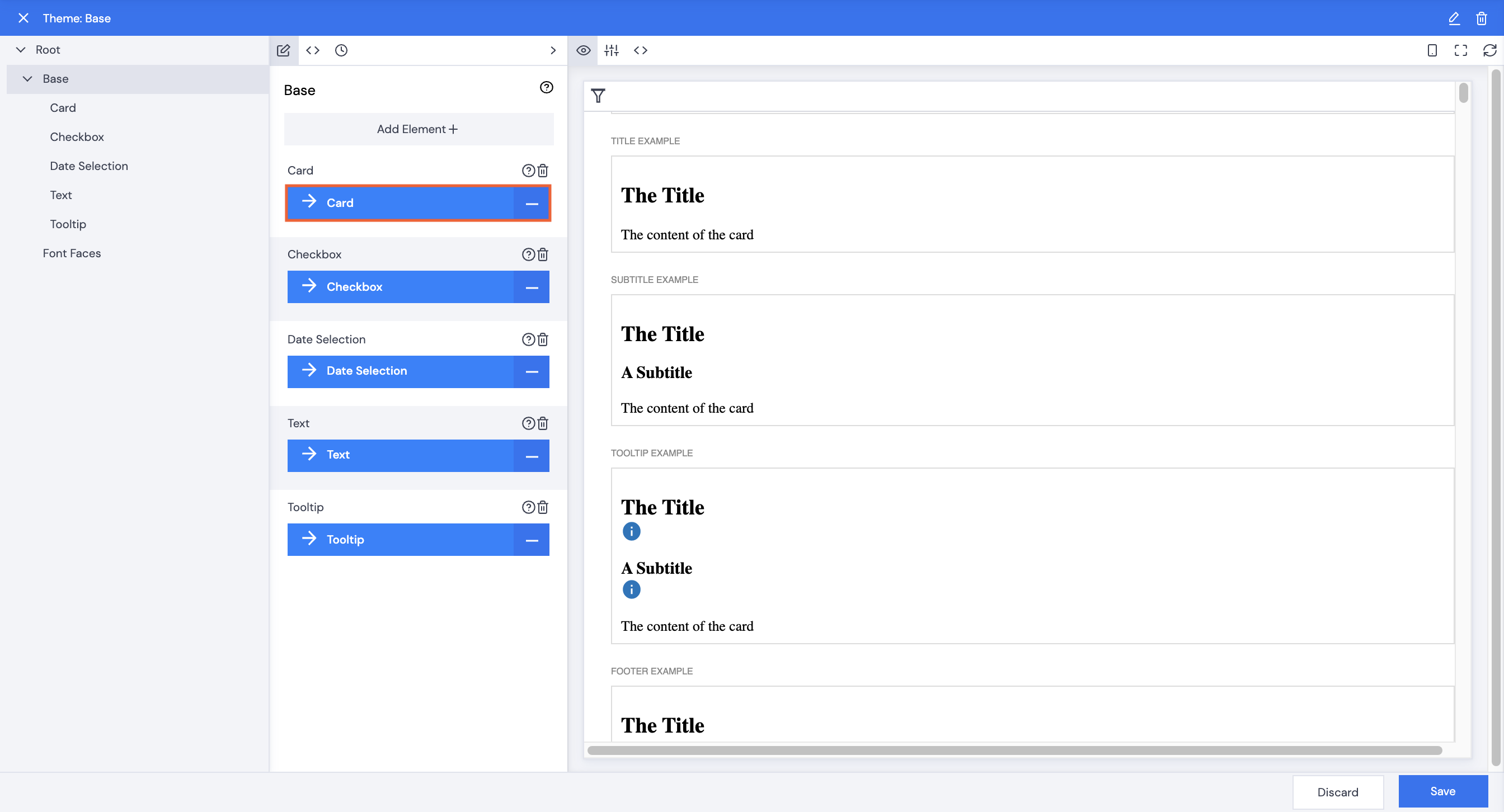
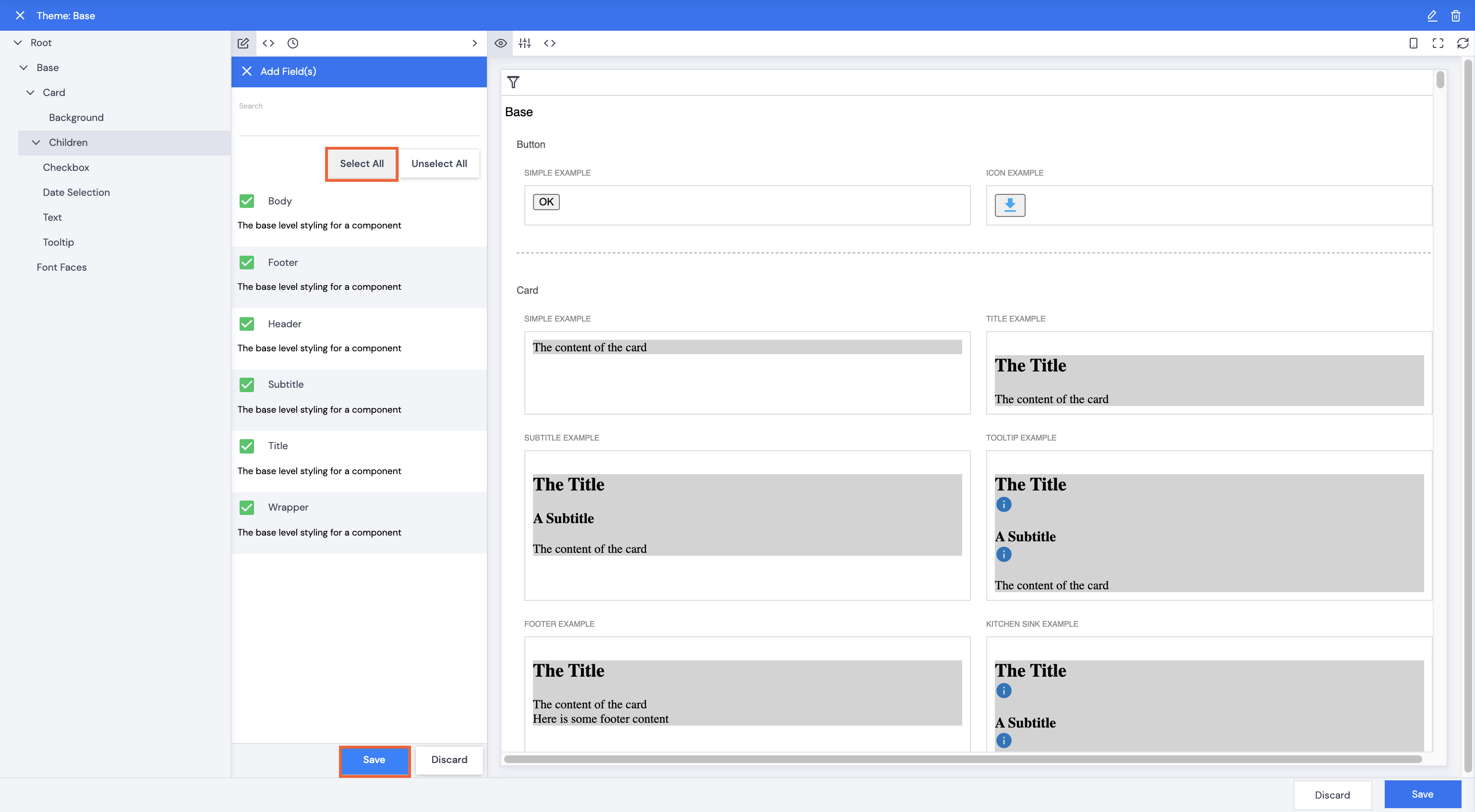
- Click Add Element+.
- Select fields to edit. The first set of fields all relate to the entire element, e.g the background or border. Selecting Children allows editing of the lower level components of each element, e.g. Title and Subtitle of a card for a Commentary app.
- Click Save.
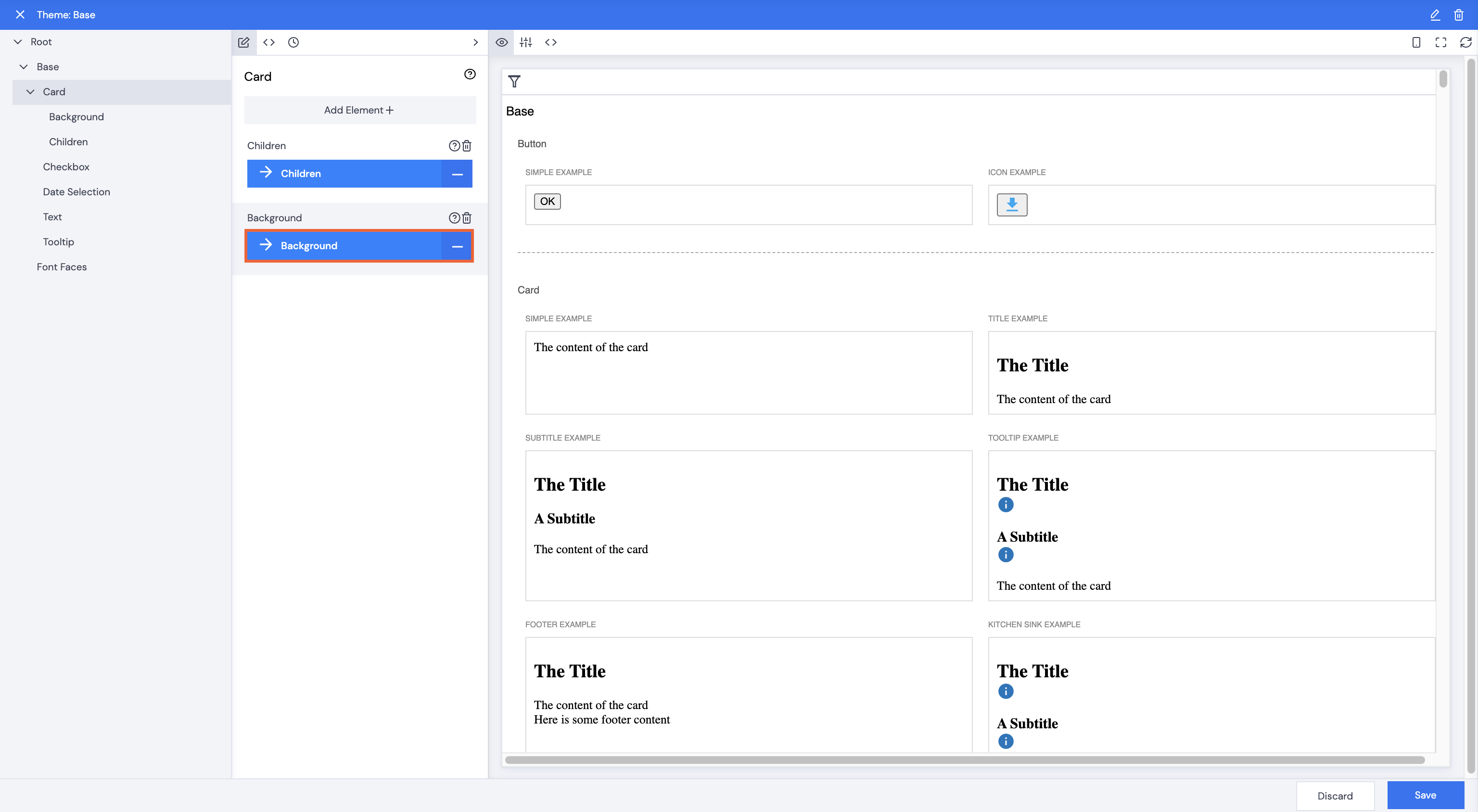
Background
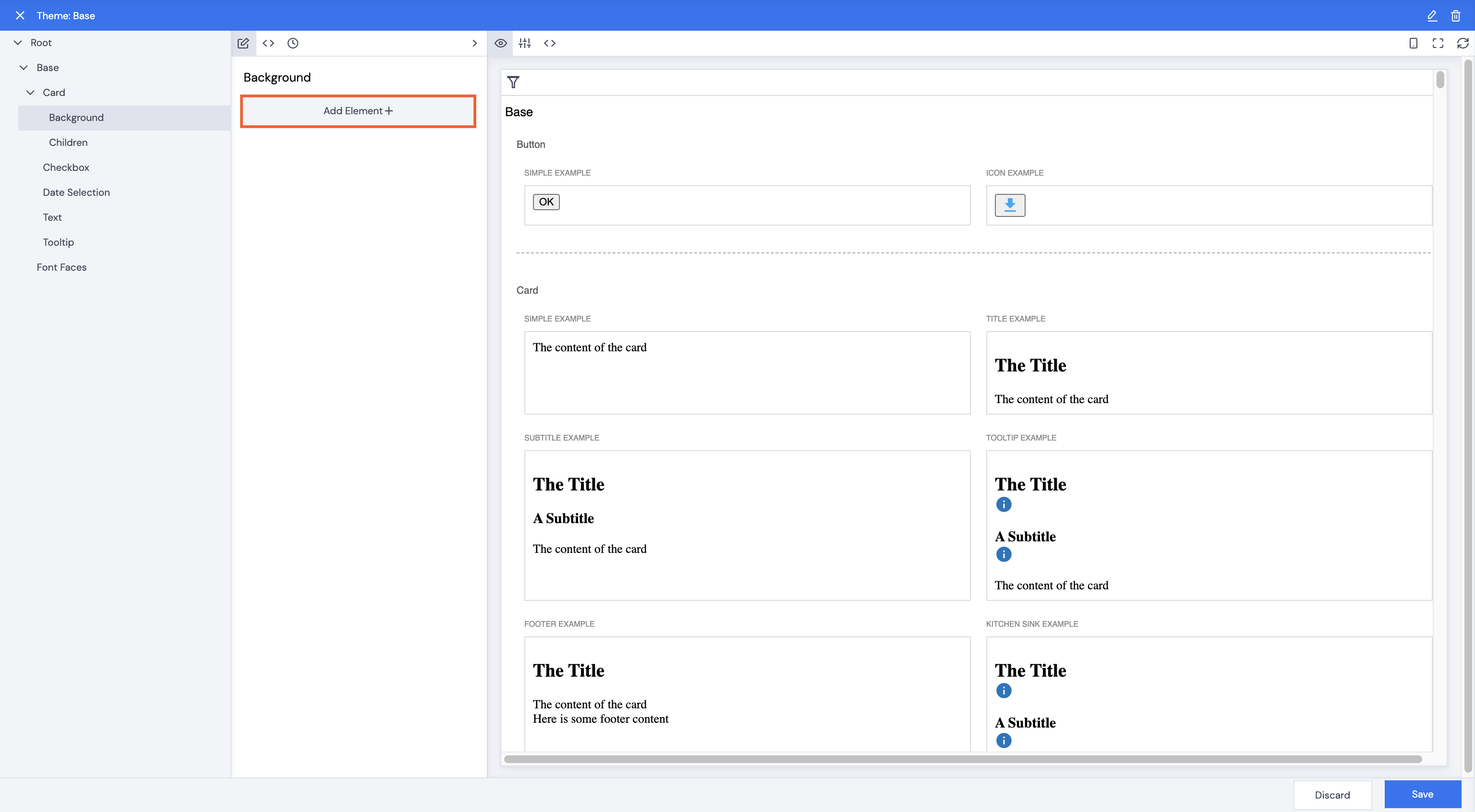
- Click Background.
- Click Add Element+.
- Select Color.
- Click Save.
- Type in a color name or hex code, e.g. lightgrey. The Card example backgrounds will change to match your selection.
Font Color and Size
- Click back to Card to click Children.
- Click Add Element+.
- Click Select All.
- Click Save.
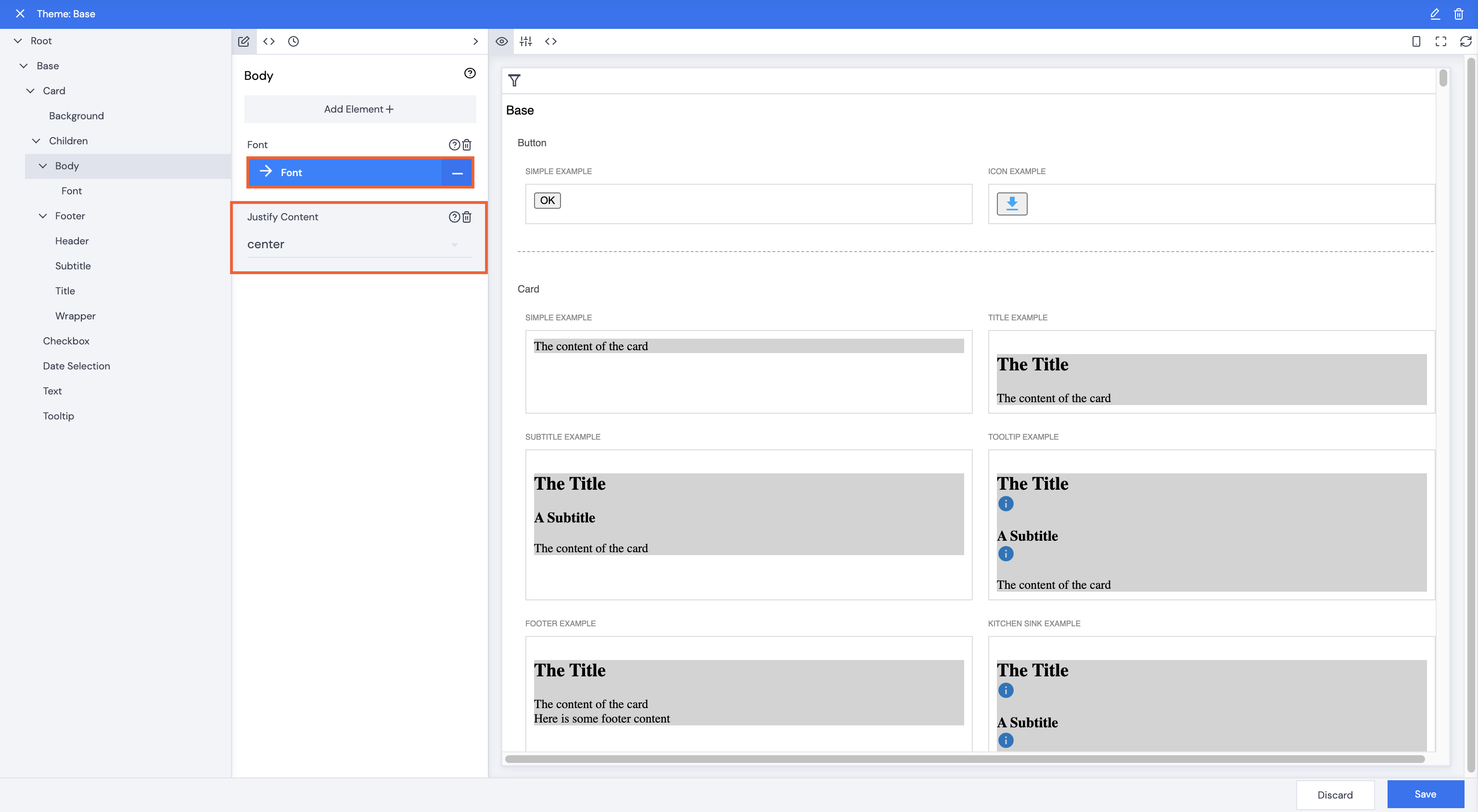
- Click Body.
- Click Add Element+.
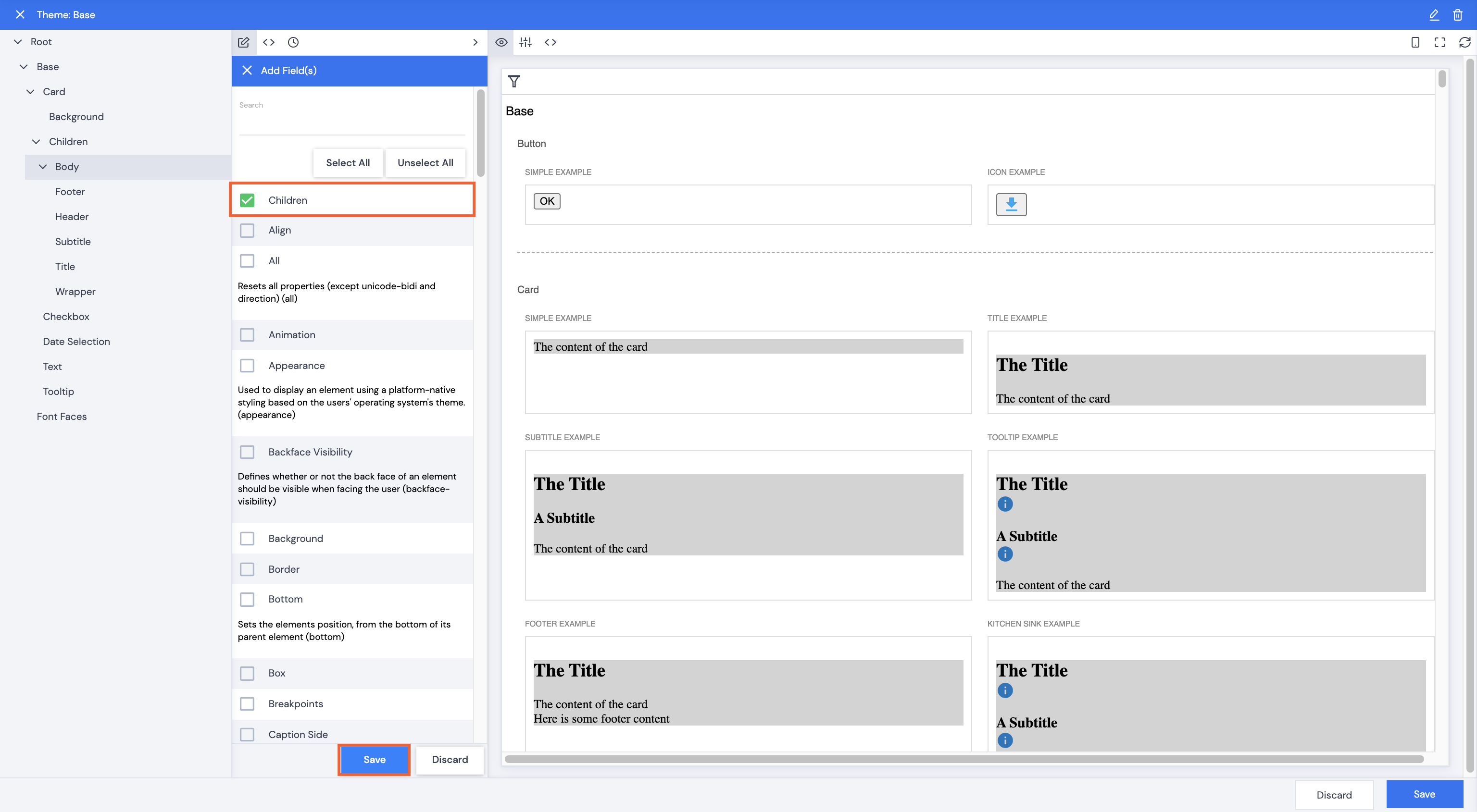
- Select Children.
- Click Save.
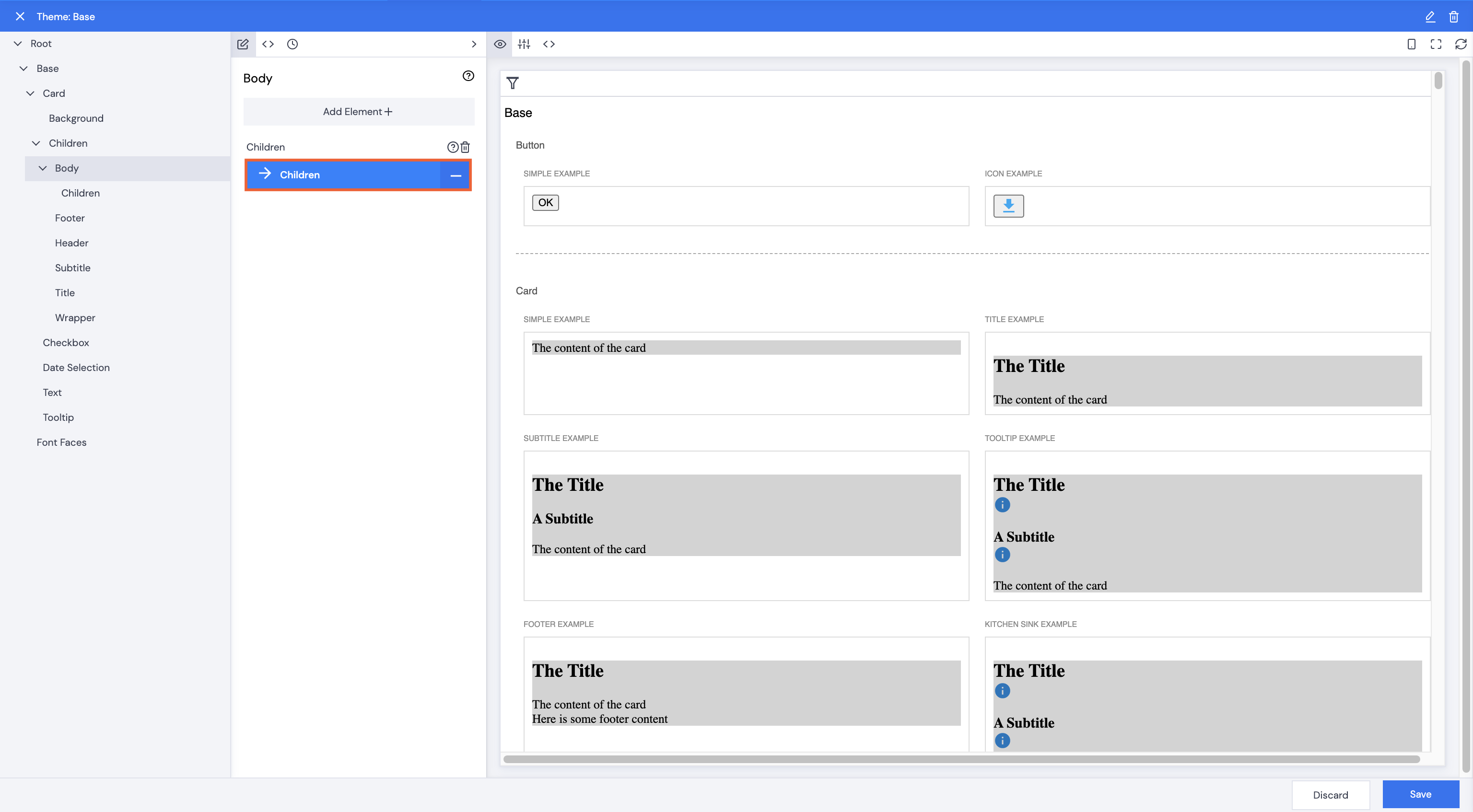
- Click Children.
- Click Add Field.
- Select font-type fields to edit.
- Click Save.
- Use the dropdown arrow to select paragraph styling: center, left, right, etc.
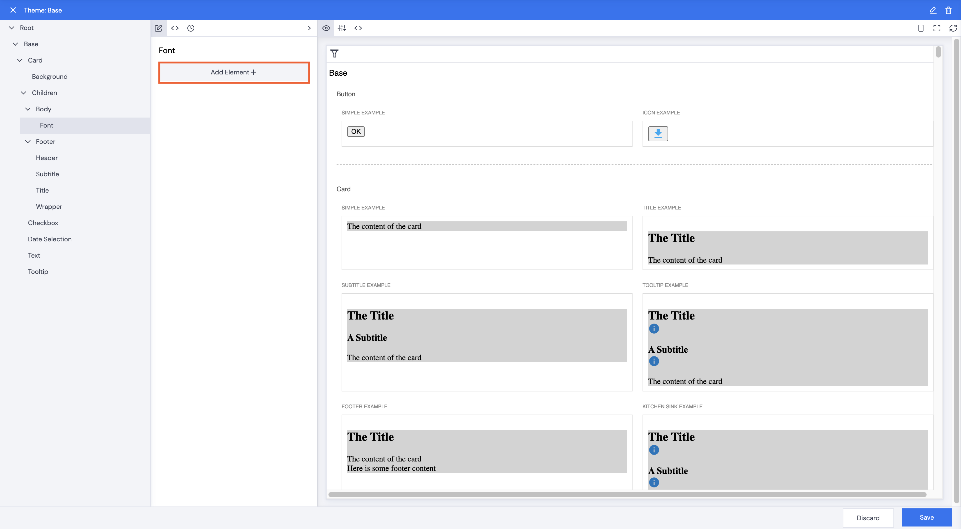
- Click Font.
- Click Add Element+.
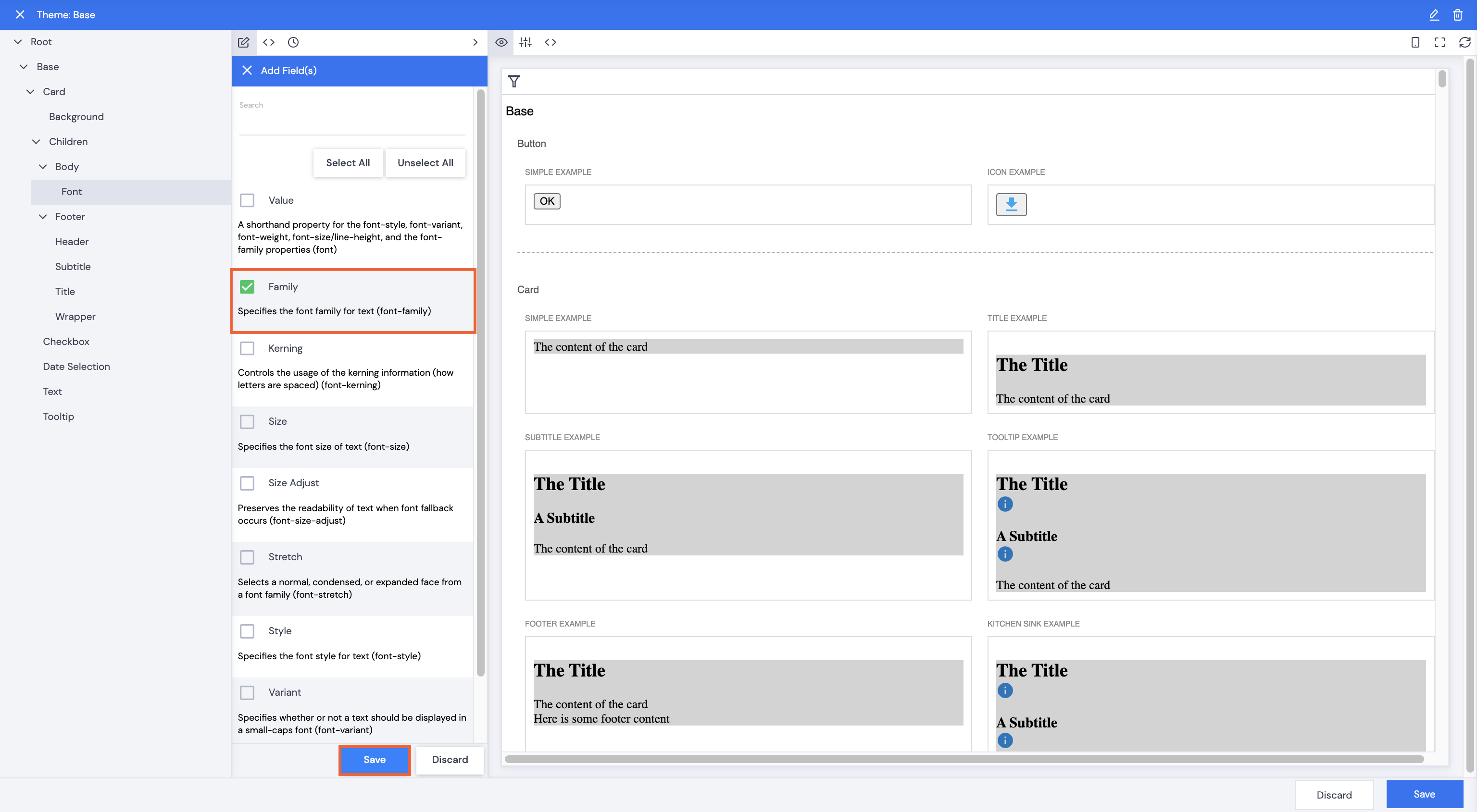
- Select Style.
- Click Save.
- Type in the required font style name in the Family field. The card content will update immediately.
- Click Save.
- Type in a comment, then click Confirm.
Text Font Style and Size
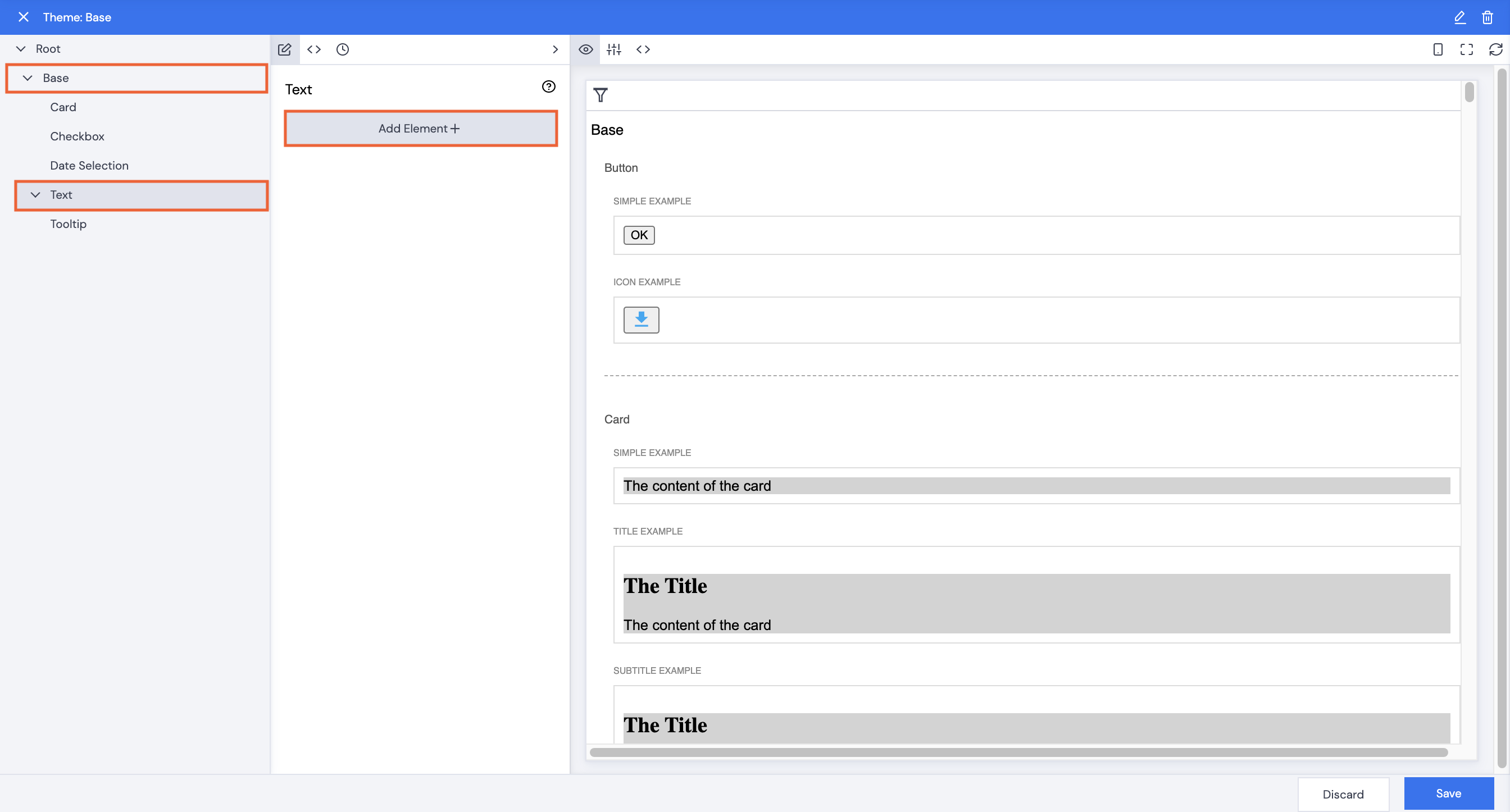
- Click back under Base to Text in the navigation pane.
- Click Add Element+.
- Select Font.
- Click Save.
- Click Font. Scroll down the right pane to line up the Text section so that you can see changes.
- Click Add Element+.
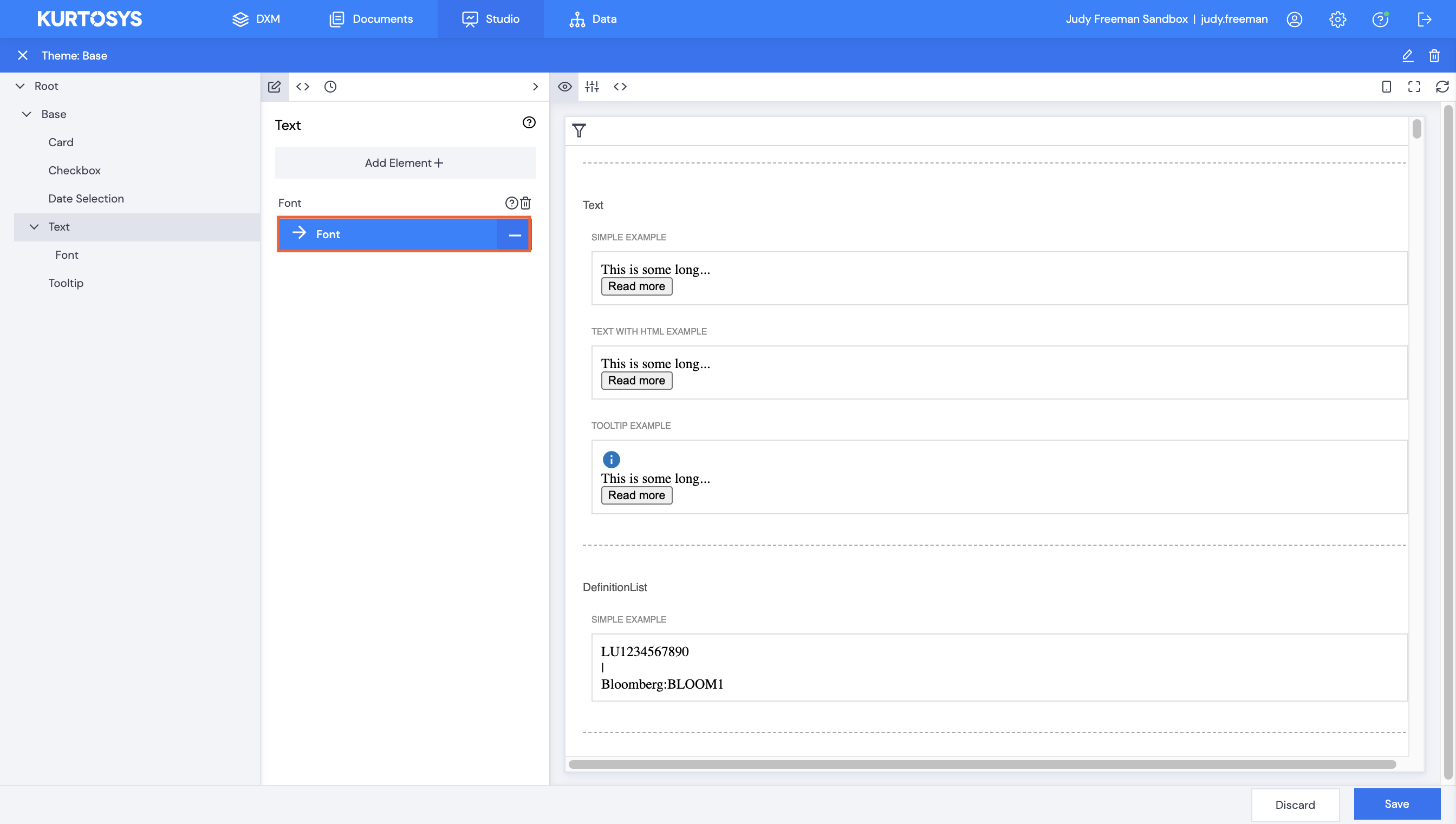
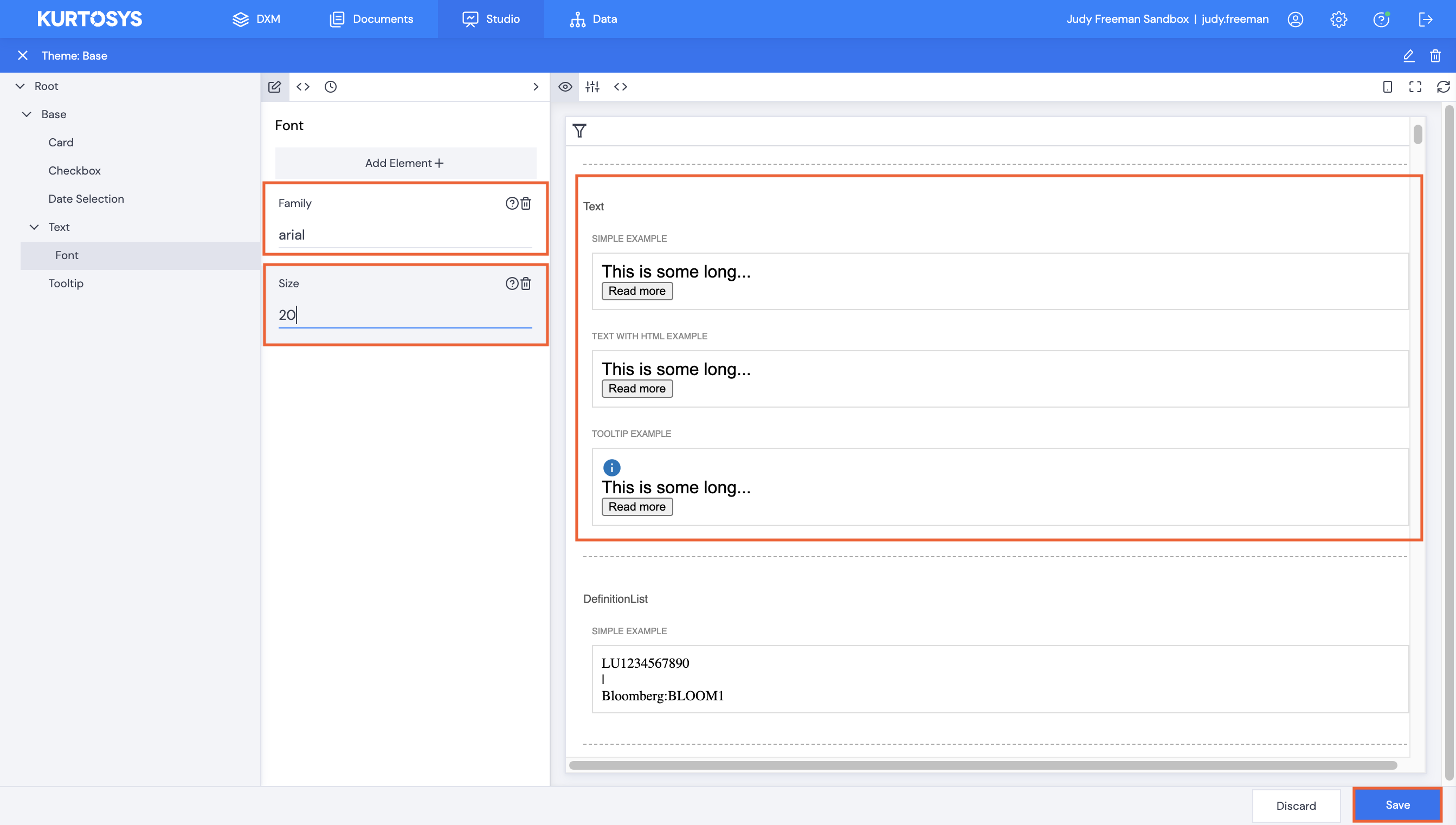
- Select fields to edit.
- Click Save.
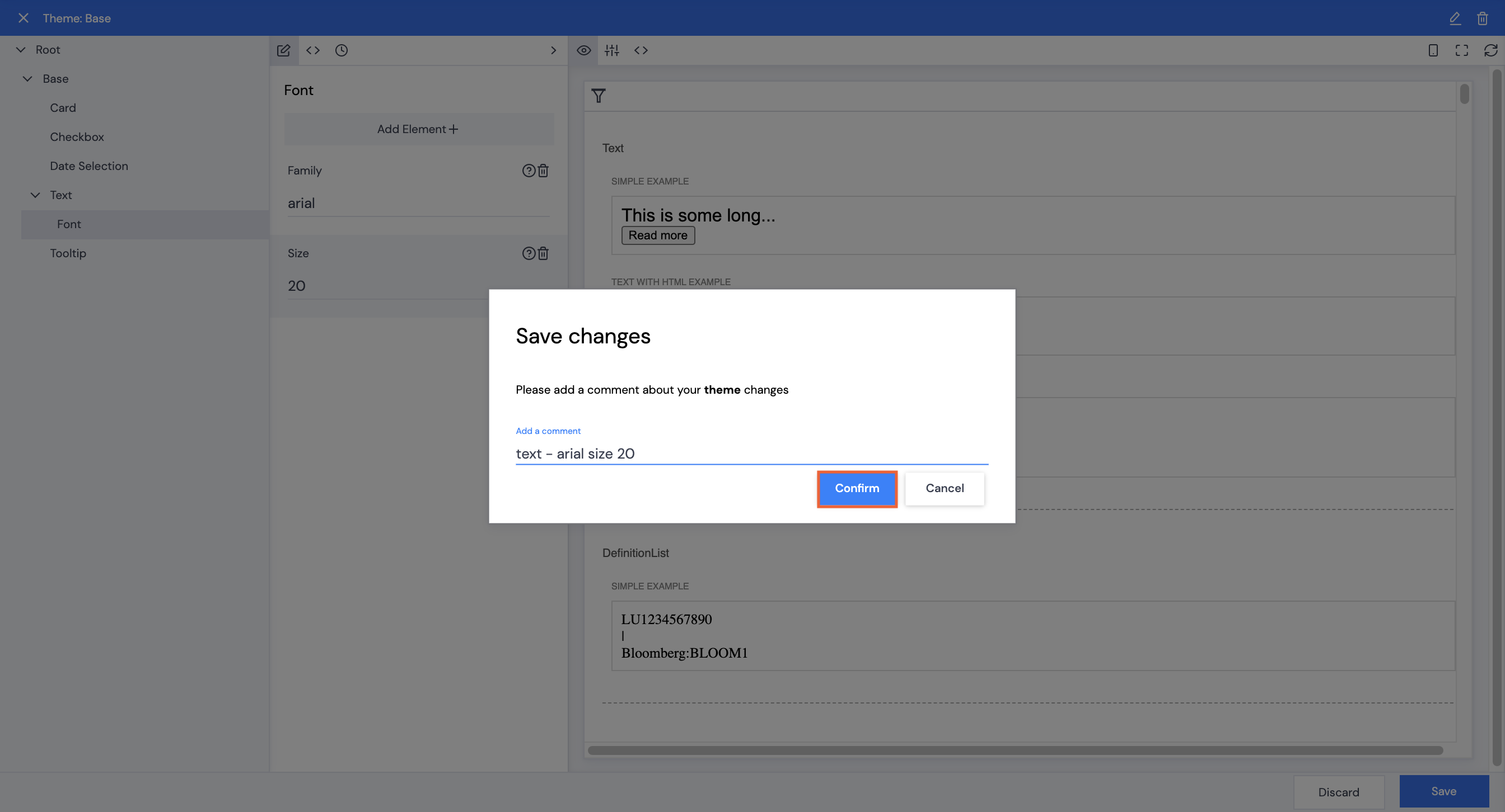
- Type in a font style name in the Family field.
- Type in a number – pt size – in the Size field. The sample Text will update immediately.
- Click Save.
- Type in a comment, then click Confirm.
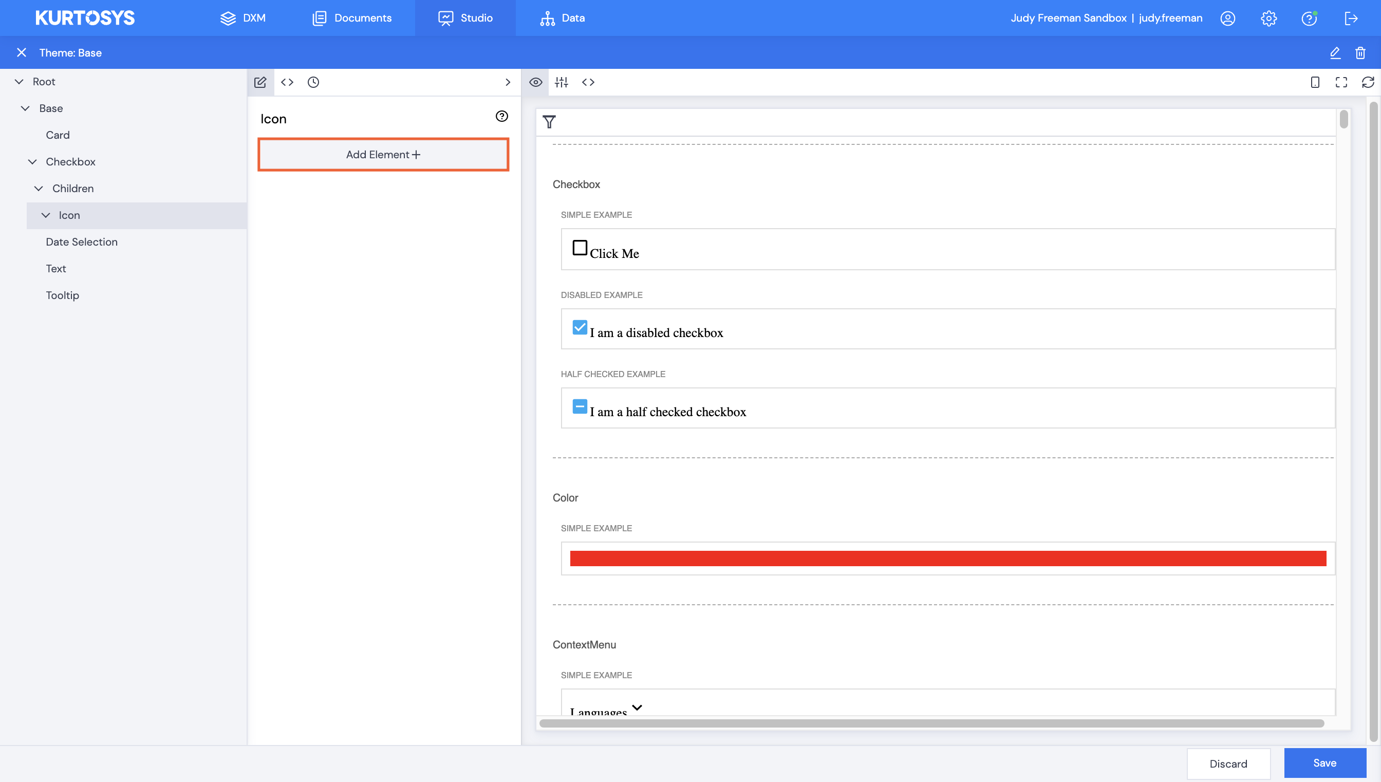
Checkbox Icon Width
- Click back to the Root level and click Checkbox in the navigation pane.
- Scroll down in the right pane so that the checkbox section is visible.
- Click Add Element+.
- Select Children from the list of fields.
- Click Save.
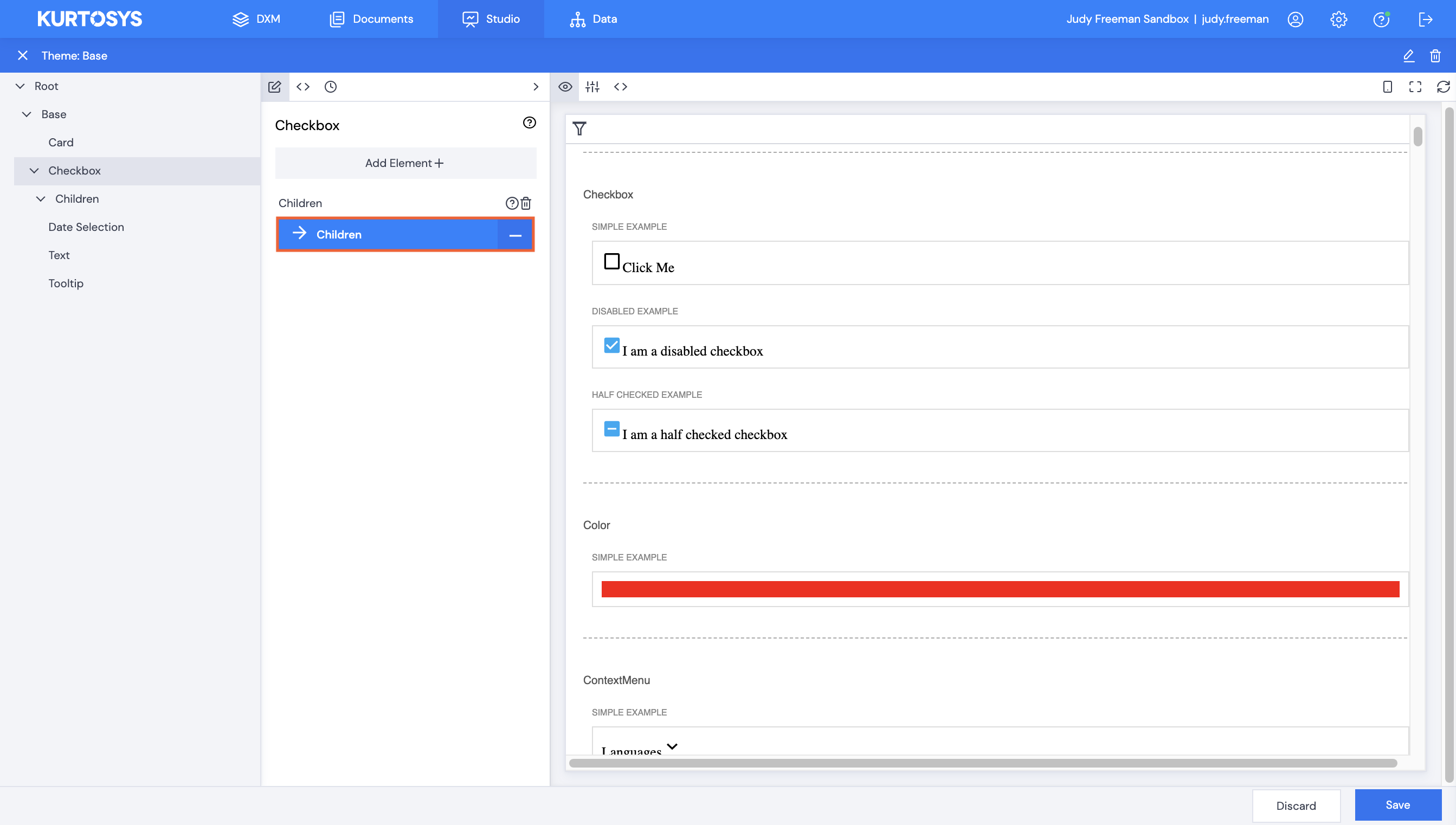
- Click Children.
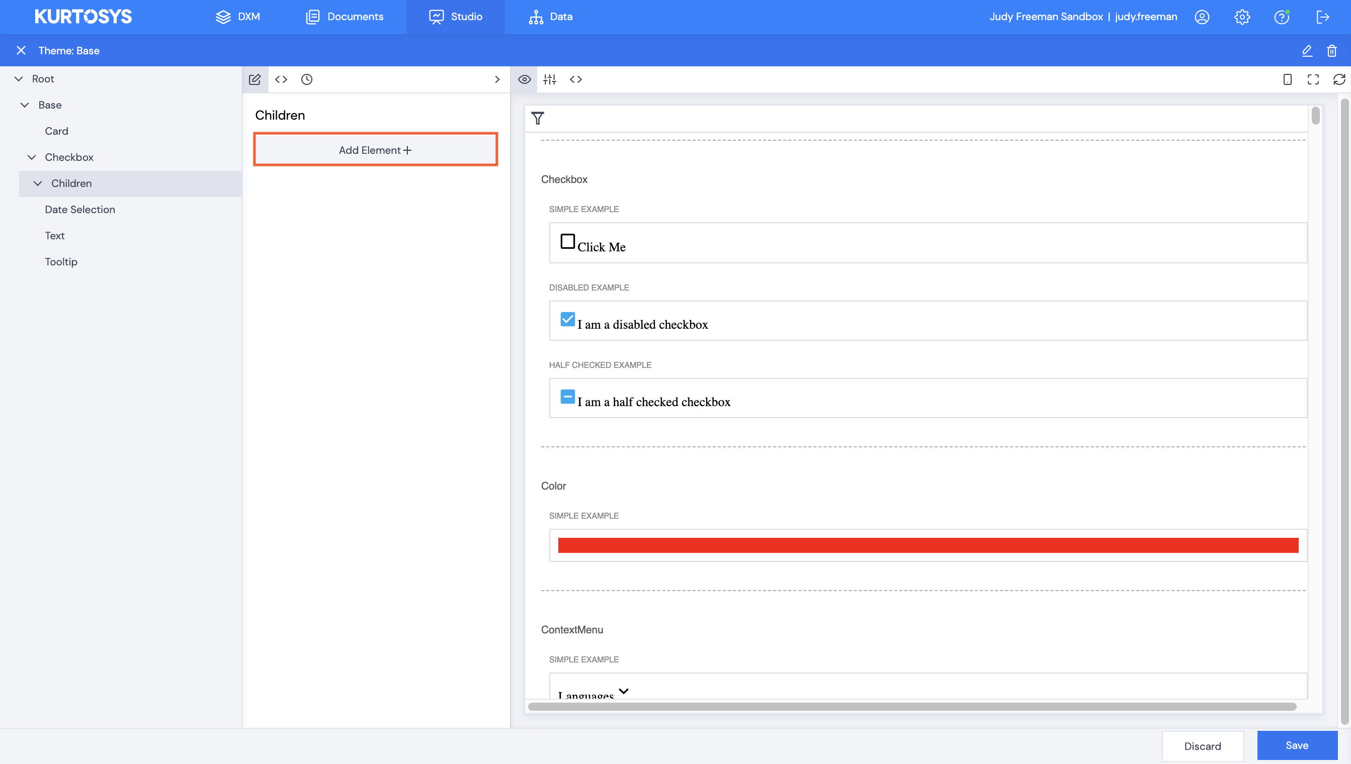
- Click Add Element+.
- Select Icon.
- Click Save.
- Click Icon.
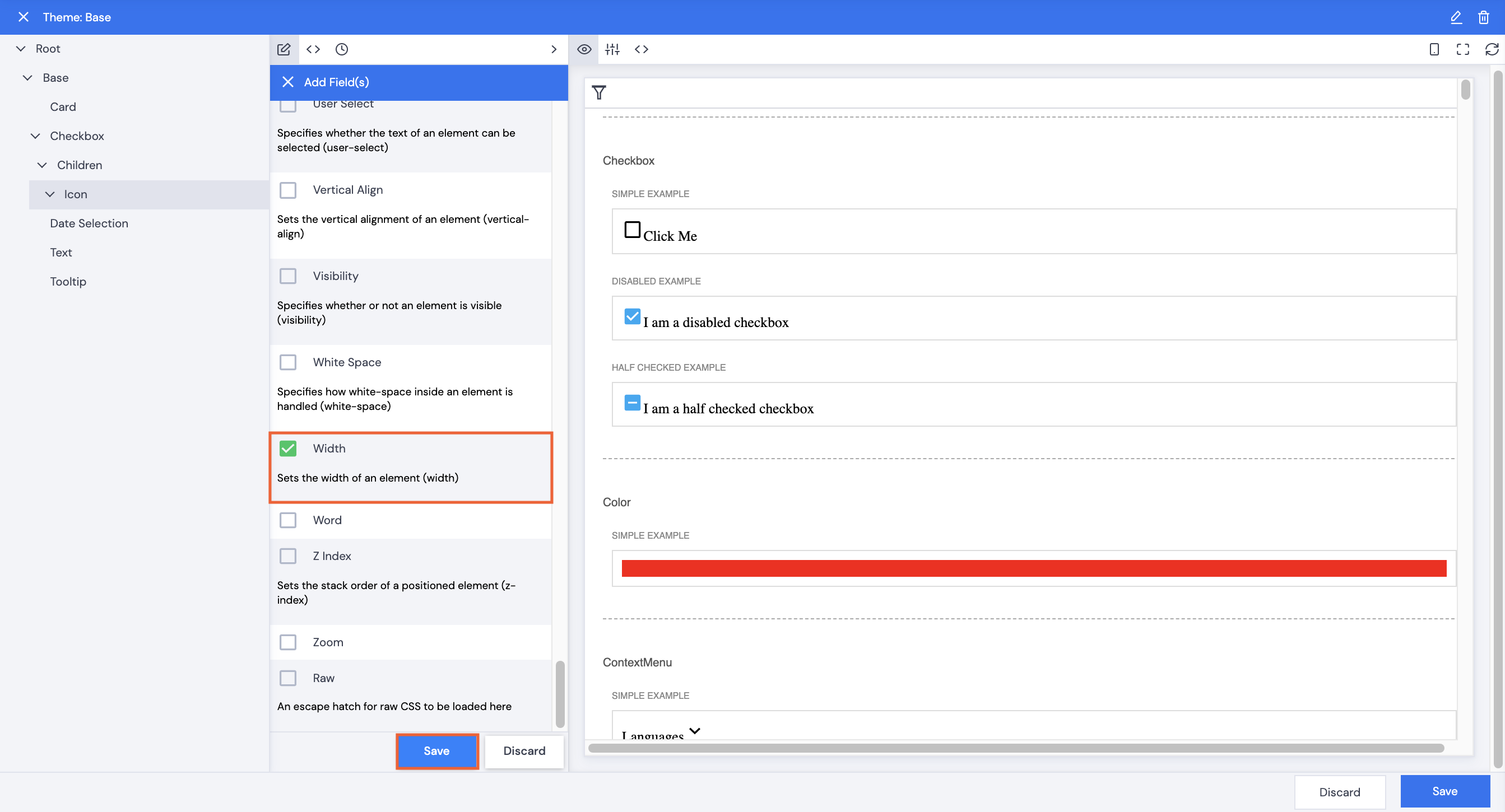
- Click Add Element+.
- Scroll down to select Width.
- Click Save.
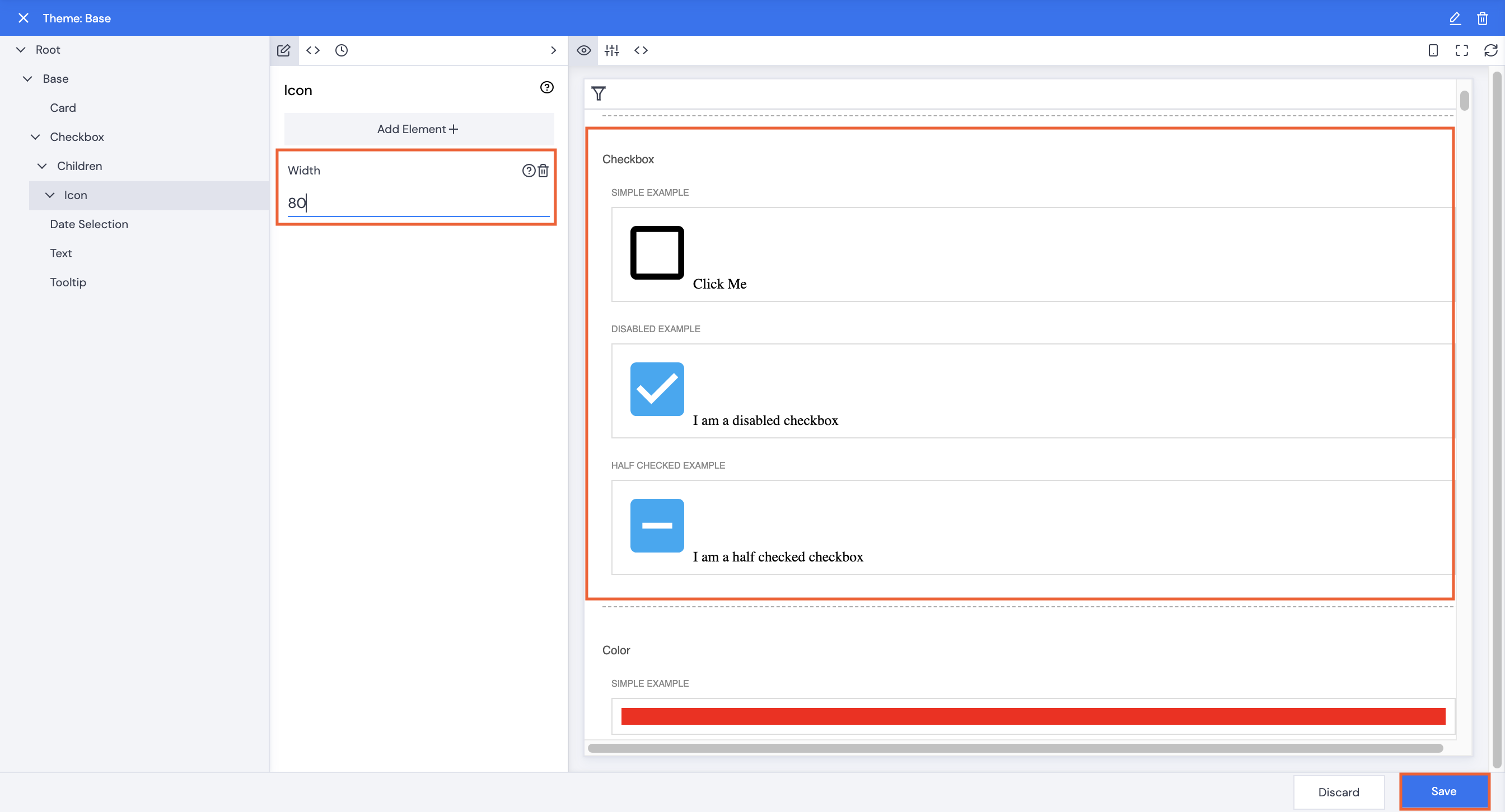
- Type in a number, e.g. 80. Note the size of the icon increases immediately.
- Click Save.
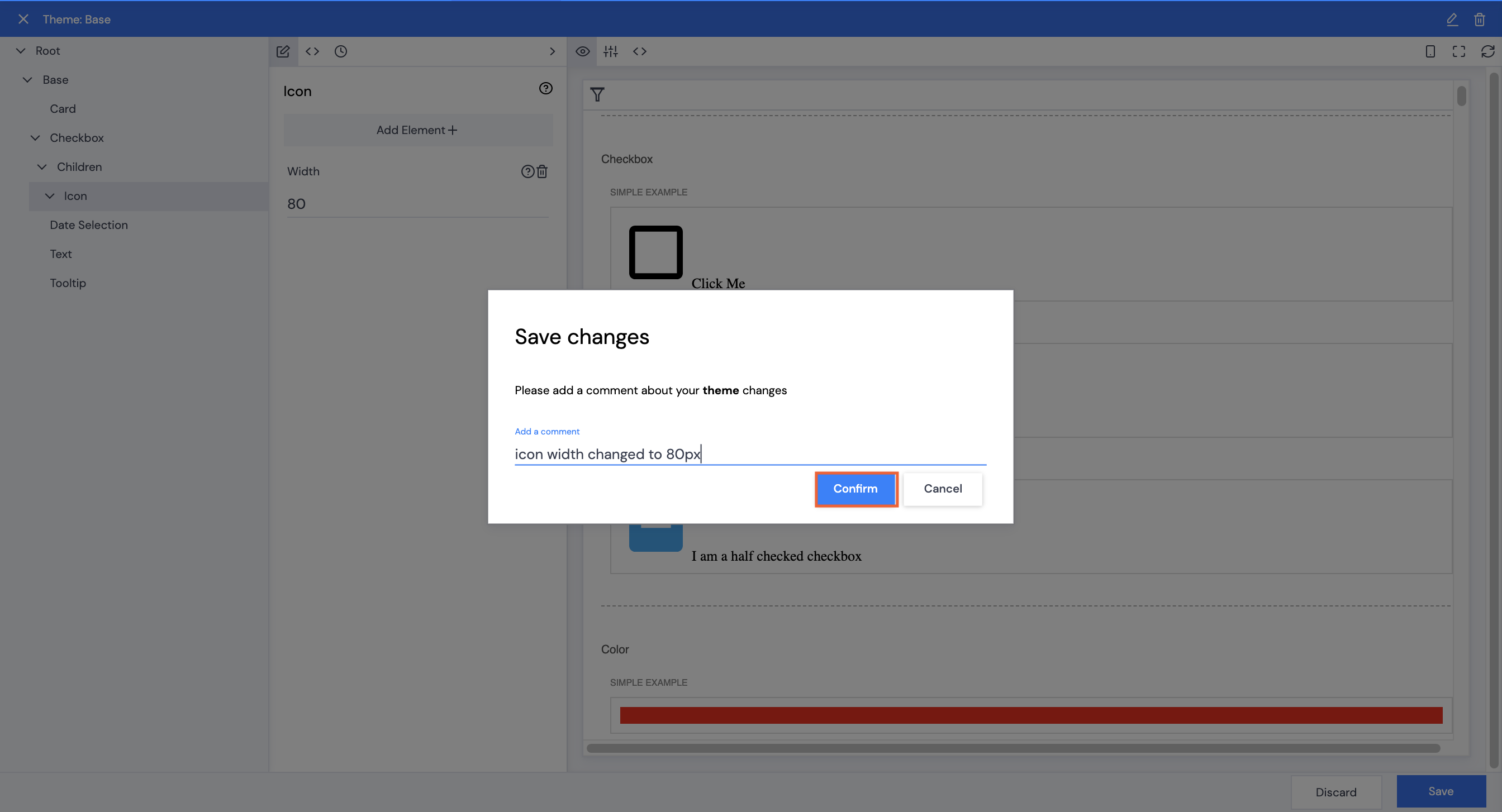
- Type in a comment, then click Confirm.
Any changes which are made to the theme globally update all apps which use the theme which makes making style and color amendments to a client’s site much simpler and more efficient.