
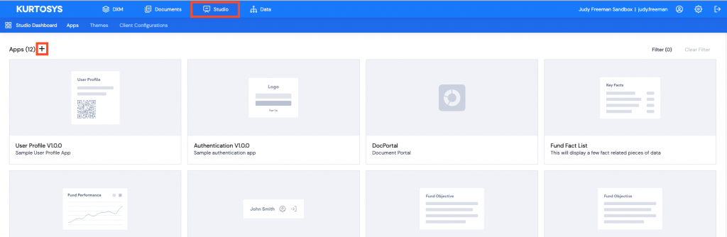
Add a new App
Click the Studio tab, then click + to add a new application.
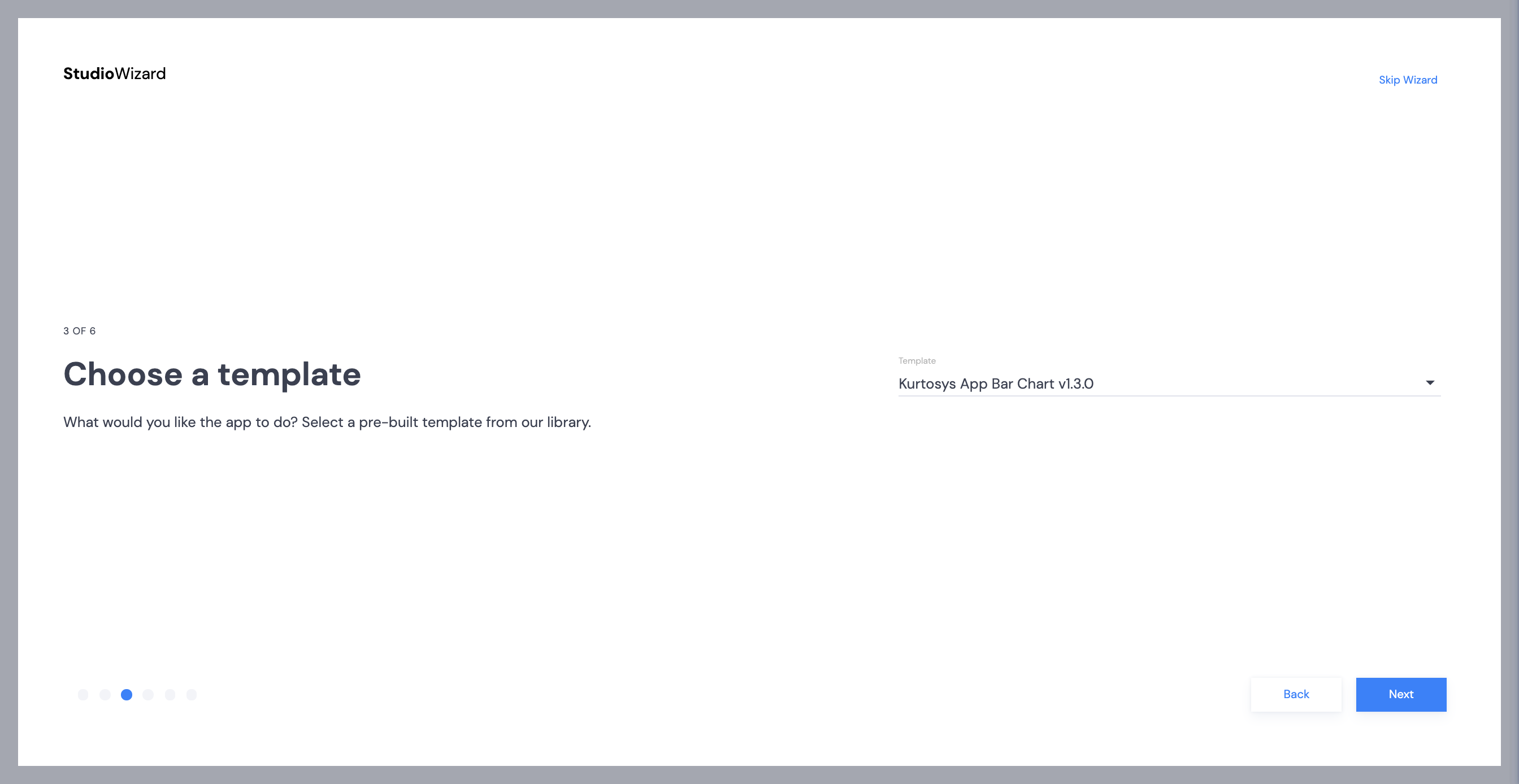
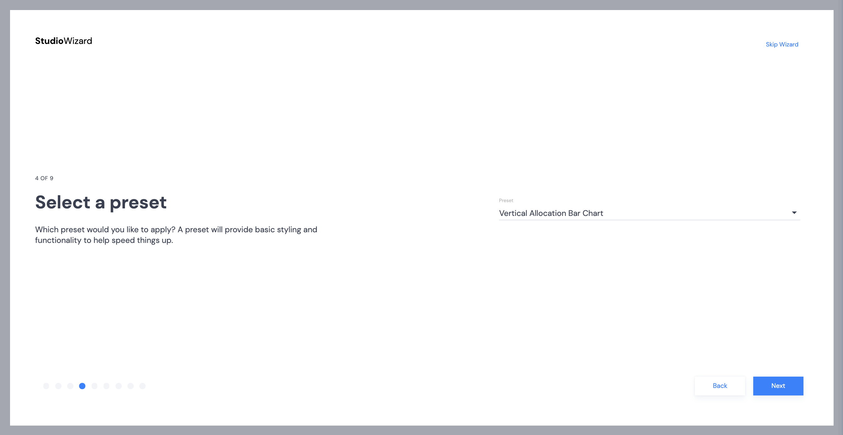
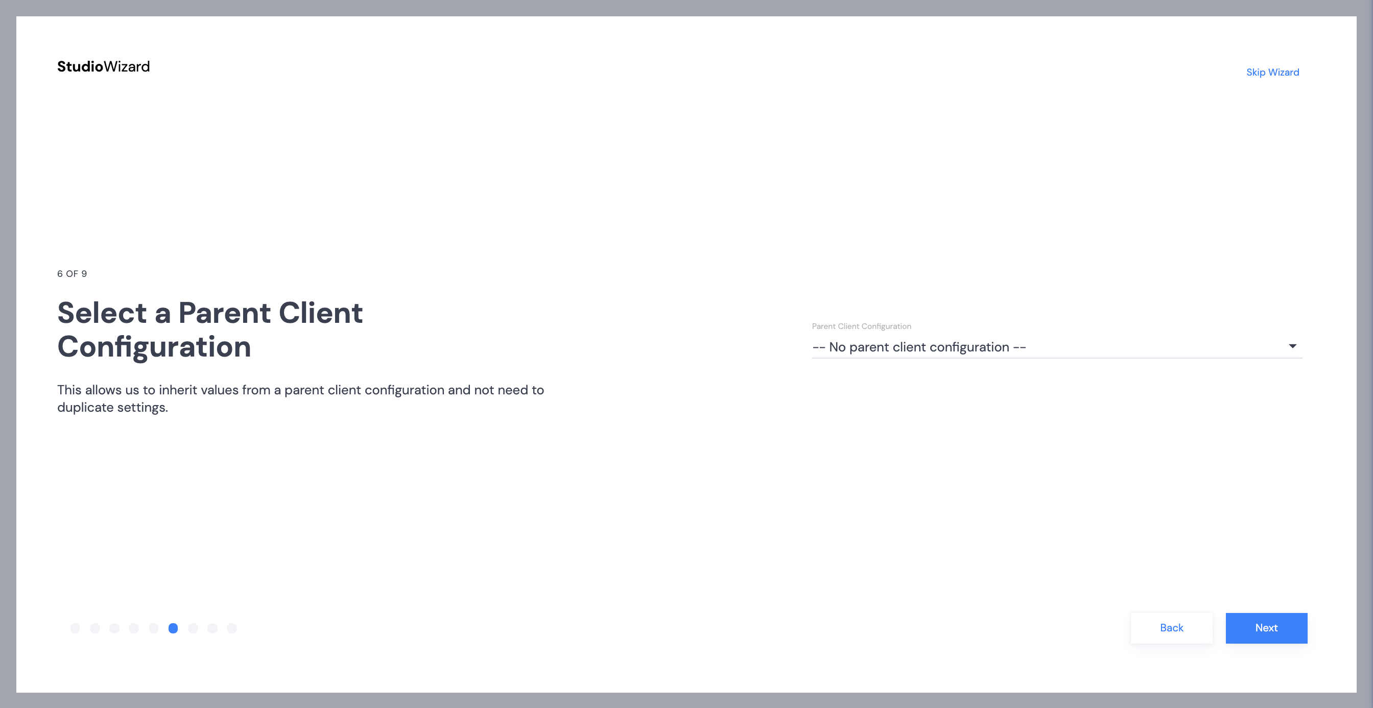
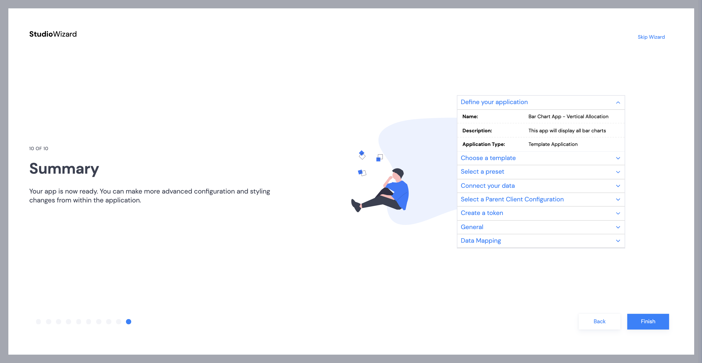
Studio Wizard
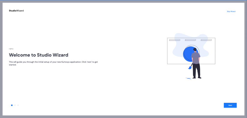
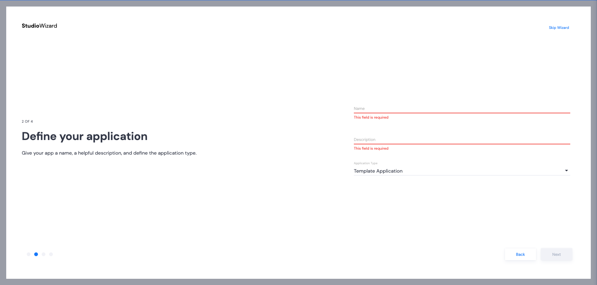
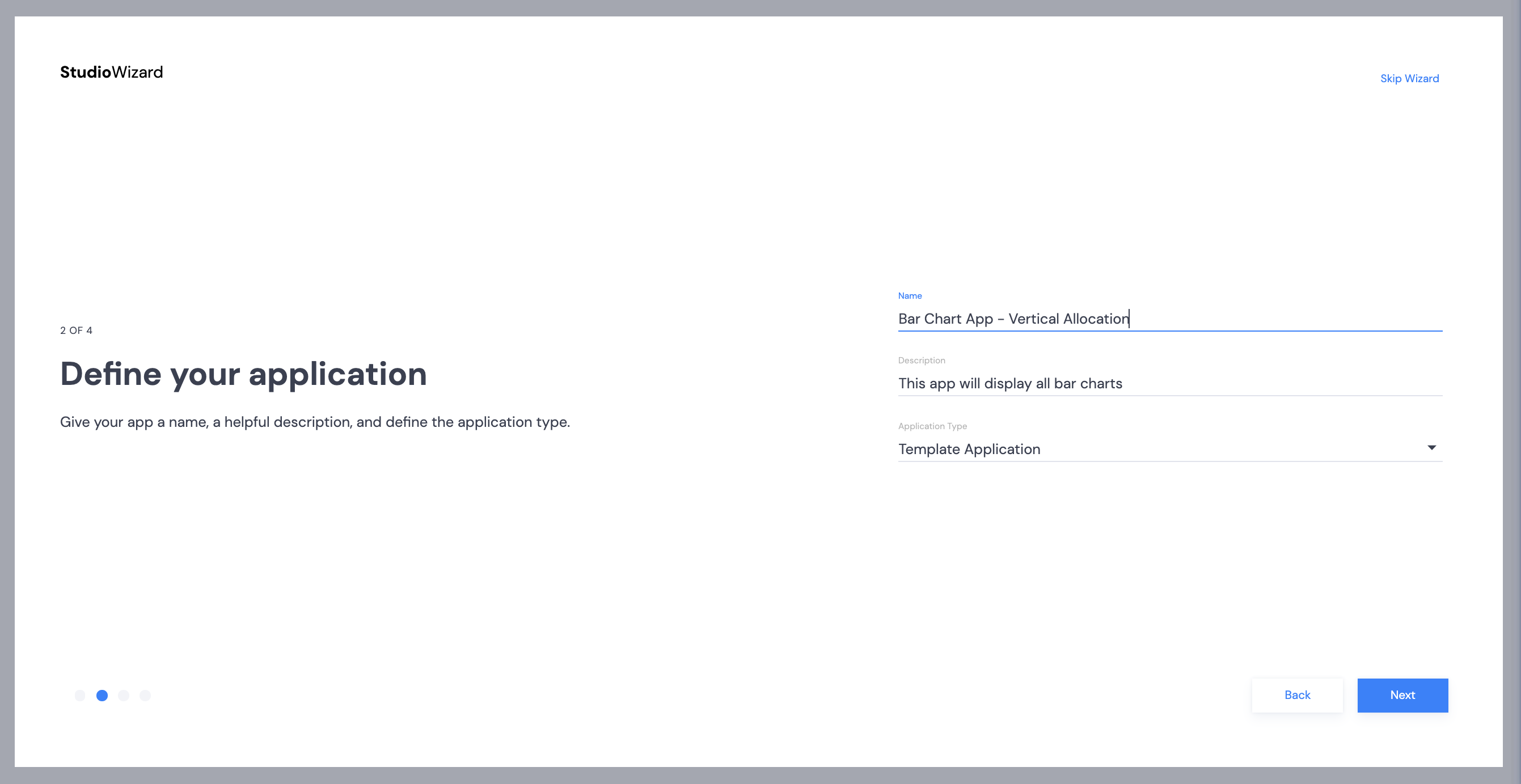
- Click Next to start the Studio Wizard.
- Provide a name and description for your app. Once these items have been filled, the Next button will become active. Click Next.
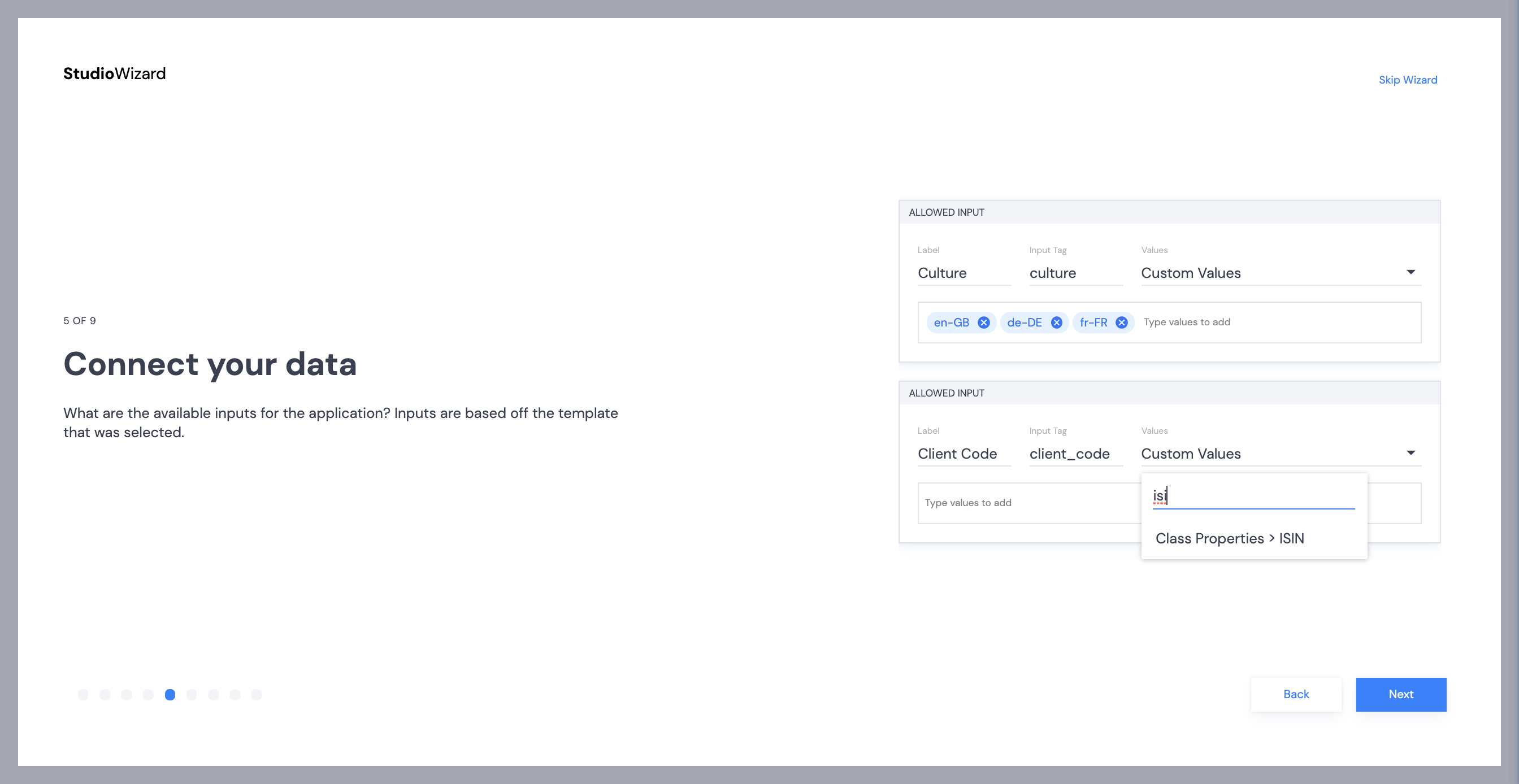
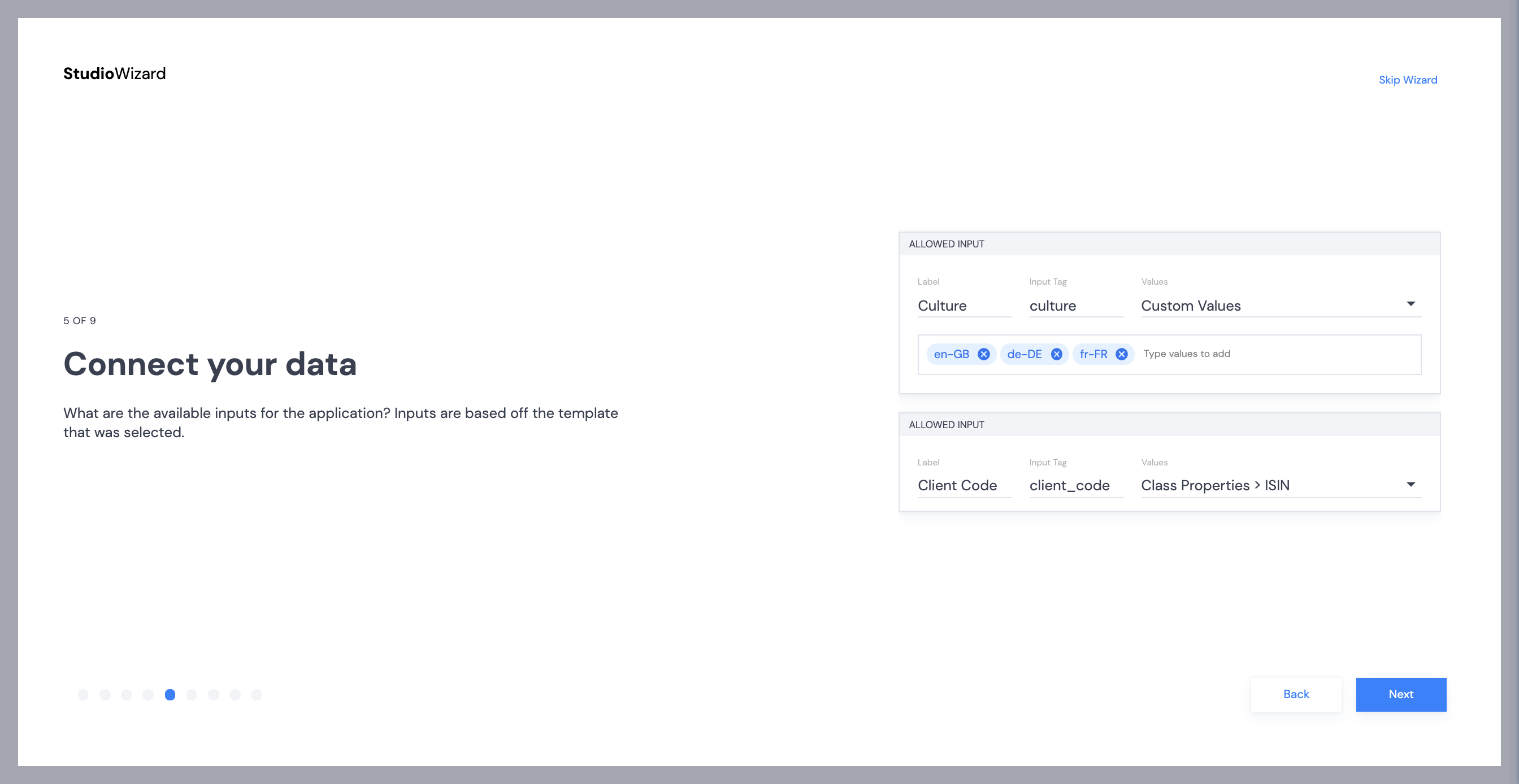
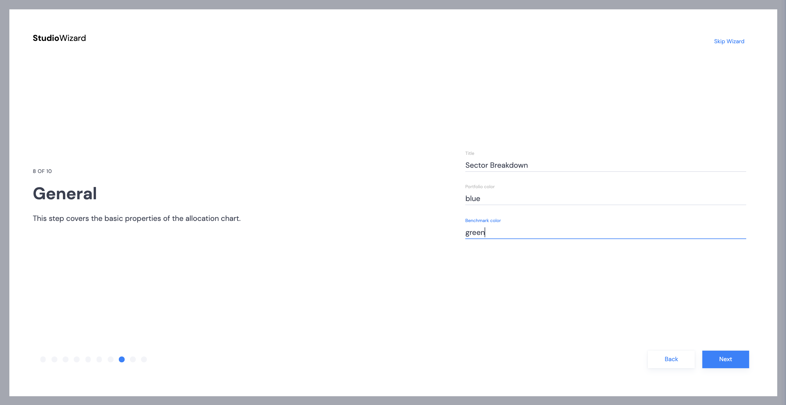
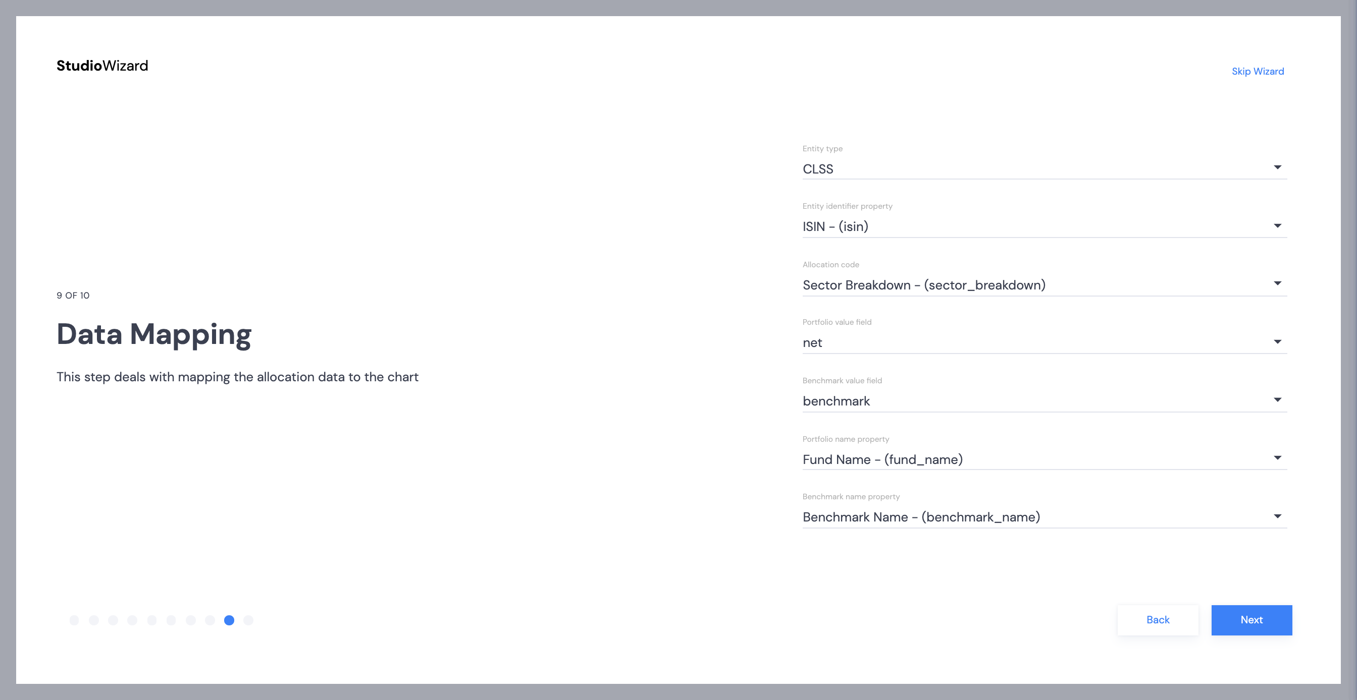
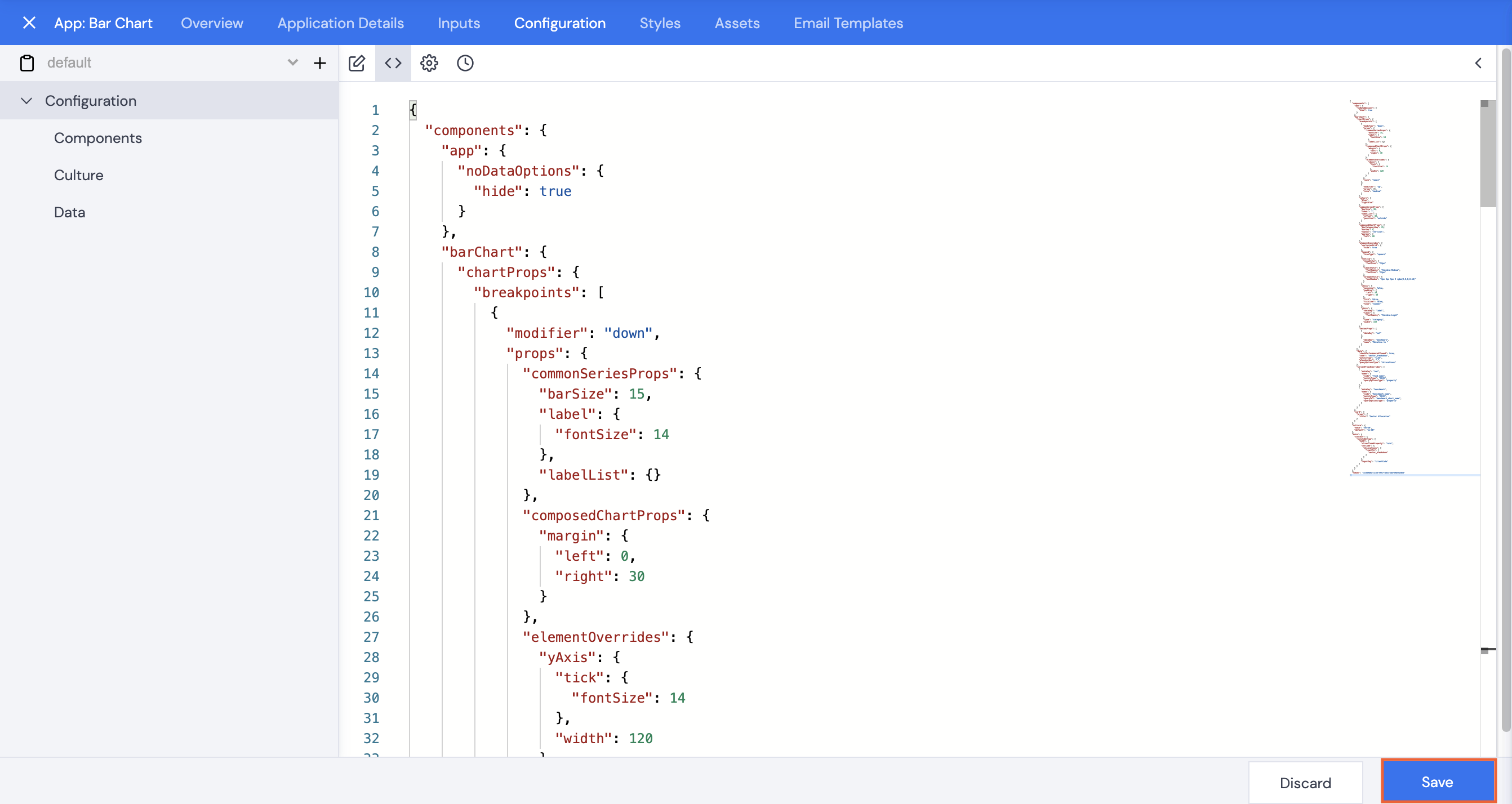
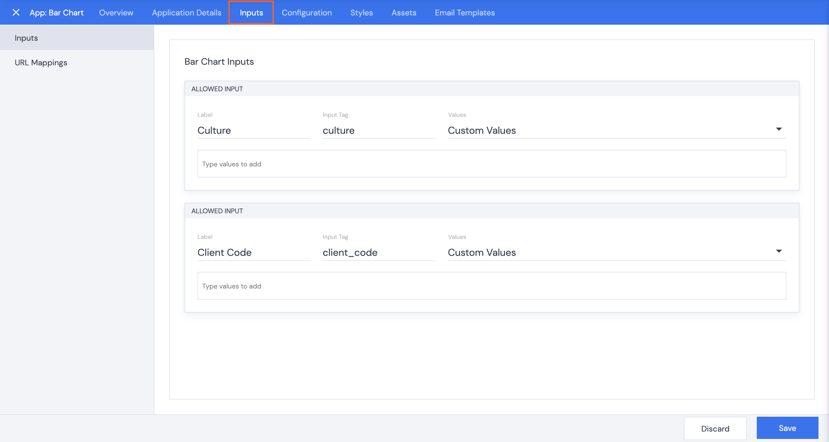
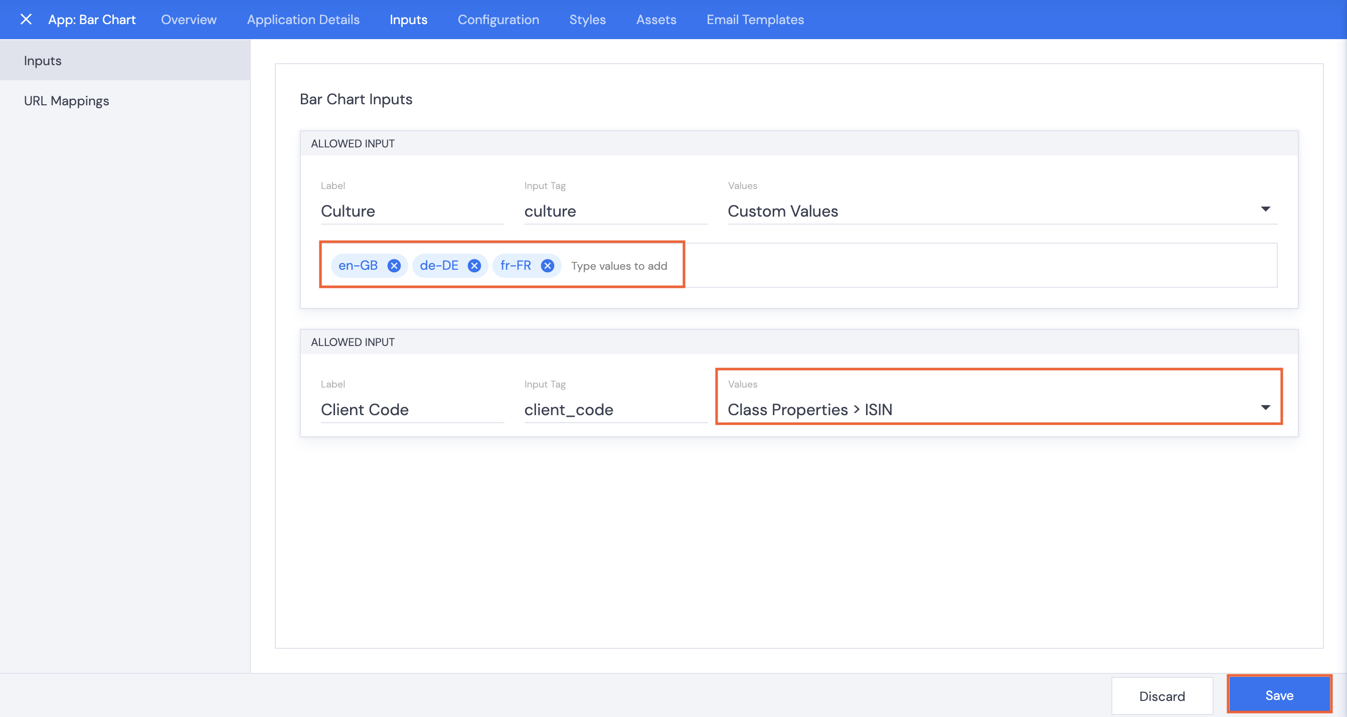
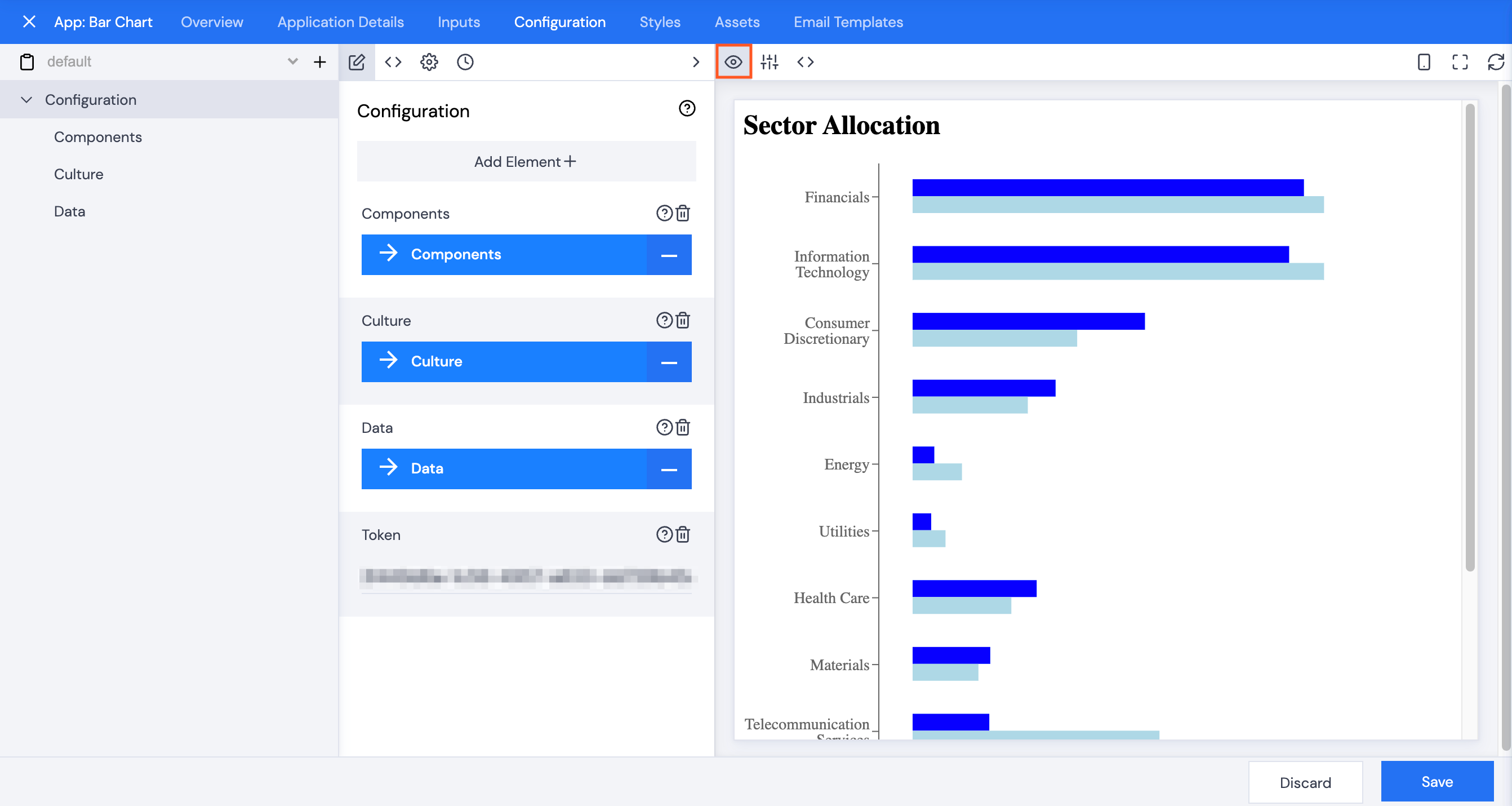
Configuration
Preview
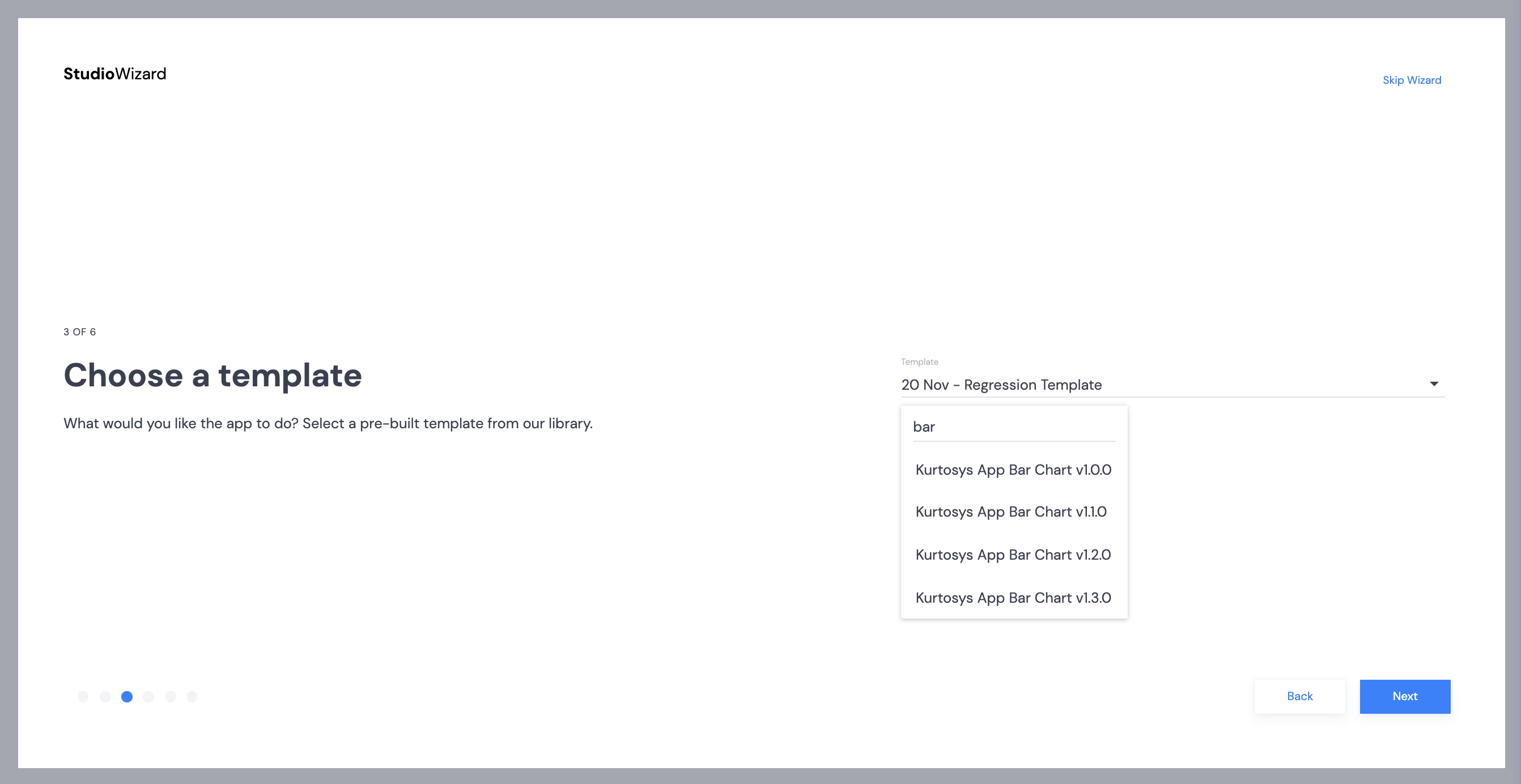
Click the Configuration tab, and make sure the Preview button is selected. The Wizard includes all necessary presets for the app.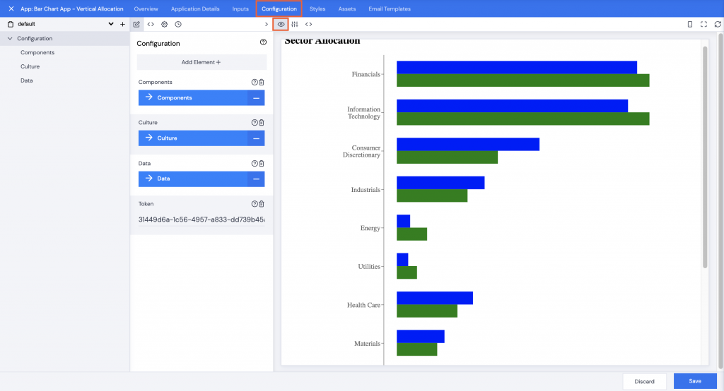
Copy and paste JSON
However, if you skipped the Wizard, this is where you would use the JSON.- Click the JSON <> icon to open the JSON editing screen.
- Copy the JSON below.
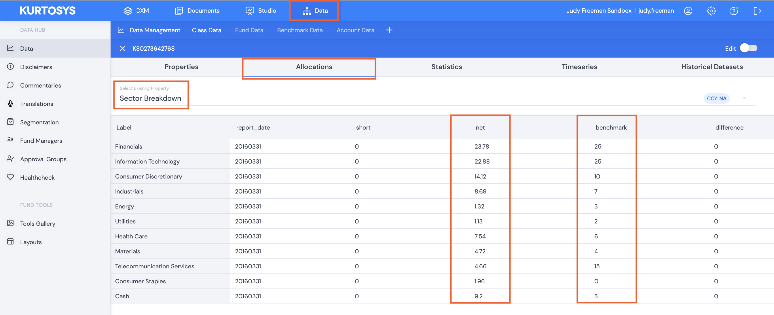
Note: If you are using an existing JSON file, you will need to ensure that the data you are using to connect exists in your data base.
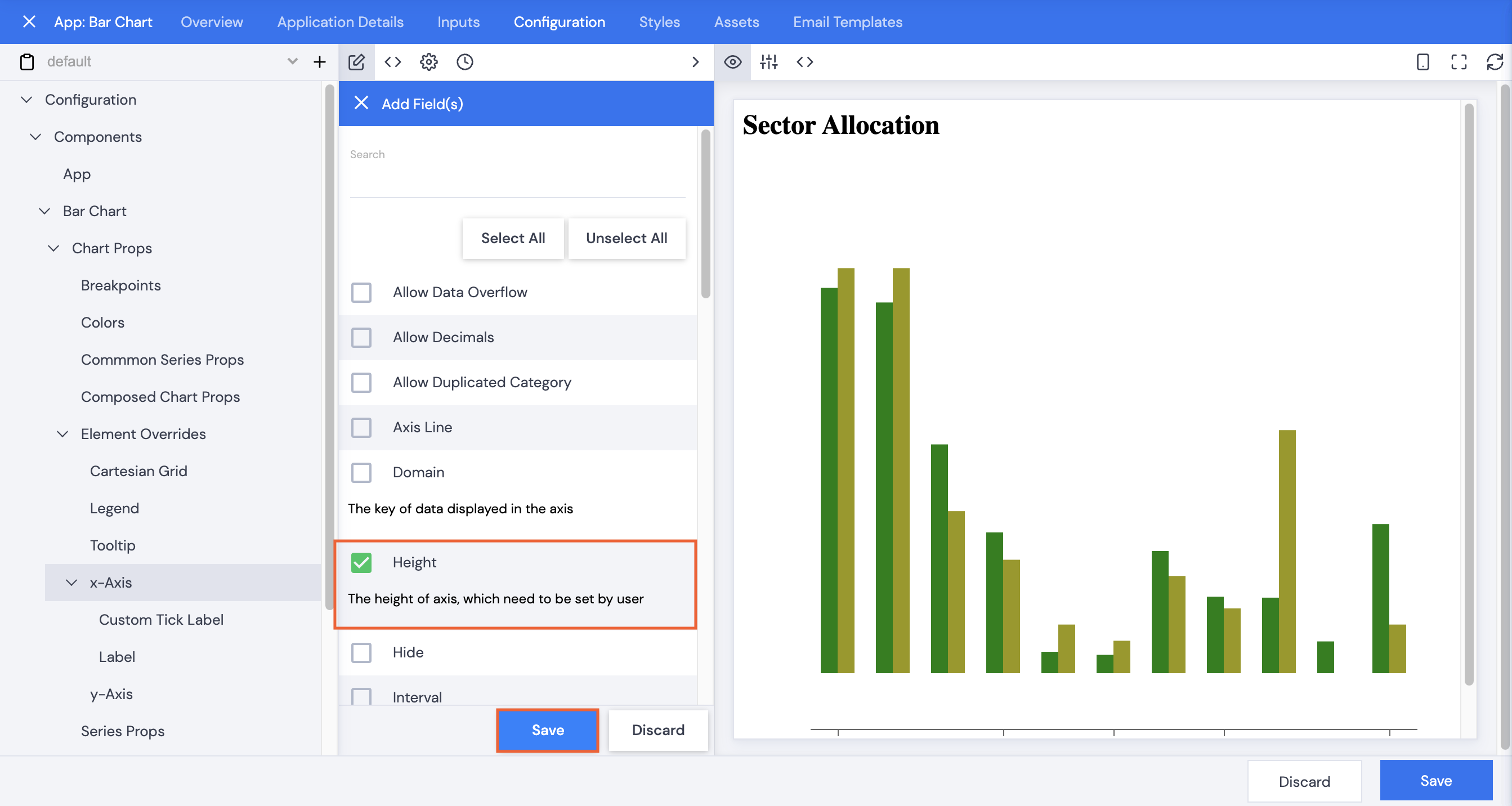
Customization
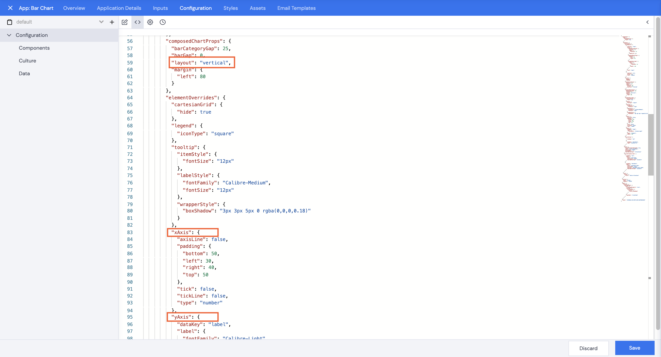
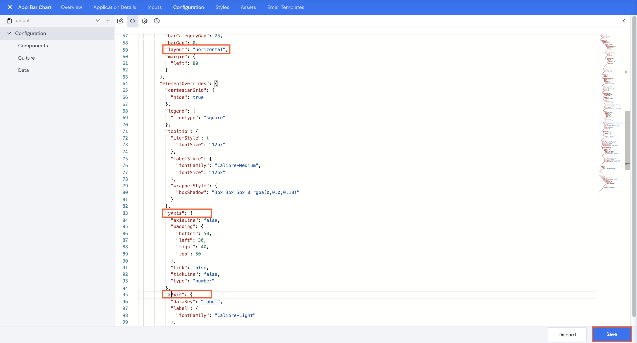
You can make various customizations to the app depending on requirements. These include changing the color and width of the bars, size and font of the labels, the x and y axes to change the graph from horizontal to vertical, indents, the icons for the legend, etc.
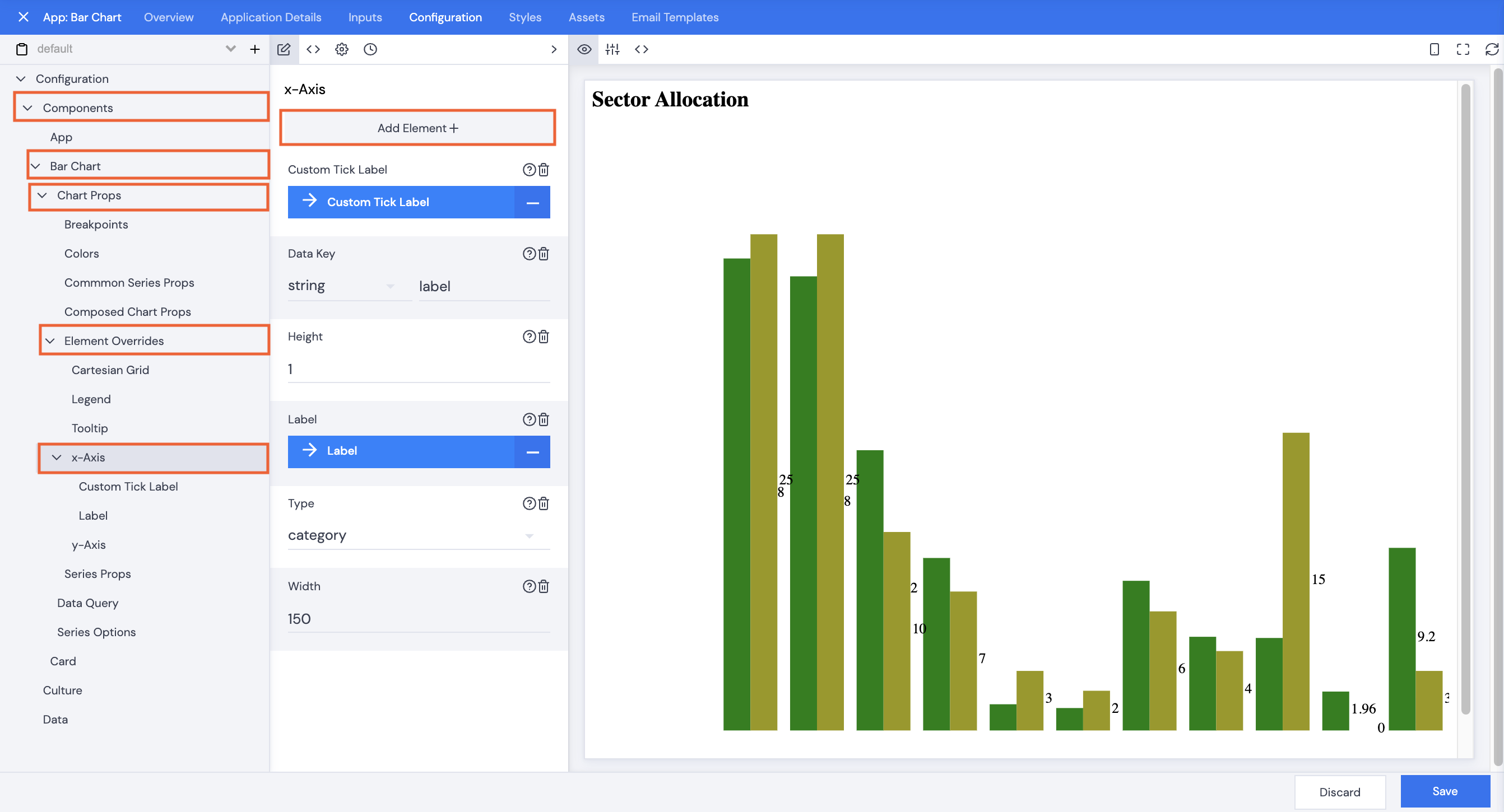
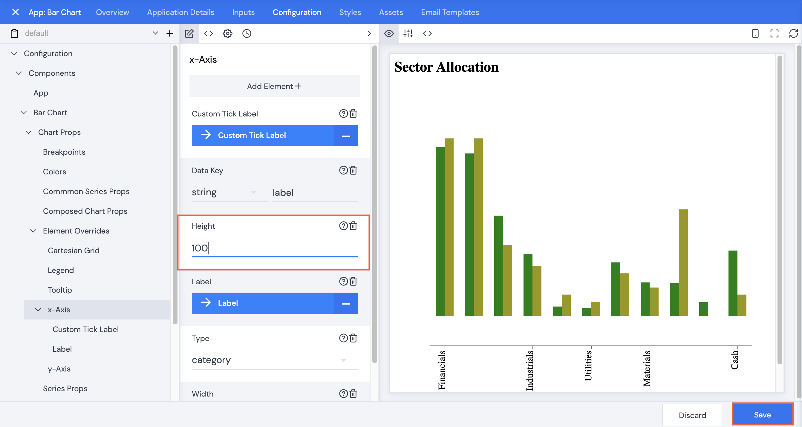
Click the JSON <> icon and open > the editing pane to full screen or browse to the applicable section using the navigation pane for the UI.
![]()
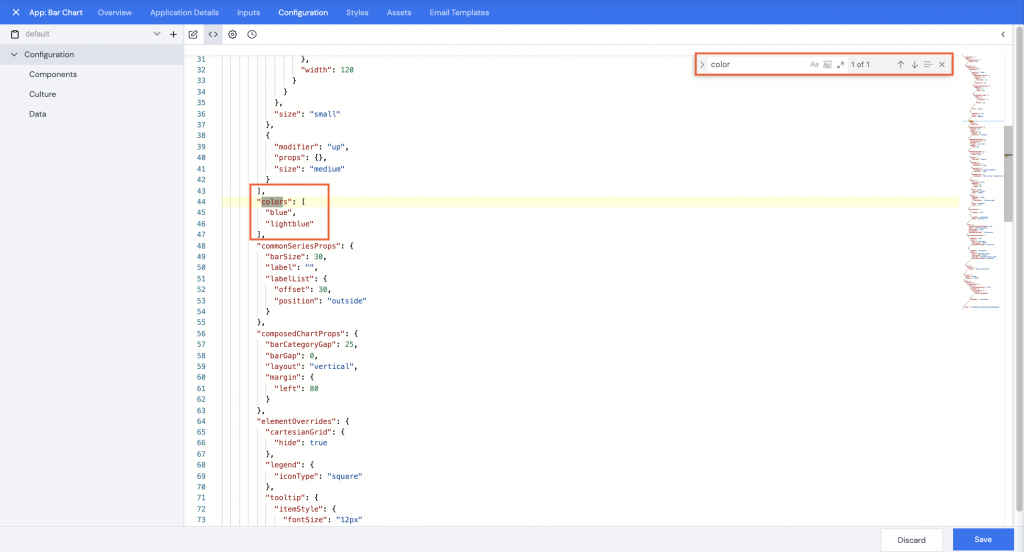
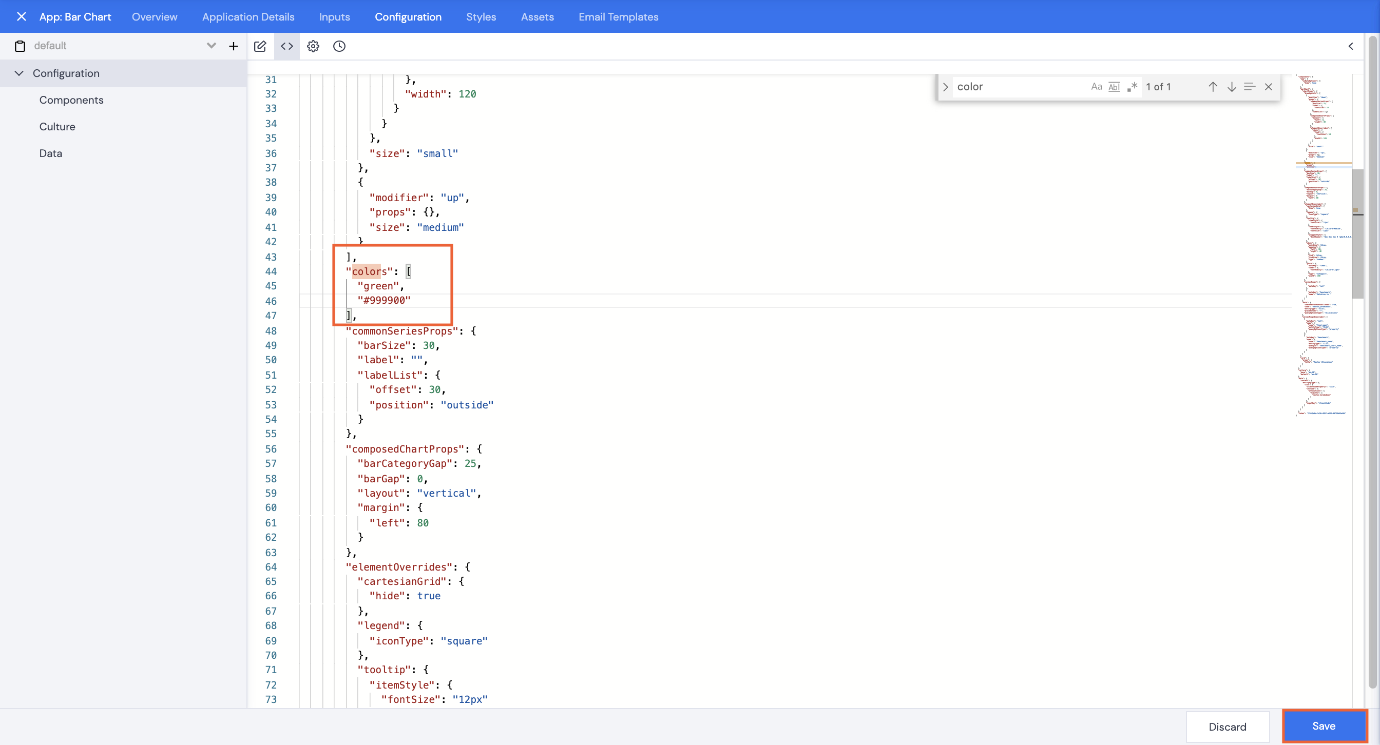
Colors
- To change the bar chart colors, command+F or Ctrl+F in the editing pane, and search for “color”.
Note:The first color listed is for the selected fund, the second color is for the benchmark.
- Change the colors by typing in a different color name or a hex code.
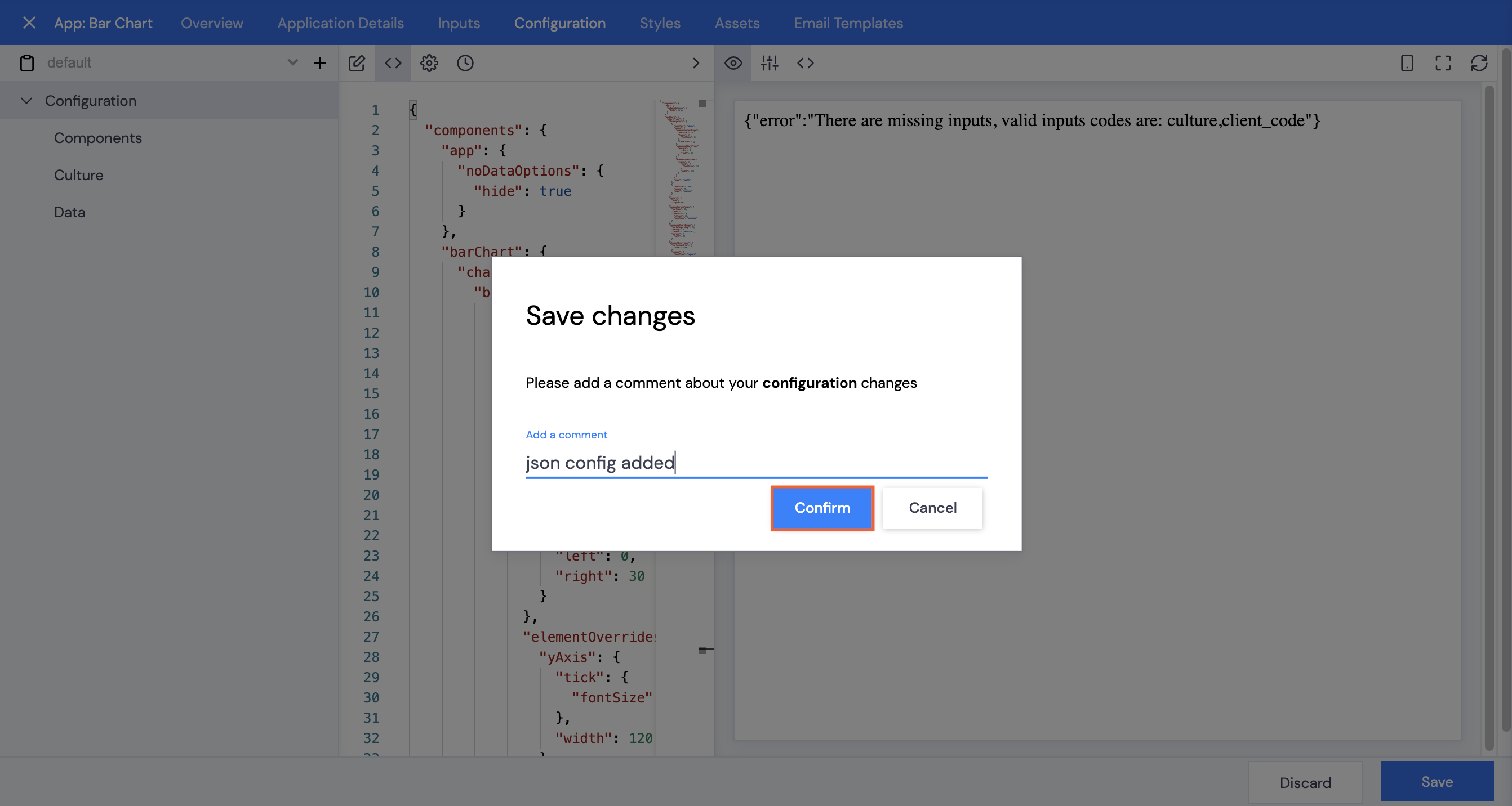
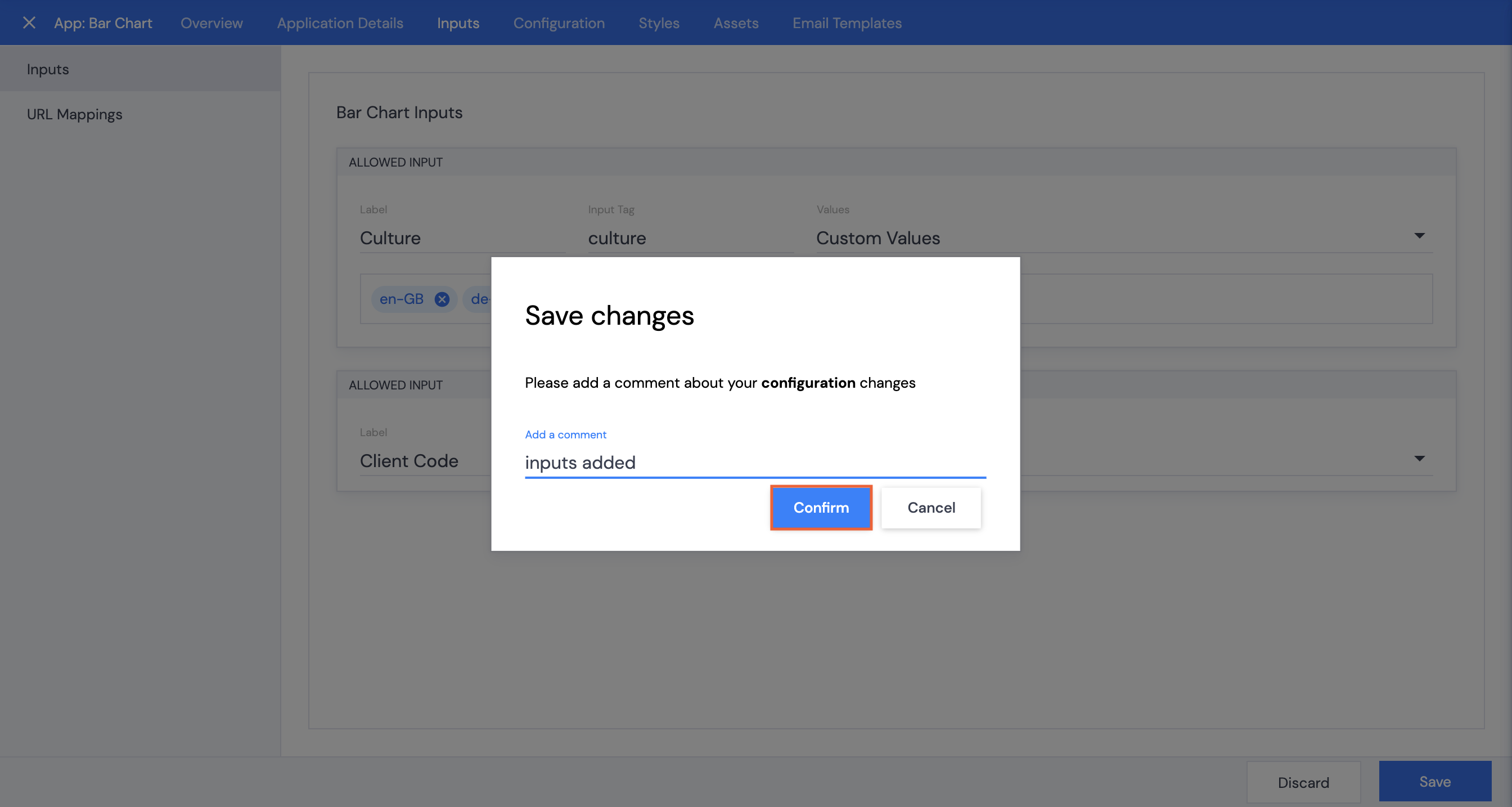
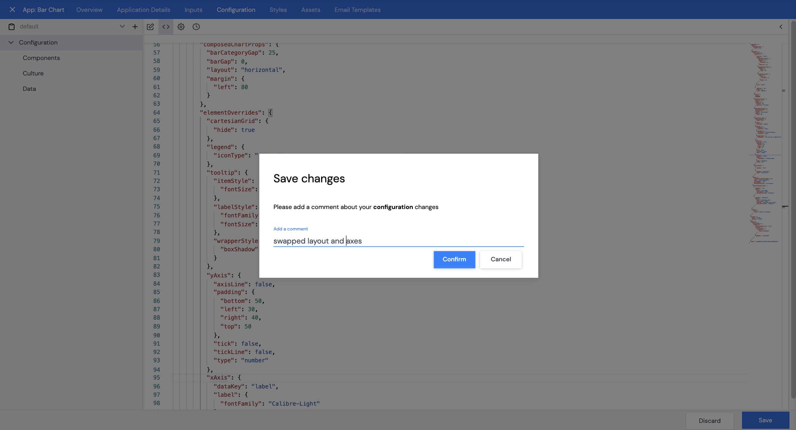
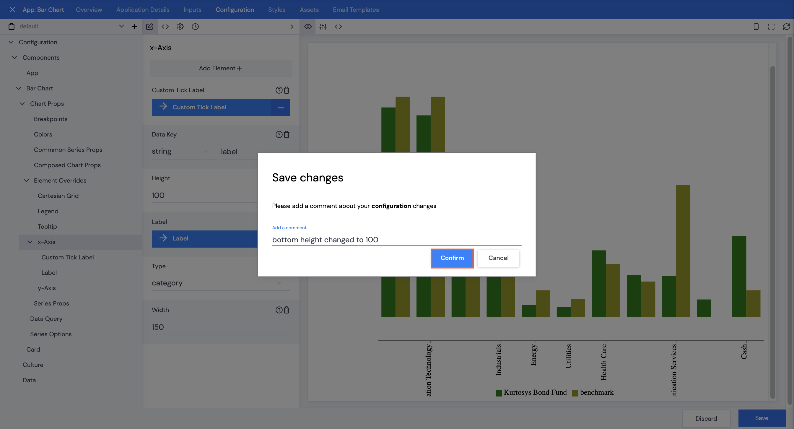
- Click Save.
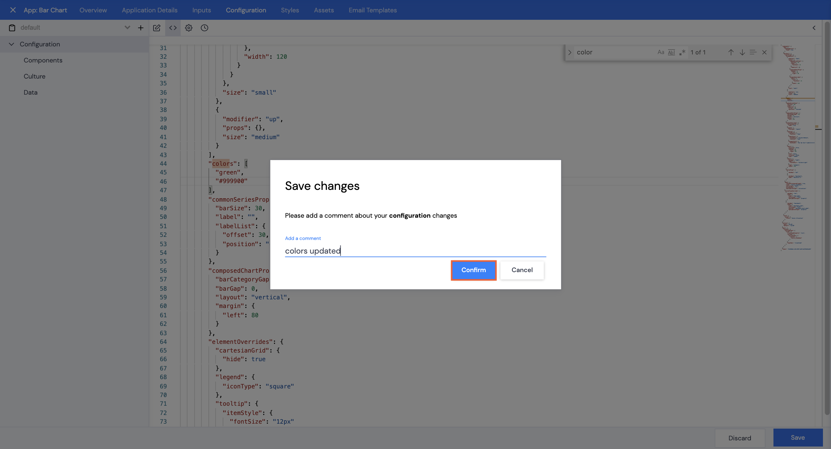
- Add a comment, then click Confirm.
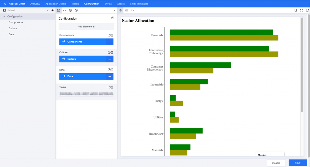
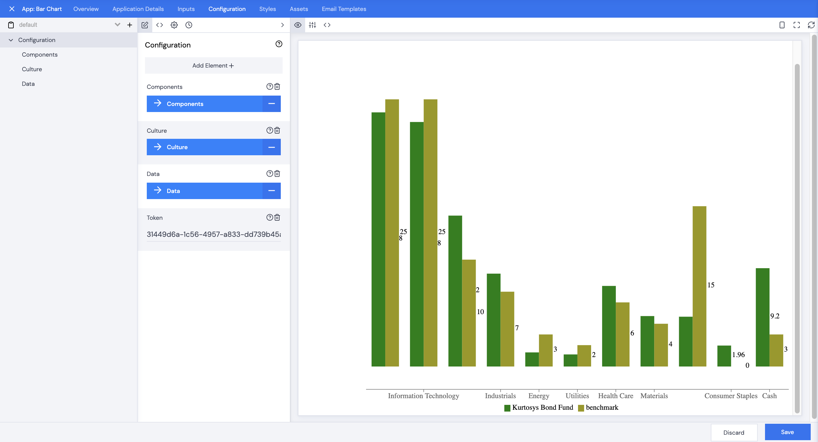
The new colors will be displayed in the Preview pane.