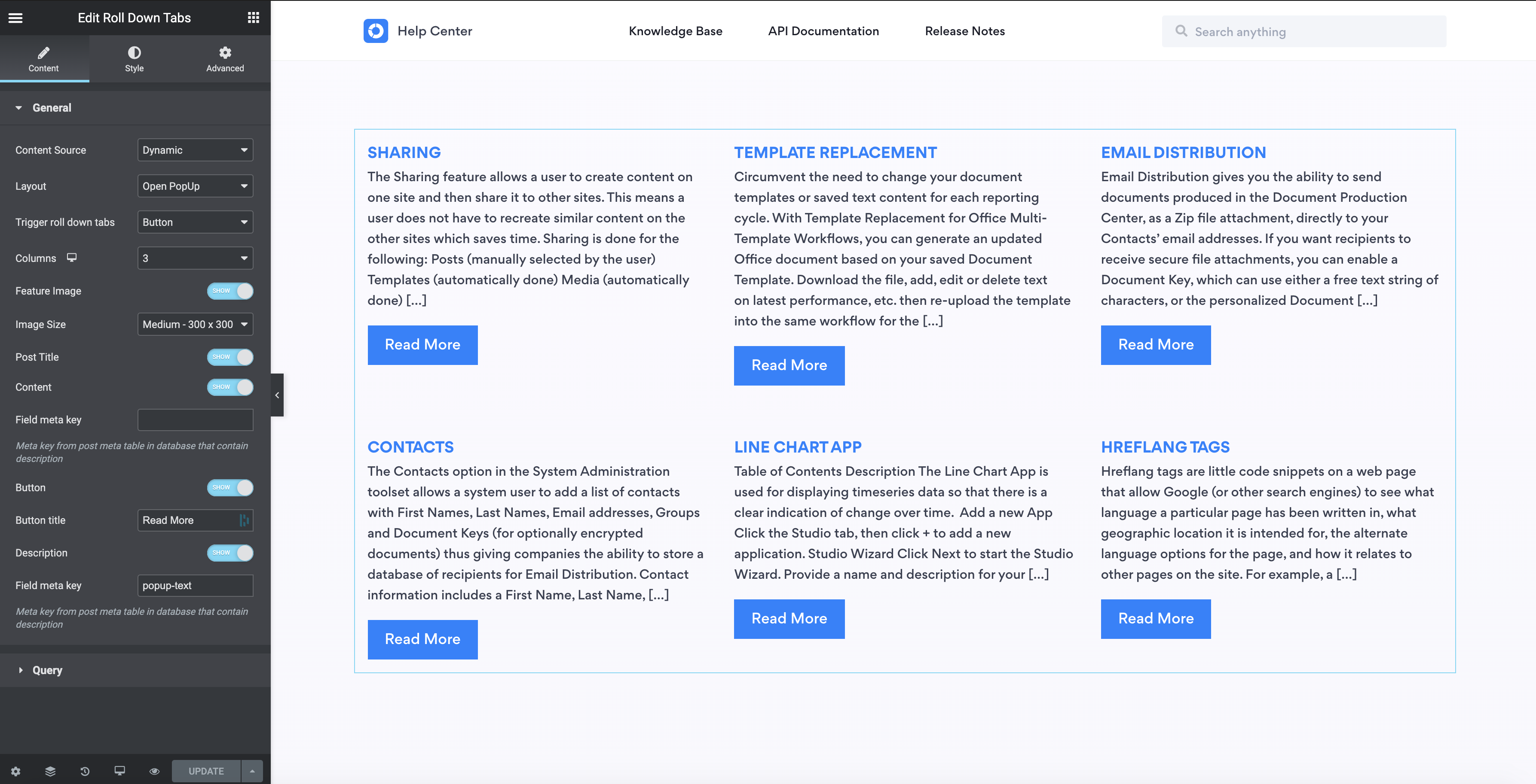
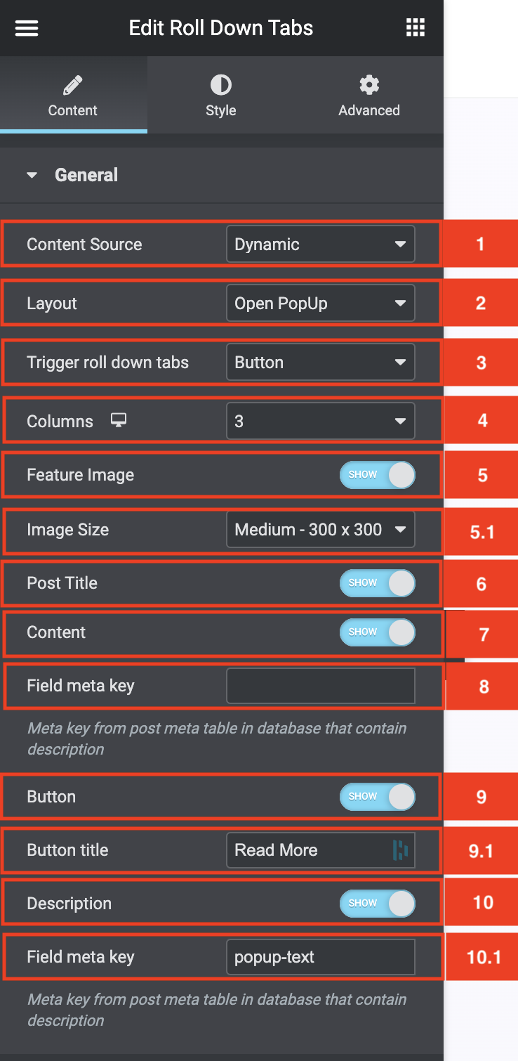
General Settings For Dynamic Content Source
- In the Content Source select area, you can select if you want to display dynamic or manual content. If you select Dynamic you will be able to call on posts within a post type.
- The Layout select area controls how the additional content (meta field content) is shown. If you select Roll Down the content will display below the relevant section.
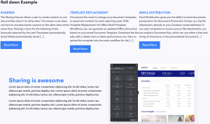
If you select Open Popup it will display the content in a popup.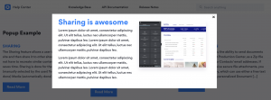
- The Trigger Roll Down Tabs select area enables you to select what triggers the popup or roll-down effect. You can select one of 4 options
- Box (meaning the full post card area of the relevant post)
- Image (only the image is clickable)
- Title (only the title is clickable)
- Button (only the button is clickable)
- The column select area controls the column layout of the list that will be shown.
- The Featured Image toggle control if the posts featured image is displayed on each card.
- If you toggled the Feature image toggle on you will see the Image Size select area. This is where you set the size of your image
- Toggling the post title on shows the title, toggling it off hides it.
- Toggling the Content on shows the content of the post as an excerpt, toggling it off hides it.
- The Field Meta Key under the Content Toggle allows you to fill in a custom Meta Field Key for the content area instead of the default content.
- If you would like a button to be displayed in the listing you can toggle it on with the Button toggle.
- If you toggled the Button on you will see a button title area where you can fill in your own custom button text.
- If you have certain posts that do not have a Roll down or Popup attached to them then you can toggle the button off for those items. To make this work you need to set the Trigger Roll Down Tabs to Button
- The Description toggle below the button title should be on, this will show the field meta key area where you can place the meta field you would like to display in either the roll down area or the popup area.
- As mentioned above, the Field Meta Key area below the description toggle should contain the meta key that you would like to display in the roll-down area or popup.
General settings For Manual Content Source
- If you select manual you will be able to manually add in the content. This will allow you to use the repeater area to add your content.
- The Layout select area controls how the additional content (meta field content) is shown. If you select Roll Down the content will display below the relevant section.
If you select Open Popup it will display the content in a popup. - The Trigger Roll Down Tabs select area enables you to select what triggers the popup or roll-down effect. You can select one of 4 options. Box (meaning the full post card area of the relevant post), Image, Title or Button.
- The column select area controls the column layout of the list that will be shown.
- The Featured Image toggle control if the posts featured image is displayed on each card.
- If you toggled the Feature image toggle on you will see the Image Size select area. This is where you set the size of your image
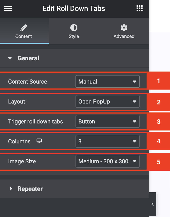
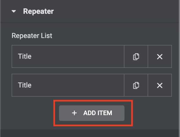
Repeater settings For Manual Content Source
To add a Manual Content area for the roll-down tabs you need to press the + Add item button. This will add an item to the Repeater list.
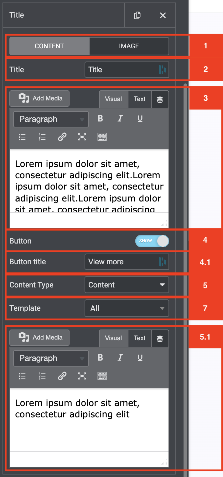
- Once you have added a repeater item you will see two items at the top of the area. The first is where you add in your content. The next is where you can add in your image.
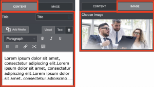
- The next area is called Title. This is where you add in the title of your Item.
- In the main content area, you can place any type of content. But keep in mind that this is the excerpt type area for your roll-down tabs item.
- The next area will allow you to toggle the button on or off.
- If you toggled the Button on you will see a button title area where you can fill in your own custom button text.
- If you have certain posts that do not have a Roll down or Popup attached to them then you can toggle the button off for those items. To make this work you need to set the Trigger Roll Down Tabs to Button
- In the content type area, you can select if you want to add via the editor or a template for the popup/roll-down area.
- In this area, you can add in the content for your roll-down or popup depending on what you selected in the general area.
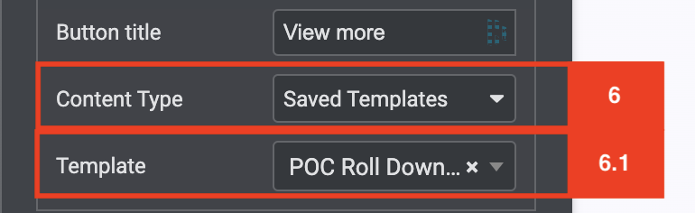
- If you selected Template for your content type the text area will be removed allowing you to select a template to show in your roll-down/popup area.
- You can select your template in the template area. Just start typing the name of the template and the search will find it for you.
- You can select any template in your template library.
- If you reverted from a template to content then you will still be able to see your template in the template area above the text box.